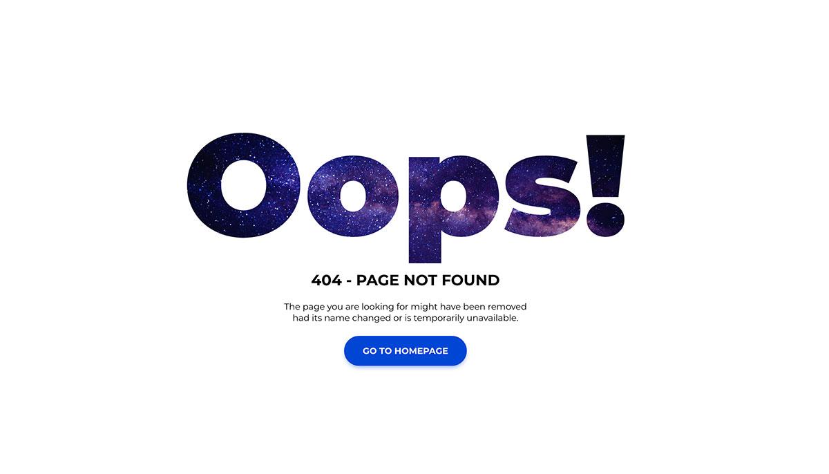
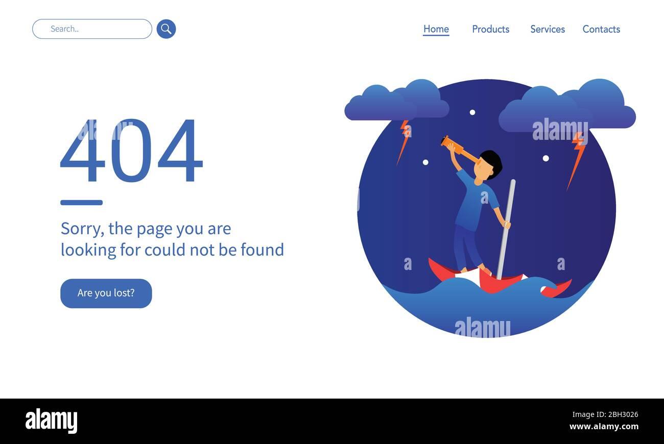
7 Best 404 Page Examples and Every Best Practice They Use
We’ve all been there—you’re happily browsing a website, and suddenly, you hit a dead end: the dreaded 404 error page. It’s that frustrating moment when the page you’re looking for seems to have vanished into thin air. But what if I told you that a 404 page doesn’t have to be a roadblock? In fact, it can be a golden opportunity for your brand to shine!
In this article, we’ll explore seven of the best 404 page examples that not only soften the blow of hitting a dead end but also engage visitors in unique and creative ways. From witty humor to clever navigation, these standout pages turn a potentially negative experience into a memorable interaction. We’ll dissect the best practices they use so you can implement these strategies to enhance your own website. Ready to transform your 404 into a delightful detour? Let’s dive in!
Understanding the Importance of a Great 404 Page
In the vast landscape of the internet, encountering a 404 error page can be frustrating for users. However, this does not have to be a dead end. Instead, a well-designed 404 page can transform a negative experience into a positive one. Understanding its importance is crucial for any website aiming to retain visitors and maintain a strong online presence.
Redirection: It can guide users back to relevant content, ensuring they continue their journey on your site.
Branding: A creative and on-brand 404 page can reinforce your website’s identity, turning a potential drawback into an opportunity for engagement.
Humor and Personality: Injecting humor or a personalized touch can humanize your brand, making it more relatable and memorable.
Feedback Channels: Providing a way for users to report broken links or issues can help improve your site’s functionality.
Moreover, a 404 page can significantly affect your site’s performance metrics. When users encounter a well-crafted error page, they are more likely to stay on your website rather than bounce off. This extended dwell time can positively influence your SEO ranking. Google favors user engagement, and a 404 page that captivates visitors can keep them exploring your site longer.
To make a lasting impact, a 404 page should be user-friendly and visually appealing. The design should be consistent with the overall look and feel of your website. Consider integrating elements such as:
Search Bar: Allow users to search for the content they were looking for directly from the 404 page.
Navigation Links: Include links to popular sections or recent blog posts to guide users to valuable content.
Engaging Visuals: Use images, illustrations, or animations that resonate with your brand’s voice.
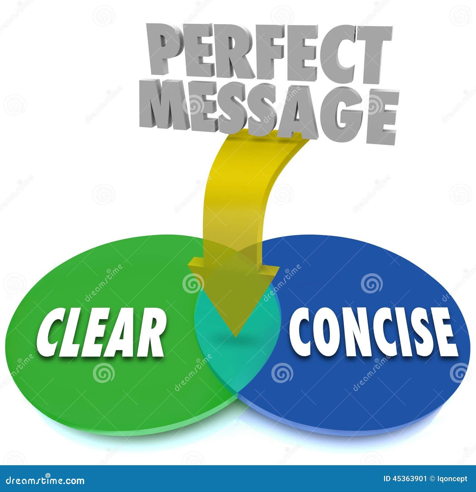
Clear Messaging: Communicate clearly that the page they are looking for cannot be found, but also let them know what they can do next.
Incorporating interactive elements such as quizzes or fun facts can also enhance user engagement. A touch of creativity can turn a mundane experience into a delightful one. After all, users appreciate brands that can bring a smile to their faces, even in moments of confusion.
Ultimately, the importance of a great 404 page cannot be overstated. It is not just about addressing errors; it’s about creating an opportunity to connect with your audience. By implementing best practices and enhancing user experience, your 404 page can play a pivotal role in your website’s success.
Key Elements That Make a 404 Page Stand Out
When users stumble upon a 404 page, it’s crucial to transform their frustration into a positive experience. A standout 404 page not only informs visitors that the page they are looking for is absent, but also provides a sense of direction. Here are some key elements that can make a 404 page truly memorable:
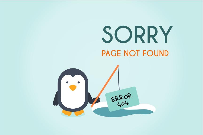
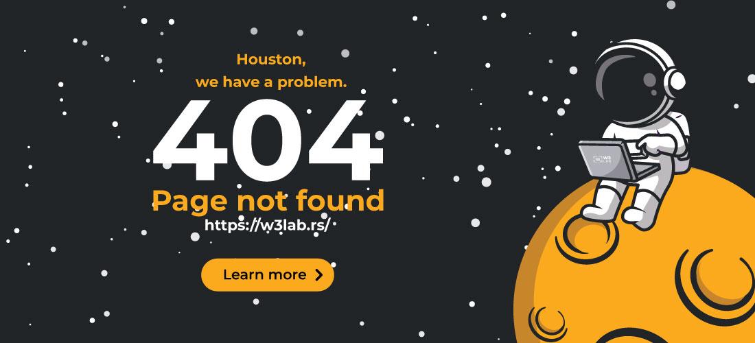
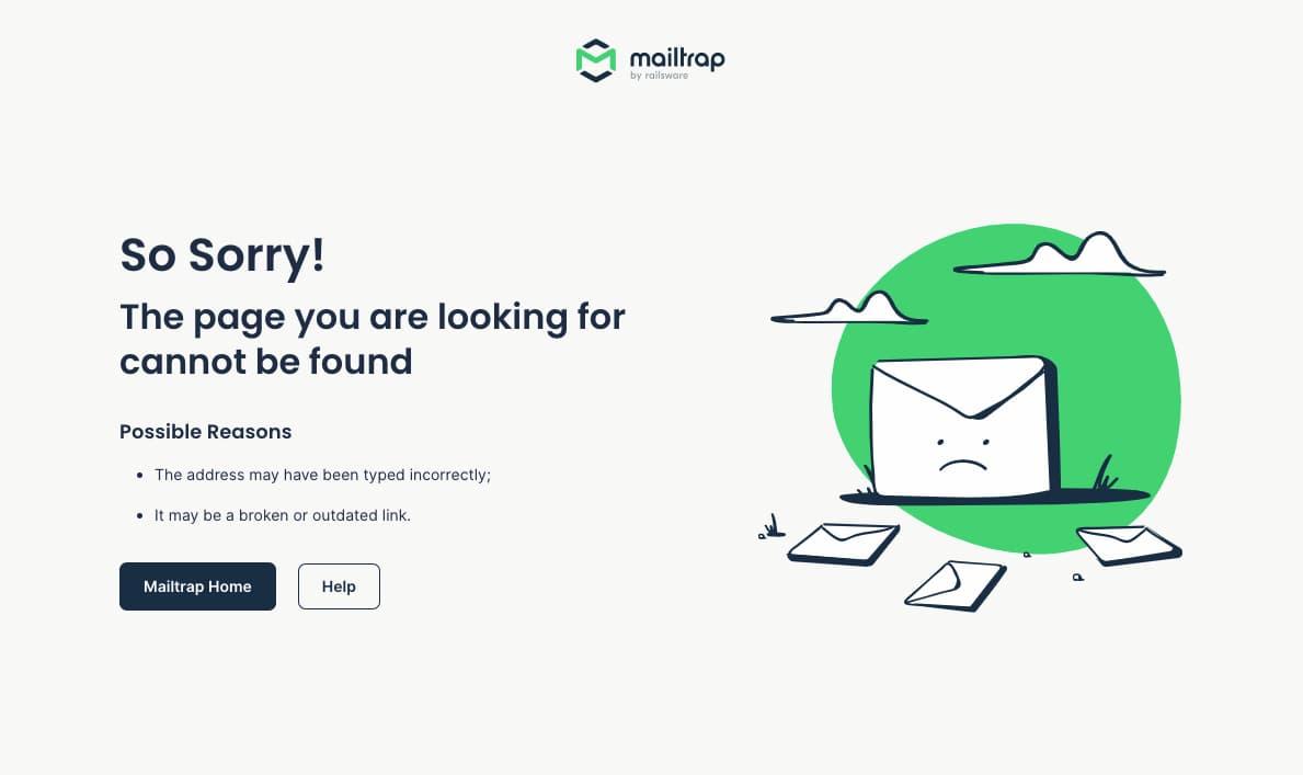
Creative Design: Utilize eye-catching visuals that resonate with your brand. This could be quirky illustrations, animations, or even a humorous character that guides users.
Clear Messaging: Keep the text simple and straightforward. A message like “Oops! We couldn’t find the page you were looking for,” can lighten the mood and set the right tone.
Helpful Navigation: Provide links to popular pages or a search bar. This not only helps users find what they need but also minimizes bounce rates.
Integrating a sense of humor can also elevate the user experience. A well-placed joke or pun can ease the frustration of hitting a dead end. Consider incorporating phrases like, “Looks like you’re lost in the internet void!” to bring a smile to their face.
Another essential aspect is mobile responsiveness. With a significant number of users browsing on mobile devices, ensuring your 404 page is optimized for various screen sizes is a must. A responsive design not only looks better but also enhances usability, making it easier for users to navigate away from the error.
Don’t forget about branding. The 404 page should reflect your brand’s voice and personality, using consistent colors, fonts, and styles. This reinforces your brand identity and keeps users connected, even in a moment of confusion.
Element
Description
Visual Appeal
Engaging graphics and design elements that align with your brand.
Clear Call-to-Action
Encourages users to navigate to other parts of the site.
Search Functionality
Helps users find specific content quickly.
Social Media Links
Directs users to your social platforms to keep them engaged.
Lastly, consider adding a playful or interactive element, like a mini-game or a quiz. This can turn a frustrating experience into something entertaining, encouraging users to stay on your site longer.
In essence, a standout 404 page is not just about showing an error; it’s about maintaining a positive user experience, reinforcing your brand, and providing alternative pathways to keep visitors engaged. By incorporating these elements, your 404 page can be a strategic opportunity rather than a dead end.
How Creative Designs Can Transform User Experience
In the digital world, the user experience (UX) is paramount, and one area that often gets overlooked is the 404 page. This page appears when users encounter a broken link, leading them to a dead end. However, a creatively designed 404 page can turn a frustrating moment into an opportunity for engagement. By using humor, design, and clear navigation, brands can transform a simple error page into a delightful and memorable experience.
Visual Appeal is the first thing that can capture a user’s attention. A well-designed 404 page should be visually striking and aligned with your overall brand aesthetics. Consider using unique illustrations, animations, or even videos that reflect your brand’s personality. This not only softens the blow of encountering an error but also reinforces brand recognition.
Another effective technique is to incorporate humor and wit. A clever message can ease the frustration and make users smile instead. For instance, instead of a bland “404 Not Found,” a playful message like “Oops! You’ve hit a bump on the road” can lighten the mood. Pairing this with an engaging graphic can enhance the overall experience.
Clear Navigation Options are essential. Users don’t just want to know they’ve hit a wrong turn; they want to get back on track. Providing links to popular pages, a search bar, or a sitemap can help users locate the content they were seeking. This not only improves user experience but also reduces bounce rates, turning potential frustration into user retention.
Incorporating elements of personalization can also elevate the experience. Use the data you have on returning visitors to tailor the 404 page to their interests. Suggesting popular articles or products based on their previous visits can make users feel valued and more likely to explore your site further.
Here’s a simple table to illustrate some elements that can enhance a creative 404 page:
Lastly, encouraging user feedback can transform a 404 page from merely functional to interactive. Adding a simple feedback form asking users what they were looking for can provide invaluable insights. Additionally, letting users report broken links not only helps improve your site but also engages them in a constructive way.
In sum, a creative 404 page is about more than just aesthetics; it’s an opportunity to enhance user experience, retain visitors, and strengthen brand loyalty. By implementing these best practices, you can ensure that your users leave with a positive impression, even when they don’t find what they were looking for.
The Power of Humour: Making Your 404 Page Memorable
We’ve all been there—clicking on a link only to be greeted by the dreaded 404 error page. But what if that moment of frustration could be transformed into a chuckle? The power of humor on your 404 page is not just about making a joke; it’s about turning a potentially negative experience into a memorable one. A well-crafted, witty 404 page can resonate with users and even encourage them to stick around instead of bouncing away.
Here are several ways humor can elevate your 404 page:
Human Connection: A dash of humor humanizes your brand. It shows that you understand the user’s frustration and are willing to make light of it.
Brand Personality: Your humor reflects your brand’s voice. A quirky joke or pun can showcase creativity and make your brand more relatable.
Encourages Exploration: Instead of leaving the site, users might be motivated to explore more content when greeted with a laugh.
Memorable Experience: A funny 404 page sticks in the mind, making your brand more memorable in a sea of competitors.
Consider using playful language and amusing graphics that align with your brand’s identity. For example, if you run a bakery, a visual of a doughnut with a missing hole could not only bring a smile but also encourage users to check out your latest pastry offerings. It’s all about creating a visual and textual experience that resonates.
Here’s a simple layout idea for your 404 page that combines humor with functionality:
Element
Description
Funny Headline
A catchy line like “Oops! This page has taken a coffee break!” can grab attention.
Illustrative Graphic
A cartoon or creative image that ties into the humor, making it visually engaging.
Clear Navigation
Links to popular pages or a search bar to help users find what they need.
Social Sharing Icons
Encourage users to share their experience or the page on social media, spreading the humor.
Remember, the key to a successful humorous approach is to keep it relevant and tasteful—don’t force a joke that feels out of place. Aim for something clever that reflects your brand’s identity and aligns well with the overall customer experience. When done right, a humorous 404 page can turn a moment of confusion into an opportunity for engagement.
In the world of web design, a 404 page doesn’t have to be just a dead end. Use humor to breathe life into a typically grim situation, and watch as it transforms user sentiment from annoyance to appreciation. After all, who says error pages can’t be fun?
Using Clear Messaging to Guide Users Back On Track
When users land on a 404 page, it can feel like they’ve hit a brick wall. However, this is an opportunity for websites to turn a negative experience into a navigational guide. Clear and concise messaging is essential in helping users quickly find what they need and regain their sense of direction. The key is to communicate effectively without overwhelming them with information.
Provide a Warm, Friendly Tone: A 404 page shouldn’t just convey that something went wrong; it should connect with the user on a personal level. Using phrases like “Oops! Looks like we’ve misplaced that page,” can soften the blow and make users feel more at ease. A friendly tone encourages users to stay and explore further instead of bouncing away out of frustration.
Offer Simple Navigation Options: Users are often looking for a quick way to get back on track. Including links to popular sections or the homepage can guide them efficiently. Consider these options:
Incorporate a Search Bar: Sometimes, users have specific intentions but simply miss the page they were seeking. Adding a search bar allows them to quickly enter terms and find what they need without navigating away from the 404 page. This simple feature can significantly enhance user experience and retention.
Use Visuals to Engage: A little humor or creativity can go a long way. Using engaging visuals, such as friendly illustrations or even animations, can lighten the mood. It’s not just about aesthetics; effective visuals can reinforce the message and make the experience memorable. Think about using images that relate to your brand or mission, creating a cohesive experience.
Provide Contextual Help or FAQs: If applicable, offering links to FAQs or help sections can be incredibly beneficial. Users may appreciate direct support for issues they might be encountering. A small section titled “Need Help?” with relevant resources can be very effective.
Track and Analyze User Behavior: it’s crucial to track how users interact with your 404 page. By analyzing the data, you can identify common paths leading to the error and make necessary adjustments. Create a table to monitor key metrics like:
Metric
Importance
Page Views
Understand how often users land here
Time on Page
Gauge user engagement and frustration levels
Click-Through Rate on Links
Measure effectiveness of navigation options
By employing clear messaging strategies on your 404 page, you can not only minimize user frustration but also enhance overall site navigation. It’s all about providing users with the right tools and information to make their journey as seamless as possible, turning an error page into a user-friendly experience.
Incorporating Visuals: Why Images Matter on Your 404 Page
When users land on a 404 page, they’re often frustrated and confused, searching for the content they expected. This is where the power of visuals comes into play. Incorporating images on your 404 page can transform a negative experience into a more engaging and memorable one. Here’s why images matter:
Capture Attention: A well-placed image can grab users’ attention and draw them into the page, making them less likely to click away in frustration.
Communicate Emotion: Humor or creativity in visuals can evoke emotions, helping to diffuse the disappointment of encountering a broken link.
Create Brand Identity: Custom illustrations or branded visuals can reinforce your brand’s personality, reminding users of who you are even in a moment of error.
Guide Navigation: Images can be used to visually guide users toward helpful links or suggestions, improving their chances of finding what they need.
Consider using whimsical graphics or illustrations that resonate with your brand’s voice. For example, a playful cartoon character can lead users to other sections of your site, making the experience feel friendly rather than frustrating. This approach not only softens the blow of the 404 error but also maintains user engagement.
Moreover, incorporating relevant visuals can help in conveying the message more effectively. A well-designed image can encapsulate the essence of what the user is missing, succinctly pointing them in the right direction. For instance, if your website is about travel, a stunning image of a scenic destination can inspire users to explore other content on your site.
Let’s take a quick look at how visual elements can enhance your 404 page:
Visual Element
Benefit
Custom Illustrations
Personalizes the experience and enhances brand identity.
Engaging Backgrounds
Creates an inviting atmosphere that encourages exploration.
Call-to-Action Buttons
Directs users to popular or related content, reducing bounce rates.
Humorous Images
Lightens the mood, making the 404 error more bearable.
Remember, the goal is to minimize user frustration. A well-crafted visual experience not only improves the aesthetics of your 404 page but also turns it into an opportunity for further engagement. By retaining users through creative visuals, you can guide them back to your site’s valuable content without losing their interest.
Ultimately, a 404 page doesn’t have to be a dead end. With the right images and design, it can become a stepping stone for users to navigate your site more effectively, keeping them coming back for more. Invest in good visuals, and watch how they can positively impact user experience even in less-than-ideal circumstances.
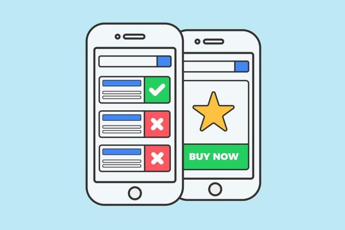
Examples of Effective Calls to Action on 404 Pages
When users land on a 404 page, it’s a prime opportunity to redirect them toward the content they’re seeking or encourage them to engage further with your site. Here are some creative examples of effective calls to action (CTAs) that can turn a frustrating experience into a delightful one:
Search Bar: A simple yet powerful CTA is a prominently displayed search bar. Encourage users to find what they were looking for by saying something like, “Can’t find what you’re looking for? Try searching our site!” This invites them to explore further and can significantly reduce bounce rates.
Popular Links: Provide a list of popular or related links that users might find interesting. For example, “Still looking for something? Check out our most popular articles!” This not only aids navigation but also keeps users engaged with your content.
Home Page Redirect: Sometimes, a direct path back to the home page is the best approach. Use a friendly message like, “Oops! Let’s get you back on track. Head over to our home page to start fresh!” This gives users a straightforward option without frustration.
Contact Options: Offering a way to contact customer support or ask for help can demystify the user experience. A message such as, “Need assistance? We’re here to help! Get in touch with us.” encourages communication and can lead to increased user satisfaction.
Additionally, consider incorporating engaging visual elements that complement your CTAs:
Visual Element
Description
Custom Illustrations
Create a lighthearted illustration relevant to the 404 page that reflects your brand’s personality.
Animated GIFs
Use a fun or humorous GIF that resonates with the user to lighten the mood and keep them engaged.
Video Clips
Short clips can be used to explain how to navigate the site or highlight popular content, making the experience more interactive.
Lastly, add a sprinkle of humor! A well-placed joke or pun can break the ice. For example, “Looks like you’ve taken a wrong turn! But don’t worry, even GPS gets confused sometimes. Let’s find your way back.” This not only defuses frustration but also humanizes your brand, making users more likely to stick around.
Remember, the goal of your 404 page is not just to inform users that a page doesn’t exist, but to guide them back into your website’s ecosystem. With the right CTAs, you can transform a negative experience into a positive one, keeping users engaged and encouraging them to continue exploring.
Learning from Mistakes: What to Avoid on Your 404 Page
When it comes to crafting a remarkable 404 page, avoiding common pitfalls can make all the difference. A mismanaged error page can lead to user frustration and ultimately drive visitors away. Here are some key mistakes to steer clear of:
Being Too Generic: A bland, generic 404 message won’t engage users. Instead, personalize your message to resonate with your brand voice. Your visitors should feel that their experience matters, even in error.
Neglecting Navigation: Don’t leave users stranded. Ensure your 404 page includes links to popular sections of your site, a search bar, or a sitemap. This keeps users engaged and encourages them to explore further.
Ignoring Branding: A 404 page should still feel like part of your website. Maintain your branding elements such as colors, fonts, and logos to ensure a cohesive experience, even when something goes wrong.
Overcomplicating the Design: While creativity is encouraged, a cluttered design can overwhelm users. Aim for simplicity and clarity. Let the message stand out and provide easy navigation options.
Using Jargon: Avoid technical language that might confuse users. Your 404 message should be straightforward and easily understood. A simple, friendly tone will resonate more effectively.
In addition to these missteps, it’s crucial to consider the emotional impact of your 404 page. A little humor can go a long way in easing the disappointment of landing on a broken link. However, be careful not to cross the line into insensitivity. Here’s a quick reference table for balancing humor and professionalism:
Humor Style
Effect
Playful
Lightens the mood, keeps users smiling
Witty
Engages users, encourages sharing
Overly Sarcastic
May alienate or offend users
Confusing
Leaves users frustrated and navigating away
Lastly, don’t forget about the mobile experience. Many users browse websites on their phones, so your 404 page should be fully responsive. Test how it appears on different devices to ensure that all links and navigation elements remain functional and accessible.
By avoiding these common mistakes, you’ll not only improve user experience but also turn a potentially negative situation into an opportunity for engagement and conversion. A well-crafted 404 page can be an unexpected touchpoint that delights your visitors and encourages them to stay on your site.
Mobile Responsiveness: Ensuring a Seamless Experience
In today’s digital landscape, a seamless mobile experience is paramount, especially when users encounter a 404 error page. With a growing number of users accessing websites via mobile devices, it’s crucial that your 404 page is not only functional but also visually appealing and easy to navigate on smaller screens.
When designing a mobile-responsive 404 page, consider the following elements:
Simple Navigation: Ensure that users can quickly find their way back to the homepage or other relevant sections of your site. A clear and concise navigation menu can greatly enhance user experience.
Touch-Friendly Buttons: Make sure that all interactive elements are large enough for users to tap easily. Avoid tiny links and buttons that can be frustrating on mobile devices.
Fast Loading Times: Optimize images and scripts to ensure your 404 page loads quickly. Mobile users are often on the go, and slow loading times can lead to increased bounce rates.
Responsive Design: Use flexible layouts that adapt to various screen sizes. A well-structured grid can help maintain a clean and organized look, regardless of the device being used.
Another essential aspect of a mobile-responsive 404 page is the use of compelling visuals. High-quality images or illustrations can enhance the user experience and convey your brand’s personality. Here are some tips:
Engaging Graphics: Use eye-catching visuals that relate to your brand or the message of the 404 page. Humor or creativity can turn a frustrating encounter into a memorable one.
Consistent Branding: Ensure that your 404 page reflects your brand’s colors, fonts, and overall aesthetic. This consistency helps reinforce brand recognition even in the face of an error.
Moreover, consider incorporating a search bar on your 404 page. This simple addition allows users to quickly find what they were looking for, reducing frustration and improving their overall experience. Here’s a quick overview of why a search feature is beneficial:
Benefit
Description
Enhanced User Experience
Users can easily find content without leaving the 404 page.
Reduced Bounce Rate
Engaged users are less likely to leave the site immediately.
Increased Engagement
A search feature encourages users to explore more content.
don’t forget to test your 404 page on multiple devices and screen sizes. What looks good on a desktop may not translate well to mobile. Use tools to preview your designs across different devices and make adjustments as necessary. By prioritizing mobile responsiveness, you not only improve user satisfaction but also the overall effectiveness of your website.
The Role of SEO in Your 404 Page Strategy
When users encounter a 404 page, it can often lead to frustration and a lost opportunity for engagement. However, integrating SEO into your 404 page strategy can turn a potential dead end into a valuable asset for your website. A well-designed 404 page doesn’t just inform visitors that the page they were looking for isn’t available; it can also guide them toward other relevant content, ensuring they don’t leave your site entirely.
First and foremost, it’s crucial to keep your 404 page optimized for search engines. This means using the right 404 HTTP status code so that search engines understand the page is not available. Avoiding misconfigurations that lead to 200 status codes on error pages is essential. This distinction helps search engines accurately index your site and prevents them from thinking these pages are valid content.
Next, consider implementing internal links on your 404 page. This could include links to popular articles, categories, or even a search bar that allows users to find what they were originally looking for. For example, you can use a friendly and engaging message such as:
“Oops! It seems we can’t find that page. But why not check out these popular links?”
“Try using our search bar below to discover what you need!”
“Here are some sections you might find interesting:”
User engagement is another critical component of a successful 404 page. Incorporating elements like humor, relatable content, or even a fun graphic can soften the blow of disappointment. This not only retains visitors but can also encourage social sharing. You could showcase user-favorite content or seasonal promotions, giving users a reason to stick around.
Additionally, don’t underestimate the impact of brand messaging on your 404 page. This is an opportunity to showcase your brand personality. Whether you choose to be witty, empathetic, or straightforward, ensure that your tone resonates with your target audience. For instance, a lighthearted message might go: “Lost, are we? Let’s get you back on track!”
Element
Importance
404 HTTP Status Code
Informs search engines of the error status
Internal Links
Keeps users engaged and on-site
Brand Personality
Enhances user experience and brand connection
Lastly, use analytics to monitor the performance of your 404 page. Tools like Google Analytics can provide insight into how many visitors are landing on your 404 page and which links they are clicking. This information can inform future adjustments to your website’s structure and content, ensuring you’re not only preventing 404 errors but also providing a satisfying user experience.
a strategically crafted 404 page is more than a mere placeholder for errors; it is a vital part of your overall SEO and content strategy. When done right, it can enhance user experience, improve site navigation, and contribute positively to your search engine ranking. Turn your 404 pages into a bridge rather than a barrier, and watch how it influences user behavior on your site.
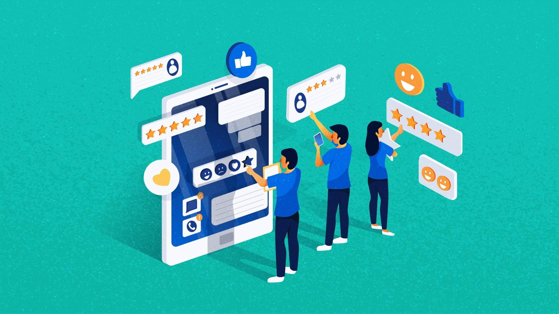
Leveraging User Feedback to Improve Your 404 Page
Every website experiences 404 errors, but how you handle them can say a lot about your brand. A strategic way to enhance your 404 page is by actively seeking and leveraging user feedback. Understanding how visitors interact with your 404 page can provide critical insights into what works and what doesn’t. Here’s how you can use their feedback to create a more engaging experience.
First, consider implementing a simple feedback mechanism on your 404 page. This could be as straightforward as a thumbs up/down option or a brief survey asking users what they were expecting to find. By gathering this information, you can:
Identify common errors: Discover which links are frequently broken or misdirected.
Understand user intent: Learn what users were searching for when they landed on your 404 page.
Gauge satisfaction: Measure how well your 404 page serves its purpose and keeps users engaged.
Once you have collected user feedback, analyze it to uncover patterns and trends. For instance, if multiple users express frustration about not knowing where to go next, it may be time to enhance your navigation options on the 404 page. Consider including:
Search bars: Allow users to search for content directly from the 404 page.
Suggested links: Provide links to popular pages or relevant content.
Clear next steps: Guide users on what they can do next to find the information they need.
Another powerful strategy is to use A/B testing based on the feedback received. By creating variations of your 404 page and directing a segment of your traffic to each version, you can measure which elements resonate most with your audience. Focus on changing:
Design elements: Experiment with different layouts, colors, or images.
Messaging: Test variations in the text to see what encourages users to stay on your site.
Calls to action: Evaluate which CTAs drive user engagement effectively.
Don’t forget to keep communication lines open. If users feel their feedback is valued, they’re more likely to provide it in the future. Consider creating a dedicated section on your site where users can easily submit their thoughts and suggestions about the 404 page. A simple feedback form can go a long way in fostering a sense of community and improving user experience.
Lastly, regularly review and update your 404 page based on ongoing user feedback. The digital landscape is constantly evolving, and what resonates with users today may not tomorrow. By staying agile and responsive to feedback, your 404 page can transform from a frustrating dead end into a valuable resource that keeps users engaged and encourages them to explore your site further.
Case Studies: Success Stories from Top Brands
When it comes to 404 pages, some brands have truly nailed the art of turning a frustrating experience into a delightful one. Let’s explore how these brands transformed their error pages into opportunities for engagement, reinforcing their brand identity while enhancing user experience.
Airbnb
Airbnb cleverly uses its 404 page to maintain the warmth and community feel of its platform. Their whimsical illustration of a lost house reinforces the idea that users might be on a journey, just not one that leads to the intended destination. The page includes:
Friendly language: A message that feels personal and relatable.
Search bar: Encouraging users to find their desired listings.
Call-to-action buttons: Suggestions to explore popular destinations.
GitHub
GitHub’s 404 page is a perfect blend of humor and functionality. It features a playful graphic alongside a straightforward message that directs users back on track. Key elements include:
Creative imagery: A humorous depiction of a lost Octocat.
Search functionality: A clear option to search the repository.
Links to helpful resources: Guides and documentation for user assistance.
Mailchimp
Mailchimp takes a quirky approach with its 404 page, featuring a cute illustration and a friendly message. Their success lies in:
Visual appeal: Engaging graphics that capture attention.
Brand voice: Consistent tone that aligns with their marketing strategy.
Navigation options: Clear paths to return to the main site or sign up.
LEGO
LEGO uses its 404 page to reflect its playful spirit. With a vibrant design and interactive elements, it encourages users to engage. They excel by incorporating:
Interactive elements: Options to play mini-games or explore featured sets.
Redirects: Suggestions for popular pages and products.
Patagonia
Patagonia’s 404 page is straightforward but effective. It aligns with their brand ethos of environmentalism and sustainability. Their approach includes:
Dropbox employs a 404 page that emphasizes their user-centric approach. With a friendly message and useful options, they focus on:
Clear messaging: Apologizing for the inconvenience in a friendly tone.
Search functionality: Making it easy to find files or folders.
Support links: Quick access to help and FAQs.
Spotify
Spotify’s 404 page utilizes humor and brand character to engage users. Their strategy includes:
Witty text: Light-hearted messaging that reflects their brand personality.
Visual branding: Strong visual elements that resonate with users.
Easy navigation: Suggestions to explore new music or playlists.
Final Thoughts: Elevating Your Brand with a Thoughtful 404 Page
In a digital landscape where first impressions are everything, a well-crafted 404 page can transform a frustrating experience into an opportunity for engagement. When users encounter a broken link or a missing page, their immediate reaction may be disappointment. However, a thoughtful 404 page can redirect that disappointment into a moment of brand interaction that leaves a lasting impression.
Why settle for a generic error message when you can create a page that reflects your brand’s voice and personality? By integrating humor, creativity, or even a simple apology, you can turn a mundane error into a memorable interaction. Here are a few strategies to elevate your 404 page and keep users connected:
Embrace Your Brand’s Personality: Use distinctive language and design elements that align with your brand’s identity.
Offer Guidance: Include links to popular pages or a search bar to help users navigate back to relevant content.
Be Visual: Incorporate engaging images or illustrations that resonate with your audience and lighten the mood.
Include a Call-to-Action: Encourage users to explore further, whether it’s signing up for a newsletter or visiting your homepage.
Moreover, consider the aesthetics of your 404 page. This is an opportunity to showcase your design skills and creativity. A visually appealing layout can draw users in, making them feel more inclined to stay and explore rather than leave your site altogether. Think about implementing interactive elements, such as animations or hover effects, which can add an extra level of engagement.
To further enhance user experience, it’s crucial to maintain a straightforward and clear message. Users should quickly understand that they have encountered a 404 error and what their next steps should be. A cluttered page can lead to confusion and frustration, which defeats the purpose of your thoughtful design.
Here’s a table showcasing effective 404 page features you might consider:
Feature
Description
Search Bar
Helps users find what they are looking for without backtracking.
Funny Copy
Lightens the mood and keeps the user engaged.
Custom Illustrations
Adds a unique touch that reflects your brand’s personality.
Contact Information
Allows users to reach out for support if needed.
remember to regularly analyze the performance of your 404 page. Check your site analytics to understand how users interact with the page and where they navigate afterward. This data can provide valuable insights into improving user experience and optimizing your website’s overall performance.
In essence, a thoughtful 404 page is more than just a placeholder for errors; it’s a chance to engage with users, reinforce your brand identity, and guide them seamlessly back into your site. By investing time into crafting an impressive 404 experience, you can turn a potential negative into a memorable and constructive interaction that keeps users coming back for more.
Frequently Asked Questions (FAQ)
Q: What is a 404 page, and why is it important?
A: A 404 page is what users see when they try to access a webpage that doesn’t exist. It’s essential because it’s often the last chance you have to engage a visitor who might be frustrated. A well-designed 404 page can turn a negative experience into a positive one, keeping users on your site instead of pushing them away.
Q: What makes a great 404 page?
A: A great 404 page should be visually appealing, user-friendly, and it should convey a sense of humor or empathy. It typically includes a clear message that the page is not available, along with navigation options to guide users back to functional areas of your site. Creativity is key here—think of it as an opportunity to showcase your brand’s personality!
Q: Can you give an example of an effective 404 page?
A: Absolutely! One standout example is from GitHub. Their 404 page features a friendly octocat character and a humorous message about the lost page. It also provides links to popular repositories and a search bar. This blend of humor and practicality not only eases frustration but also encourages users to explore further.
Q: What are some best practices to consider when creating a 404 page?
A: Here are a few best practices you should keep in mind:
Clear Messaging: Use simple language to inform the user they’ve hit a dead end.
Visual Appeal: Design it to match your brand’s aesthetics—consistency is important!
Navigation Aids: Include links to the homepage, popular pages, or a search bar.
Engaging Content: Consider adding humor or illustrations to lighten the mood.
SEO Considerations: Use a custom 404 page that communicates a 404 status to search engines.
Q: How can humor enhance a 404 page?
A: Humor can turn a frustrating experience into an enjoyable one. It shows your brand has a personality and can relate to users’ feelings. A witty line or funny graphic can make the visitor smile, which may encourage them to stick around and explore your site instead of leaving in frustration.
Q: Do all websites need a 404 page?
A: Yes, every website should have a 404 page. Regardless of how well-structured your site is, broken links can happen, and visitors will inevitably encounter them. A dedicated 404 page can help minimize the negative impact of these occurrences.
Q: What should I avoid when designing a 404 page?
A: Avoid using technical jargon or error codes that can confuse users. Don’t make the page too cluttered or overwhelming. And, most importantly, never leave users without a clear path to move forward—this can lead to higher bounce rates.
Q: How can I measure the effectiveness of my 404 page?
A: You can track how users interact with your 404 page through analytics. Look at metrics like bounce rates, time spent on the page, and clicks on navigation links. If users frequently leave the page quickly, it might be time to rethink your design or messaging.
Q: Where can I find inspiration for creating my own 404 page?
A: Check out the examples in our article on the ”7 Best 404 Page Examples and Every Best Practice They Use.” You’ll find a variety of creative and effective designs that can inspire you to craft a custom 404 page that resonates with your audience and reflects your brand’s uniqueness!
Closing Remarks
As we wrap up our exploration of the 7 best 404 page examples and the invaluable best practices they employ, it’s clear that a well-crafted 404 page is much more than just a placeholder. It’s an opportunity—a chance to engage your visitors, redirect their journey, and even infuse a bit of personality into your brand.
Remember, a 404 page is often the first and last impression a visitor might have of your site if they encounter a broken link. By taking cues from the standout examples we’ve discussed, you can transform a potential frustration into a delightful experience that keeps users on your site, rather than sending them away in search of better navigation.
So, take a moment to assess your own 404 page. Are you using it to its full potential? With a little creativity and strategic thinking, you can turn what was once a roadblock into a stepping stone for deeper user engagement. After all, a well-designed 404 page isn’t just about saying “Oops!”—it’s about saying “We’ve got you covered!”
Now, go ahead and give your 404 page the makeover it deserves. Your visitors will thank you, and you just might boost your site’s overall performance in the process. Happy designing!