Welcome to the vibrant world of monochrome web design, where simplicity meets sophistication! As we step into 2025, the digital landscape continues to evolve, and monochrome aesthetics are making a powerful statement. If you think vibrant colors are the only way to captivate an audience, think again! This year, we’re seeing a remarkable rise in stunning monochrome websites that not only showcase creativity but also deliver an unforgettable user experience. In this article, we’ll explore 21 breathtaking monochrome websites that have mastered the art of minimalism while still packing a visual punch. But we won’t stop there—along the way, we’ll share essential design tips to help you harness the power of monochrome in your own projects. Whether you’re a seasoned designer or just starting out, get ready to be inspired by the elegance and impact of monochrome design in 2025! Let’s dive in!
Exploring the Allure of Monochrome Web Design
Monochrome web design is captivating, drawing users in with its simplicity and elegance. By employing a single color palette, designers create a cohesive visual experience that resonates deeply with visitors. When executed well, this style not only enhances usability but also allows the brand’s message to shine through without distractions.
One of the key benefits of monochrome design is focus. With fewer colors to distract the eye, visitors can concentrate on the content and functionality of the site. This is particularly effective for businesses that prioritize storytelling or want to convey a specific emotion. Imagine a photographer’s portfolio where the lack of color emphasizes the artistry of the images, or a minimalist e-commerce site that directs attention to the products themselves.
When exploring monochrome design, consider the following elements to enhance your site:
Contrast: Use varying shades of your chosen color to create depth and dimension.
Texture: Incorporate different textures to add visual interest without introducing new colors.
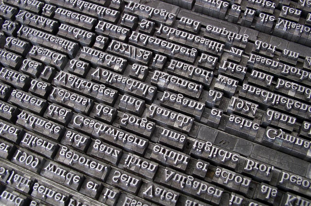
Typography: Choose bold typography that stands out against your background for an impactful statement.
Imagery: Utilize high-quality images that align with your monochrome palette, enhancing the overall aesthetic.
As you delve into monochrome design, it’s essential to maintain brand consistency. Your color choice should align with your brand’s identity. For instance, a tech company might opt for sleek grays and blacks to convey professionalism, while a creative agency might choose vibrant oranges or blues to represent innovation and energy. This strategic approach not only visually communicates your brand but also fosters recognition and trust among users.
To inspire your design journey, here’s a quick comparison of some notable monochrome websites from 2025:
Website
Color Scheme
Design Feature
Studio Black
Charcoal & White
Bold Typography
Blue Horizon
Deep Blue
Gradient Background
Eco Green
Forest Green
Textured Elements
Luxury Gold
Gold and Cream
Sleek Navigation
remember that less is more in monochrome design. The absence of color can be striking, but it’s essential to avoid clutter. Each element should serve a purpose, whether it’s guiding users through the site or providing necessary information. Embrace white space to allow your content to breathe, creating a serene and inviting browsing experience.
monochrome web design is more than a trend—it’s a strategic approach that can elevate your online presence. By thoughtfully considering color, contrast, and composition, you can create stunning websites that leave a lasting impression. So, dare to explore this design philosophy and watch how it transforms your digital landscape!
Why Monochrome is Making Waves in 2025
As we dive deeper into 2025, the design world is witnessing a remarkable shift towards monochrome aesthetics. This trend is not just about simplicity; it embodies a powerful statement where colors evoke emotions and perceptions. With a focus on a single hue, designers can create a cohesive and sophisticated experience, making it a go-to choice for many brands striving to stand out in a saturated market.
One of the key reasons monochrome is resonating so well this year is its versatility. Whether it’s a bold black and white scheme or a soft pastel palette, the monochrome style adapts to various industries, including tech, fashion, and wellness. This flexibility allows businesses to convey their brand identity while maintaining a clean and modern appearance.
Moreover, monochrome designs enhance user experience by minimizing distractions. By stripping away the clutter, visitors can focus on essential elements, such as calls to action or core content. This streamlined approach not only improves navigation but also increases engagement rates, making it a smart choice for businesses looking to optimize their web presence.
When implementing a monochrome design, consider these key design tips:
Choose a Signature Color: Select a color that aligns with your brand identity and resonates with your target audience.
Utilize Shades and Tints: Create depth by playing with different shades and tints of your chosen color, adding visual interest without straying from the monochrome theme.
Incorporate Textures: Textures can provide contrast and enhance the sensory experience, making the design feel more dynamic.
Focus on Typography: Use bold and creative typography to emphasize key messages, ensuring that text stands out against your background.
Additionally, using high-quality imagery can elevate a monochrome design. While the color scheme may be limited, striking visuals can captivate users and draw them into the brand narrative. Consider using images that align with your color choice, allowing them to complement the overall aesthetic rather than detract from it.
To illustrate the impact of monochrome designs, let’s take a look at some successful examples from 2025:
Website
Color Scheme
Industry
ArtistryHub
Shades of Blue
Creative Portfolio
TechNiche
Black and White
Technology
HealthVibe
Soft Greens
Wellness
StyleWave
Pastel Pinks
Fashion
These examples showcase how brands leverage monochrome to create striking online identities that resonate with their audiences. As we continue through 2025, it’s clear that monochrome is not just a fleeting trend; it’s a powerful design choice that emphasizes clarity, focus, and sophistication.
Key Benefits of a Monochrome Palette
Choosing a monochrome palette can transform your website into a cohesive visual experience. By using varying shades of a single color, you can create a striking impact without overwhelming your audience. Here are some key benefits of adopting this design approach:
Simplicity and Clarity: A monochrome palette eliminates the clutter that can arise with multiple colors. This simplicity enhances clarity, making it easier for visitors to focus on your content.
When your design is less busy, users can navigate your site more intuitively. This can lead to longer visit durations and lower bounce rates, as users are drawn in by a clean, streamlined interface.
Emotional Connection: Colors evoke feelings and emotions. A monochrome scheme allows you to focus on the emotional weight of your chosen color, whether it’s the calmness of blue or the energy of red.
By consistently using variations of a single color, you can build a brand identity that resonates with your audience, creating a lasting impression that encourages brand loyalty.
Versatility: Monochrome palettes are incredibly versatile. They can be adapted to suit various niches, from minimalistic portfolios to vibrant e-commerce sites.
This adaptability means you can experiment with textures and layouts while maintaining a consistent look—perfect for showcasing diverse content without compromising on style.
Color
Emotion
Use Case
Blue
Trust & Calm
Corporate Websites
Red
Passion & Energy
Fashion & Lifestyle Blogs
Green
Growth & Harmony
Health & Wellness Sites
Furthermore, a monochrome palette enhances the overall aesthetic appeal. The interplay of light and dark shades can create depth and dimension, making your site visually striking. This can be particularly effective in photography or portfolio websites, where visuals take center stage.
Focus on Content: With fewer distractions, the content becomes the hero of your website. This is particularly advantageous for blogs or service-oriented sites, where delivering clear messages is crucial.
embracing a monochrome palette can elevate your website’s design by simplifying the user experience, strengthening emotional connections, and enhancing aesthetic appeal. Whether you’re revamping an existing site or launching a new one, consider the powerful advantages of this sophisticated design choice.
Showcasing the Top Monochrome Websites of 2025
In the realm of web design, monochrome websites have become a striking trend in 2025, captivating users with their simplicity and elegance. These sites utilize a single color palette, allowing for a clean and cohesive look that enhances user experience. Let’s dive into some of the most stunning monochrome websites that are setting the standard this year.
First up, we have a standout site that uses a deep, rich black as its base color. The combination of bold typography and ample white space creates a dramatic contrast, drawing attention to key elements. This approach not only enhances readability but also makes images pop, further engaging visitors.
Design Tips:
Use varying shades of your chosen color to create depth.
Incorporate texture to avoid a flat appearance.
Strategically place white space to improve readability and navigation.
Next, we explore a serene website featuring soft grays. This site utilizes subtle gradients to add visual interest without overwhelming the user. The thoughtful arrangement of elements offers a sense of calm, making it an ideal choice for brands focused on wellness or mindfulness.
Another remarkable example showcases a vibrant blue theme. Here, the website masterfully blends bold graphics with interactive features, encouraging users to explore various sections without feeling lost. The use of hover effects adds an engaging layer, enhancing the user’s journey through the site.
Key Elements to Incorporate:
Interactive elements like buttons or links should be clearly defined.
Animation and transitions can add excitement to the user experience.
Consistency in imagery and iconography reinforces brand identity.
Website
Color Scheme
Industry
Elegance in Black
Black & White
Fashion
Serene Grays
Soft Grays
Wellness
Vibrant Blue Experience
Bright Blue
Technology
let’s not forget the impact of typography in monochrome design. Websites that prioritize distinctive fonts can communicate their message effectively, even within a limited color palette. Choosing the right typeface not only reflects the brand’s personality but also ensures that the content remains engaging.
Final Design Tips:
Pair fonts wisely for headings and body text to maintain harmony.
Test readability across different devices to ensure accessibility.
Analyzing What Makes These Designs Stand Out
In the realm of web design, monochrome websites have emerged as a bold trend, showcasing the powerful impact of a single color palette. These designs not only speak to minimalism but also create a visceral experience that captivates users. Let’s dive into the elements that make these monochrome websites truly exceptional.
First and foremost, contrast plays a pivotal role. By using various shades of the same color, designers can highlight different sections of a website without overwhelming the viewer. This technique allows for a clear visual hierarchy, guiding the user’s eye where it needs to go. For example:
Shade
Usage
Light
Backgrounds and large areas
Medium
Sections and cards
Dark
Text and CTAs
Beyond just contrast, texture is another key aspect. The inclusion of subtle textures or patterns can add depth to a design, ensuring it feels engaging rather than flat. Websites that effectively incorporate texture can evoke feelings of sophistication and warmth, drawing users into their content. This technique can be especially effective for brands wanting to convey luxury or craftsmanship.
Another standout feature of these designs is the use of whitespace. Monochrome websites thrive on simplicity, and whitespace allows elements to breathe. By carefully balancing content and space, designers can create a serene browsing experience, which is often more appealing to users. It’s about making sure that every element has its own space to shine.
Don’t underestimate the power of typography in a monochrome website. With the color palette streamlined, the font choices become a focal point. Utilizing bold, interesting typography can add personality and flair to the design, ensuring that even with a limited color scheme, the website remains memorable. Pairing different font weights and styles can also create a dynamic visual flow.
Lastly, interactive elements have the unique ability to elevate a monochrome design. When buttons, hover effects, or animations are thoughtfully integrated, they can provide an engaging experience that captivates users. For instance:
Subtle animations: Adding movement to images or text can create a more immersive experience.
the beauty of monochrome websites lies in their simplicity and the thoughtful application of design principles. By focusing on contrast, texture, whitespace, typography, and interactivity, designers can craft websites that stand out in a saturated digital landscape, making a lasting impression on users.
Essential Design Tips for Creating a Monochrome Website
Creating a monochrome website can be both an exciting and challenging endeavor. The key to success lies in embracing the simplicity of a single color palette while ensuring your design remains engaging and visually appealing. Here are some essential design tips to help you craft a stunning monochrome website.
Choose a Core Color: Begin by selecting a core color that aligns with your brand identity. Think about the emotions and messages you want to convey. For instance, blue often evokes trust and calmness, while red can inspire energy and passion. Once you’ve chosen your primary color, you can explore various shades and tones to add depth to your design.
Create Contrast: Even within a monochrome scheme, contrast is crucial for visual hierarchy. Use lighter and darker shades of your chosen color to differentiate between elements. Headings can be bold and dark, while body text can be lighter, ensuring readability. Incorporating textures and patterns can also enhance contrast without introducing additional colors.
Utilize White Space: White space is your best friend in a monochrome design. It allows the eye to rest and helps emphasize key areas of your content. Ensure that your layout isn’t overcrowded. Adequate spacing between elements can guide visitors smoothly through your site, making it easier to digest information.
Element
Color Use
Headings
Dark Shade
Body Text
Medium Shade
Background
Light Shade
Buttons
Accent Shade
Focus on Typography: Typography plays a pivotal role in monochrome designs. Invest time in selecting a font that enhances your brand’s personality. Consider pairing a bold typeface for headings with a lighter, more legible font for body text. Maintain a consistent font size hierarchy to improve navigation and readability.
Incorporate Imagery Wisely: Even in a monochrome design, images can add significant impact. Utilize black and white photography or images that resonate with your chosen color tone. Ensure that images complement the overall aesthetic without overshadowing your content.
Test for Accessibility: Accessibility is an essential aspect of web design. Make sure your monochrome palette offers enough contrast to be legible for all users, including those with visual impairments. Use tools to check color contrast ratios and ensure your site is navigable by everyone.
By following these simple yet powerful tips, you can create a monochrome website that not only captures attention but also communicates your brand’s message effectively. Keep experimenting, and don’t shy away from innovating within the monochrome spectrum!
Choosing the Right Shades for Maximum Impact
When it comes to creating a monochrome website, the choice of shades can make or break your design. Selecting the right colors not only enhances visual appeal but also reinforces your brand identity. Here are some essential tips to consider for achieving maximum impact with your color palette:
Understand Color Psychology: Different colors evoke different emotions. For instance, blue often conveys trust and professionalism, while red can stimulate excitement and urgency. Align your color choices with the feelings you want to evoke in your audience.
Utilize Contrast: High contrast between text and background can improve readability. Ensure that your darkest shades are used for text, while lighter shades serve as backgrounds or accents to maintain clarity and visual interest.
Experiment with Shades and Tints: While sticking to a monochrome palette, don’t hesitate to play with lighter and darker variations of your chosen color. This adds depth and dimension, making the design more dynamic and engaging.
Incorporating varying shades in different sections can guide users through your website. For example, using a darker shade for headers can help them stand out, while softer shades can create a calming effect in body text areas. Here’s a simple table to illustrate how different shades can be applied:
Section
Color Shade
Purpose
Header
#2C3E50
Establishes authority and grabs attention
Body Text
#34495E
Ensures readability and comfort
Buttons
#16A085
Encourages interaction and clicks
Background
#ECF0F1
Creates a clean and modern look
Another crucial aspect is consistency. Ensure that your chosen shades are used consistently throughout the website. This not only reinforces your branding but also creates a cohesive look that guides visitors seamlessly from one section to another.
Highlight Key Elements: Use your monochrome shades strategically to highlight important elements, such as call-to-action buttons or special offers. A well-placed pop of color can dramatically enhance user engagement.
Test and Iterate: Don’t be afraid to solicit feedback and make adjustments. Tools like A/B testing can help you determine which color combinations resonate best with your audience.
Ultimately, the right shades can transform a simple monochrome website into a stunning visual experience. By understanding the emotional impact of colors and how to use them effectively, you can create a design that not only looks amazing but also functions beautifully for your audience. Dive into your color selection with confidence, knowing that each shade has the potential to elevate your design to new heights.
Balancing Contrast and Harmony in Your Design
Creating a captivating design is all about finding the sweet spot between contrast and harmony. When it comes to monochrome websites, this balance becomes even more crucial. A well-executed monochrome palette can evoke strong emotions, guide the viewer’s eye, and create a unified aesthetic, but it requires a delicate touch.
Contrast is essential for adding depth and interest to your design. In monochrome schemes, this can be achieved through:
Shades and Tints: Utilize various shades of your primary color to create visual interest. Darker shades can provide grounding elements, while lighter tints can highlight important information.
Texture: Incorporate different textures to break the monotony. Smooth, glossy elements can contrast with matte surfaces, offering a tactile experience even in a color-restricted environment.
Whitespace: Effective use of whitespace can enhance legibility and draw attention to key components of the design. This contrast helps to break up sections and creates a clean look.
On the other hand, harmony ensures that all elements of your design work together seamlessly. To maintain harmony in a monochrome design, consider the following:
Consistent Color Usage: Stick to one main color and its derivatives across the entire site. This consistency fosters a cohesive feel and reinforces brand identity.
Typography: Select fonts that complement each other. Pairing a bold typeface with a more delicate one can soften the overall appearance while maintaining visual interest.
Imagery: Use images that are tinted or filtered to match your color scheme. This not only ties your visuals into the design but also enhances the monochrome feel.
To exemplify these principles, let us explore how these concepts manifest in the design of some stunning websites. Below is a table showcasing a selection of monochrome websites, highlighting how they balance contrast and harmony:
Website
Primary Color
Contrast Techniques
Harmony Elements
Site A
#000000
Shadows and Highlights
Minimalist Typography
Site B
#FF5733
Textured Backgrounds
Consistent Imagery
Site C
#FFFFFF
Bold Accents
Uniform Font Choice
striking the right balance between contrast and harmony in your design can elevate a monochrome website to new heights. By thoughtfully applying various shades, textures, and whitespace, alongside consistent color usage and complementary typography, your website can achieve that stunning visual appeal that resonates with users. Embrace these design tips, and let your creativity shine through the simplicity of monochrome design!
Incorporating Texture and Patterns in Monochrome Design
Monochrome design often evokes simplicity and elegance, but it can easily fall into the trap of being bland or uninspired. To combat this, incorporating texture and patterns can elevate your design, creating a dynamic visual experience without introducing additional colors. This technique not only adds depth but also keeps the viewer engaged, making your website memorable.
First, consider how textures can enhance your monochrome palette. Textures add a tactile quality, inviting users to explore your content further. Here are a few ideas:
Background Textures: Use subtle textures like linen or paper to create a backdrop that feels rich and inviting.
Overlay Effects: Implement overlays with varying opacities to give layers to your elements, making them stand out against a flat background.
Image Treatments: Apply unique treatments to images, such as graininess or blurring, to align them with your monochromatic theme.
Next, patterns can serve as excellent tools for breaking the monotony of a single color scheme. Patterns can be bold or subtle, and they can be integrated into backgrounds, buttons, or even typography. Here are some pattern ideas:
Geometric Patterns: Use shapes that repeat, adding a modern feel to your design.
Stripes or Dots: Simple stripes or polka dots can create a playful mood while maintaining a cohesive look.
Organic Patterns: Incorporate natural shapes or textures that suggest movement, adding an organic feel to your design.
Texture and patterns can also work wonders in establishing a hierarchy within your design elements. For instance, using a textured background for your headers while keeping the body text simple can make your headings pop without the need for additional colors. This technique ensures that the viewer’s eye is drawn to the most important information first.
Another effective method is to use contrast strategically. A smooth matte finish combined with a rough texture can create visual tension and intrigue. This contrast can guide users through your site, making the experience more interactive and enjoyable.
don’t forget about typography! Text can be a powerful way to introduce patterns and textures into your design. Consider using a bold serif font with a subtle pattern overlay for headlines, while maintaining a clean sans-serif font for body text. This combination not only adds interest but also enhances readability.
To summarize, incorporating texture and patterns in a monochrome design is about balancing simplicity with visual interest. By carefully selecting textures and patterns that complement your design, you can create a website that is both sophisticated and captivating. Give your audience a reason to stay and explore with thoughtful design choices that engage the senses.
The Role of Typography in Monochrome Websites
Typography plays a crucial role in the aesthetic and functional aspects of monochrome websites. When color is stripped away, every choice in font style, size, weight, and spacing becomes magnified, demanding designers to pay extra attention to typographic details. A well-chosen typeface not only communicates the brand message but also enhances the overall user experience.
In a monochrome setting, contrast is key. Bold fonts can create a sense of strength and urgency, while lighter, more delicate typefaces may evoke elegance and sophistication. It’s essential to balance these elements to ensure that the typography stands strong against the stark backdrop. Here are a few tips to harness the full potential of typography in a monochrome design:
Choose the Right Fonts: Opt for sans-serif fonts for a modern look and serif fonts for a more traditional feel. Mixing the two can create visual interest and hierarchy.
Utilize Weight Variations: Leverage different font weights to emphasize headings and important content. This not only guides the reader’s eye but also adds depth to the design.
Play with Size: Varying font sizes can help establish a clear visual hierarchy, making it easier for users to navigate content seamlessly.
Another essential aspect to consider is line spacing and letter spacing. In a monochrome design, these elements can significantly impact readability. Ample line height can prevent the text from feeling cramped, while appropriate letter spacing can enhance clarity. A good rule of thumb is to ensure that the text is legible at various screen sizes, especially on mobile devices.
Creating a consistent typographic rhythm is also vital. Using a set of predetermined styles for headers, subheaders, and body text helps to maintain uniformity throughout the site. This rhythm not only aids in aesthetic appeal but also contributes to functional design, leading users through the content with ease.
Lastly, don’t underestimate the power of white space. In monochrome designs, negative space becomes an essential element in typography. It allows the text to breathe, creating balance and preventing the layout from feeling overwhelming. By strategically incorporating white space, you can enhance the readability of your content and guide the viewer’s eye to key areas of the site.
Ultimately, effective typography in monochrome websites transforms the design from merely functional to truly engaging. By making thoughtful choices in fonts, spacing, and composition, you can create a captivating visual experience that resonates with your audience and leaves a lasting impression.
Enhancing User Experience with Monochrome Elements
Monochrome elements in web design can create a striking visual impact, guiding users’ attention and enhancing the overall user experience. When implemented thoughtfully, these elements can evoke emotions, establish brand identity, and improve usability. Let’s explore how monochrome aesthetics can elevate your website.
Using a single color palette allows for a cohesive design that can be both minimalist and expressive. By varying the shades and tints of a single color, you can create depth and hierarchy without overwhelming users with too many hues. This technique not only simplifies navigation but also helps in emphasizing key areas, such as calls to action.
Consider incorporating texture and patterns within your monochrome design. Subtle textures, such as grain or watercolor effects, can add dimension without breaking the monochromatic scheme. Implementing patterns in backgrounds or sections can also guide users’ eyes, making the site more engaging.
Element
Impact
Contrast
Enhances readability and focus
White Space
Increases clarity and user comfort
Consistent Typography
Strengthens brand identity
Another exciting aspect of monochrome design is the ability to play with lighting and shadows. Creating a sense of depth through changes in brightness can guide the user’s journey throughout the site. This technique not only breaks the flatness that can come with a single-color scheme but also adds an artistic flair that can make your site memorable.
When using monochrome elements, don’t shy away from bold imagery. Black and white photographs or illustrations can complement a monochrome color palette beautifully, allowing for striking combinations that draw users in. They can convey strong emotions and tell stories without the distraction of color.
Lastly, testing user interactions with A/B testing is crucial. Experimenting with different monochrome shades and layouts can reveal what resonates best with your audience. By analyzing user behavior, you can refine your design to enhance satisfaction and improve conversion rates.
Mobile Optimization for Monochrome Designs
In today’s digital landscape, ensuring that your monochrome design shines on mobile devices is crucial. With an increasing number of users browsing the web on smartphones, optimizing your site for mobile not only enhances user experience but also improves engagement and retention rates. Here’s how to ensure your monochrome website is stellar on mobile screens:
Responsive Design: Use fluid grids and flexible images to ensure every element of your site adjusts seamlessly to different screen sizes. A responsive design allows your monochrome palette to remain consistent while adjusting layouts for readability.
Touch-Friendly Elements: Make sure buttons and links are easy to tap. In monochrome designs, using varying shades can help distinguish clickable elements from static ones, guiding users effortlessly.
Font Size and Readability: Choose legible fonts and ensure they’re sized appropriately for mobile screens. Contrast in your color scheme can enhance readability, so leverage different shades of your monochrome palette to highlight key information.
Loading Speed: Optimize images and reduce file sizes. Mobile users expect quick loading times, and a monochrome design with heavy images can slow down your site. Use compression tools to maintain quality while ensuring speedy performance.
Another vital element is the use of white space. In monochrome designs, the effective use of negative space can make your content more digestible on smaller screens. It helps in directing attention to key areas without overwhelming the user.
Consider implementing a mobile-first approach in your design strategy. Design the mobile version first, ensuring that the monochrome elements are tailored for small screens. Once that’s successful, you can scale up to desktop versions. This will help you focus on the essentials and prioritize user experience.
Challenge
Solution
Small Screen Size
Utilize vertical stacking of elements and large touch targets.
Slow Load Times
Optimize images and use minimal scripts.
Poor Readability
Use contrasting shades and larger font sizes.
Lastly, test your monochrome designs across multiple mobile devices and browsers. What looks great on one screen may not translate well to another. Use tools like Google’s Mobile-Friendly Test to identify areas for improvement. Embracing feedback from real users will also help you fine-tune your design for optimal performance.
Case Studies: Brands that Nail Monochrome Aesthetics
Monochrome design is all about creating a visual impact through a single color palette, and when executed well, it can bring a brand’s identity to life. Let’s take a look at some brands that have truly mastered this art, showcasing how thoughtful applications of color can enhance user experience and brand recognition.
Apple is often at the forefront of design innovation, and their website is a prime example of monochrome aesthetics in action. Utilizing shades of grey and white, Apple creates a sleek and modern atmosphere while allowing their products to shine. The minimalistic approach not only highlights the features of their devices but also speaks volumes about their brand ethos—simplicity and sophistication.
Evernote, with its signature green, showcases how a monochrome theme can be both functional and appealing. The website prominently features various shades of green, complemented by white space, which guides users’ attention to important features and calls to action. This focused use of color enhances user interactions and reinforces brand identity.
Adobe proves that monochrome doesn’t have to be boring. Their website incorporates deep blacks and whites with vibrant pops of color used sparingly to draw attention to key elements. This design strategy creates a dramatic effect that emphasizes creativity, aligning perfectly with Adobe’s mission to empower users in their creative journeys.
Brand
Color Palette
Key Feature
Design Tip
Apple
Greyscale
Product Focus
Use ample whitespace to enhance clarity.
Evernote
Green Tones
Functional Design
Incorporate color to guide user actions.
Adobe
Black & White
Visual Impact
Use dramatic contrasts to enhance creativity.
Dropbox showcases how a monochrome aesthetic can evoke a sense of calm and reliability. Their predominantly blue color scheme creates a serene browsing experience, allowing users to feel comfortable and confident in their service. The sleek design, combined with a clear presentation of information, makes user navigation intuitive and enjoyable.
Another brand that excels in monochrome is Spotify. The use of black and green creates a striking visual identity that stands out in a crowded market. The dark background allows album artwork to pop, immersing users in a rich audio-visual experience. Their simple navigation draws users into their extensive library without overwhelming them.
Incorporating monochrome elements into your own designs can lead to powerful brand messaging. By observing how these successful companies leverage color, you can create a cohesive and compelling web presence that resonates with your audience. Remember, the key is to maintain balance and always keep user experience at the forefront of your design decisions.
Conclusion: Embracing the Future of Monochrome Design
As we step into 2025, the evolution of monochrome design is more than just a trend; it’s a statement. Websites that embrace this aesthetic highlight the power of simplicity, allowing brands to communicate their messages with clarity and grace. The versatility of monochrome schemes enables designers to experiment with textures, shapes, and layouts, fostering a unique user experience that resonates deeply with audiences.
One of the most appealing aspects of monochrome design is its ability to evoke emotion and mood through color tones and contrasts. By playing with different shades, designers can create a dynamic visual narrative that captures the essence of a brand. This approach not only enhances visual appeal but also ensures that users remain engaged, leading to increased retention and conversion rates.
Here are some key elements to consider when diving into monochrome design:
Contrast is Key: Use varying shades to create depth and visual interest.
Typography Matters: Bold, clear fonts stand out against monochrome backgrounds and ensure readability.
Strategic Use of Space: White space can enhance focus on key elements, guiding users through the site.
Imagery Selection: Choose images that align with your monochrome palette to maintain harmony throughout the design.
To illustrate the potential of monochrome design, consider the following table showcasing some striking examples from 2025:
Website
Palette
Notable Feature
Brand A
Shades of Blue
Interactive scroll animations
Brand B
Grayscale
Minimalistic layout with bold imagery
Brand C
Earth Tones
Textured backgrounds for depth
Brand D
Monochrome Red
Eye-catching CTAs with high contrast
Adopting a monochrome design approach also simplifies the decision-making process for users. With fewer distractions, visitors can focus on the content and functionalities that matter most, leading to a more intuitive browsing experience. This focused environment fosters a stronger connection between the user and the brand, enhancing overall satisfaction.
as we embrace the future of monochrome design, it’s clear that this minimalist approach is not just about aesthetics. It represents a broader shift towards clarity, engagement, and user-centric design. By implementing thoughtful monochrome strategies, brands can set themselves apart in a crowded digital landscape, creating memorable experiences that invite users back time and again.
Q: What is a monochrome website, and why should I consider using one? A: A monochrome website uses varying shades of a single color (plus black and white) throughout its design. This approach can create a striking visual impact and enhance brand identity. By focusing on one color, you can ensure a cohesive look that keeps visitors engaged and emphasizes your content without distractions.
Q: What are some benefits of using a monochrome color scheme? A: The biggest advantages are simplicity and elegance. Monochrome designs can convey professionalism and sophistication, making them perfect for brands that want to project a strong identity. Additionally, they can improve readability and highlight key elements, guiding your audience’s attention where it matters most.
Q: Can monochrome designs be versatile enough for different industries? A: Absolutely! Monochrome websites can fit a variety of industries—from tech startups to fashion brands. The key is to choose the right color that aligns with your brand messaging and target audience. For instance, a bold red might work well for a dynamic sports brand, while a soft blue could be perfect for a calming wellness site.
Q: What are some design tips to create an effective monochrome website? A: Here are a few tips:
Choose Your Color Wisely: Pick a color that resonates with your brand and appeals to your audience.
Use Contrast: Incorporate different shades and tints of your chosen color to create depth and visual interest.
Focus on Typography: Use varied font styles and sizes to add texture and maintain readability.
Incorporate Imagery: Use black and white or tinted images to harmonize with your color scheme.
Limit Elements: Keep the design clean and uncluttered to let your content shine.
Q: Are there any examples of stunning monochrome websites I can draw inspiration from? A: Definitely! In our article, we showcase 21 breathtaking monochrome websites that demonstrate how creative and effective this design approach can be. Each example highlights unique uses of color, typography, and layout that you can adapt for your own site.
Q: Is designing a monochrome website challenging? A: It can be, but that’s where the beauty lies! The challenge is in making a single color pop, which requires creativity. However, with thoughtful planning and design principles, you can create something truly captivating. Remember, simplicity is key!
Q: How can I ensure my monochrome website remains user-friendly? A: User experience should always be a priority. Make sure to:
Keep navigation intuitive.
Use clear call-to-action buttons.
Ensure text is legible against the background.
Test your design on various devices to ensure consistency and ease of use.
Q: Do you think monochrome websites will remain popular in the future? A: Given their timeless appeal and the way they can highlight content without overwhelming visuals, it’s likely that monochrome designs will stay in fashion. As web design evolves, we may see new trends emerge, but the elegance of a monochrome palette will always hold a special place in the design world.
Q: Where can I learn more about creating stunning monochrome websites? A: Our article not only showcases fantastic examples but also dives into design strategies that can help you create your own monochrome masterpiece. So, check it out for expert insights and inspiration to elevate your web design game!
The Way Forward
As we wrap up our exploration of these 21 stunning monochrome websites in 2025, it’s clear that simplicity and elegance are taking the digital world by storm. Whether you’re a designer looking for inspiration or a business owner aiming to elevate your online presence, monochrome designs offer a unique way to make a statement.
Remember, the beauty of a monochrome palette lies in its versatility. It encourages creativity within constraints, allowing you to focus on typography, layout, and content without the distraction of multiple colors. As you embark on your design journey, don’t hesitate to experiment with textures, contrasts, and shades to create a visually captivating experience for your audience.
So, why not take a cue from these stunning examples? Embrace the power of monochrome and let your website reflect your brand’s personality in the most striking way possible. Dive in, have fun with it, and who knows—your site could be the next one featured in a roundup like this! Happy designing!