Introduction
Hey there, fellow web designer! Are you ready to take your website to the next level? We all know that a strong visual identity is crucial for making a memorable first impression, and one of the most powerful tools in your design arsenal is typography. The right font can convey your brand’s personality, enhance readability, and keep visitors engaged. But with so many fonts out there, how do you choose the perfect ones?
In this article, we’ll explore the 27 Best Fonts for Websites that will not only elevate your design but also resonate with your audience. Plus, we’ll share some insider tips on how to choose and pair fonts like a pro. Whether you’re building a sleek corporate site, a vibrant portfolio, or a cozy blog, we’ve got you covered. So, grab a cup of coffee, and let’s dive into the wonderful world of fonts! Your website deserves it!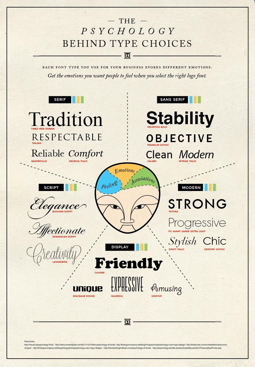
Understanding the Importance of Font Choices for Your Website
When it comes to designing a website, one of the most overlooked elements is the choice of fonts. Yet, the right typography can significantly shape user experience and influence how your content is perceived. Fonts are more than just a visual element; they play a crucial role in establishing your brand identity and enhancing readability. Opting for the right font can draw in visitors, communicate your message effectively, and keep users engaged with your content.
First and foremost, legibility is key. Visitors should be able to read your text effortlessly, regardless of the device they’re using. Fonts that are too ornate or overly stylized might look appealing but can lead to frustration when users struggle to decipher your message. Aim for clear, straightforward fonts for body text and reserve more decorative fonts for headings or accents. This creates a balanced visual hierarchy that guides the reader’s eye where it’s needed most.
Consider the emotional impact of typography as well. Different fonts evoke different feelings and can significantly alter the mood of your website. For instance:
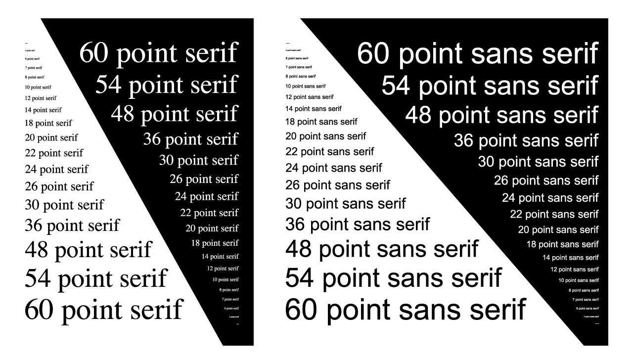
- Serif fonts (like Times New Roman) often convey tradition and reliability.
- Sans-serif fonts (like Arial) tend to feel modern and clean.
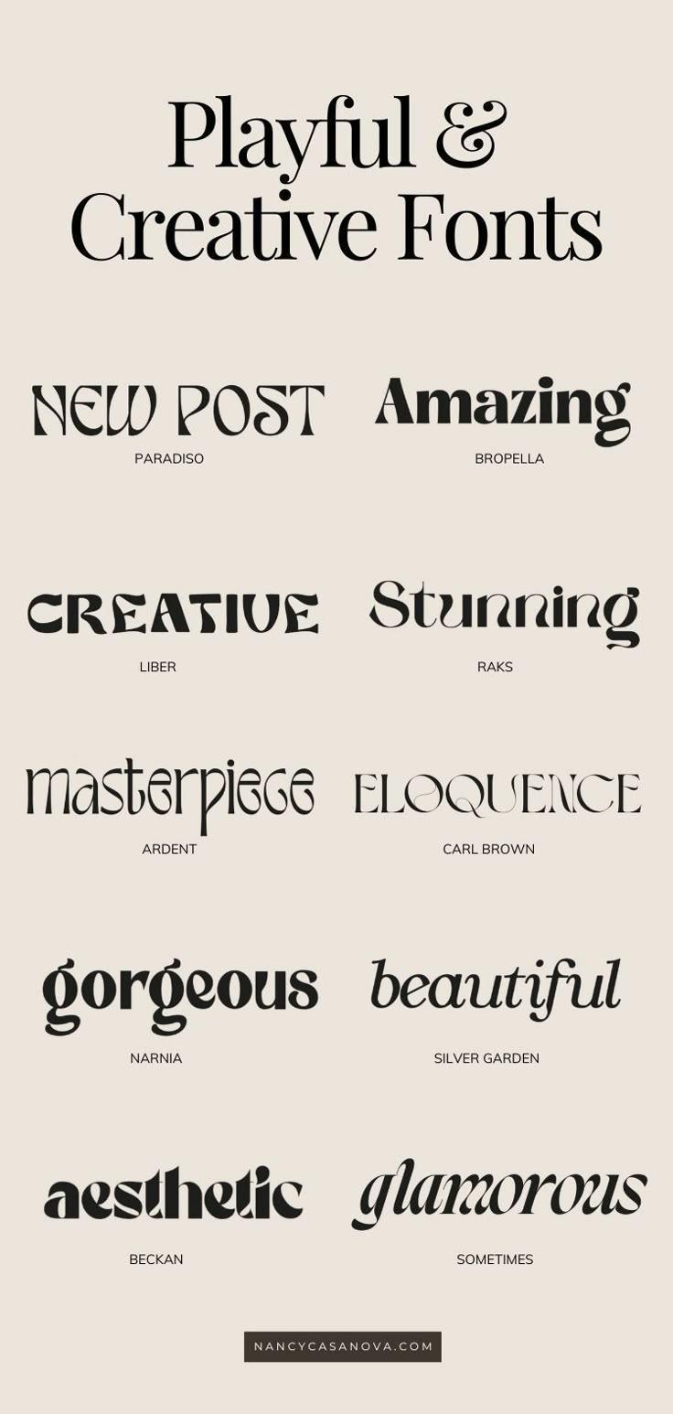
- Script fonts can add a touch of elegance or whimsy, suitable for creative businesses.
Choosing a font that aligns with your brand’s personality can help establish a stronger connection with your audience. This connection is not just about aesthetics; it’s about creating an experience that resonates with your users. They’ll feel more at home on a site that reflects their values and expectations.
Pairing fonts effectively is another art form in itself. A well-chosen combination can elevate your design. Here are some tips for effective pairing:
- Choose contrasting styles (e.g., a bold sans-serif for headings and a subtle serif for body text).
- Limit your palette to two or three fonts to maintain cohesion.
- Ensure that your font choices complement each other in terms of weight, size, and spacing.
To help visualize effective font pairings, here’s a simple table showcasing some popular combinations:
| Heading Font | Body Font | Style |
|---|---|---|
| Montserrat | Open Sans | Modern & Clean |
| Playfair Display | Lato | Elegant & Readable |
| Raleway | Roboto | Sleek & Professional |
Lastly, remember to test your font choices across various devices and screen sizes. What looks good on a desktop may not translate well to mobile. Always prioritize the user experience above all to ensure your website is welcoming and accessible to everyone. By taking typography seriously, you’re not just enhancing your site’s appearance—you’re also investing in your brand’s credibility and user satisfaction.
Exploring the Impact of Typography on User Experience
Typography plays a crucial role in shaping user experience, often going unnoticed until it disrupts the flow of reading. When users visit a website, the first things they notice are not just the images or layout but also the fonts used. The right typeface can enhance readability, evoke emotions, and establish brand identity. Here’s how typography influences user engagement:
- Readability: A clean, legible font makes it easier for users to absorb content. Fonts like Roboto or Open Sans are great choices for body text as they maintain clarity across various devices.
- Hierarchy: The use of different font sizes and weights helps establish visual hierarchy. Headings and subheadings should stand out to guide users through the content. Using a bold typeface for titles, such as Montserrat, can attract attention effectively.
- Emotional Connection: Different typefaces evoke different feelings. For instance, a serif font like Playfair Display can convey elegance, while a playful sans-serif like Poppins can suggest a more casual vibe. Choosing the right font can align with your brand’s personality.
- Consistency: Maintaining consistent typography throughout your site reinforces branding. Selecting a primary font for body text and a complementary font for headings ensures a cohesive look, making your website more professional.
Moreover, pairing fonts wisely can create visually appealing combinations that enhance the user experience. Let’s look at some popular pairings:
| Font Pairing | Description |
|---|---|
| Roboto & Lora | A modern sans-serif paired with a classic serif for a balanced, readable look. |
| Open Sans & Merriweather | Clean lines meet traditional styling, perfect for blogs and articles. |
| Poppins & Raleway | Two geometric sans-serifs that create a contemporary feel ideal for startups. |
Another key aspect to consider is the size and spacing of your fonts. Insufficient space between lines can lead to a cluttered look, while too much space can disrupt reading flow. A line height of 1.5 to 1.6 is generally recommended for body text, optimizing legibility without overwhelming the reader.
Lastly, don’t forget about accessibility. Choosing fonts that are easy to read for everyone, including those with visual impairments, can broaden your audience. Fonts with ample contrast against background colors and clear letterforms are essential. Tools like the WebAIM Contrast Checker can help ensure your typography meets accessibility standards.
investing time in selecting and thoughtfully pairing fonts can significantly enhance user experience on your website. Each choice you make in typography is a chance to communicate with your audience, making it essential that these choices support your overall site goals and user needs.
Factors to Consider When Selecting Fonts for Your Site
Selecting the right fonts for your website is a crucial aspect that can significantly impact user experience and engagement. Here are several factors to keep in mind to ensure you make the best choices:
- Readability: Prioritize fonts that are easy to read across different devices and screen sizes. Avoid overly decorative typefaces that may distract or confuse your audience.
- Brand Identity: Choose fonts that reflect your brand’s personality. Whether you’re aiming for a modern, sophisticated, playful, or classic look, your font selection should align with your overall brand message.
- Web Safety: Opt for web-safe fonts or Google Fonts to ensure that your chosen fonts render correctly across all browsers. This helps maintain a consistent look and feel for all users.
- Hierarchy: Establish a clear visual hierarchy using varying font sizes and weights. This guides readers through your content and helps them easily identify key information.
Another important consideration is legibility. While a font might look great in a graphic, it might not translate well to body text. Test your font choices in various contexts to see how they perform:
| Font Type | Use Case | Legibility Test |
|---|---|---|
| Serif | Headlines & Logos | High in print, moderate on screens |
| Sans-serif | Body Text | Ideal for digital content |
| Display | Calls to Action | Best for short text |
And let’s not forget about font pairing. Combining different fonts can elevate your design, but it’s essential to find a balance. Here are some tips for successful pairings:
- Pair a serif font with a sans-serif for contrast.
- Use the same font family but vary the weight for consistency.
- Avoid pairing fonts that are too similar, as this can create confusion.
Lastly, consider loading times. Custom fonts can slow down your site’s performance if not handled properly. Use font formats like WOFF or WOFF2, which are optimized for the web, to ensure quick loading times without sacrificing design.
By keeping these factors in mind, you’ll be well on your way to selecting fonts that not only enhance your website’s aesthetic appeal but also improve user experience, leading to better engagement and conversions.
The Top Fonts That Are Taking the Web by Storm
In the ever-evolving landscape of web design, fonts play a pivotal role in delivering not just information, but also the essence of a brand. The right typography can dramatically enhance user experience, guiding visitors through your content with ease. Here are some of the top fonts that are currently captivating designers and developers alike:
- Montserrat: This geometric sans-serif font has taken the web by storm with its modern aesthetic. Its versatility makes it suitable for everything from headings to body text.
- Roboto: Created by Google, Roboto combines functionality with style. It’s perfect for tech-oriented sites, offering a clean and professional look that enhances readability.
- Lora: For those who love a touch of elegance, Lora is an excellent serif option. It’s characterized by its balanced and contemporary feel, making it ideal for blogs and literary sites.
- Poppins: This rounded sans-serif has a friendly vibe that works well for creative and casual brands. Its geometric shapes ensure a polished look across any device.
- Open Sans: Another Google font favorite, Open Sans is known for its neutrality and legibility. It’s a great choice for professional websites where clarity is key.
When selecting a font for your website, consider how it aligns with your brand identity. The right font can evoke emotions and set the tone for your entire site. Here’s a quick breakdown of how to choose and pair fonts effectively:
| Font Type | Best Used For | Pairing Tips |
|---|---|---|
| Serif | Blogs, Literary Sites | Combine with a sans-serif for contrast |
| Sans-Serif | Corporate, Tech Sites | Pair with a decorative font for flair |
| Display | Landing Pages, Promotions | Use sparingly alongside simpler fonts |
Another essential factor to consider is readability across devices. With more users accessing websites on mobile, choosing a font that looks good at various sizes is crucial. Test your font choices on different screen sizes to ensure a consistent user experience.
don’t forget about pairing fonts! A well-paired combination can create visual hierarchy and guide the reader’s eye through your content. Aim for a harmonious balance where one font complements the other without competing for attention.
As you explore these trending fonts, remember to keep your brand’s personality in mind. Whether it’s modern, playful, or sophisticated, the right fonts will elevate your website and engage your audience in ways that keep them coming back for more.
Classic Fonts That Never Go Out of Style
When it comes to website design, the typeface you choose can significantly influence the overall aesthetic and functionality of your site. Some fonts have stood the test of time, consistently bringing a sense of elegance and professionalism. Here are several classic fonts that can elevate your website while ensuring readability and style.
1. Times New Roman
This serif font is synonymous with tradition and reliability. Its clarity and classic appeal make it an excellent choice for text-heavy websites, such as blogs or academic platforms. Times New Roman lends a formal tone while ensuring your content remains approachable.
2. Arial
A versatile sans-serif font, Arial is clean and modern. Its simplicity makes it perfect for both body text and headings. If you want to create a contemporary design without distracting your audience, Arial is a go-to option that pairs well with various other fonts.
3. Georgia
Georgia was designed for clarity on screens, making it a fantastic choice for web use. This serif font combines traditional elegance with modern functionality. It’s perfect for blogs, online articles, and any site where you want to create an inviting reading experience.
4. Helvetica
Considered one of the most widely used sans-serif fonts in the world, Helvetica’s clean lines and balanced proportions make it incredibly versatile. Whether you’re designing a corporate website or an artistic portfolio, Helvetica can adapt to any context, adding a touch of sophistication.
5. Garamond
For a more vintage feel, Garamond brings a classic touch to your website. This serif font is perfect for literature and design-centric projects, offering a refined look without sacrificing readability. It’s ideal for brands that wish to convey artistry and tradition.
When selecting a classic font, consider the following tips:
- Readability: Ensure your chosen font is easy to read across various devices.
- Brand Alignment: Choose a font that aligns with your brand’s personality and values.
- Pairing: Experiment with font pairings to create visual hierarchy and interest.
To help you visualize which classic fonts might work best for your site, here’s a quick comparison:
| Font | Style | Best Use |
|---|---|---|
| Times New Roman | Serif | Academic and formal content |
| Arial | Sans-serif | Modern, clean designs |
| Georgia | Serif | Blogs and articles |
| Helvetica | Sans-serif | Corporate and artistic sites |
| Garamond | Serif | Literature and design projects |
Ultimately, the right font can enhance your website’s user experience by making content more enjoyable to read. Don’t shy away from experimenting with these classic options to find the perfect fit for your brand. Each of these fonts carries its unique charm and can help you create a timeless design that resonates with your audience.
Modern Fonts to Give Your Website a Fresh Look
Choosing the right fonts for your website can dramatically enhance its overall appeal and user experience. With so many options available, it can feel overwhelming, but don’t worry! Here’s a selection of modern fonts that not only look great but also help convey your brand’s personality.
Popular Modern Fonts
- Montserrat: A clean and versatile sans-serif font, perfect for headers and body text alike.
- Roboto: This font combines geometric shapes with friendly curves, making it an excellent choice for tech and lifestyle sites.
- Lora: With its rich serif style, Lora is ideal for blogs and content-heavy sites aiming for an elegant look.
- Poppins: A geometric sans-serif typeface, its rounded letters provide a modern yet approachable feel.
- Open Sans: Widely used for its readability, this sans-serif font works well for both small and large text.
Why Font Pairing Matters
It’s not just about choosing a single font; font pairing plays a crucial role in your site’s design. The right combination can create a hierarchy, enhance readability, and add a touch of creativity. Here are some tips for effective font pairing:
- Contrast: Pair a bold headline font with a simple body font to create a visual balance.
- Complement: Use a serif font for headings and a sans-serif for body text to provide a distinct look without clashing.
- Consistency: Limit yourself to two or three font families to maintain a cohesive design.
Font Pairing Examples
| Header Font | Body Font | Use Case |
|---|---|---|
| Montserrat | Open Sans | Corporate Websites |
| Lora | Montserrat | Personal Blogs |
| Poppins | Roboto | E-commerce Stores |
By selecting contemporary fonts that resonate with your brand, you can create a user-friendly interface that keeps visitors engaged. Whether your aesthetic leans towards bold and dynamic or subtle and refined, modern fonts can help you achieve that fresh look you’re aiming for. Think about your audience and the message you want to send—this will guide you in making the best font choices for your website.
How to Pair Fonts for Maximum Impact
Pairing fonts effectively can elevate the visual appeal of your website, capturing attention and enhancing readability. To create a harmonious design, it’s essential to understand how different typefaces interact. Here are some key tips to ensure your font choices resonate well together:
- Contrast is Key: When selecting fonts, aim for contrast that helps distinguish between headings and body text. A bold sans-serif header paired with a delicate serif body can create a dynamic visual hierarchy.
- Limit Font Choices: Stick to two or three fonts to maintain cohesiveness. Too many different fonts can overwhelm visitors and disrupt the design flow.
- Consider Mood and Tone: Different fonts convey different emotions. Choose fonts that reflect the personality of your brand. For example, playful scripts can evoke a fun vibe while clean, modern fonts may project professionalism.
To help you visualize effective pairings, here’s a handy reference table showcasing some excellent font combinations:
| Header Font | Body Font | Style |
|---|---|---|
| Montserrat | Open Sans | Modern and Clean |
| Playfair Display | Lato | Elegant and Classic |
| Raleway | Merriweather | Bold and Readable |
| Oswald | Source Sans Pro | Strong and Professional |
Another effective technique is to leverage font weights and styles. Using the same font family with different weights can create a unified look while providing enough variation to keep the design engaging. For instance, using a bold version of a font for titles and a regular weight for body text can enhance readability without introducing too many different typefaces.
- Experiment with Sizes: Varying font sizes helps establish a visual hierarchy. Larger fonts naturally draw attention, making them perfect for headlines.
- Test Your Combinations: Don’t be afraid to play around with different pairings. A/B testing can help you determine which combinations resonate best with your audience.
- Seek Inspiration: Look at designs you admire. Analyze their font pairings and consider how you might adapt similar styles for your own website.
Lastly, always keep accessibility in mind. Ensure that your font choices are legible and maintain a good contrast against the background. This not only benefits all users but also adheres to best practices in web design. By thoughtfully pairing your fonts, you can create a website that is both visually stunning and user-friendly.
Creating Contrast: The Art of Using Different Fonts Together
When it comes to web design, the choice of fonts can make a substantial difference in how your content is perceived. Mixing different fonts is an art form that requires a keen eye and a thoughtful approach. To create a visually appealing design, you should aim for contrast that enhances readability while providing a distinct character to your website. The goal is to engage your audience while ensuring that your message remains clear.
To effectively create contrast, consider the following aspects:
- Size Variation: Using a larger font for headings and a smaller one for body text can create a hierarchy that guides the reader’s eye. This not only enhances readability but also draws attention to important elements on the page.
- Font Weight: Pairing a bold font with a light or regular-weight font can add depth. This contrast can be particularly striking when used in calls to action or key messages.
- Typeface Contrast: Mixing serif and sans-serif fonts can create an interesting dynamic. For example, a classic serif font for headings can convey tradition, while a clean sans-serif for body text can feel modern and approachable.
- Style Differences: Combining different styles—like a playful script with a straightforward sans-serif—can evoke emotion and personality. Just ensure that the styles complement rather than clash with each other.
To visualize these ideas, consider the following table that outlines some effective font pairings:
| Heading Font | Body Font | Contrast Effect |
|---|---|---|
| Playfair Display | Open Sans | Classic meets modern |
| Bebas Neue | Lato | Bold and sleek |
| Raleway | Roboto | Elegant yet readable |
| Merriweather | Montserrat | Serif warmth with geometric precision |
Another key element to consider is the emotional impact of your font choices. Fonts carry their own personalities; for instance, a whimsical script might evoke a sense of fun, while a geometric sans-serif may suggest efficiency. Think about the tone you want to set for your website and choose fonts that reflect that.
Don’t forget about color when creating contrast. The interplay of font color against background color can either enhance or diminish legibility. A light font on a dark background can create a striking contrast, while a dark font on a light background tends to be more traditional and easier to read in long formats. Experiment with different color combinations to find the perfect balance.
Lastly, remember to test your font pairings across different devices and screen sizes. What looks great on a desktop may not translate as well on mobile. Ensuring that your contrast works in various contexts will help maintain a cohesive brand image and improve user experience.
By thoughtfully pairing fonts, you can not only enhance the aesthetic appeal of your website but also create an engaging and user-friendly environment. The right combination of contrast will invite your visitors to explore further, keeping them engaged and ensuring that they walk away with a memorable experience.
Best Practices for Font Size and Readability
When it comes to web typography, the font size you choose plays a crucial role in ensuring your content is easily readable. A font that’s too small can lead to frustration among users, while one that’s too large can disrupt the flow of your design. Finding the sweet spot is essential.
For body text, a font size of 16px is widely considered the standard for readability on most devices. However, depending on the font style you choose, you might need to adjust this slightly. Some fonts appear larger or smaller than others at the same pixel size, so always test your selections across various screen sizes.
Here are some best practices to keep in mind when deciding on font sizes:
- Hierarchy is key: Use larger font sizes for headings and subheadings to create a clear visual structure. This helps readers navigate your content effortlessly.
- Line height matters: A line height of 1.5 to 1.6 times the font size enhances readability. This extra space gives your text room to breathe.
- Contrast is crucial: Ensure there’s enough contrast between your text and background. Dark text on a light background or vice versa is easiest on the eyes.
- Consider accessibility: Keep in mind that users with visual impairments may require larger fonts. Offering options to adjust text sizes can enhance the user experience.
Don’t forget about mobile users! With the increase in mobile browsing, it’s essential to optimize font sizes for different screen sizes. A responsive design should adjust font sizes accordingly. For instance, a font size of 14px could be ideal for mobile devices, while maintaining 16px for desktops.
To help you visualize the ideal font sizes for various elements on your website, here’s a simple table:
| Element | Recommended Font Size |
|---|---|
| Body Text | 16px |
| Headings (H1) | 32px |
| Subheadings (H2) | 24px |
| Links | 16px |
| Captions | 12px |
Lastly, always test your typography choices with real users. Gather feedback on their reading experience and make adjustments based on their suggestions. Ultimately, the goal is to create an engaging experience where users can consume your content with ease and comfort.
The Role of Color in Typography and Font Selection
When it comes to typography and font selection, color plays a pivotal role in enhancing the visual hierarchy and emotional impact of your website. Choosing the right color for your fonts can transform a simple text into an engaging element that resonates with your audience. Let’s dive into how color interacts with typography and why it’s essential to consider this aspect in your design process.
Color has the power to evoke emotions and set the tone. For instance, a bold red can convey urgency and excitement, making it perfect for call-to-action buttons or headlines. In contrast, a soft blue feels calming and trustworthy, often used in corporate websites or healthcare-related content. Therefore, when selecting a font color, think about the message you want to communicate and the feelings you want to elicit from your visitors.
Another crucial factor is contrast. A well-contrasted font color against the background can greatly enhance readability, ensuring that your audience can consume the content without strain. Here are some tips for effective contrast:
- Use dark text on a light background for clarity.
- Consider using light text on a dark background for a modern look.
- Test color combinations to ensure they’re legible on different devices.
Moreover, when pairing fonts, keep in mind that the color scheme should remain cohesive. A harmonious color palette not only elevates your brand identity but also aids in creating a visually appealing experience. This means that while one font might be vibrant and eye-catching, its color should complement the more subtle tones of another font used in your design. Here are a few pairing ideas:
| Font Pairing | Color Scheme |
|---|---|
| Montserrat & Merriweather | Monochrome with a splash of Orange |
| Open Sans & Playfair Display | Soft Blues with Grey |
| Lato & Roboto Slab | Earthy Tones with Green accents |
It’s also essential to consider the psychology of colors. Different shades can significantly change how your fonts are perceived. For example, yellow can exude optimism and creativity, making it great for startups or creative agencies, while purple signifies luxury and wisdom, often appealing to high-end brands. Therefore, aligning your font colors with your brand’s identity is critical for making a lasting impression.
Lastly, don’t forget about accessibility. The Web Content Accessibility Guidelines (WCAG) recommend a contrast ratio of at least 4.5:1 for normal text. This ensures that your content is not only attractive but also accessible to everyone, including those with visual impairments. Using tools like contrast checkers can help you make informed decisions about your color choices.
Ultimately, is not just about aesthetics; it’s a fundamental aspect of effective design. By thoughtfully integrating color into your typography, you can enhance user experience, improve readability, and strengthen your brand identity. So, take the time to experiment with different color combinations and find the perfect fit for your website’s overall look and feel.

Testing Your Font Choices: Tools and Techniques
Choosing the right fonts for your website is just the beginning; testing those choices is crucial to ensure readability, appeal, and overall effectiveness. Here are some tools and techniques to help you assess the fonts you’ve selected.
A/B Testing is a powerful method to evaluate how different fonts perform. By creating two versions of a webpage, each using a different font, you can track user engagement metrics like bounce rates, time on page, and conversion rates. This method gives you concrete data on which font resonates better with your audience.
Another useful technique is using Font Testing Tools. Websites like Google Fonts or Typekit allow you to preview how different fonts appear in real-time. You can adjust size, weight, and color to see how they fit into your design. This hands-on approach can help you visualize how the fonts will look in your actual layout.
Don’t underestimate the power of User Feedback. Engaging with your audience through surveys or feedback forms can provide insights that data alone may not reveal. Ask your visitors what they think of your font choices—do they find them easy to read? Do they feel the fonts align with your brand’s personality?
Visual Hierarchy Testing is another important technique. Examine how your fonts interact with one another. Pairing a bold header font with a clean, legible body font can create a pleasing aesthetic and improve readability. Try to evaluate how well your selected fonts communicate the message of your content.
Lastly, consider the Accessibility Factor. Tools like the WebAIM Contrast Checker can help ensure that your font colors and sizes are accessible to all users, including those with visual impairments. Aim for high contrast and avoid overly decorative fonts that may hinder comprehension.
| Testing Technique | Description |
|---|---|
| A/B Testing | Compare user engagement between two font versions. |
| Font Testing Tools | Preview and adjust fonts in real-time. |
| User Feedback | Gather insights directly from your audience. |
| Visual Hierarchy Testing | Evaluate how fonts pair and communicate. |
| Accessibility Checks | Ensure readability for all users. |
Testing your font choices doesn’t have to be overwhelming. By leveraging these tools and techniques, you can confidently select fonts that enhance your site’s design and functionality, ensuring a better experience for your visitors.
Adapting Fonts for Mobile and Responsive Design
In today’s digital landscape, ensuring that your website’s typography looks great on mobile devices is crucial. With the rise of responsive design, fonts must adapt to various screen sizes without sacrificing readability or aesthetic appeal. Here are some key considerations for optimizing fonts specifically for mobile.
Size Matters: When choosing fonts for mobile, size is a critical factor. A font that looks perfect on a desktop might be too small on a smartphone. Aim for a minimum font size of 16px for body text to ensure readability on smaller screens. For headings, you can go larger, but maintain a clear hierarchy to guide the reader.
Line Length and Spacing: To enhance readability, keep your line lengths between 40-75 characters for body text. This range helps prevent reader fatigue. Additionally, use adequate line spacing (line height) of around 1.5 to 1.6 times the font size. This spacing gives your text room to breathe and improves legibility.
Font Pairing: When selecting fonts, consider how they pair together. A combination of a sans-serif font for body text and a serif font for headings often works well, creating a nice contrast. For mobile, ensure that both fonts are legible at smaller sizes. Here are some popular pairings:
| Body Font | Heading Font |
|---|---|
| Roboto | Merriweather |
| Open Sans | Playfair Display |
| Lato | Oswald |
| Poppins | Montserrat |
Web-Safe Fonts: To ensure consistency across different devices and browsers, opt for web-safe fonts that render well on most platforms. While custom fonts can add unique flair, they may also slow down your site’s loading time, especially on mobile. Stick to fonts that are widely supported or use font services like Google Fonts.
Testing and Optimization: Lastly, always test your typography on multiple devices. What looks good on a high-resolution desktop might not translate well to a lower-resolution mobile screen. Utilize tools and browser developer modes to simulate how your fonts appear across various devices and make necessary adjustments.
By focusing on these aspects of font selection and adaptation, you can create a seamless experience for users accessing your site on mobile devices. Typography is more than just style; it’s an essential element of user experience that can significantly impact engagement and retention.
How to Stay on Trend with Your Typography
In the ever-evolving world of web design, staying on trend with typography is crucial for creating an engaging user experience. Typography can make or break your website’s aesthetic, so it’s essential to keep your text visually appealing while also ensuring it serves its purpose. Here are some insights on how to stay current with your typography choices:
First and foremost, understand the importance of font selection. Different fonts convey different emotions and messages. For instance, a modern sans-serif font might be perfect for a tech-focused site, while a classic serif could be ideal for a luxury brand. Here are some popular types of fonts and the feelings they evoke:
- Sans-Serif: Clean, modern, and minimalistic
- Serif: Traditional, reliable, and refined
- Display: Bold, unique, and attention-grabbing
- Monospace: Technical, structured, and organized
Next, consider font pairing. A well-thought-out combination of fonts can enhance readability and create a hierarchy of information on your website. When pairing fonts, think about contrasting styles that complement each other. For example, you might pair a bold headline font with a more subtle body font. Here are some effective pairings:
| Headline Font | Body Font |
|---|---|
| Montserrat | Open Sans |
| Playfair Display | Lato |
| Bebas Neue | Roboto |
| Raleway | Source Sans Pro |
Another vital aspect is keeping up with design trends. Typography trends can shift, influenced by cultural movements, technology advancements, and design philosophies. For instance, the use of oversized typography has become a popular trend, drawing visitors’ eyes and creating impactful visuals. Similarly, variable fonts are gaining traction, allowing for versatile design within a single font file.
Lastly, always prioritize readability. No matter how trendy a font might be, if it’s difficult to read, it defeats its purpose. Test your chosen fonts across various devices and screen sizes to ensure they maintain clarity. Use ample line spacing and contrast between your text and background colors to enhance legibility.
By integrating these practices into your web design strategy, you’ll not only keep your typography fresh and trendy but also improve user engagement and satisfaction. Remember, the right typography is not just about aesthetics; it’s about enhancing communication and delivering your message effectively.

Final Thoughts: Elevating Your Website with the Right Fonts
When it comes to designing your website, the choice of fonts can significantly impact user experience and overall aesthetics. Selecting the right typography not only enhances your site’s readability but also helps convey your brand’s unique identity. Here are some key considerations to keep in mind as you elevate your website with the perfect fonts.
Understand Your Brand’s Voice
Your font choices should resonate with the message and tone of your brand. A playful, modern business might lean towards quirky sans-serifs, while a law firm would benefit from classic serifs that exude professionalism. Take time to define your brand’s voice and choose fonts that align perfectly with it.
Focus on Readability
No matter how beautiful a font may look, it won’t serve its purpose if your visitors struggle to read it. Consider these factors for optimal readability:
- Font size: Ensure text is large enough for comfortable reading.
- Line height: Adequate spacing between lines improves clarity.
- Contrast: Make sure there is enough contrast between the text and the background.
Experiment with Pairings
Combining fonts can create a dynamic look, but not all pairings work well together. When mixing fonts, consider:
- Contrasting styles: Pair a serif with a sans-serif for balance.
- Complementary weights: Choose different weights of the same font family for a cohesive feel.
- Hierarchy: Use variations in size and style to guide the reader’s eye through your content.
Limit Your Choices
While it can be tempting to use a variety of fonts, too many can confuse visitors and make your site feel unprofessional. Aim for a maximum of two to three fonts across your website. This keeps your design streamlined and visually appealing.
Test Across Devices
With the variety of devices used to access websites today, it’s crucial to ensure your fonts look great everywhere. Make sure to test your font choices on different screens, from desktops to smartphones. Tools like Google Fonts allow you to preview how your selections will render in various sizes and settings.
Stay Updated on Trends
Typography trends evolve, much like any other design element. Stay informed about current trends—such as minimalist typefaces or bold, oversized lettering—to keep your website looking fresh and modern. However, always ensure that your choices align with your brand’s identity rather than merely following trends.
By thoughtfully considering your font choices, you can significantly enhance your website’s appeal, ensuring it communicates your brand effectively and engages your audience. Experiment, iterate, and don’t hesitate to make changes based on user feedback. The right fonts can truly elevate your online presence and set you apart from the competition.
Frequently Asked Questions (FAQ)
Q&A: 27 Best Fonts for Websites (+ How to Choose and Pair Them)
Q1: Why is choosing the right font important for my website?
A1: Great question! The font you choose sets the tone for your entire website. It impacts readability, user experience, and even brand perception. A well-chosen font can make your content more engaging and help convey your message more effectively. Think of your font as the voice of your website—make sure it resonates with your audience!
Q2: What are some of the best fonts for websites?
A2: We’ve curated a list of 27 fantastic fonts that cater to various styles and purposes! Whether you’re looking for something modern and sleek, or classic and elegant, there’s a font that will fit your needs. Some popular options include Google Fonts like Roboto, Open Sans, and Lora. Each of these has its unique charm and versatility!
Q3: How do I choose the right font for my website?
A3: Choosing the right font involves a few key considerations. First, think about your brand identity—what message do you want to convey? Next, consider your audience. Are they young and trendy or more traditional? Lastly, prioritize readability. Your visitors should be able to easily read your content without straining their eyes.
Q4: Can I use more than one font on my website?
A4: Absolutely! In fact, pairing fonts can create a dynamic and professional look. The key is to find complementary fonts that enhance each other. A common approach is to pair a serif font with a sans-serif font. For instance, you might use a classic serif for headings and a clean sans-serif for body text. Just ensure that the fonts have a cohesive feel!
Q5: Are there any tools to help me with font pairing?
A5: Definitely! There are several online tools designed to help you with font pairing. Websites like Google Fonts offer pairing suggestions, and tools like FontPair and Canva’s Font Combinations can help you visualize your choices. These resources make it easy to explore different combinations and find the perfect match for your site.
Q6: How do I ensure my fonts are web-safe?
A6: To ensure your fonts are web-safe, stick to widely supported fonts or use web font services like Google Fonts or Adobe Fonts. These services host fonts that are optimized for web use, ensuring they load quickly and display correctly across different devices and browsers. Always check for font licensing too—some fonts are free for web use while others may require a purchase.
Q7: What are some common mistakes to avoid when choosing fonts?
A7: One of the biggest mistakes is choosing fonts that are overly complicated or decorative. While they may look great, they can hinder readability. Mixing too many fonts is another common pitfall. As a rule of thumb, stick to two or three fonts to maintain a cohesive design. Lastly, don’t forget about size—ensure your text is large enough to read comfortably, especially on mobile devices!
Q8: How do I implement these fonts on my website?
A8: Implementing fonts on your website can be straightforward! If you’re using a content management system like WordPress, many themes allow you to easily customize fonts within the settings. If you’re coding from scratch, you can link the fonts directly from Google Fonts or host them locally. Just remember to test your website on different devices to ensure the fonts render correctly.
Q9: Can fonts affect my website’s SEO?
A9: While fonts themselves don’t have a direct impact on SEO, they do affect user experience, which is an important factor for search engine rankings. A website that’s easy to read and navigate tends to keep users engaged longer, reducing bounce rates. So, in a roundabout way, choosing the right font can contribute to better SEO performance!
Q10: What’s the takeaway from this article?
A10: The takeaway is that font selection is more than just an aesthetic choice— it’s a crucial aspect of web design that can influence how users perceive your brand. By exploring our list of the 27 best fonts and following the tips on choosing and pairing them, you can create a visually appealing and engaging website that truly reflects your brand’s identity. So go ahead, make your website shine with the perfect fonts!
Future Outlook
As we wrap up our journey through the 27 best fonts for websites, it’s clear that typography isn’t just about making your text look pretty—it’s a key player in shaping your brand’s identity and enhancing user experience. Remember, the right font can captivate your audience, convey your message effectively, and guide visitors through your content seamlessly.
Choosing and pairing fonts might seem daunting at first, but with a little practice and a keen eye, you’ll find your perfect match in no time. Don’t hesitate to experiment! Whether you lean towards classic serif fonts or modern sans-serifs, the right combinations can elevate your website from good to unforgettable.
So, what are you waiting for? Dive in, try out some of the fonts we’ve discussed, and see how they transform your site. Your visitors will notice the difference, and you’ll be one step closer to creating a visually stunning and user-friendly experience. Happy designing!