69 Website Background Ideas: Stunning Examples & How to Pick the Perfect One
Hey there, savvy web designer! If you’re on a quest to elevate your website’s look and feel, you’re in for a treat. The right background can transform your online space from mundane to magnificent, setting the tone for your visitors and enhancing their experience. But with so many options out there, how do you choose the one that perfectly embodies your brand’s spirit?
In this article, we’re diving into 69 stunning website background ideas that will inspire you to think outside the box. Whether you’re going for a minimalist vibe, a bold statement, or something in between, we’ve got examples that will spark your creativity and guide you in making the right choice. So grab a cup of coffee, settle in, and let’s explore how to make your website not just a destination, but an experience!
Exploring the Power of Website Backgrounds
When it comes to designing a website, the background is often an undervalued aspect that can drastically alter the user’s experience. A well-chosen background not only enhances the visual appeal but also supports the overall theme and message of your site. Here are some powerful ideas that can transform your website into a captivating space.
Solid Colors
Sometimes, simplicity is key. Opting for a bold, solid color can make your content pop and create a strong brand identity. Here are a few tips for using solid colors effectively:
Contrast: Ensure the text stands out against the background for optimal readability.
Brand Alignment: Choose colors that reflect your brand’s personality.
Emotional Impact: Different colors evoke different feelings, so select hues that resonate with your audience.
Gradient Backgrounds
Gradients are a beautiful way to add depth and dimension to your site. They can give a modern feel while maintaining visual interest. Consider these aspects when using gradients:
Subtlety: A soft gradient can be less distracting while adding a sophisticated touch.
Direction: Experiment with angles to see how they change the perception of space.
Color Combinations: Choose complementary colors for a harmonious effect.
Image Backgrounds
Images can tell a story, evoke emotion, and convey your brand message in a single glance. Here’s how to maximize their impact:
High Quality: Always use high-resolution images to avoid pixelation.
Overlay: Consider using a color overlay to enhance text readability.
Relevance: Make sure the image relates closely to your content; it should add context, not distract.
Textures and Patterns
Adding textures or patterns can create a tactile feel that draws visitors in. Textures can range from wood grain to fabric, while patterns can be geometric or organic. Here are some tips:
Subtlety is Key: Too much texture can be overwhelming; opt for soft patterns that complement your content.
Layering: Combine textures with colors and images for a dynamic look.
Video Backgrounds
For a truly immersive experience, incorporate video backgrounds. They can captivate visitors and convey complex ideas quickly. Keep these pointers in mind:
Looping: Use short, looping videos to maintain viewer engagement without causing distraction.
Sound Considerations: Typically, it’s best to have videos without sound, allowing your content to shine without interruption.
selecting the right background for your website isn’t just about aesthetics; it’s about enhancing user experience and conveying your brand’s message. By exploring these diverse options, you can create a visually stunning site that keeps visitors coming back for more.
Why Your Website Background Matters More Than You Think
When visitors land on your website, their first impression is often shaped by the background. A thoughtfully chosen background can enhance the overall aesthetic, set the mood, and guide user experience in ways you might not even realize. It’s not just a backdrop; it’s a vital component that can either captivate your audience or turn them away. Here’s .
Visual Appeal: The background is a canvas for your brand’s story. Whether you opt for a solid color, a gradient, or an elaborate image, it should resonate with your brand identity. A well-designed background can create a visually appealing atmosphere that encourages exploration. Consider the following:
Consistency: Your background should align with your overall website aesthetic, ensuring visual harmony across all pages.
User Experience: A busy or distracting background can detract from your content, making it hard to read or navigate. Striking the right balance is essential. A subtle pattern or a soft gradient can enhance readability, while a chaotic image may frustrate users. Ask yourself:
Does the background complement the text?
Is there enough contrast for legibility?
Brand Recognition: Your background can be an extension of your brand. Custom backgrounds that feature your logo, signature colors, or unique textures can reinforce brand identity and make your website more memorable. For example, a tech company might use sleek, modern textures to convey innovation, while a wellness brand might incorporate soothing nature imagery.
Call to Action: The right background can guide users toward your calls to action. A contrasting background behind a button can draw attention and increase click-through rates. This strategic use of background can be a game-changer in your conversion rates. Consider testing different backgrounds to see which one performs best.
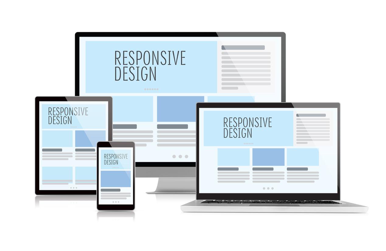
Responsive Design: In the age of mobile browsing, your website background must adapt seamlessly across devices. A background that looks great on a desktop may not translate well to a smartphone. Ensure that your background maintains its integrity and appeal, regardless of screen size. It’s crucial to prioritize the user experience on all platforms.
Background Type
Best Use Case
Solid Color
Minimalist websites, text-heavy content
Gradient
Modern designs, to add depth without distraction
Dynamic engagement, promotions, brands with strong visual elements
Ultimately, your website background is more than just a design choice; it plays a fundamental role in shaping how users interact with your content. By carefully considering your options and aligning your background with your goals, you can create a more engaging and effective online presence. Don’t underestimate the power of a well-thought-out background; it could be the key to unlocking your website’s full potential.
Understanding Different Types of Backgrounds
When it comes to website design, the background plays a pivotal role in setting the tone and enhancing the user experience. Different types of backgrounds can evoke various emotions and guide visitors’ attention to important elements on the page. Understanding these types can help you choose the best one for your specific needs.
1. Solid Colors: A classic choice, solid color backgrounds are clean and can make text and images pop. They work particularly well for minimalist designs or when you want to draw attention to specific content. Consider using:
Bold colors for a modern look.
Pastel shades for a softer, approachable feel.
Contrasting colors to enhance readability.
2. Gradients: Gradients offer a trendy way to add depth without overwhelming the page. They can create a dynamic visual effect and can be used to guide users’ eyes toward CTAs (Call to Actions). Experiment with:
Two-tone gradients for simplicity.
Rainbow gradients for a vibrant, playful look.
Subtle gradients for a sophisticated touch.
3. Textures: Adding texture can bring a tactile quality to your website, making it feel more inviting. Whether you opt for a soft fabric feel or a rugged, natural texture, backgrounds with patterns can add character. Remember to keep the texture subtle to avoid distraction.
4. Images: High-quality images can transform a website, providing an instant emotional connection. Choose images that resonate with your brand identity. Consider:
Hero images for impactful first impressions.
Backgrounds that align with your content theme.
Blurred images for a modern, sleek look while maintaining focus on foreground content.
5. Videos: Video backgrounds can create an immersive experience, captivating visitors right from the start. However, they should be used judiciously, particularly on websites with heavy content. Consider adding:
Muted videos to prevent distraction.
Short clips that loop seamlessly.
Options for users to pause or mute.
When selecting a background type, consider the overall mood you want to convey and the message you intend to deliver. The right background can enhance user engagement and make a lasting impression. Don’t hesitate to experiment and see what works best for your audience!
Background Type
Best For
Key Considerations
Solid Colors
Minimalist designs
Choose contrasting colors for better readability
Gradients
Dynamic visuals
Use color combinations that resonate with your brand
Textures
Character and warmth
Avoid overpowering patterns
Images
Emotional connection
Ensure high quality and relevance
Videos
Immersive experiences
Provide controls for user preference
The Impact of Color Psychology on Your Website Design
When it comes to website design, the colors you choose can greatly influence user experience and behavior. Understanding the principles of color psychology can help you not only create a visually appealing site but also communicate the right message to your visitors. Different colors evoke different feelings and reactions, which can ultimately affect how users interact with your site.
For instance, blue is often associated with trust and dependability, making it a popular choice for financial institutions and healthcare websites. If you want to instill confidence in your audience, incorporating blue into your background or accent colors can be a wise choice. On the other hand, red is known for stimulating excitement and urgency, which can be effective for promotional offers or calls to action. However, using red excessively can overwhelm users, so it’s best to use it strategically.
Another color to consider is green, which symbolizes growth and tranquility. It works well for environmental brands or health-related websites, promoting a sense of balance and connection with nature. For brands that want to convey a sense of luxury and sophistication, black is an excellent option. It creates a clean and modern aesthetic that can elevate your website’s perceived value.
When selecting a color palette, it’s also essential to think about your target audience. Different demographics may respond uniquely to certain colors. For example:
Color
Target Audience
Common Associations
Blue
General Audience
Trust, Calm
Red
Young Adults
Excitement, Urgency
Green
Environmentally-Conscious
Growth, Nature
Black
Luxury Shoppers
Sophistication, Elegance
It’s crucial to create a harmonious color scheme that aligns with your brand identity. Think about how colors work in combination; using complementary colors can make your design pop while ensuring visual comfort. Tools like color wheels can help you identify which colors pair well together, enabling you to craft an appealing and cohesive design.
Don’t forget about the emotional and psychological impact of color contrast, too. High contrast can draw attention and guide users’ eyes to important elements, such as buttons or call-to-action sections. Conversely, low contrast backgrounds can create a more relaxed browsing experience, encouraging users to stay and explore more content.
leveraging the principles of color psychology can significantly enhance your website’s effectiveness. By understanding how colors resonate with your audience and strategically applying them to your background and overall design, you’re setting the stage for a successful website that not only attracts visitors but also keeps them engaged.
Textures That Transform: Adding Depth to Your Background
When it comes to web design, the background is often an overlooked element, yet it plays a vital role in shaping the overall user experience. Textures are one of the most impactful ways to enhance your background, creating a visual depth that draws visitors in and keeps them engaged. Using textures can transform a flat design into a rich, immersive experience that captivates your audience.
Types of Textures to Consider:
Natural Textures: Think of wood, stone, or fabric patterns that evoke a sense of warmth and authenticity.
Geometric Patterns: These can add a modern touch, creating an organized visual that guides the user’s eyes.
Subtle Noise: A light grain or film effect can soften the starkness of a solid color background without overwhelming content.
Watercolor Effects: These can introduce a playful, artistic vibe that appeals to creative audiences.
Choosing the right texture is not just about aesthetics; it’s also about enhancing readability and usability. A well-chosen texture can serve as a backdrop that complements your content without stealing the spotlight. For instance, a light linen texture can make text more legible, whereas a dark concrete pattern might work well for bold, impactful statements. It’s essential to find the right balance.
Tips for Implementing Textures:
Ensure that the texture is high-quality to maintain professionalism.
Test the texture across different devices and screen sizes to ensure it appears as intended.
Use semi-transparency to layer textures without hindering readability.
Consider the emotional response that different textures evoke; for example, soft textures can create a feeling of calm, while rough textures might suggest strength.
Here’s a quick reference table to illustrate how different textures can influence design:
Texture Type
Emotional Impact
Best Use Cases
Wood Grain
Warmth, Authenticity
Handmade products, Nature-focused sites
Marble
Luxury, Elegance
High-end brands, Event planning
Denim
Casual, Trendy
Fashion, Lifestyle blogs
Canvas
Artistic, Creative
Portfolios, Art galleries
Don’t shy away from experimenting with different layers and combinations of textures. Mixing subtle patterns can lead to unique and engaging backgrounds that set your site apart from the competition. A textured background can also create a visual hierarchy, helping to draw attention to key elements of your site, such as calls to action or important information, enhancing usability while maintaining a visually appealing layout.
Incorporating textures into your website background is a surefire way to add depth and character to your design. Take the time to explore various options, and don’t forget to align your texture choices with your overall brand identity. A thoughtful texture can amplify your message and resonate with your audience, creating a lasting impression that encourages them to return.
Using Images and Patterns to Create Visual Interest
When it comes to crafting an engaging website, the right background can make all the difference. Images and patterns not only enhance the aesthetic appeal of a site, but they also serve to reinforce brand identity and guide user experience. By strategically selecting visuals that resonate with your audience, you can create an inviting atmosphere that encourages exploration and interaction.
Images are powerful tools for storytelling. They can evoke emotions, highlight products, or showcase services in ways mere text cannot. Here are a few ideas to consider:
Hero Images: A large, captivating image at the top of a webpage can grab visitors’ attention immediately.
Background Photography: Subtle, high-quality photos in the background can create depth without distracting from the primary content.
Custom Illustrations: These can add a unique touch and align with your brand’s personality.
On the other hand, patterns can seamlessly blend into the background while adding visual interest. They work particularly well in areas where you want to maintain a clean look but still desire some character. Consider these approaches:
Geometric Patterns: Crisp lines and shapes can provide a modern feel, perfect for tech or design-related websites.
Textured Backgrounds: Subtle textures can create a sense of depth, inviting users to interact with the site.
Custom Patterns: Creating patterns that incorporate your logo or brand colors reinforces branding while keeping the design cohesive.
When choosing between images and patterns, consider your brand message and the emotions you want to evoke. A vibrant, colorful image may convey excitement and energy, while a soft, muted pattern can create a calm, sophisticated atmosphere. Your choices should align with your overall design goals and target audience preferences.
To help visualize how different backgrounds can impact your design, here’s a simple table comparing various styles:
Style
Best For
Emotional Impact
Hero Images
Landing Pages, Portfolios
Excitement, Engagement
Subtle Patterns
Blogs, Informational Sites
Calm, Professionalism
Textures
Creative Fields, E-commerce
Warmth, Approachability
Illustrations
Startups, Creative Agencies
Whimsy, Innovation
Ultimately, the key lies in balancing aesthetics with functionality. Ensure that your background complements the content rather than overwhelms it. A well-thought-out background can enhance readability, leading to better user engagement and retention. Remember, your website is often the first impression potential customers have of your brand—make it a memorable one!
How to Choose the Right Background for Your Audience
Choosing the right background for your website is crucial. It’s not just about aesthetics; the background sets the tone for the entire user experience. A well-selected background can enhance your message and resonate with your audience, while a poor choice can detract from your content. Here are some key factors to consider when selecting the perfect background:
Know Your Audience: Understanding who will visit your site is foundational. Are they young and trendy, or professional and reserved? Tailor your background to suit their preferences.
Brand Identity: Your background should reflect your brand’s personality. A creative agency might choose a vibrant, colorful design, while a law firm might opt for a more subdued, classic look.
Readability: Always prioritize legibility. Ensure that your background does not clash with the text or images on your site. Test different backgrounds to see how they affect readability.
Color Psychology: Colors evoke emotions. For instance, blue can convey trust, while red can evoke excitement. Choose colors that align with your brand message and the feelings you want to inspire in your audience.
Texture and patterns can also play a significant role in your background choice. Subtle textures add depth without overwhelming your content. Here’s a quick comparison of different texture options:
Texture Type
Effect
Best For
Solid Color
Clean and modern
Corporate sites
Gradient
Dynamic and engaging
Creative portfolios
Patterned
Playful and fun
Children’s products or services
Image
Visual storytelling
Travel, photography, or lifestyle blogs
Moreover, consider the context in which your audience will engage with your website. Are they likely to visit on mobile devices or desktop computers? Responsive design is essential; ensure your background looks great on all screen sizes. A background that appears stunning on a large monitor might not translate well to a smartphone.
Test Variations: Don’t hesitate to experiment with different backgrounds. A/B testing can provide insights into which designs resonate best with your audience.
Stay Current: Design trends change frequently. Keep an eye on emerging styles and consider refreshing your background periodically to maintain relevance.
Get Feedback: Whenever you make a change, seek feedback from your audience. Their insights can guide you toward the best choice.
Ultimately, the goal is to create a cohesive experience that feels intentional and curated. Your background should serve as a canvas that enhances your content and engages your audience, making it easier for them to connect with your message. Choose wisely, and you’ll create a space that feels just right.
Balancing Backgrounds with Content for Maximum Engagement
Choosing the right background for your website isn’t just about aesthetics; it’s a strategic decision that affects user experience and engagement. The perfect balance between background and content can create a harmonious environment that draws visitors in and keeps them on your page longer. Here are some effective strategies to ensure that your website background complements your content rather than overshadows it.
Contrast is Key: One of the most important factors to consider is the contrast between the background and your text. If your background is too busy or colorful, it can distract from your message. Aim for a background that allows your content to stand out effortlessly. For instance:
Light text on a dark background: This combination is visually striking and easy to read.
Dark text on a light background: This classic approach is always a safe bet.
Subtle patterns or textures: These can add depth without overwhelming your content.
Choose Backgrounds That Enhance Mood: The background of your website sets the tone for your brand. Depending on your industry, you may want to evoke feelings of calm, excitement, or professionalism. For example, a creative agency might opt for a vibrant, abstract background, while a wellness brand could benefit from serene landscapes or soft pastel colors. Always ask yourself: does the background reflect the emotions I want my audience to feel?
Use White Space Wisely: White space, or negative space, is not merely empty space; it’s a powerful design tool that can enhance readability and focus. Incorporating ample white space around your content allows your audience to breathe and digest the information provided. Consider integrating backgrounds that feature ample whitespace, enabling your content to shine.
Background Type
Pros
Cons
Solid Colors
Easy to read, professional
Can be dull if overused
Images
Engaging, visually appealing
Can distract from content
Patterns
Adds depth, creative
May confuse readability
Responsive Design Matters: With the variety of devices used to access the web today, your background must be responsive. What looks great on a desktop may not translate well on a mobile device. Always test how your background behaves on different screen sizes. A good practice is to use backgrounds that can adapt or scale down while keeping the essence intact. Consider backgrounds that can change based on device orientation, maintaining engagement across all platforms.
Color Psychology: Colors have a profound impact on how visitors perceive your website. Understanding color psychology can help you make informed decisions about your background. For example:
Blue: Conveys trust and professionalism.
Green: Represents growth and harmony.
Red: Evokes excitement and urgency.
By selecting a background that aligns with the emotions tied to your brand, you can create a more engaging experience that resonates with your audience.
Ultimately, the goal is to enhance your content, not overshadow it. By thoughtfully balancing backgrounds with content, you create a cohesive and inviting space that encourages interaction, exploration, and conversion. Remember, your website is not just a digital presence; it’s a reflection of your brand and a key tool in your marketing strategy.
Responsive Design: Ensuring Your Background Looks Great Everywhere
When it comes to website design, the background is often an overlooked aspect, yet it plays a crucial role in shaping the visitor’s first impression. A well-crafted background can enhance your brand’s identity and keep users engaged. However, with the variety of devices and screen sizes available, it’s essential to implement a responsive design that ensures your background looks great everywhere.
To achieve a stunning background that adapts seamlessly across platforms, consider the following key factors:
Image Resolution: Choose high-resolution images that maintain clarity on larger screens while still loading quickly on mobile devices.
Aspect Ratio: Use images with adaptable aspect ratios to prevent distortion on different screen sizes.
Color Scheme: Ensure that your background colors harmonize with the overall theme of your site, providing visual cohesiveness regardless of device.
Texture and Patterns: Subtle textures or repeating patterns can add depth and interest without overwhelming the content.
Incorporating CSS techniques can also significantly enhance your website’s responsiveness. Here are a few essential styles to consider:
CSS Property
Description
background-size: cover;
Ensures the background image covers the entire element, maintaining its aspect ratio.
background-position: center;
Centers the image, making it visually appealing across various screen sizes.
media queries
Allows you to apply specific styles based on the device’s width, optimizing the background for mobile or desktop.
Don’t forget about fallback options for older browsers that may not support certain features. Providing a solid color background or a low-resolution image can ensure a consistent experience for all users. Additionally, consider the contrast between the background and your text to maintain readability and accessibility.
Testing is another vital step in the process. Regularly check how your background appears on different browsers and devices. Tools like Google Chrome’s Developer Tools allow you to simulate various screen sizes and orientations, ensuring your background looks fabulous everywhere.
By paying attention to these details, you can create a visually stunning background that enhances user experience, keeps visitors engaged, and ultimately drives conversions. Emphasize a seamless design, and your website will stand out as a polished and professional online presence.
Trendy Background Ideas That Will Make Your Site Stand Out
When it comes to designing a website, the background is like the canvas upon which your entire masterpiece is painted. Choosing the right backdrop can elevate your site from ordinary to extraordinary, captivating visitors and encouraging them to stay longer. Here are some trendy ideas that will help your site stand out:
Gradient Backgrounds: Soft gradients can create a smooth transition between colors, adding depth and dimension to your site. Opt for vibrant colors that complement your brand palette.
Image Overlays: Use semi-transparent overlays on top of images to enhance readability while maintaining a visually appealing aesthetic. This technique works wonders for hero sections.
Geometric Patterns: Incorporating geometric shapes can add a modern, artistic touch. Think about using subtle patterns that won’t distract from your content but will intrigue visitors.
Video Backgrounds: Utilize muted videos that tell a story or evoke emotion. A carefully chosen video background can draw users in and create a memorable experience.
Textured Backgrounds: Incorporating textures like paper, fabric, or even natural elements can give your website a unique feel. This tactile quality can enhance user engagement.
Illustrative Backgrounds: Custom illustrations can make your site feel personal and distinctive. Consider hiring an illustrator to create unique art that reflects your brand’s identity.
When selecting a background, consider how it aligns with your overall site goals and audience preferences. Here’s a quick guide to help you make your choice:
Background Type
Best Use
Pros
Cons
Gradient
Modern, dynamic sites
Visually appealing, easy to customize
Can be overwhelming if too bright
Image Overlay
Content-heavy sites
Improves readability, enhances aesthetics
Can slow down load times
Geometric Pattern
Creative portfolios
Stylish, trendy
May clash with content
Video Background
Storytelling sites
Engaging, immersive experience
Can distract if not done right
Textured Background
Artistic sites
Adds depth and character
Can make text hard to read
Illustrative
Brand-focused websites
Unique, memorable
Requires skilled designer
Remember, the key to a stunning background lies in balance. Your choice should enhance your content, not overshadow it. Play around with different styles, test them on various devices, and see what resonates with your audience. With the right background, your website can become a striking reflection of your brand’s personality and values.
Classic Background Styles That Never Go Out of Fashion
When it comes to web design, selecting the right background can set the tone for the entire user experience. There are certain styles that have stood the test of time, continually captivating audiences and enhancing the aesthetic appeal of websites. These classic backgrounds not only provide visual interest but also ensure that your content remains the focal point.
Solid Colors: One of the simplest yet most effective background styles is a solid color. This choice can create a clean and professional look, making it a favorite among corporate websites. Consider these options:
White: Offers a minimalist approach, enhancing readability.
Pastels: Soft colors that evoke calmness and approachability.
Dark Shades: Perfect for creating a sleek, modern vibe while emphasizing bright text and visuals.
Subtle Textures: Adding texture to your background can provide depth without overwhelming the viewer. Think of materials like:
Paper: Gives a tactile feel that can evoke nostalgia.
Wood: Adds warmth and a natural touch.
Fabric: Softens the look, creating a cozy atmosphere.
Geometric Patterns: Timeless and versatile, geometric patterns can effortlessly add a modern twist to your website. They work well in:
Background Images: Large-scale designs can make a bold statement.
Subtle Overlays: Small patterns can create visual interest without detracting from the main content.
Background Type
Best For
Style Impact
Solid Colors
Corporate Websites
Professional and Clean
Textures
Creative Portfolios
Depth and Warmth
Geometric Patterns
Modern Business
Trendy and Eye-Catching
Nature-Inspired Backgrounds: Images or patterns derived from nature can evoke feelings of tranquility and connection. Options like:
Water: Calming blues can enhance a sense of peace.
Landscapes: Expansive views can inspire adventure.
Floral Designs: Bring life and vibrancy to your page.
Incorporating these classic styles can significantly impact the visual hierarchy of your website. By carefully selecting a background that aligns with your brand’s identity and resonates with your audience, you can create an inviting and memorable experience that keeps visitors coming back. Remember, the goal is to complement your content, not overshadow it.
Case Studies: Websites That Nail Their Background Choices
Choosing the right background can make or break a website’s visual appeal. Let’s dive into some stunning examples of websites that have successfully nailed their background choices, showcasing how effective design can enhance user experience and engagement.
1. Airbnb: With its clean white background and stunning imagery, Airbnb effectively showcases its offerings. The full-screen background images of unique accommodations invite users to explore further. The choice of high-quality visuals paired with minimalist text creates an inviting atmosphere that encourages exploration.
2. Apple: Renowned for its sleek and modern design, Apple uses a subtle gradient background that doesn’t overshadow its products. The background complements the products on display, ensuring they remain the focal point. This strategic use of color enhances the overall aesthetic while maintaining simplicity.
3. Spotify: Utilizing a dynamic gradient background that reflects the music culture it embodies, Spotify captures the attention of visitors immediately. The energetic colors evoke a sense of vibrancy and creativity, aligning perfectly with its brand identity. It makes users feel part of a community that thrives on music and innovation.
4. Dropbox: Dropbox opts for a clean and spacious background, which puts a spotlight on its core messaging. The use of white space makes it easier for users to navigate and absorb information. This design choice emphasizes clarity and functionality, making it simple for users to understand their services.
5. Medium: The reading platform Medium employs a soft, neutral background that enhances readability. The subtlety of its background allows the content to take center stage. This choice is particularly effective, as it creates a calm environment that encourages users to focus on the written word without distractions.
Here’s a quick summary of background strategies used by these exemplary websites:
Website
Background Type
Effect
Airbnb
Full-screen Images
Invites exploration
Apple
Subtle Gradient
Highlights products
Spotify
Dynamic Colors
Reflects music culture
Dropbox
Clean White Space
Enhances clarity
Medium
Neutral Soft Background
Focus on content
These case studies illustrate that a well-chosen background can dramatically influence a website’s effectiveness. By understanding the interplay between background choices and user engagement, designers can create visually stunning and functional websites that resonate with their audiences. The right background sets the mood, directs attention, and communicates brand values effectively.
Tips for Testing and Tweaking Your Background
Getting your website background just right can significantly impact the overall look and feel of your site. Testing and tweaking your background is essential to ensure it complements your content and enhances user experience. Here are some effective strategies to help you refine your website’s background.
1. Start with a Color Palette
Choose a color palette that aligns with your brand identity. Consider using tools like Adobe Color or Coolors to find harmonious color combinations. Once you have a palette, apply the following tips:
Use a main background color that reflects your brand.
Incorporate accent colors to highlight key elements.
Test different shades to find what works best visually.
2. Experiment with Patterns and Textures
Patterns and textures can add depth and interest to your background. Try experimenting with various types of patterns, such as:
Geometric shapes for a modern touch.
Natural textures like wood or fabric for a warm feel.
Subtle gradients that transition between colors.
3. Consider Transparency and Overlay
Using transparent backgrounds or overlays can create a sophisticated look. This technique allows your background to blend with foreground elements. Use CSS properties like opacity to achieve the desired effect:
background-color: rgba(255, 255, 255, 0.5);
4. Test Across Devices
Always test how your background appears across different devices and screen sizes. Use responsive design principles to ensure your background looks great on both desktops and mobile devices. Tools like BrowserStack can help you check the appearance on various devices.
5. Gather Feedback
Sometimes, a fresh set of eyes can provide valuable insights. Share your background designs with colleagues or friends and gather their feedback. Ask specific questions about:
Visual appeal
Readability of text
Overall impression of the site
6. Use A/B Testing
Implement A/B testing to compare different background options. This method can help you determine which design resonates best with your audience. Use tools like Google Optimize to create and analyze test variations effectively.
Final Thoughts on Crafting the Perfect Website Background
When it comes to creating a standout website, the background is often the unsung hero. It sets the tone for your brand and can significantly impact user experience. If your background is bland or chaotic, it can distract visitors from your content. Thus, choosing the right background is essential for maintaining an aesthetically pleasing and functional site.
First, consider color psychology. Different colors evoke different feelings and reactions. For instance:
Blue: Evokes trust and professionalism.
Green: Associated with nature, health, and tranquility.
Red: Grabs attention and creates a sense of urgency.
Using colors strategically can enhance your message and connect with your audience on a deeper level. You might want to choose a palette that complements your branding while also being easy on the eyes.
Another important factor is texture and patterns. A simple solid color can be elegant, but adding a subtle texture can add depth and interest. Consider using:
Gradient backgrounds: Smooth transitions between colors can create a modern feel.
Geometric patterns: Clean lines and shapes can provide structure without overwhelming the viewer.
Natural textures: Wood, stone, or fabric textures can create warmth and an organic feel.
Many successful websites also implement image backgrounds. High-quality images can tell a story and create an emotional connection. However, ensure that the image does not overshadow your content. Use overlays or filters to maintain readability. Always consider the aspect ratio and resolution, especially for responsive design.
Let’s take a look at a few examples to illustrate these concepts:
Website
Background Style
Airbnb
Stunning imagery with overlays for text readability
Dropbox
Sleek gradients that match branding colors
Apple
Clean, white backgrounds emphasizing products
Lastly, don’t forget about the importance of consistency. Your background should harmonize with your overall design elements. Ensure that fonts, colors, and images all work together cohesively. This not only enhances usability but also reinforces your brand’s identity.
Ultimately, crafting the perfect website background is a blend of creativity and strategic thinking. By understanding your audience and experimenting with various styles, you can create a captivating backdrop that enhances your website’s effectiveness and charm.
Frequently Asked Questions (FAQ)
Q&A for “69 Website Background Ideas (Stunning Examples & How to Pick)”
Q1: Why is choosing the right website background so important?
A1: Great question! The background of your website sets the tone for your entire design. It’s like the canvas for a beautiful painting—if the background doesn’t complement your main content, the whole piece can feel off. A well-chosen background can enhance readability, evoke emotions, and create a memorable experience for your visitors. Essentially, it’s your chance to make a lasting first impression!
Q2: What types of backgrounds are trending right now?
A2: Trends are always evolving, but currently, minimalistic designs, bold gradients, and vibrant imagery are all the rage. Textured backgrounds, like subtle patterns or organic textures, can provide depth without being distracting. Also, videos as backgrounds are gaining traction, adding a dynamic element that can captivate visitors. The key is to choose a background that aligns with your brand’s personality!
Q3: How do I decide which background is right for my website?
A3: It all starts with understanding your brand and your audience. Ask yourself: What emotions do I want to evoke? What story am I telling? A professional service might benefit from a simple, clean background, while a creative portfolio might thrive on vibrant colors or engaging visuals. Also, consider the content you’ll have on the page; the background should support it, not overshadow it!
Q4: Can you offer some practical tips for selecting a website background?
A4: Absolutely! Here are a few tips:
Keep it Simple: Avoid overly busy designs that can distract from your content.
Contrast is Key: Ensure there’s enough contrast between your text and background—this enhances readability.
Think About Mobile: Make sure your background looks great on all devices. Responsive design is essential!
Test with Real Users: Get feedback from actual users to see how they interact with the background.
Stay True to Your Brand: Whatever you choose, it should reflect your brand identity and values.
Q5: Are there any backgrounds that I should avoid?
A5: Yes, there are a few common pitfalls! Avoid overly complex patterns or images that can make text hard to read. Dark backgrounds with dark text can also cause strain on the eyes. Additionally, steer clear of trendy backgrounds that may not align with your brand’s timelessness. You want your site to age well, not feel out of date in six months!
Q6: How can I see examples of stunning website backgrounds in action?
A6: You’re in luck! In our article, we’ve compiled a diverse collection of 69 stunning examples across various industries. These examples will not only inspire you but also help you visualize how different backgrounds can work harmoniously with content. Just remember to take notes on what resonates with you and why!
Q7: Any final thoughts on selecting a website background?
A7: Yes! Remember, your website background is more than just a backdrop; it’s an essential part of your brand’s story. Take the time to explore your options, experiment, and find what truly encapsulates your message. The perfect background can elevate your design from ordinary to extraordinary, enhancing user experience and leaving a lasting impression. Happy designing!
Future Outlook
Wrapping It Up: Your Perfect Background Awaits!
And there you have it—69 website background ideas that are not just stunning but also versatile enough to suit any brand or vibe you want to create. As you dive into the world of web design, remember that your background is more than just a visual element; it sets the tone for your entire site and can enhance user experience when chosen wisely.
Whether you’re leaning towards something subtle to keep the focus on your content, or a bold, eye-catching design that tells your brand story, there’s no shortage of inspiration here. Now is the time to brainstorm and experiment—don’t be afraid to mix and match styles until you find the perfect fit!
So, what are you waiting for? Go ahead and transform your website with a background that captivates your visitors and reflects your unique style. Your dream site is just a click away! If you found this article helpful, share it with your fellow creators or drop a comment below with your favorite background ideas. Happy designing!