Every Hero Image Size You Need to Know
When it comes to creating an eye-catching website or a stunning online portfolio, hero images are often the stars of the show. You’ve likely seen them—those captivating full-width images that instantly draw you in and set the tone for the entire page. But here’s the catch: not all hero images are created equal. Choosing the right size is crucial if you want your visuals to shine without sacrificing load times or quality.
Whether you’re a web designer, a marketer, or just someone eager to make your online presence pop, understanding the ins and outs of hero image sizes can make all the difference. In this article, we’re diving deep into the ideal dimensions, the best practices, and the common pitfalls to avoid. So, grab a cup of coffee, and let’s ensure your hero images not only look amazing but also work seamlessly across devices. Trust us, your audience will thank you for it!
Understanding Hero Images and Their Importance
Hero images are more than just visually appealing elements of a webpage; they serve as the first impression of your brand. A well-crafted hero image can instantly grab attention, evoke emotions, and communicate the essence of your message. Whether you’re promoting a product, service, or cause, the right hero image can make all the difference in engaging your audience.
When selecting a hero image, it’s essential to consider the following factors:
- Relevance: The image should align with your brand’s message and values.
- Quality: High-resolution images create a professional look and enhance user experience.
- Emotion: Aim for images that evoke the desired emotional response from your audience.
- Text Overlay: Ensure the image allows for clear visibility of any text or call-to-action you plan to include.
The size of your hero image plays a crucial role in achieving optimal results. A hero image that is too small may fail to capture attention, while one that is too large can slow down your site’s loading time. Here’s a simple breakdown of popular hero image sizes:
| Screen Size | Recommended Size | Aspect Ratio |
|---|---|---|
| Desktop | 1920 x 1080 px | 16:9 |
| Tablet | 1024 x 768 px | 4:3 |
| Mobile | 750 x 1334 px | 9:16 |
Additionally, utilizing a hero image effectively involves strategic placement within your design. Placing your hero image at the top of your landing page can create a strong visual hierarchy, guiding visitors’ eyes toward essential messages and calls-to-action. Remember, the hero image sets the tone for the entire site, so choose wisely.
Incorporating hero images into your website doesn’t merely enhance aesthetics; it can significantly impact conversion rates. Studies have shown that pages with compelling hero images can experience higher engagement levels, leading to increased click-through rates and customer retention. A well-placed hero image can entice users to explore more of your site, improving overall navigation.
Moreover, hero images can be optimized for various devices, ensuring a seamless experience for users regardless of how they access your site. Implementing responsive design techniques ensures that your hero images adjust gracefully, maintaining their visual appeal across all platforms.
Lastly, remember that a hero image is not static; it can evolve with your brand. Regularly updating your hero images to reflect seasonal campaigns, new product launches, or changes in your brand’s narrative can keep your content fresh and engaging. Consistent evaluations will also help you identify which images resonate most with your audience, allowing for data-driven decisions.
Choosing the Right Dimensions for Your Website
When it comes to creating an impactful website, selecting the appropriate dimensions for your hero images can make all the difference. A hero image serves as the first impression for your visitors, and its size plays a crucial role in user experience, loading times, and overall aesthetics.
Here are some essential dimensions to consider:
- Full-Width Hero Images: Typically, these should be at least 1920 x 1080 pixels to ensure they look sharp on high-resolution displays.
- Responsive Designs: Aim for images that adapt smoothly across devices. Standard sizes include 1200 x 800 pixels for tablets and 768 x 1024 pixels for smartphones.
- Aspect Ratios: Keep an eye on the aspect ratio. A common choice is 16:9, which maintains visual integrity on both widescreen desktops and mobile devices.
Different platforms may also have specific requirements. For instance, if you’re integrating your hero image into social media, consider the following sizes:
| Platform | Recommended Size |
|---|---|
| 1200 x 630 pixels | |
| 1080 x 1350 pixels | |
| 1200 x 675 pixels |
To ensure your hero images serve their purpose effectively:
- Test Loading Times: Large images can slow down your site. Aim for a file size under 1 MB by using proper compression techniques.
- Focus on Composition: The main subject of your hero image should be clear and visible across all devices, so consider the focal point while cropping.
- Accessibility Matters: Don’t forget to add alt text, which not only improves SEO but also helps visually impaired users understand your content.
Ultimately, the right dimensions for your hero image depend on your website’s design and the message you want to convey. Keep your target audience in mind and test your images in real-world scenarios to find the perfect fit.
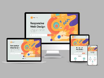
Responsive Design: Making Hero Images Work on Any Screen
In today’s digital landscape, hero images serve as the first point of contact for users. To create a stunning impact, these images must adapt seamlessly to any device. Ensuring your hero images look fantastic on mobile, tablet, and desktop screens is crucial for engaging visitors and enhancing their experience.
When designing hero images, consider the following key principles:
- Aspect Ratios: Maintain consistency in aspect ratios across devices. A common ratio is 16:9, which works well across most screens.
- Focal Points: Identify focal points in your hero images. Design your layouts so that important elements remain visible, regardless of screen size.
- Flexible Layouts: Use relative units like percentages or viewport widths instead of fixed pixel values. This allows images to resize dynamically, fitting any screen.
- CSS Techniques: Implement CSS properties like
object-fitandbackground-sizeto control how images fill their containers without distortion.
It’s also essential to optimize images for performance. Large files can slow down loading times, especially on mobile devices. Here are some tips for optimization:
- Compression: Use tools like TinyPNG or ImageOptim to reduce file size without compromising quality.
- Responsive Formats: Consider using modern image formats like WebP, which offer better compression and quality compared to traditional formats like JPEG or PNG.
- Lazy Loading: Implement lazy loading techniques to delay the loading of images until they enter the viewport, improving initial load times.
To give you a clearer idea of the different sizes required for hero images, check out the table below:
| Device Type | Image Dimensions | Recommended Format |
|---|---|---|
| Mobile | 640 x 360 px | JPEG/WebP |
| Tablet | 1024 x 576 px | JPEG/WebP |
| Desktop | 1920 x 1080 px | JPEG/WebP |
| Large Screens | 2560 x 1440 px | JPEG/WebP |
Using media queries in CSS can enhance your hero images further by applying different styles based on the screen size. This technique allows you to change image placement or switch to alternative images tailored for specific devices, ensuring an optimal user experience.
Lastly, consider A/B testing different hero images to see which versions resonate best with your audience. Analyzing engagement metrics can provide valuable insights into user preferences, helping you refine your approach and continually improve your design.
Optimizing Image Quality Without Sacrificing Speed
When it comes to web design, there’s a delicate balance between image quality and site speed. High-resolution images are essential for engaging users, but they can also bog down your website’s performance if not optimized correctly. Fortunately, there are several strategies to improve image quality while keeping load times speedy.
One of the most effective methods is to choose the right file format. Each format has its strengths:
- JPEG: Perfect for photographs where color depth is critical.
- PNG: Best for images requiring transparency, like logos or graphics.
- WebP: Offers superior compression and quality, making it an ideal choice for the web.
Compression plays a vital role as well. Image files can be significantly reduced in size without noticeable loss in quality. Tools like TinyPNG or ImageCompressor make it easy to shrink your images before uploading them to your site. Aim for a balance where images appear sharp and vibrant but don’t take ages to load.
| Image Type | Ideal Format | Compression Tool |
|---|---|---|
| Photographs | JPEG | TinyPNG |
| Logos | PNG | ImageCompressor |
| Web Graphics | WebP | Optimizilla |
Another critical component is responsive design. Use CSS to ensure that images adapt to different screen sizes. This way, you’re serving up smaller images on mobile devices and larger, more detailed images on desktops. The srcset attribute is an excellent tool for this as it allows browsers to select the right image based on the device’s characteristics.
Don’t overlook the power of lazy loading. By implementing this technique, images are only loaded when they come into the viewport. This not only saves bandwidth but also enhances the user experience by ensuring the initial page load is fast.
Lastly, regularly audit your images. Over time, websites accumulate outdated or oversized images that can slow down performance. Take the time to review your media library and eliminate unnecessary files. This practice keeps your website lean and fast, ultimately leading to better engagement and higher conversion rates.
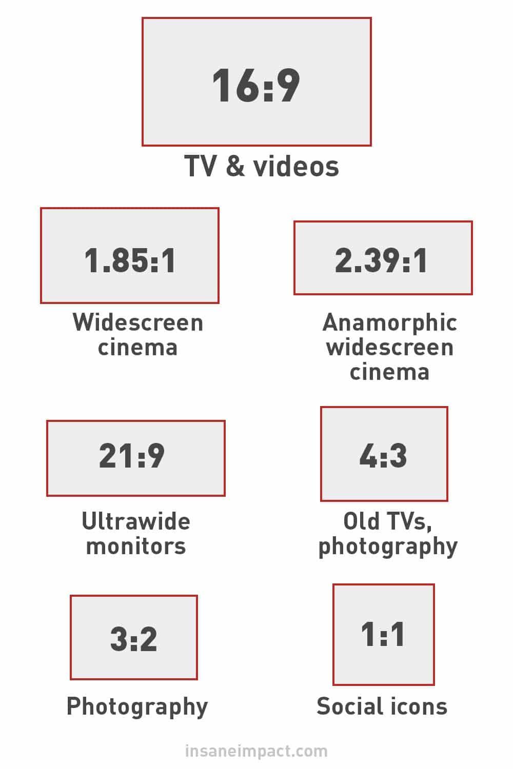
The Perfect Aspect Ratios for Different Platforms
Choosing the right aspect ratio for your hero images can significantly enhance the visual appeal of your content. Different platforms have specific dimensions that work best to capture attention and convey your message effectively. Let’s dive into the most effective ratios for various social media networks and website designs.
For Facebook, the recommended aspect ratio for hero images is 16:9. This ratio not only fits perfectly within the feed but also allows for high-quality visuals that resonate with followers. Here’s a quick look at some suggested sizes:
| Type | Dimensions |
|---|---|
| Cover Photo | 820 x 312 px |
| Shared Image | 1200 x 630 px |
Moving onto Instagram, this platform thrives on striking visuals. The ideal aspect ratio here is 1:1 for square images, and 4:5 for portrait images. Using these ratios ensures that your images utilize the screen space effectively, engaging your audience more actively. Here’s the breakdown:
- Square Image: 1080 x 1080 px
- Portrait Image: 1080 x 1350 px
- Landscape Image: 1080 x 566 px
When it comes to Twitter, you’ll want to opt for a 16:9 aspect ratio as well, particularly for header images and links. This creates a cohesive look across your profile and posts. Suggested sizes include:
- Header Photo: 1500 x 500 px
- In-Stream Photo: 1200 x 675 px
For LinkedIn, professionalism is key. The ideal aspect ratio for your hero images should be 1.91:1. This ensures that your visuals maintain a polished and professional appearance. Recommended sizes include:
- Company Page Banner: 1128 x 191 px
- Personal Profile Background: 1584 x 396 px
Lastly, if you’re working on a website, a 16:9 aspect ratio remains a favorite for hero images, as it adapts well to various screen sizes. Here, recommended dimensions typically range from:
- Full-width Hero Image: 1920 x 1080 px
- Standard Hero Image: 1600 x 900 px
By understanding and utilizing these aspect ratios, you can ensure your images not only look great but also serve their purpose effectively on each platform. Don’t underestimate the power of the right dimensions; they can make a world of difference in how your content is perceived!
Best Practices for Mobile Hero Images
When it comes to mobile hero images, getting the right size and style is essential for creating a captivating user experience. The best practices can make a significant difference in how your content is perceived and how users interact with your site.
First and foremost, always optimize your images for mobile devices. This means reducing file sizes without sacrificing quality. Tools like blank”>TinyPNG or blank”>ImageCompressor can be incredibly helpful. Smaller images load faster, which is crucial for mobile users who may be on slower connections.
Next, consider the aspect ratio of your images. For mobile hero images, a common aspect ratio is 16:9. This format is visually appealing and fits most mobile screens. Ensure your image is resized to this ratio to maintain a cohesive look across devices. You can use CSS to help adjust the display without having to create multiple image sizes:
.hero-image {
    width: 100%;
    height: auto;
}
Another vital aspect is the focus point. When choosing or editing your hero image, ensure that the focal point is centered or adjusted according to the mobile screen. This ensures that key elements of your image aren’t cut off when displayed on smaller devices.
Don’t forget about text overlay! If your hero image includes text, make sure it is easily readable. Use contrasting colors and adjust the font size according to mobile standards. For instance, a font size of at least 24px is generally recommended for mobile headers. You can use CSS to style your text overlays effectively:
.hero-text {
    font-size: 24px;
    color: #ffffff;
    text-shadow: 1px 1px 2px rgba(0, 0, 0, 0.7);
}
Consider implementing a fallback image for devices that may not display hero images properly. Using a simple, light-weight image can ensure that users still have a pleasant experience even if the main image fails to load.
Lastly, always run A/B tests to see what works best for your audience. Test different images, text placements, and styles to find the perfect hero combination. User engagement can vary widely, so analyzing data will help you make informed decisions.
| Best Practice | Description |
|---|---|
| Optimize Images | Reduce file size without losing quality. |
| Aspect Ratio | Use 16:9 for a standard fit. |
| Focus Point | Ensure key elements are centered. |
| Text Overlay | Make text readable with contrast and size. |
| Fallback Image | Provide a lightweight alternative image. |
| A/B Testing | Experiment and analyze for optimal results. |
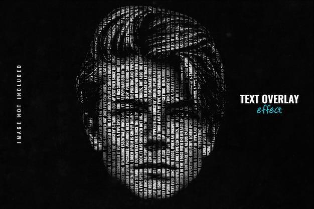
Using Text Overlays: Balancing Readability and Aesthetics
When it comes to hero images, the right text overlay can elevate your design from good to stunning. However, achieving the perfect balance between readability and aesthetics can be a tricky task. You want your text to stand out but also blend seamlessly with the backdrop. Here are some key considerations to help you nail that balance.
- Font Choice: Select fonts that are easy to read, even at a distance. Sans-serif fonts often work best for overlays because of their clean lines.
- Contrast Matters: Ensure there is sufficient contrast between your text and the background. Tools like contrast checkers can help you determine if your text is legible.
- Size It Right: Use larger font sizes for key messages. Titles should be bold and significant, while secondary text can be smaller.
- Text Shadow: Applying a subtle text shadow can enhance readability, especially against busy backgrounds.
Another important aspect is the placement of your overlay. Try to position your text in a way that uses empty spaces in the image. This not only makes the text easier to read but also ensures that it doesn’t detract from the visual impact of the hero image itself. Here’s a simple table to illustrate effective text placement strategies:
| Placement Area | Advantages |
|---|---|
| Top Left | Great for catching attention; less cluttered space. |
| Center | Perfect for impactful messages; draws focus immediately. |
| Bottom Right | Less intrusive; allows for more visual storytelling. |
Furthermore, consider the color palette of your overlay. Using a solid color background behind your text can help it pop against the image while adding a layer of design sophistication. For example, a semi-transparent black or white box can provide a perfect backdrop without overshadowing the image itself.
Lastly, don’t shy away from experimenting! Different combinations of text styles, sizes, and placements can lead you to creative solutions that keep your audience engaged. A/B testing can be invaluable in revealing what resonates most with your viewers. By iterating on your designs, you’ll not only improve readability but also strengthen the overall aesthetic of your website.
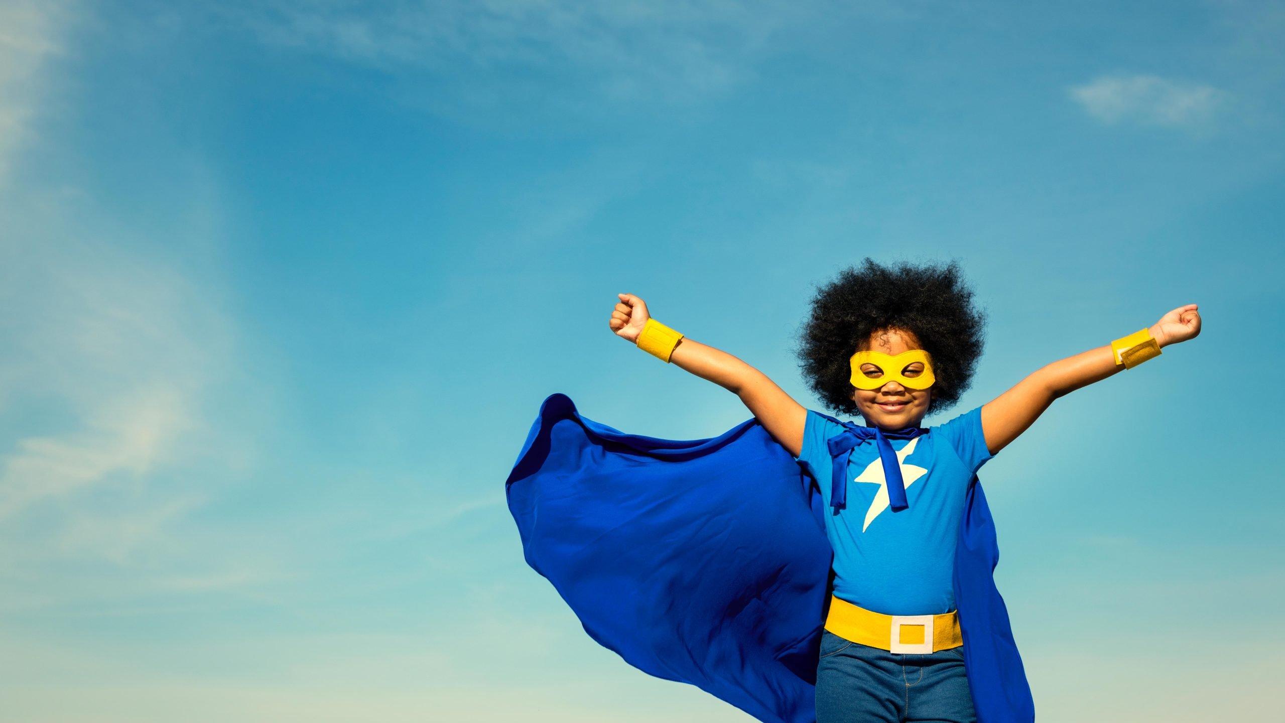
Color and Contrast: Making Your Hero Image Stand Out
Creating a captivating hero image is not just about size; it’s also about how color and contrast can elevate the visual appeal and effectiveness of your design. Strong color choices paired with thoughtful contrast can guide the viewer’s eye, evoke emotions, and enhance brand recognition.
When selecting colors for your hero image, consider these key principles:
- Color Theory: Understand the basics of complementary and analogous colors. Complementary colors (opposites on the color wheel) can create dynamic visual tension, while analogous colors (next to each other) provide harmony.
- Brand Colors: Incorporate your brand’s color palette. Consistency in color helps reinforce brand identity and creates a professional look.
- Emotional Impact: Different colors evoke different emotions. For example, blue can instill trust, while red can provoke urgency. Choose colors that align with the message you want to convey.
Contrast is equally important; it helps to differentiate elements within your hero image, making sure that key components stand out. Here’s how you can effectively use contrast:
- Light vs. Dark: A light subject on a dark background (or vice versa) draws attention and can create a striking visual. This high contrast can be particularly useful for text overlays or focal points.
- Text Visibility: Ensure that any text within your hero image is easily readable. Use contrasting colors between the text and background for maximum visibility.
- Textures and Patterns: Adding texture or pattern to backgrounds can increase depth and interest. Just be cautious not to make the image too busy; the main focus should remain clear.
To visualize the impact of color and contrast, consider the following table that illustrates examples of effective color combinations:
| Color Combination | Emotional Response | Ideal Use Case |
|---|---|---|
| Blue & Orange | Trust & Energy | Tech Products |
| Black & Yellow | Luxury & Attention | Fashion Brands |
| Green & White | Health & Freshness | Wellness Services |
| Purple & Gold | Royalty & Exclusivity | High-End Products |
Utilizing color and contrast effectively will not only make your hero image stand out but also enhance user engagement. When users are visually attracted to your image, they are more likely to explore the content that follows, boosting the overall effectiveness of your website.
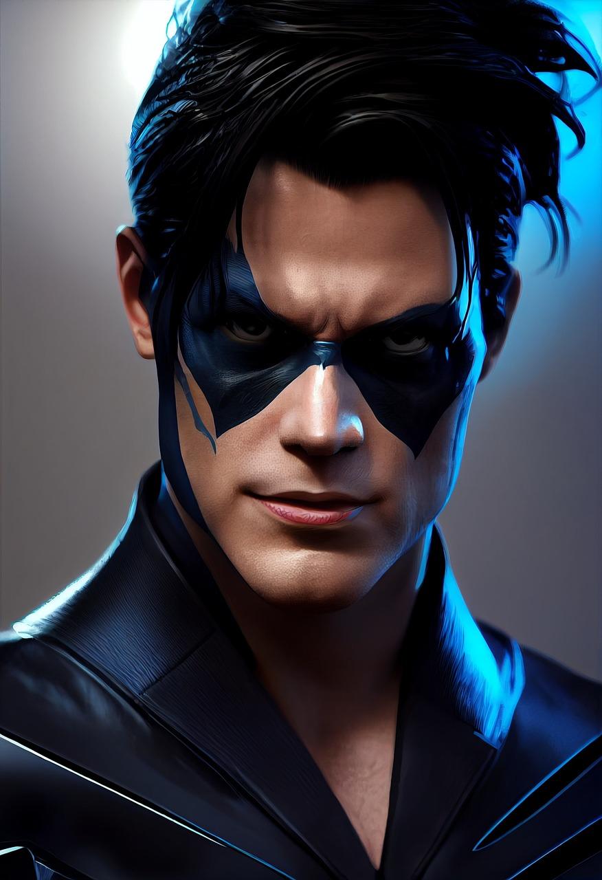
Incorporating CTAs in Hero Images Effectively
When designing a hero image, it’s not just about aesthetics; it’s about effectiveness. One of the key components of a hero image is the inclusion of a compelling call-to-action (CTA). A well-placed CTA can drive engagement, conversions, and ultimately lead to achieving your business goals. Here’s how to effectively incorporate CTAs into your hero images.
First and foremost, clarity is essential. Your CTA should be immediately understandable. Phrases like “Get Started,” “Learn More,” or “Shop Now” are clear and direct, leaving no room for confusion. Use concise language that resonates with your audience. Remember, the goal is to prompt users to take action without overwhelming them with information.
Next, consider contrast and visibility. The CTA should stand out against the background of your hero image. Use contrasting colors that draw the eye without clashing with the overall design. Here are some tips for achieving this:
- Choose bold colors for buttons that pop against softer backgrounds.
- Utilize transparent overlays to enhance text readability.
- Ensure font size is large enough to be legible at a glance.
Another effective strategy is to position your CTA thoughtfully. Traditionally, CTAs are placed in the center or at the bottom of a hero image, but testing different placements can yield surprising results. Consider these positions:
| Position | Pros | Cons |
|---|---|---|
| Center | High visibility; draws immediate attention | Can be seen as too aggressive |
| Bottom | Natural reading flow; less intrusive | May be overlooked if the image is too engaging |
| Side | Dynamic layout; allows for creative designs | Potentially less visibility on mobile devices |
Incorporating social proof or urgency can also enhance your CTA’s effectiveness. Adding elements like customer reviews, testimonials, and limited-time offers can encourage users to act quickly. For example:
- “Join 1,000+ happy customers!”
- “Limited time only—act now!”
- “Free trial for the first month!”
Lastly, remember to test and optimize your CTAs continually. A/B testing different phrases, colors, sizes, and positions can yield valuable insights into what resonates best with your audience. Keep an eye on your analytics to measure how changes impact user behavior. This is a crucial step that can lead to significant improvements in conversion rates.
effectively integrating CTAs into your hero images can transform them from mere decorative elements into powerful tools for engagement and conversion. By prioritizing clarity, visibility, strategic positioning, and the incorporation of social proof, you can create hero images that not only capture attention but also drive action.
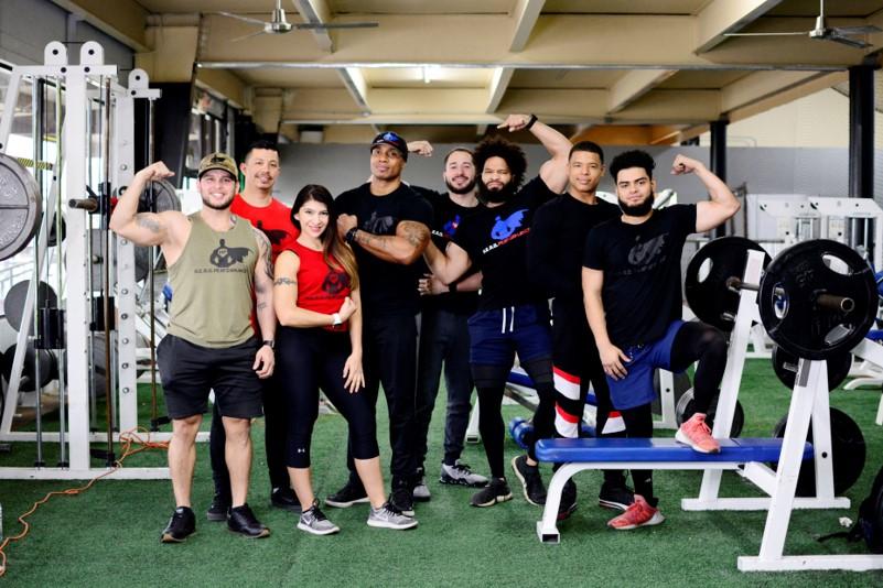
Testing and Analyzing Hero Image Performance
When it comes to hero images, testing and analyzing their performance is crucial for optimizing user engagement and enhancing overall site aesthetics. The right hero image not only captures attention but also drives conversions. Here are a few key factors to consider:
- A/B Testing: Experiment with different images, layouts, and text overlays. This helps you determine which version resonates more with your audience.
- Loading Speed: Ensure your hero image is optimized for quick loading. A slow-loading image can lead to increased bounce rates and frustrated users.
- Mobile Responsiveness: With a significant number of users accessing sites via mobile devices, it’s essential to analyze how your hero image performs on various screen sizes.
Utilizing tools like Google Analytics can provide insightful data on how users interact with hero images. Pay attention to metrics such as:
| Metric | Description |
|---|---|
| Engagement Rate | Measures the percentage of visitors who interact with the hero image. |
| Click-Through Rate (CTR) | Indicates how often users click on calls to action associated with the hero image. |
| Bounce Rate | Tracks the percentage of visitors who leave the site after viewing only the hero image. |
Another important aspect is analyzing the context in which your hero image is viewed. Consider the following:
- Content Alignment: Ensure your hero image complements the surrounding content, creating a cohesive narrative that keeps users engaged.
- Audience Demographics: Tailor your hero image based on the preferences and behaviors of your target audience.
- Seasonal Trends: Update your hero image to reflect seasonal changes or promotional events, keeping your content fresh and relevant.
Don’t forget to gather feedback directly from your users. Create quick surveys or polls that ask visitors about their impression of the hero image. This qualitative data can be incredibly valuable in shaping your visual strategy.
Lastly, continuously revisit and adjust your hero images based on performance analytics. Trends change, and so do user preferences. By regularly testing and analyzing, you can ensure that your hero images remain effective tools for engagement and conversion.
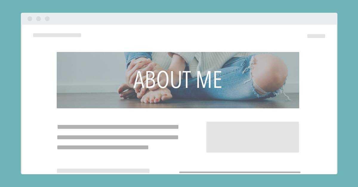
Common Mistakes to Avoid with Hero Image Sizes
When it comes to designing your website, the hero image is often the first thing users see. Choosing the right size is crucial, but there are some common pitfalls that can detract from its effectiveness. Here’s what to steer clear of:
- Overly Large Files: Using high-resolution images that are excessively large can slow down your website’s loading speed. Aim for a balance between quality and size to optimize user experience.
- Ignoring Aspect Ratios: Different devices display images differently. Failing to consider aspect ratios can lead to unsightly cropping or stretching. Always prepare your hero images for various screen sizes.
- Using the Wrong Dimensions: Each platform has its own recommended hero image sizes. Using a universal size without tailoring it to specific needs can result in poor image display. Always check the guidelines for each platform.
To help, here’s a quick reference table of common hero image dimensions for various platforms:
| Platform | Recommended Size |
|---|---|
| Desktop | 1920 x 1080 pixels |
| Tablet | 768 x 1024 pixels |
| Mobile | 375 x 667 pixels |
| WordPress (Header) | 1600 x 600 pixels |
- Neglecting Focal Points: A common error is choosing an image that loses its impact due to poor cropping. Always ensure key elements of your image are visible and positioned to draw attention.
- Failing to Test Responsiveness: Just because it looks good on your device doesn’t mean it works on all. Always test your hero images on various devices to see how they hold up.
- Not Optimizing for SEO: Don’t overlook the importance of alt text and file names. Use descriptive, keyword-rich phrases to enhance your image’s discoverability in search engines.
Avoid these mistakes, and your hero image will not only capture attention but also enhance the overall user experience, driving engagement and conversions.

Tools and Resources for Creating Stunning Hero Images
Creating captivating hero images can be a game changer for your website’s aesthetics and user engagement. Fortunately, there are plenty of tools and resources available that can help you design images that not only look fantastic but are also optimized for performance. Here’s a curated list of some must-have tools to elevate your hero images.
Design Software
Whether you’re a seasoned designer or just starting out, the right software can make all the difference. Consider using:
- Adobe Photoshop – The industry standard for image editing with extensive features for graphic design.
- Canva – User-friendly and perfect for creating quick designs with pre-made templates.
- Figma – Excellent for collaborative design projects, allowing multiple users to edit in real-time.
- Affinity Designer – A cost-effective alternative to Adobe with powerful vector editing capabilities.
Stock Image Resources
Sometimes, you might not have the perfect image at hand. Stock image libraries provide high-quality visuals without breaking the bank. Check out:
- Unsplash – A popular source of free high-resolution images, perfect for hero images.
- Pexels – Offers a vast collection of free stock photos and videos.
- Shutterstock – While it requires payment, it boasts a plethora of premium images.
- Adobe Stock - Integrates seamlessly with Creative Cloud applications for easy access to high-quality assets.
Image Optimization Tools
After creating or selecting your hero image, optimizing it for web use is essential. Large image files can slow down your site, affecting user experience and SEO. Here are some tools to help:
- TinyPNG – Compresses images without sacrificing quality, making your files lighter.
- ImageOptim – A great tool for Mac users to optimize images for faster loading times.
- Kraken.io – An all-in-one image optimizer that also offers a pro version for more advanced features.
Responsive Design Frameworks
Making sure your hero images look great on all devices is crucial. Here are some frameworks that can help you with responsive design:
- Bootstrap - A popular front-end framework that allows you to create responsive layouts seamlessly.
- Foundation - Another robust framework for building responsive websites with great flexibility.
- Tailwind CSS – A utility-first CSS framework that makes styling your hero images a breeze.
Image Size Guidelines
Understanding the ideal dimensions for hero images is vital. Below is a quick reference table outlining the recommended sizes for different platforms:
| Platform | Recommended Size |
|---|---|
| Website | 1920 x 1080 px |
| 1200 x 630 px | |
| 1080 x 1080 px | |
| 1200 x 675 px |
Learning Resources
if you’re looking to refine your skills or learn more about design principles, there are plenty of online courses and tutorials available:
- Skillshare – Offers a range of design classes taught by industry professionals.
- Udemy – Find courses on everything from photo editing to graphic design.
- YouTube – A treasure trove of free tutorials covering every aspect of image design and editing.

Future Trends in Hero Image Design
As we move into a new era of digital design, the concepts surrounding hero images are evolving rapidly. No longer merely a static visual, hero images are becoming dynamic canvases that engage users in innovative ways. The future of hero image design is set to embrace several trends that will enhance user interaction and experience.
1. Responsive and Adaptive Design
In an age where users access content across multiple devices, hero images must be responsive. This means that the design will automatically adjust to different screen sizes and orientations, ensuring a seamless experience on both mobile and desktop. Adaptive images that load according to the device resolution will also enhance performance and reduce loading times.
2. Video and Animation Integration
Static images are gradually being replaced by video backgrounds and animations that capture attention instantly. This trend is not just about aesthetics; it’s about storytelling. Videos can convey messages and emotions more effectively, helping brands connect with their audience on a deeper level. As bandwidth improves, expect to see more brands opting for engaging video hero sections that are both informative and captivating.
3. Minimalism with Bold Typography
The minimalist trend is gaining traction, where the focus shifts to clean designs with bold typography. This approach allows the hero image to create a striking first impression without overwhelming the viewer. Brands will prioritize clarity and simplicity, using large, easy-to-read fonts that complement the visuals rather than compete with them.
4. Personalization through AI
Artificial Intelligence is set to revolutionize hero image design by enabling personalized experiences. Imagine a hero section that changes based on user behavior, preferences, or location. This level of customization will create a more relevant experience, making users feel valued and understood. AI-driven tools will analyze user data in real time, delivering hero images that resonate with individual visitors.
5. Accessibility Considerations
As digital inclusivity becomes a priority, hero images will also evolve to be more accessible. Designers will be tasked with ensuring that visual content is usable for people with disabilities. Using alt text, high-contrast colors, and considering cognitive load will become standard practice, making websites more welcoming for everyone.
6. Augmented Reality (AR) Elements
AR technology is creeping into web design, and hero images are prime candidates for enhancement. Imagine using AR to project a product in a real-world setting directly from a website’s hero section. This interactive experience could be a game-changer, allowing customers to visualize products in their own space, thereby influencing their purchasing decisions.
As these trends unfold, staying ahead of the curve will not only enhance user engagement but also elevate your brand’s visibility in an increasingly crowded digital landscape. Embracing these changes will position you at the forefront of design innovation, ensuring your hero images remain striking, effective, and memorable.
Final Thoughts on Elevating Your Visual Content
When it comes to crafting compelling visual content, understanding the nuances of hero image sizes is crucial. These images not only capture attention but also set the tone for your brand’s narrative. Emphasizing the right dimensions ensures that your visuals are optimized for various platforms, enhancing user experience and engagement.
One of the key aspects of effective hero images is their ability to create a strong first impression. With the right size, these images can effectively convey your message without distorting or losing quality. Consider the following tips to elevate your visual content:
- Prioritize Quality: Always use high-resolution images that are crisp and clear. Blurry images can diminish your brand’s credibility.
- Responsive Design: Ensure that your hero images adapt beautifully across devices. A mobile-friendly design is not just a trend; it’s a necessity.
- Experiment with Aspect Ratios: Different platforms may favor specific aspect ratios, so don’t hesitate to test various sizes to see what resonates with your audience.
- Leverage A/B Testing: Use A/B testing to analyze how different hero image sizes perform in terms of engagement and conversions.
Choosing the appropriate size for your hero images can significantly impact loading times. A well-optimized image will load faster, reducing bounce rates and improving overall site performance. Take a look at the table below for an overview of recommended sizes across popular platforms:
| Platform | Recommended Size |
|---|---|
| Website | 1920 x 1080 pixels |
| 1200 x 630 pixels | |
| 1080 x 1350 pixels | |
| 1200 x 675 pixels |
Remember, hero images are often the first thing visitors see, making their size and quality pivotal in retaining interest. Incorporate calls-to-action strategically within your hero images, ensuring they are enticing and clearly visible. This combination not only boosts aesthetic appeal but also guides users toward desired actions.
To truly elevate your visual content, embrace the idea of storytelling through your hero images. Each image should resonate with your brand’s identity and evoke emotions that align with the experience you wish to create for your audience. The right hero image can tell your story at a glance, making it an invaluable asset in your content marketing strategy.
mastering hero image sizes is an art and a science. By prioritizing quality, optimizing for responsiveness, and continually testing your visuals, you can create a lasting impact that drives engagement and conversions. Transform your visual content into a powerful tool that not only attracts but also retains your audience’s attention.
Frequently Asked Questions (FAQ)
Every Hero Image Size You Need to Know: Q&A
Q: What exactly is a hero image?
A: Great question! A hero image is a large, visually striking banner image that sits at the top of a webpage. It’s your first opportunity to grab visitors’ attention, often featuring a compelling photo, a catchy headline, or both. Think of it as your digital welcome mat—it sets the tone for the entire website!
Q: Why is the size of a hero image so important?
A: The size matters more than you might think! If your hero image is too small, it can look pixelated or blurry, which diminishes your site’s credibility. On the flip side, a file that’s too large can slow down your page load times, leading to frustrated visitors who might just click away. The right size enhances user experience and keeps your site looking professional.
Q: What are the standard sizes I should consider for hero images?
A: Excellent question! Common sizes vary depending on the type of website. For full-width hero images, a size of around 1920×1080 pixels is pretty standard. If you’re designing for mobile, aim for 720×1280 pixels. For a more tailored approach, consider the specific dimensions of your template or theme. Always check to ensure your images are optimized for various screen sizes!
Q: How do I choose the right hero image size for my website?
A: It’s all about your goals! Start by identifying where the image will be used. If it’s a full-width banner on a desktop, go large—but not so large that it impacts loading speed. For mobile users, a smaller size will suffice. Always prioritize responsiveness—your image should look fantastic on any device!
Q: What formats should I use for hero images?
A: Typically, JPEG and PNG are your best bets. JPEGs are great for rich photographs because they balance quality and file size nicely. PNGs are fantastic for images that require transparency or for graphics with text. Just remember, you want to keep file sizes low without sacrificing too much quality.
Q: How can I ensure my hero image loads quickly?
A: Optimizing your images is key! You can use tools like TinyPNG or ImageOptim to compress your files without losing noticeable quality. Additionally, consider using next-gen formats like WebP, which provide high quality with smaller file sizes. Don’t forget to use proper alt text for accessibility and SEO benefits!
Q: What’s the best way to test if my hero image size is effective?
A: A/B testing is your friend! Create two variations with different sizes and see which one performs better in terms of load time and user engagement. You can also utilize tools like Google PageSpeed Insights to analyze load times and get suggestions on how to improve!
Q: Any final tips for choosing hero images?
A: Absolutely! Always use high-quality, relevant images that resonate with your audience. Your hero image should not only look good but also align with your brand message. Lastly, consider the emotional response you want to evoke—images that tell a story or inspire action can significantly increase conversions!
Q: Where can I find high-quality hero images?
A: You’re in luck! There are plenty of resources out there. Websites like Unsplash, Pexels, and Shutterstock offer a range of free and paid images that are perfect for hero sections. Just make sure you check the licensing agreements if you’re using them commercially!
the right hero image size can make a world of difference in your website’s success. By understanding these nuances, you can create an inviting and engaging digital space that truly reflects your brand. Happy designing!
In Conclusion
As we wrap up our journey through the world of hero images, it’s clear that understanding the sizes and specifications can make all the difference in your web design. Choosing the right dimensions not only enhances your site’s visual appeal but also boosts user engagement and conversion rates. Remember, a hero image is often the first impression visitors have of your brand, so why not make it a great one?
Now that you’re armed with the knowledge of every essential hero image size, it’s time to put it into action. Experiment with different dimensions, test the impact on your audience, and watch your website’s performance soar. Don’t forget to keep your brand’s unique story at the forefront—after all, it’s not just about size; it’s about making a connection.
So go ahead, elevate your site with stunning hero images that capture attention and convey your message. Your audience is waiting, and they deserve nothing less than a remarkable experience. Happy designing!


