Introduction: Unlock the Power of Visual Impact with Hero Images
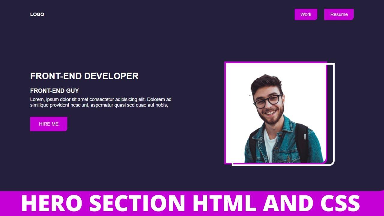
Hey there, web design enthusiast! Have you ever landed on a website that instantly grabbed your attention with stunning visuals? That’s the magic of a hero image! In the world of web design, a striking hero image can set the tone for your entire site, drawing users in and guiding them through their journey. If you’re looking to elevate your website’s aesthetic and user experience, adding a hero image is a fantastic place to start.
But don’t worry if you’re not a coding whiz! With just a bit of CSS know-how, you can transform your site’s appearance and make a memorable first impression. In this article, we’ll walk you through the ins and outs of adding a hero image using CSS, with easy-to-follow steps and tips that will have you creating eye-catching designs in no time. So, let’s dive in and unlock the potential of your website with compelling visuals that truly stand out!
Understanding the Power of a Hero Image in Web Design
When it comes to web design, a hero image serves as a powerful tool that can captivate visitors from the moment they land on your site. It sets the tone and mood while offering a glimpse into the essence of your brand or message. A well-chosen hero image is not just decorative; it can enhance the user experience, making it more engaging and memorable.
Creating a hero image with CSS is relatively straightforward, yet there are some best practices to keep in mind:
- Choose the Right Image: Select an image that resonates with your brand and content. It should evoke emotion and convey your message effectively.
- Optimize for Performance: Large images can slow down your site. Make sure to compress images without sacrificing quality to ensure quick loading times.
- Consider Responsiveness: Your hero image should look great on all devices. Use CSS media queries to adjust styles for different screen sizes.
- Use Overlay Text: Enhance your hero image by adding text overlays. This can serve to communicate key messages or calls to action right away.
Here’s a simple CSS example to implement a hero image:
| CSS Property | Description |
|---|---|
| background-image | Sets the image to be used as the hero background. |
| height | Defines the height of the hero section, typically full viewport height. |
| background-size | Ensures the image covers the entire section without distortion. |
| text-align | Centers the text overlay, creating a visually appealing layout. |
Here’s a sample code snippet you can use:
.hero {
    background-image: url('your-image-url.jpg');
    height: 100vh;
    background-size: cover;
    background-position: center;
    text-align: center;
    color: white;
    display: flex;
    align-items: center;
    justify-content: center;
}
Remember, the effectiveness of your hero image relies not only on aesthetic appeal but also on functionality. Ensure that it works seamlessly with other elements on your page, guiding users toward their next steps. Whether it’s signing up for a newsletter, making a purchase, or exploring your blog, the hero image can be a pivotal element in driving user interaction.
Incorporating a compelling hero image into your web design is an investment in user engagement. By following these guidelines, you can elevate your site’s visual appeal and effectiveness, leading to a stronger connection with your audience.

Choosing the Right Image for Your Hero Section
When it comes to selecting the perfect image for your hero section, the stakes are high. This image is often the first thing visitors see, and it sets the tone for their entire experience on your site. Here are some tips to ensure you choose an image that not only captures attention but also enhances your brand’s message.
- Relevance: Ensure the image aligns with your brand and the content it accompanies. It should be a visual representation of your message, product, or service.
- Quality: Use high-resolution images. A crisp, clear image reflects professionalism and attention to detail, making a positive first impression.
- Emotion: Choose images that evoke the right emotions. Whether it’s joy, trust, or excitement, the emotional connection can significantly influence user engagement.
- Color Scheme: Consider how the colors in the image complement or contrast with your website’s overall color palette. A harmonious color scheme can create a more cohesive look.
Another critical aspect is the composition of the image. Pay attention to the following:
- Focal Point: Make sure the subject of your image is well-defined and easily identifiable. It should draw the viewer’s eye and keep their attention.
- Negative Space: Leave breathing room around the main subject. This space can help reduce clutter and direct focus to your key message.
- Text Overlay: If you plan to overlay text on the image, choose one that offers enough contrast and clarity. A well-placed text can enhance the message without compromising the visual appeal.
To help you visualize the impact of different types of images, here’s a quick comparison:
| Image Type | When to Use | Pros |
|---|---|---|
| Stock Photos | General usage | Easy access, diverse options |
| Custom Images | Brand-specific content | Unique, tailored to your brand |
| Illustrations | Creative fields | Whimsical, can convey complex ideas |
| Background Patterns | Subtle designs | Add texture without overwhelming |
the right image for your hero section can make or break your website’s first impression. By focusing on relevance, quality, emotional impact, and composition, you can select an image that not only enhances your site’s aesthetics but also reinforces your brand identity. So, take your time, explore options, and choose wisely!
Setting Up Your HTML Structure for Effective CSS
When it comes to creating a stunning hero image with CSS, the foundation is everything. To ensure your design stands out, start with a solid HTML structure. This not only helps with styling but also enhances accessibility and SEO. Here’s how you can organize your HTML to support your CSS effectively:
First, consider using a
Next, use a
, you can add an Element Purpose Defines the hero section. Groups content for styling. Main headline for impact. Short description or tagline. Call-to-action link.
With this structure in place, you can turn your focus to CSS. Consider adding a background image to your hero section using the background-image property. It’s a good idea to also set properties like background-size: cover; to ensure the image scales well across different devices. Here’s a snippet:
.hero {
background-image: url('your-image-path.jpg');
background-size: cover;
height: 100vh;
display: flex;
align-items: center;
justify-content: center;
text-align: center;
color: white;
}
Don’t forget about responsive design! Use media queries to adjust the layout based on screen size. You might want to decrease font sizes or change padding to maintain a polished look on smaller devices. Here’s a quick example:
@media (max-width: 600px) {
.hero-content h1 {
font-size: 2em;
}
}
always test your hero section across various browsers and devices to ensure consistency. With the right HTML structure, your CSS will shine, creating an engaging experience for your visitors.
The Essential CSS Properties for Hero Images
Understanding the Basics of Hero Image CSS
When it comes to creating a stunning hero image, certain CSS properties are your best friends. These properties help you achieve a visually appealing layout while ensuring your image looks great on all devices. Let’s dive into some essential CSS properties that can elevate your hero image game.
1. Background Properties
The background-image property is a must-have for any hero section. This property allows you to set your image as a background. Coupled with background-size, it gives you control over how the image is displayed:
- background-image: url(‘your-image.jpg’);
- background-size: cover;
- background-position: center center;
Using cover ensures that your image fills the entire hero section without distortion, while center center keeps the focal point of your image in the center, regardless of screen size.
2. Displaying the Right Dimensions
Setting the dimensions of your hero section is crucial. The height property is particularly important:
- height: 100vh;
By using 100vh, your hero image will always fill the viewport height, creating an immersive experience for your visitors.
3. Text Styling and Positioning
Your hero image isn’t just about the visuals; it’s also about the message. Use CSS properties like color, font-size, and text-align to style your text:
- color: white;
- font-size: 2.5em;
- text-align: center;
Ensure your text stands out against the background by using contrasting colors and appropriate sizing. The text-align property helps center your text, making it visually appealing.
4. Overlay for Better Readability
Sometimes the background image can be too vibrant, making text hard to read. Adding a semi-transparent overlay can solve this:
CSS Property Value background-color rgba(0, 0, 0, 0.5); position absolute; top 0; left 0; width 100%; height 100%;
This overlay softens the image while allowing your text to pop, enhancing both readability and aesthetics.
5. Responsive Enhancements
Don’t forget about responsiveness! Utilizing media queries ensures your hero image adjusts to different screen sizes:
@media (max-width: 768px) {
.hero {
height: 50vh;
font-size: 1.5em;
}
}
This approach allows your hero section to adapt smoothly, maintaining visual appeal and functionality across devices.

Making Your Hero Image Responsive Across Devices
To ensure your hero image looks stunning on any device, you’ll need to adopt a responsive design approach. This means that your image should adapt fluidly to different screen sizes, maintaining its aesthetic appeal without compromising functionality.
One effective way to achieve this is by utilizing CSS properties. Here are some key styles you might implement:
- Width: Set the width to 100% to allow the image to stretch across its container while keeping the aspect ratio intact.
- Height: Use
auto for the height to prevent distortion. - Object-fit: This property can be particularly useful. Use
cover to ensure the image covers the entire container without being skewed.
Here’s a simple CSS snippet to demonstrate these properties:
.hero-image {
width: 100%;
height: auto;
object-fit: cover;
}
In addition to these properties, media queries can help refine how your hero image behaves on various devices. For example, you might want to change the image or its alignment based on the screen size. Consider the following media query:
@media (max-width: 768px) {
.hero-image {
object-position: top;
}
}
This particular query adjusts the object-position to align the image towards the top when viewed on devices with a screen width of 768 pixels or less, enhancing visibility where it matters most.
To further illustrate how responsive design works, here’s a quick comparison table showing how different devices render your hero image:
Device Type Image Size CSS Adjustments Desktop Full Width None Tablet 75% Width object-position: center;Mobile 100% Width object-position: top;
As you implement these techniques, always remember to test your designs across various devices. Tools like Chrome DevTools can simulate different screen sizes, allowing you to fine-tune your hero image’s appearance without needing to grab an actual device.
Ultimately, the goal is to create a seamless experience for your users, where your hero image enhances your site’s message rather than detracting from it. With just a few adjustments in your CSS, you can ensure your hero image shines brightly across all platforms.

Adding Overlay Effects to Enhance Your Hero Image
To truly make your hero image stand out, adding overlay effects is an excellent strategy. These effects can not only enhance the visual appeal but also improve readability and guide user interaction. Below are some creative ways to incorporate overlays into your hero images.
One popular technique is the gradient overlay. By blending two colors, you can create a smooth transition that draws attention to your content. For instance, a soft black-to-transparent gradient can make text pop against a bright image. Here’s how you can implement it:
.hero-image {
position: relative;
background-image: url('your-image.jpg');
height: 400px;
background-size: cover;
}
.gradient-overlay {
position: absolute;
top: 0;
left: 0;
right: 0;
bottom: 0;
background: linear-gradient(to bottom, rgba(0, 0, 0, 0.5), rgba(0, 0, 0, 0.5));
}
Another effective option is to use a color overlay. This is especially useful for branding purposes, as it allows you to apply your brand colors directly onto the image. For instance, a semi-transparent blue overlay can maintain the essence of the image while reinforcing brand identity:
.color-overlay {
position: absolute;
top: 0;
left: 0;
right: 0;
bottom: 0;
background-color: rgba(0, 102, 204, 0.5);
}
Don’t forget about texture overlays. Adding a subtle texture can give your hero image a unique flair. You can use a light grain effect or a soft pattern that complements your overall design. This can be done using the following code:
.texture-overlay {
position: absolute;
top: 0;
left: 0;
right: 0;
bottom: 0;
background-image: url('texture.png');
opacity: 0.3; / Adjust opacity as needed /
}
For those who want to create a more dynamic experience, consider adding an animation effect to your overlay. Subtle animations, like a slow fade-in or a gentle zoom, can engage users as they arrive on your page. Here’s a simple way to achieve a fade-in effect:
@keyframes fadeIn {
from { opacity: 0; }
to { opacity: 1; }
}
.animated-overlay {
animation: fadeIn 2s ease-in-out;
}
When designing your overlay, consider the following best practices:
- Keep it subtle: Overlays should enhance, not overpower.
- Focus on contrast: Ensure text is legible against the overlay.
- Mobile responsiveness: Test how overlays look on various screen sizes.
Here’s a quick reference table for different types of overlays:
Overlay Type Use Case CSS Example Gradient Highlight text linear-gradient(…) Color Brand reinforcement rgba(…) Texture Add uniqueness background-image Animation Engage users @keyframes
By thoughtfully integrating overlay effects, you can elevate your hero image from ordinary to extraordinary. Experiment with different styles and techniques to find the perfect balance that resonates with your audience and enhances the overall user experience.
Incorporating Text and Call-to-Action Buttons
Now that you’ve set up your hero image, it’s time to make it truly engaging by adding some impactful text and call-to-action buttons. These elements can transform a simple image into a dynamic part of your website that captures visitors’ attention and encourages them to take action.
When incorporating text, consider the following:
- Clarity: Your message should be clear and concise. Aim for a headline that grabs attention and a subheading that provides more context.
- Contrast: Ensure that the text stands out against the background. Use contrasting colors or text shadows to enhance visibility.
- Font Choices: Select fonts that reflect your brand’s personality while maintaining readability. A combination of a bold headline font and a simple body font often works well.
For your call-to-action buttons, keep these tips in mind:
- Visibility: Make your buttons large enough to be easily clickable, yet not so large that they dominate the image.
- Color Psychology: Use colors that evoke the desired action. For example, red can create urgency, while green is often associated with go or positive actions.
- Clear Text: Use action-oriented language on buttons like ”Learn More,” “Get Started,” or “Sign Up Now.” Your visitors should know exactly what to expect when they click.
Here’s a simple CSS example to style your text and buttons effectively:
.hero-text {
position: absolute;
top: 50%;
left: 50%;
transform: translate(-50%, -50%);
color: white;
text-align: center;
}
.cta-button {
background-color: #ff5733;
color: white;
padding: 15px 30px;
border: none;
border-radius: 5px;
cursor: pointer;
font-size: 16px;
transition: background-color 0.3s ease;
}
.cta-button:hover {
background-color: #c70039;
}
It’s essential to maintain a balance between aesthetics and functionality. Here’s an example of how you might structure the layout using a simple HTML table:
Element Description CSS Class Hero Image Main visual element that sets the tone .hero-image Text Overlay Text that conveys your message .hero-text Call-to-Action Button Encourages user interaction .cta-button
effective use of text and call-to-action buttons can significantly enhance the impact of your hero image. Not only do they provide essential information, but they also guide your visitors toward the next steps you want them to take. Get creative, experiment with different styles, and watch how your engagement rates improve.
Utilizing Background Positioning for Impact
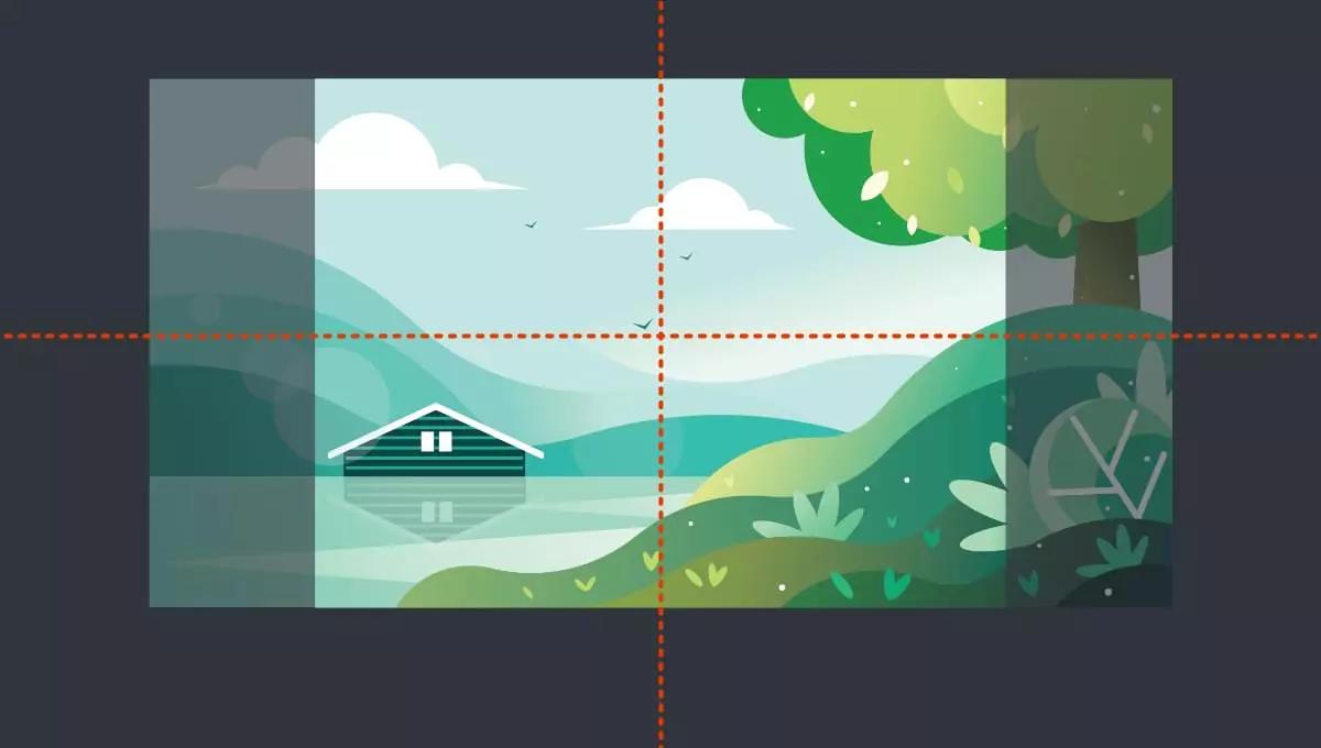
When it comes to creating a stunning hero image, background positioning can be your secret weapon. This technique allows you to control exactly how your image fits within its container, making it a pivotal part of your web design strategy. By mastering background positioning, you can enhance the visual impact of your hero images and improve user engagement on your site.
Start by defining the background-image property in your CSS. This is where you’ll specify the URL of your image. After that, it’s all about positioning:
- center: This option centers your image, ensuring it remains the focus regardless of the screen size.
- top: Perfect for images that have a significant amount of content at the top, like landscapes or skies.
- bottom: Use this for images that are more visually appealing at the bottom, such as backgrounds that feature water or rolling hills.
To implement this effectively, you might use something like:
.hero {
background-image: url('path/to/your/image.jpg');
background-position: center;
background-size: cover; /* Ensures the image covers the entire area */
height: 100vh; /* Full viewport height for maximum impact */
}
Another crucial aspect is the background-size property. Utilizing cover ensures that your image covers the entire section without distortion, while contain will keep your image at its original aspect ratio, but may leave some empty space. This choice often depends on the aesthetic you wish to achieve:
Option Effect Cover Image fills the entire space, possible cropping. Contain Image fully visible, may leave gaps.
Additionally, consider combining background positioning with media queries to ensure your hero images look great on all devices. For instance, you might want to change the positioning depending on whether the user is on a mobile device or a desktop:
@media (max-width: 768px) {
.hero {
background-position: top; /* Adjust for smaller screens */
}
}
Utilizing background positioning also allows for creativity with overlays. Adding a semi-transparent color overlay can help text stand out against a busy background. This makes your hero section not only visually appealing but also functional:
.hero-overlay {
position: absolute;
top: 0;
left: 0;
right: 0;
bottom: 0;
background-color: rgba(0, 0, 0, 0.5); /* Black overlay with transparency */
}
background positioning is not just a technical detail; it’s a critical part of creating a cohesive and engaging user experience. By leveraging the power of CSS, you can transform your hero images into visually captivating elements that draw users in and invite them to explore your content further. Don’t underestimate the beauty of a well-positioned image—it could be the key to your website’s success.
Creating a Fluid Layout with CSS Flexbox
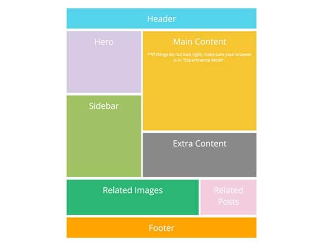
Creating a fluid layout that seamlessly integrates with your hero image can significantly enhance the visual appeal of your website. With the power of CSS Flexbox, achieving this is not only straightforward but also highly effective. Flexbox allows you to design a responsive layout that adjusts beautifully to different screen sizes, ensuring that your hero image stands out no matter the device.
To get started, you’ll want to set up a container for your hero image. Using Flexbox, you can easily center your image and any accompanying text, which creates a harmonious look. Here’s a simple example:
.hero {
display: flex;
align-items: center;
justify-content: center;
height: 100vh; /* Full viewport height */
background-image: url('path-to-your-image.jpg');
background-size: cover;
background-position: center;
}
This CSS snippet does a few key things:
- Display as flex: This initiates the flexbox layout.
- Align items: Centers content vertically.
- Justify content: Centers content horizontally.
- Background properties: Ensures that your image covers the entire section and is centered for optimal appearance.
Next, let’s enhance the text overlay on your hero image. A common practice is to add a heading and a call-to-action button. To keep your layout responsive, you might want to use relative units for font sizes and padding. Here’s an example:
.hero-text {
color: white;
text-align: center;
padding: 20px;
max-width: 600px; /* Keeps text from stretching too far */
}
This keeps your text readable and visually appealing. Don’t forget to add some subtle styles to your button:
.cta-button {
background-color: rgba(255, 0, 0, 0.7); /* Semi-transparent red */
color: white;
padding: 10px 20px;
border: none;
border-radius: 5px;
cursor: pointer;
}
Using Flexbox, you can easily position your button beneath the text like so:
.hero {
display: flex;
flex-direction: column; /* Stack items vertically */
}
Here’s a quick reference table for key CSS Flexbox properties you can use:
Property Description display: flex;Enables flexbox layout. flex-directionDefines the direction of the flex items (row or column). justify-contentAligns items along the main axis (horizontal). align-itemsAligns items along the cross axis (vertical).
With these techniques, you can create a striking hero section that not only grabs attention but also provides a seamless user experience. The flexibility of CSS Flexbox makes it easier to adapt your layout for any device, ensuring that your website remains both functional and beautiful.

Optimizing Image Loading for Faster Performance
When it comes to enhancing user experience on your site, the speed at which your images load can have a significant impact. A well-optimized hero image not only captivates visitors but also ensures that your site performs smoothly. Here are some effective strategies to optimize image loading:
- Choose the Right File Format: Different formats serve different purposes. Use JPEG for photographs, PNG for graphics with transparency, and SVG for scalable vector graphics. This ensures that you are using the most efficient format for each type of image.
- Image Compression: Reduce file sizes without sacrificing quality. Tools like TinyPNG or ImageOptim can help compress images. Aim for a balance where your images look great but don’t slow down your page.
- Responsive Images: Use the
srcset attribute in your ![]()
- Lazy Loading: Implement lazy loading for images that appear below the fold. This technique delays the loading of images until they are needed, drastically improving initial load times.
Moreover, it’s crucial to implement caching strategies. By setting proper caching headers, you can allow browsers to store images locally, reducing the need for repeated downloads. Consider using a Content Delivery Network (CDN) as well, which will deliver images from a location closer to the user, speeding up load times.
Image Type Best Format Use Case Photography JPEG High-quality images with rich detail Graphics/Icons PNG Graphics that require transparency Logos/Illustrations SVG Scalable without losing quality
Another essential practice is to integrate CSS to handle image display efficiently. Using CSS properties like object-fit and background-image can help ensure that your hero images are not only visually appealing but also loaded in a way that does not hinder performance. For instance:
.hero {
background-image: url('your-image.jpg');
background-size: cover;
background-position: center;
height: 100vh;
}
By meticulously applying these techniques, you’ll create a seamless experience for your users. Faster image loading leads to lower bounce rates, higher user engagement, and ultimately, a more successful website. So, take the time to optimize your hero images and watch your site performance soar.
Accessibility Considerations for Your Hero Image
When adding a hero image to your website, it’s essential to prioritize accessibility to ensure that all users, including those with disabilities, can engage with your content effectively. Here are some important considerations to keep in mind:
- Alt Text: Always include descriptive alt text for your hero image. This text should convey the purpose of the image, especially if it’s decorative or conveys important information. For instance, if your hero image features a product, the alt text should describe the product succinctly.
- Color Contrast: Ensure that there is sufficient color contrast between the text and the hero image background. This helps users with visual impairments read the text easily. A minimum contrast ratio of 4.5:1 is recommended for body text.
- Text Overlays: If you’re placing text over your hero image, use solid backgrounds or shadows to improve readability. Transparent overlays can sometimes make text difficult to read, particularly for users with low vision.
- Responsive Design: Make sure your hero image is responsive so that it scales appropriately on different devices. This ensures that users on mobile devices, tablets, and desktops have a cohesive experience without losing critical information.
Implementing these practices not only enhances usability but also boosts your site’s SEO, as search engines favor accessible content. To illustrate the importance of these considerations, here’s a simple table outlining the best practices:
Consideration Best Practice Alt Text Descriptive and concise Color Contrast Minimum 4.5:1 ratio for text Text Overlays Use solid backgrounds or shadows Responsive Design Ensure scalable images across devices
Additionally, consider the use of ARIA (Accessible Rich Internet Applications) roles to enhance the semantic structure of your hero section. This can help assistive technologies understand the content better, providing a richer experience for users who rely on screen readers.
Lastly, always test your hero image and text with various accessibility tools and real user feedback. This will help you identify any potential barriers and ensure that every visitor can enjoy your site without frustration. Accessibility is not just an add-on; it’s an essential part of web design that fosters inclusivity.
Testing and Adjusting Your Hero Image on Different Browsers
Once you’ve set up your hero image using CSS, it’s crucial to ensure it appears consistently across different browsers. Each browser has its own rendering engine, which can cause variations in how your hero image is displayed. Here are some essential steps to test and adjust your hero image effectively:
- Cross-Browser Testing: Utilize tools like BrowserStack or CrossBrowserTesting to see how your site looks in various browsers, including Chrome, Firefox, Safari, and Edge. This will allow you to identify discrepancies in your hero image’s alignment, size, and quality.
- Responsive Design Check: Make sure your hero image adapts well to different screen sizes. Use CSS media queries to adjust the image for mobile devices and tablets, ensuring it doesn’t get cropped or lose quality.
- Image Formats: Experiment with different image formats (like JPEG, PNG, and WebP). While JPEGs are great for photographs, PNGs are better for graphics with transparency. WebP provides superior compression, making it ideal for loading times.
- Fallback Options: Consider implementing fallback options for older browsers that may not support modern CSS features. Using a simple CSS technique, you can designate a default image that will be displayed if the primary image fails to load.
Here’s an example of a CSS rule that sets a fallback image:
.hero {
background-image: url('primary-image.webp');
background-size: cover;
background-position: center;
}
.hero-fallback {
background-image: url('fallback-image.jpg');
background-size: cover;
background-position: center;
}
After you’ve made your adjustments, it’s wise to gather feedback from users who access your site through different browsers. Here are a few aspects to focus on:
- Load Time: Ensure that your hero image loads quickly across all platforms, as this can significantly affect user experience and bounce rates.
- Clarity: Check if your hero image remains sharp and clear, especially when resized on smaller screens.
- Accessibility: Make sure to add
alt text to your hero image for SEO benefits and to improve accessibility for visually impaired users.
Consider documenting your findings in a simple table format to track adjustments and results:
Browser Image Quality Load Time Notes Chrome Excellent 2s Responsive, no issues Firefox Good 3s Minor alignment issue Safari Average 4s Image clarity slightly low
By thoroughly testing and adjusting your hero image on various browsers, you’ll ensure a seamless experience for all users. This attention to detail not only enhances user engagement but also reflects your commitment to quality design.
Final Touches: Enhancing Your Hero Image with Animations
To truly captivate your audience and make your hero image stand out, incorporating animations can add a dynamic flair that draws the eye. Simple animations can transform a static image into an engaging visual experience that invites users to explore your site further. Here are some effective ways to implement animations for your hero image:
- Fade-In Effect: A gentle fade-in animation can create an inviting atmosphere. By fading your hero image in as the page loads, you establish a sense of warmth and welcome.
- Parallax Scrolling: This technique allows the background image to move at a different speed than the foreground content, giving depth to the visual presentation. It’s not just trendy; it adds a layer of sophistication.
- Zoom-In on Hover: When users hover over your hero image, a slight zoom can provoke curiosity. This encourages interaction and engagement, making visitors want to explore more.
- Sliding Text: Animate your headings or call-to-action text to slide in from the sides. This adds a sense of motion that can guide the viewer’s attention right where you want it.
When implementing these animations, consider using CSS keyframes for more control. Here’s a quick example of how to set up a simple fade-in effect:
@keyframes fadeIn {
0% { opacity: 0; }
100% { opacity: 1; }
}
.hero-image {
animation: fadeIn 2s ease-in-out;
}
In addition to CSS, the timing and duration of your animations are crucial. Too slow, and you may lose the viewer’s attention; too fast, and they may miss the intent. A table showcasing the optimal durations for different types of animations could be helpful:
Animation Type Recommended Duration Fade-In 1-2 seconds Parallax Scroll Dependent on scroll speed Zoom-In 0.5-1 second Slide-In Text 0.5 seconds
Don’t forget to optimize your animations for mobile devices. Users will appreciate smooth transitions that don’t hinder loading times. Media queries can be your best friend here, allowing you to adjust animations based on the viewport size.
always test your animations across different browsers and devices. What looks fantastic on one platform may not translate well to another. By ensuring compatibility, you’re not just enhancing visual appeal; you’re also enhancing the user experience. Remember, the key is to enhance, not overwhelm. Keep animations subtle and purposeful, and watch your hero image transform into a powerful storytelling tool.
Conclusion: The Lasting Impact of a Well-Designed Hero Image
In the digital landscape, a hero image stands as a powerful visual element that can set the tone for a website. When designed effectively, it not only captures the attention of visitors but also communicates the essence of a brand. The benefits of incorporating a well-crafted hero image are manifold, ranging from enhanced user engagement to improved conversion rates.
One of the most significant advantages of a hero image is its ability to:
- Convey emotion: A striking image can evoke feelings and establish a connection with the audience, leading them to explore further.
- Highlight key messages: A hero image can serve as a visual representation of the primary message or value proposition, instantly communicating what a brand stands for.
- Guide user navigation: An engaging hero image can direct users’ attention to essential calls to action, improving overall site navigation.
Moreover, when designed with responsive CSS, a hero image maintains its effectiveness across various devices. This adaptability ensures that whether a visitor accesses the site from a desktop, tablet, or smartphone, the visual impact remains intact. This is crucial in today’s multi-device world, where user experience can significantly influence a visitor’s decision to stay or leave.
It’s also worth noting that the integration of a hero image can have a positive impact on SEO. Search engines favor well-structured, visually appealing content. By using descriptive alt text and optimizing file sizes, a hero image can boost a website’s search visibility, attracting even more potential customers.
When creating a hero image, consider the following elements for optimal impact:
Element Importance Color Scheme Aligns with brand identity and creates emotional resonance. Typography Enhances readability and complements the image style. Focus Point Directs viewer attention and supports the overall message.
Ultimately, the lasting impact of a well-designed hero image is profound. It acts as a digital handshake, welcoming visitors while leaving a memorable impression. A thoughtfully crafted hero image not only draws users in but also encourages them to engage with the site’s content, fostering a sense of trust and credibility.
In a world saturated with information, a striking hero image can differentiate a brand from its competitors. It becomes a visual anchor that encapsulates the brand’s story, mission, and values in a single glance, making it an invaluable asset in any web design strategy.
Frequently Asked Questions (FAQ)
Q: What exactly is a hero image?
A: Great question! A hero image is a large, eye-catching image that typically sits at the top of a webpage. It’s often the first thing visitors see when they land on your site, making it a crucial part of your design. Think of it as the digital equivalent of a captivating book cover—it draws people in and sets the tone for what’s to come.
Q: Why should I add a hero image to my website?
A: Adding a hero image can significantly boost your website’s visual appeal and engagement! A well-chosen image can convey your brand’s message, evoke emotions, and even improve conversion rates. It’s like giving your visitors a warm welcome and a glimpse into what you’re all about. Plus, with the right CSS techniques, you can make it responsive and ensure it looks stunning on all devices!
Q: How do I add a hero image using CSS? Is it complicated?
A: Not at all! Adding a hero image with CSS is straightforward. You’ll generally start with a simple HTML structure, then use CSS properties like background-image, height, and width to style it. With just a few lines of code, you can create a stunning hero section that makes your website pop. Trust me, once you see how easy it is, you’ll wonder why you didn’t do it sooner!
Q: What are some tips for choosing the right hero image?
A: Choosing the right hero image is vital! Here are a few tips:
- Relevance: Make sure the image reflects your brand or message.
- Quality: Use high-resolution images to maintain a professional look.
- Emotion: Select images that evoke the feelings you want your visitors to experience.
- Simplicity: Sometimes less is more. A busy image can distract from your content.
Just remember, the goal is to enhance your website, not overshadow it!
Q: Will a hero image affect my website’s loading speed?
A: It can, but there are ways to mitigate this! Large images can slow down your site, which is why optimization is key. Use formats like JPEG or WebP with compression to reduce file sizes without sacrificing quality. Plus, consider lazy loading techniques so that images load only when they’re in the viewport. Faster loading times mean happier visitors!
Q: Can I customize the hero image with text and buttons?
A: Absolutely! In fact, adding text and buttons on top of your hero image can make it even more effective. You can use CSS to position your text, choose fonts, and style buttons to create a cohesive design. This is a great way to include a call to action, guiding your visitors on what to do next—whether it’s to sign up, learn more, or shop your latest products.
Q: How do I make my hero image responsive?
A: Making your hero image responsive is crucial in today’s mobile-first world! You can achieve this by using CSS properties like background-size: cover; or background-size: contain;, which will help your image scale properly across different devices. Additionally, using media queries can allow you to adjust the image or its styling based on screen size, ensuring it always looks fantastic—no matter how your audience is viewing your site.
Q: Where can I learn more about implementing hero images?
A: You’re already on the right track by reading this article! For more in-depth tutorials, consider checking out web design blogs, online CSS courses, or platforms like MDN Web Docs. Experimenting on your own website is also one of the best ways to learn. Don’t hesitate to dive in and start coding—you’ll be amazed at the difference a stunning hero image can make!
Insights and Conclusions
Wrapping It Up: Elevate Your Web Design with Hero Images!
And there you have it! Adding a hero image to your website using CSS is not just a technical task; it’s a creative opportunity to showcase your brand’s essence and engage your visitors from the very first glance. Remember, a well-chosen hero image can set the tone for your entire site, drawing users in and guiding them on their journey.
As you experiment with different styles, sizes, and placements, don’t be afraid to think outside the box. The beauty of web design lies in its flexibility—your imagination is the only limit! So, go ahead, play around with CSS, and let your website reflect your unique vision.
If you found this guide helpful, why not share it with fellow designers or colleagues? The more we learn together, the better our web experiences become. Now, get out there and make your web pages pop with stunning hero images that tell your story! Happy coding!
We will be happy to hear your thoughts


