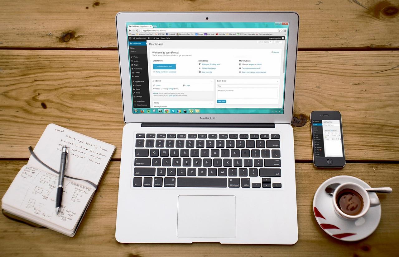
Are you tired of your WordPress website slowing down because of heavy images? You’re not alone! In today’s fast-paced digital world, users expect websites to load in the blink of an eye. If your images are taking too long to display, you might be losing potential visitors—and that’s not something you want. Luckily, serving scaled images is a simple, effective solution to this common problem. In this article, we’ll walk you through the ins and outs of scaling images for optimal performance on your WordPress site. By the end, you’ll not only know how to speed up your website, but you’ll also enhance user experience and boost your SEO. So, let’s dive in and transform your image game!
Understanding the Importance of Scaled Images for Your Website
When it comes to web design, the role of images cannot be overstated. They are not just decorative elements; they are essential for grabbing attention and conveying information. However, serving images that are not properly scaled can lead to a host of problems that ultimately affect user experience and website performance.
Why is Image Scaling Important?
Faster Load Times: Large, unscaled images can significantly slow down your website. Users are less likely to stay on a page that takes too long to load.
Better SEO: Search engines favor sites that load quickly. Scaled images help improve your website’s speed, potentially boosting your rankings.
Enhanced User Experience: Properly scaled images ensure that your content looks good on all devices, from desktops to smartphones, making it more likely that visitors will engage with your site.
For WordPress users, ensuring that images are scaled correctly is a breeze with the right tools and plugins. For instance, using plugins like Smush or Imagify can automatically optimize and scale images as you upload them to your media library. Not only do these plugins compress images, but they also ensure that your images are the right size for your specific theme and layout.
Another key aspect of serving scaled images is the use of responsive design. By implementing CSS techniques such as max-width: 100%; and height: auto;, you can ensure that images resize properly across different screen sizes without losing quality. This approach not only enhances the visual appeal but also helps in maintaining a consistent user experience.
To illustrate the impact of image scaling, consider the following comparison of load times with and without optimized images:
Image Type
Load Time (Seconds)
Unscaled Image (2MB)
5.2
Scaled Image (200KB)
1.2
As you can see, scaling your images can drastically reduce load times, which is vital for keeping your visitors engaged and reducing bounce rates.
prioritizing scaled images is not just a technical requirement; it’s a strategic decision that can elevate your website’s performance. With a few easy adjustments and the right tools, you can make a significant impact on your site’s speed, SEO, and overall user satisfaction. Don’t underestimate the power of a well-optimized image!
Identifying the Right Image Sizes for Your Needs
Choosing the correct image sizes for your WordPress website is essential for both user experience and site performance. The right dimensions ensure that images load quickly without sacrificing quality, enhancing overall site aesthetics while maintaining functionality.
Here are some factors to consider when determining the ideal image sizes:
Purpose of the Image: Are you using the image as a header, in a gallery, or as a featured image? Each serves different purposes and may require different sizes.
Screen Resolution: With the variety of devices available today, consider responsive images that adapt to different screen sizes—desktop, tablet, and mobile.
Image Format: JPEG, PNG, and WebP formats each have unique benefits. JPEG is great for photographs, while PNG is excellent for graphics with transparency.
WordPress automatically generates several image sizes upon upload. You can customize these sizes through the media settings, allowing you to define dimensions that best fit your design. Here’s a quick guide to standard sizes:
Image Type
Recommended Size
Thumbnail
150 x 150 px
Medium
300 x 300 px
Large
1024 x 1024 px
Full Size
Original Upload Size
For optimal performance, consider using images that are no larger than necessary. For example, a full-width banner could be processed at a maximum of 1920 pixels wide, while a blog post image might only need to be 800 pixels wide. Scaling down effectively without losing quality can be achieved through image editing tools prior to upload.
Another helpful strategy is to leverage image compression tools to reduce file sizes without compromising quality. Plugins like Smush and ShortPixel allow you to optimize images effortlessly, ensuring faster load times and improved user experience.
Lastly, always test your images on various devices and screen sizes after implementation. This helps guarantee that your content is visually appealing across platforms, ultimately leading to a more engaging experience for your visitors.
Exploring WordPress Built-In Image Resizing Features
When it comes to optimizing your WordPress website, one of the standout features is its built-in image resizing capabilities. Understanding how to leverage these features can significantly enhance your site’s performance and user experience. Let’s dive into the essentials!
WordPress automatically generates multiple image sizes when you upload an image. These sizes include:
Thumbnail: Typically, 150×150 pixels, perfect for galleries or previews.
Medium: Generally around 300×300 pixels, ideal for blog post images.
Large: Usually 1024 pixels wide, suitable for featured images.
This automatic resizing not only saves you time but also ensures that your images are optimized for various placements on your site. By using the correct size for each context, you can improve load times and provide a better experience for your visitors.
To manage these sizes, navigate to Settings > Media in your WordPress dashboard. Here, you can adjust the dimensions to better suit your specific needs. Tailoring these settings ensures that you’re not serving unnecessarily large images, which can drastically slow down your site.
Furthermore, after customizing the media sizes, it’s essential to regenerate thumbnails for previously uploaded images. You can easily do this by installing a plugin such as Regenerate Thumbnails. This tool allows you to update your old images to the new sizes, ensuring consistency across your site.
Consider using the following table to help you visualize the benefits of serving scaled images:
Image Size
Best Use
Performance Impact
Thumbnail
Galleries, Widgets
Low
Medium
Blog Posts
Medium
Large
Featured Images
High
Adopting these built-in features not only simplifies your workflow but also aligns with SEO best practices. Smaller images result in faster loading times, which can improve your search engine rankings. Remember, Google places significant importance on page speed; thus, optimized images can play a crucial role in driving traffic to your site.
always keep in mind the importance of using appropriate file formats. For images with many colors, opt for JPEG to maximize quality, while PNG works well for images requiring transparency. By choosing the right format alongside WordPress’s resizing capabilities, you’ll achieve the best balance between quality and performance.
Using Image Optimization Plugins Effectively
When it comes to enhancing the performance of your WordPress website, using image optimization plugins can be a game-changer. These plugins can automatically compress and scale images, ensuring that your site loads faster without compromising quality. Here’s how to make the most of these powerful tools:
Choose the Right Plugin
Not all image optimization plugins are created equal. Here are some top choices that stand out:
Smush: Known for its user-friendly interface, Smush compresses images without any noticeable loss in quality.
Imagify: Offers various levels of compression and integrates seamlessly with your media library.
ShortPixel: Provides excellent optimization options, including WebP conversion for even smaller file sizes.
Configure Settings Wisely
Once you’ve chosen a plugin, it’s crucial to configure its settings properly. Make sure to:
Set the appropriate image dimensions that match your theme’s requirements.
Enable automatic optimization for new uploads so that your workflow remains uninterrupted.
Regularly check for updates to ensure compatibility and security.
Utilize Bulk Optimization Features
If you have a lot of images already uploaded, take advantage of the bulk optimization feature many plugins offer. This can save you tons of time and ensure that all your existing images are optimized for performance. You might find the results surprising, as even minor reductions can significantly speed up your site.
Monitor Performance
After optimizing your images, keep an eye on your website’s performance. Use tools like Google PageSpeed Insights or GTmetrix to analyze how your site performs before and after optimization. This data can help you see the tangible benefits of your efforts.
Understand Different Image Formats
Different image formats serve different purposes. Here’s a quick rundown:
Format
Best Use
JPEG
Photographs where color depth is essential.
PNG
Images requiring transparency and sharp lines, like logos.
WebP
Next-gen format that provides high quality at smaller sizes.
Regularly Audit Your Images
Image optimization should be an ongoing practice. Regularly audit your images to ensure they remain optimized. Over time, new formats may become available, or your website’s needs may change, requiring you to reassess your image strategy.
By taking advantage of image optimization plugins and applying these strategies, you’ll not only improve your site’s loading speed but also enhance the overall user experience. A faster website leads to lower bounce rates and better SEO rankings, making it a win-win for your WordPress site.
How to Choose the Best File Formats for Your Images
When it comes to displaying images on your WordPress site, the format you choose can significantly impact both the visual quality and the loading speed. Understanding the different image file formats will help you serve scaled images that look great without compromising performance.
Here are some of the most common image formats to consider:
JPEG: Ideal for photographs and images with complex colors.
PNG: Best for images with transparent backgrounds or when you need higher quality.
GIF: Perfect for simple animations and images with fewer colors.
Each format has its strengths and weaknesses, and the right choice often depends on the specific use case. For instance, while JPEGs provide good quality at smaller file sizes, they can suffer from compression artifacts if over-processed. On the other hand, PNGs maintain high quality but may result in larger file sizes, which can slow down your site.
When scaling images, it’s essential to balance quality and performance. If you are using images predominantly for the web, consider opting for WebP, as it combines the best of both worlds—excellent quality at a reduced size. Most modern browsers support this format, making it a reliable choice for your WordPress site.
Another factor to consider is responsive design. You want to ensure that images render appropriately on all devices. Using CSS media queries, you can serve different image formats based on the user’s device. This approach allows for flexibility and ensures that users always experience the best possible image quality, regardless of whether they’re on a mobile or desktop device.
Now, take a look at this simple table that summarizes the best uses for each image format:
Format
Use Case
Advantages
Disadvantages
JPEG
Photographs
Smaller file size, good quality
Lossy compression can reduce quality
PNG
Transparent images
High quality, supports transparency
Larger file size
GIF
Simple animations
Animation support, small size
Limited color palette
WebP
Web graphics
High quality, smaller size
Not supported by all browsers
remember to optimize your images before uploading them to your WordPress site. Use plugins like Smush or ShortPixel to compress images without losing quality. Optimized images not only load faster but also improve your site’s ranking on search engines, giving you an edge over the competition.
Setting Up Responsive Images for Enhanced User Experience
In today’s digital landscape, having images that look great on all devices is crucial for keeping visitors engaged. Responsive images allow your content to adapt seamlessly to various screen sizes, ensuring that your website delivers an optimal experience whether someone is browsing on a smartphone, tablet, or desktop. This not only helps in retaining your audience but also enhances your SEO, as search engines favor user-friendly websites.
To set up responsive images in WordPress, start by utilizing the built-in image sizes feature. This allows you to automatically generate multiple sizes of each image you upload. By doing so, WordPress can serve the most appropriate size based on the device accessing your site. You can configure image sizes through the Settings > Media menu in your WordPress dashboard, where you can specify dimensions for thumbnail, medium, and large images.
Next, ensure that you’re using the element and the srcset attribute in your image tags. This will give browsers the necessary information to choose the best image size for the user’s device. Here’s a simple example:
In the above code, the browser will load small.jpg for devices with a maximum width of 600px, medium.jpg for those up to 1200px, and large.jpg as a fallback for larger screens. This approach drastically reduces load times and improves user experience.
Don’t forget to optimize your images before uploading them to your WordPress media library. Use a tool like Adobe Photoshop, GIMP, or online services like TinyPNG to compress images without significant loss of quality. This not only speeds up page load times but also saves bandwidth, making your site more efficient.
For a more automated approach, consider using plugins like Smush or Imagify. These plugins can handle image optimization and provide responsive images without needing to manually adjust settings. They also allow you to serve scaled images based on user devices, enhancing performance effortlessly.
Image Size
Recommended Max Width (px)
Use Case
Thumbnail
150
Blog post previews, galleries
Medium
300
Content blocks, sidebars
Large
1024
Full-width images
always test your images on multiple devices to ensure they render correctly. Tools like Google’s Lighthouse can help analyze your site’s performance and provide insights on image usage. By investing time into setting up responsive images, you’ll create a more engaging and visually appealing experience for your visitors, encouraging them to stay longer and return more often.
Leveraging Lazy Loading to Improve Page Load Times
In the ever-evolving world of web design, lazy loading has emerged as a game-changing technique, particularly for image-heavy sites like those built on WordPress. By deferring the loading of images until they are actually needed, you not only enhance user experience but also significantly improve page load times. This is especially crucial for retaining visitors who expect fast and fluid browsing.
When you implement lazy loading, your website will load faster because it only fetches images as they come into the user’s viewport. Here’s how you can effectively leverage this technique:
Utilize Native Lazy Loading: HTML now supports native lazy loading with the `loading=”lazy”` attribute in the `` tag. This means you can add just a simple attribute without needing extra scripts.
Use a Lazy Loading Plugin: For those who prefer a more hands-off approach, WordPress offers numerous plugins that handle lazy loading for you. Options like WP Rocket and a3 Lazy Load are user-friendly and set up quickly.
Combine with Scaled Images: Ensure that your images are not only lazy-loaded but also scaled appropriately. This reduces the initial payload of your webpage, allowing users to load what’s necessary right away.
Lazy loading not only boosts performance but also enhances your site’s SEO. Search engines favor faster-loading pages, which means your rankings can improve as a result. The following table shows a comparison of loading times with and without lazy loading:
Scenario
Load Time (in seconds)
Without Lazy Loading
5.2
With Lazy Loading
2.3
Implementing lazy loading can also lead to reduced bandwidth usage. This is particularly beneficial for users on mobile devices or with limited data plans. When combined with scaled images, the savings multiply, leading to a leaner, more efficient website that appeals to a broader audience.
don’t forget to test your website after implementing lazy loading. Tools like Google PageSpeed Insights or GTmetrix can provide valuable feedback on your site’s performance. You’ll want to ensure that the user experience remains seamless, even as you adopt new technologies. With lazy loading, your WordPress website can not only look stunning but also perform like a champion!
Testing and Analyzing Image Performance on Your Site
When it comes to enhancing the user experience on your WordPress website, image performance is a crucial factor that often gets overlooked. Ensuring your images are optimized for speed and quality can significantly impact your site’s loading time and overall performance. Here are some effective strategies for testing and analyzing how images perform on your site:
Use Image Optimization Tools: Start by leveraging tools like GTmetrix, Google PageSpeed Insights, or Web.dev to analyze your pages. These tools can provide detailed reports on image load times and suggest optimizations.
Monitor Loading Times: Regularly track how quickly your images load on different devices and network speeds. This can help you identify if your images are slowing down your website.
Check for Lazy Loading: If you haven’t already, implement lazy loading techniques. This allows images to load only when they enter the viewport, significantly improving initial load times.
After you’ve implemented image optimization techniques, it’s essential to analyze their impact continuously. Here are a few metrics to keep an eye on:
Page Load Time: See how changes in image size and format affect your site’s loading speed. Ideally, aim for a load time of under 3 seconds.
First Contentful Paint (FCP): This metric indicates when the first pixel is rendered on the screen. If your images are optimized, this should improve.
Time to Interactive (TTI): Ensure that users can interact with your site quickly. Large images can delay interactivity.
Another effective way to assess your images’ performance is by creating a comparative analysis. You can use a simple data table to keep track of before-and-after metrics for your image optimizations:
Image Type
Before Optimization (KB)
After Optimization (KB)
Load Time (seconds)
JPEG
500
250
1.2
PNG
300
150
0.8
WebP
400
200
1.0
Based on the results, you can make informed decisions on which image formats and sizes work best for your audience. Additionally, consider running A/B tests with different image sizes and formats to see which versions resonate more with your visitors.
Ultimately, the goal is to create a seamless browsing experience for your users. Regular testing and analysis of image performance can lead to improved engagement, lower bounce rates, and an overall better ranking in search engines. By consistently monitoring these metrics and making data-driven adjustments, you’ll ensure that your WordPress website remains appealing and functional, no matter the device it’s viewed on.
Common Mistakes to Avoid When Serving Scaled Images
When it comes to serving scaled images on your WordPress website, avoiding common mistakes can make a significant difference in both performance and user experience. Here are some pitfalls to steer clear of:
Ignoring Image Dimensions: Always specify the width and height attributes for your images. This helps the browser allocate space for images while they load, preventing layout shifts that can frustrate your visitors.
Using Incorrect File Formats: Different formats have different strengths. For example, JPEG is great for photographs, while PNG works better for images with transparency. Using the wrong format can increase load times unnecessarily.
Neglecting Image Compression: Serving high-resolution images without compression can result in hefty file sizes. Use tools like Smush or Imagify to compress images without sacrificing quality.
Failing to Use Responsive Images: Utilize the srcset attribute to serve different image sizes based on the device. This ensures users on mobile devices aren’t downloading unnecessarily large images, enhancing their experience.
Additionally, be cautious with the following:
Not Leveraging Lazy Loading: Enabling lazy loading for images can significantly improve your page’s initial load time. This technique loads images only when they are about to enter the viewport, saving bandwidth and improving performance.
Overlooking CDN Usage: A Content Delivery Network can distribute your images across various geographical locations, reducing latency and improving load times for users worldwide. Don’t miss out on this optimization.
Disregarding Alt Text: Not only does alt text serve accessibility purposes, but it also aids in SEO. Ensure all images have descriptive alt text to enhance both user experience and search engine visibility.
To help visualize these mistakes, refer to the table below:
Common Mistakes
Impact
Ignoring Image Dimensions
Causes layout shifts and affects UX
Using Incorrect File Formats
Increases load times
Neglecting Image Compression
Hefty file sizes
Failing to Use Responsive Images
Poor performance on mobile devices
By being mindful of these common mistakes, you can enhance the performance of your WordPress site and provide a better experience for your visitors. Remember, serving images correctly isn’t just about aesthetics; it’s about functionality, speed, and accessibility.
Tips for Maintaining Image Quality While Scaling
When it comes to scaling images for your WordPress website, preserving image quality is paramount. Here are some actionable tips to ensure your images maintain their sharpness and clarity, even when resized:
Choose the Right Format: Use the appropriate image format for your content. JPEGs are great for photographs, while PNGs are ideal for graphics with transparency. WebP is a newer format that provides high quality at smaller file sizes.
Use an Image Optimization Plugin: Leverage tools like Smush or ShortPixel to automatically compress images while maintaining quality. These plugins can help you resize images without losing essential details.
Scale Images Before Uploading: Always scale your images to the dimensions you need before uploading them to your WordPress site. This minimizes the need for WordPress to automatically resize them, which can lead to quality loss.
Implement Responsive Images: Make use of the `srcset` attribute to deliver different image sizes based on the user’s device. This ensures that users always receive the best quality image for their screen size.
Check Your Image Settings: In your WordPress media settings, ensure that the maximum dimensions for large, medium, and thumbnail images are set appropriately. This allows WordPress to generate optimized versions while preserving quality.
Another effective method to maintain image quality is to consider the image resolution. Generally, a resolution of 72 DPI is sufficient for web images, but for some applications, higher resolutions may be necessary. Always keep your original, high-resolution files saved for future use.
It’s also beneficial to monitor your website’s load times. Excessively large images can slow down your site, negatively impacting user experience and SEO. A balance between image quality and performance is crucial.
Image Format
Best Use
Quality vs. Size
JPEG
Photographs
Medium Quality/Low Size
PNG
Graphics with Transparency
High Quality/Medium Size
WebP
General Web Use
High Quality/Very Low Size
Lastly, remember to test your images across different devices and screen sizes. What looks good on a desktop may not translate well to a mobile device. Regularly review your website to ensure your images consistently deliver a great user experience.
Implementing a Content Delivery Network for Faster Delivery
Integrating a Content Delivery Network (CDN) into your WordPress website is a game changer when it comes to delivering scaled images swiftly and efficiently. By using a CDN, you can distribute your image files across multiple servers worldwide, which significantly reduces the load time for your users, regardless of their geographical location. Why should you consider it? Let’s break it down!
Firstly, speed is key. A CDN caches your website images and content on various servers located closer to your users. This means that when someone visits your site, they fetch the data from the nearest server, dramatically decreasing loading times. Here are some benefits of implementing a CDN:
Reduced Latency: Users receive images from the nearest server, minimizing delays.
Scalability: Easily manage large volumes of traffic without impacting performance.
Enhanced Security: CDNs often provide DDoS protection and secure token authentication.
Improved Reliability: Content remains accessible even during high traffic or server outages.
Next, let’s talk about how to set up a CDN with your WordPress site. Most CDN providers offer user-friendly plugins that seamlessly integrate with WordPress, making setup a breeze. Here’s a quick overview of the process:
Choose a reliable CDN provider (e.g., Cloudflare, StackPath, or Amazon CloudFront).
Install the CDN plugin from your WordPress dashboard.
Configure the plugin by linking it to your CDN account.
Set up caching rules and specify which content types to serve via the CDN.
Test your site to ensure images load correctly from the CDN.
To visualize the benefits, consider a comparison of load times with and without a CDN. Check out the table below:
Scenario
Load Time (seconds)
Without CDN
3.5
With CDN
1.2
Implementing a CDN doesn’t just enhance speed; it also optimizes your images for various devices. Most CDN services offer automatic image scaling and format conversion, ensuring your images look great on any screen while keeping file sizes small. This means that your visitors will enjoy stunning visuals without the wait!
adding a CDN to your WordPress website is not just a technical upgrade; it’s a strategic move that significantly boosts user experience and site performance. By delivering your scaled images swiftly, you not only enhance your site’s speed but ultimately contribute to better engagement and conversion rates. Don’t miss out on the vast benefits a CDN can bring to your website!
Keeping Your Media Library Organized for Efficiency
When it comes to managing your media library in WordPress, organization is key to streamlining your workflow. A well-structured media library not only enhances efficiency but also improves the overall performance of your website. Here are some strategies to help you keep your media assets in check:
Use Descriptive Filenames: Before uploading images, rename them with clear, descriptive titles. For example, instead of “IMG_1234.jpg,” use “beach-sunset-hawaii.jpg.” This practice improves SEO and makes it easier to find specific files later.
Create Folders: While WordPress doesn’t provide built-in folders, you can use plugins to categorize your media files. Consider organizing by project, date, or content type to simplify your search process.
Utilize Tags: Tags are a great way to add additional layers of organization. Use them to label images based on themes, events, or campaigns, allowing for quick retrieval.
Regularly Audit Your Library: Periodically review your media library to delete unused files. This will not only free up space but also enhance your website’s loading speed.
Additionally, take advantage of WordPress’s built-in features to optimize your images for better performance:
Image Format
Best Use
Pros
Cons
JPEG
Photographs
Small file size, good quality
Lossy compression
PNG
Graphics with transparency
High quality, lossless compression
Larger file size
WebP
General use for web
Smaller size, good quality
Limited browser support
By understanding the different image formats available and their optimal usage, you can significantly enhance the performance of your site. Moreover, consider implementing responsive images using the srcset attribute. This allows browsers to choose the right image size based on the user’s screen resolution, which can drastically improve loading times on mobile devices.
Lastly, never underestimate the power of using a content delivery network (CDN). A CDN can host your images and serve them from locations closer to your visitors, reducing load times and improving the user experience. Setting up a CDN might require some initial effort, but the benefits of faster load speeds and improved SEO are well worth it.
Regularly Updating and Maintaining Your Image Strategy
In the fast-paced digital landscape, your image strategy is not a one-time setup; it requires consistent attention and refinement. Regular updates ensure that your images not only remain visually appealing but also align with the evolving standards of web performance and user experience. This proactive approach enhances site speed and fosters a responsive design that appeals to your audience.
Start by auditing your current image library. Check for outdated images that might no longer reflect your brand’s image or messaging. During this audit, consider the following:
Are the images optimized for quick loading times?
Do they maintain a consistent style that aligns with your current branding?
Are there any high-resolution images that could be compressed without sacrificing quality?
Next, leverage tools and plugins that automate the optimization process. WordPress offers various plugins designed to help you maintain your image strategy effortlessly. For instance, plugins like Smush or EWWW Image Optimizer can automatically compress images upon upload, ensuring that your site stays fast and responsive. This saves you precious time and minimizes manual effort.
Another vital practice is monitoring website performance. Use tools such as Google PageSpeed Insights or GTmetrix to analyze how images affect your loading times. Create a regular schedule—perhaps monthly or quarterly—to review performance metrics. This will help you identify slow-loading images and make necessary adjustments to enhance user experience.
When updating your image strategy, stay informed about trends in image formats. WebP, for example, is a modern format that provides superior compression. Transitioning to newer formats can significantly reduce file sizes while maintaining quality, which is crucial for faster loading speeds. Keep your eye on emerging technologies that could further improve your website’s efficiency and user experience.
Don’t forget to consider the accessibility of your images. Use alt tags effectively to describe images; this not only aids SEO but ensures that visually impaired users can also engage with your content. It’s a simple but significant step in making your website more inclusive.
consider incorporating a feedback mechanism. Engage your site visitors through surveys or comment sections to gather insights on their visual experience. Are there images they find appealing or unappealing? This feedback can provide valuable guidance for future updates and help shape your image strategy moving forward.
Final Thoughts on Scaling Images for Optimal Performance
When it comes to optimizing your WordPress website, scaling images isn’t just a technical requirement; it’s a vital component of creating an engaging user experience. By serving appropriately sized images, you can significantly enhance loading times and improve overall performance, which in turn can positively impact your search engine rankings.
One of the first steps in this process is to ensure that your images are not larger than necessary. Loading high-resolution images when smaller versions will suffice can lead to unnecessary bloat and slower load times. Consider the following tips to scale your images effectively:
Choose the Right Dimensions: Measure the space where the image will be displayed and adjust the dimensions accordingly.
Use Compression Tools: Utilize tools to compress images without compromising quality. Tools like ShortPixel or Imagify are excellent options.
Leverage Responsive Images: Implement the srcset attribute in your HTML to serve different image sizes based on the user’s device.
Consider Image Formats: Use WebP format for modern browsers to reduce file sizes further while maintaining quality.
Another essential factor is the use of plugins tailored for WordPress that can automate image optimization. Plugins such as Smush or WP Rocket not only assist in compressing images but can also help you serve scaled images dynamically based on the visitor’s device. This automation can save you time and ensure consistency across your website.
Furthermore, don’t underestimate the importance of a content delivery network (CDN). A CDN can cache your images and serve them from a location closer to the user, drastically reducing load times. Most CDN services come with built-in image optimization features, allowing you to automatically deliver scaled images without additional effort.
It’s also worthwhile to regularly audit your existing image library. Identify images that may no longer be relevant or that could be replaced with optimized versions. A clean, efficient media library will not only make it easier to manage your images but also enhance your site’s performance.
Lastly, keep an eye on your website’s performance metrics. Tools like Google PageSpeed Insights or GTmetrix can help you analyze how your images are impacting your load times. By continuously monitoring these metrics, you can make informed decisions about further optimization strategies.
Frequently Asked Questions (FAQ)
Q&A: How to Serve Scaled Images on Your WordPress Website
Q: Why should I care about serving scaled images on my WordPress site? A: Great question! Serving scaled images is crucial because it directly impacts your website’s performance and loading speed. When images are too large, they can slow down your site, leading to a poor user experience and higher bounce rates. Plus, search engines like Google favor faster websites, which means scaling your images properly can help improve your site’s SEO.
Q: What exactly does ‘serving scaled images’ mean? A: Serving scaled images means delivering images that are appropriately sized for the display dimensions they’ll be shown at on your website. Instead of uploading a huge image and relying on the browser to resize it, you create smaller, optimized versions that load faster and take up less bandwidth.
Q: How do I know what size to scale my images? A: The size depends on where you plan to use the image on your site. Measure the dimensions of the area where the image will appear (like a blog post or a header) and aim for that size. As a general rule, you don’t want to upload images wider than they need to be. A good practice is to keep images around 1200 pixels in width for full-screen display but adjust according to your theme’s specifications.
Q: What tools can I use to scale my images before uploading them? A: There are several tools you can use! Online editors like Canva or Pixlr are user-friendly options. If you prefer desktop solutions, software like Adobe Photoshop or GIMP can do the trick. Additionally, you might consider using WordPress plugins like Smush or EWWW Image Optimizer, which can automatically resize and compress images as you upload them.
Q: Can I scale images after I’ve already uploaded them? A: Absolutely! If you’ve already uploaded images that are too large, you can use WordPress’s built-in image editing feature to resize them. Just go to your Media Library, select the image, and click on “Edit Image.” From there, you can crop or resize as needed. Alternatively, plugins can help you bulk optimize existing images.
Q: What about responsive images? Do I need to worry about that too? A: Yes! Responsive images are super important for making sure your site looks good on all devices. WordPress automatically creates multiple sizes of each image you upload, so it serves the most appropriate size depending on the user’s device. Just ensure you’re using the correct image sizes when adding them to your posts or pages.
Q: What benefits can I expect from serving scaled images? A: You’ll see a noticeable improvement in your site’s loading times, which can boost user satisfaction and engagement. A faster site can lead to lower bounce rates, higher conversion rates, and improved SEO rankings. Plus, it’s just a better experience for your visitors—they’ll appreciate quick load times!
Q: Any final tips for serving scaled images effectively? A: Absolutely! Always preview your images before publishing to ensure they look sharp and fit well within your layout. Keep an eye on image formats too—consider using WebP for even better compression without losing quality. And remember, the more you optimize your images, the better your site will perform. Happy scaling!
To Conclude
serving scaled images on your WordPress website is not just a technical necessity; it’s a game changer for your site’s performance and user experience. By following the tips and techniques we’ve discussed, you can ensure that your images look stunning without slowing down your site. Remember, a faster website means happier visitors, better search engine rankings, and ultimately, more conversions.
So, why wait? Take the steps today to optimize your images, and watch your site transform into a lean, mean, user-friendly machine. If you have any questions or need further guidance, feel free to drop a comment below or reach out. We’re here to help you every step of the way on your journey to a better WordPress site. Happy optimizing!