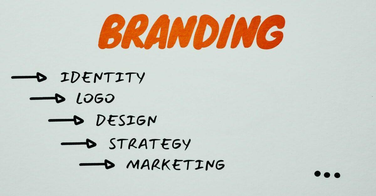
Unlocking the Secrets of Great Logo Design: Tips That Work for Everyone
Hey there! So, you’ve got a brilliant business idea or a passion project that’s ready to take flight, but there’s just one tiny hurdle: your logo. You might think that crafting a standout logo is reserved for the design-savvy folks out there, but fear not! You don’t need to be a professional designer to create a logo that captures the essence of your brand and resonates with your audience. In this article, we’re diving into some practical logo design tips that actually work—yes, even if you’ve never picked up a graphic design tool in your life. Get ready to unleash your creativity, because with a little guidance and a few essential principles, you’ll be well on your way to designing a logo that not only looks good but also tells your brand’s unique story. Let’s get started!
Understanding the Importance of a Great Logo
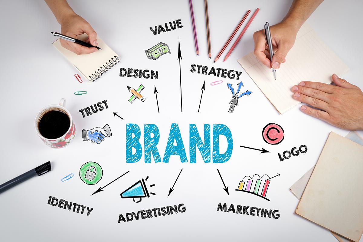
A logo is more than just a pretty image; it’s the foundation of your brand’s identity. Think of it as your business’s first impression. A well-crafted logo can communicate the essence of your brand, evoke emotions, and foster trust with your audience. Here’s why investing time and effort into creating a great logo is essential.
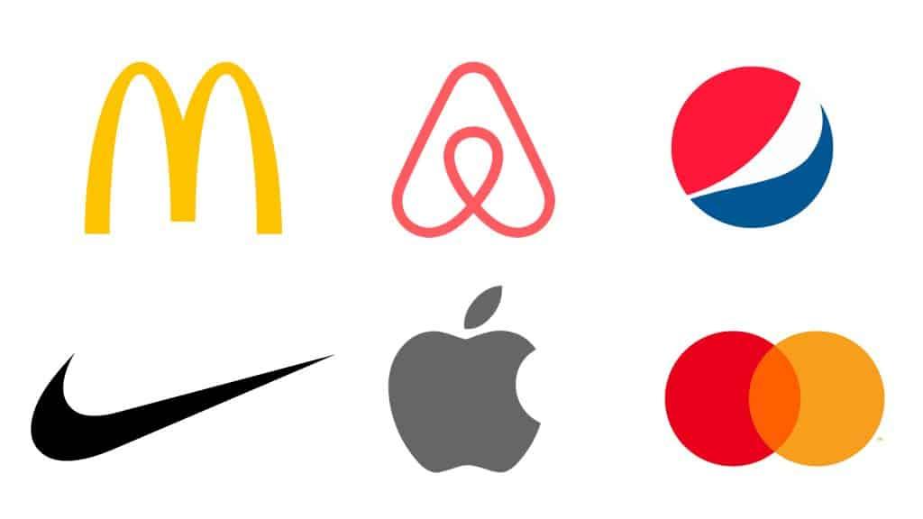
Recognition and Memorability: A striking logo can make your brand instantly recognizable. It’s often the first thing potential customers notice. An effective logo sticks in the memory, making it easier for people to remember your brand when they need your services or products. For example:
- McDonald’s golden arches
- Nike’s swoosh
- Apple’s bitten apple
These logos are simple, yet they carry powerful associations with their respective brands, demonstrating the importance of strong visual identities.
Differentiation in a Crowded Market: In a competitive landscape, a unique logo sets you apart from your competitors. If you think about your niche, you will likely find several businesses offering similar products or services. A distinctive logo can help you stand out and become the preferred choice. Consider how:
- A logo reflects your brand’s personality and values.
- It can convey the quality or uniqueness of your offerings.
By understanding your target audience and aligning your logo with their preferences, you can carve out a niche in the market.
A Logo Builds Trust: In today’s digital age, consumers are increasingly cautious about where they spend their money. A professional logo can instill confidence and credibility. When your logo looks polished and well-designed, it sends a signal that you care about quality and professionalism. A study by Design Council revealed that people are more likely to trust and purchase from brands with professional aesthetics.
Versatility and Adaptability: A great logo should be versatile enough to look good on various mediums, from business cards to billboards. It should also maintain clarity in both color and monochrome formats. Consider creating different versions of your logo for different applications, ensuring that your brand remains consistent, no matter where it appears.
Emotional Connection: Logos can evoke feelings and create a connection with your audience. Colors, shapes, and typography all play a role in how people perceive your brand. For instance:
| Color | Emotion |
|---|---|
| Red | Excitement, Passion |
| Blue | Trust, Calmness |
| Green | Growth, Health |
| Yellow | Optimism, Happiness |
Understanding these associations can help you select colors that resonate with your audience and reinforce your brand message.
a great logo is a multifaceted tool that not only represents your brand visually but also communicates its core values, builds trust, and creates lasting impressions. When embarking on your logo design journey, remember that simplicity, uniqueness, and emotional resonance are crucial elements that can significantly impact your brand’s success.
Identifying Your Brand’s Core Message
Knowing your brand’s core message is crucial in guiding your logo design process. It acts as the foundation upon which your entire visual identity is built. When potential customers encounter your brand, they should immediately grasp what you stand for, what you offer, and why it matters. Here’s how to distill that essence into a compelling message.
Start by asking yourself:
- What problem does my brand solve?
- Who is my target audience?
- What unique value do I provide?
- What emotions do I want my audience to feel?
Once you have clear answers to these questions, you can craft a message that resonates. Your message should be succinct, ideally one or two sentences that encapsulate your brand’s identity. Think of it as your brand’s elevator pitch—brief but powerful.
Here’s a simple formula to guide you:
| Element | Description |
|---|---|
| Your Brand | Who you are (brand name) |
| What You Do | What products or services you provide |
| Target Audience | Who benefits from what you offer |
| Unique Selling Proposition | What sets you apart from competitors |
With these elements in mind, try to formulate a statement that reflects your brand’s personality. For instance, if your brand is a tech startup, your message might highlight innovation and creativity. If you’re a wellness brand, focus on health and well-being.
Remember, consistency is key. Your core message should seamlessly translate into your logo design. Colors, fonts, and shapes should echo the feelings and values encapsulated in your message. For instance, a brand that aims to promote calmness may choose soft colors and rounded shapes, while a tech brand might opt for sleek lines and bold colors.
Lastly, don’t hesitate to seek feedback from your audience. Share your core message and initial design concepts with customers or peers to gauge their reactions. Their insights can refine your message and ensure it resonates with your target market.
Researching Your Competitors for Inspiration
When embarking on your logo design journey, one of the most effective strategies is to look at what your competitors are doing. This doesn’t mean copying their designs, but rather examining their approaches to gain insight and inspiration. Understanding the landscape of your industry can help you identify trends, preferences, and even gaps that your own logo could fill.
Start by identifying your main competitors. Who are the leaders in your niche? Take note of both direct competitors and those in adjacent markets. A comprehensive list can provide a wealth of inspiration. Once you have your list, dive deep into their branding:
- Color Schemes: What colors do they use? Are there commonalities among successful logos in your industry?
- Typography: How do they choose their fonts? Consider whether their typography conveys the right tone for your brand.
- Imagery: What graphics or icons do they incorporate? This can help you decide if you want to use similar elements or differentiate yourself.
Next, analyze the messages they communicate through their logos. A logo isn’t just a pretty picture; it’s a visual representation of a brand’s identity and values. Ask yourself:
- What emotions do their logos evoke?
- How do they align their logo with their overall branding strategy?
- Is there a story behind their logo that resonates with their audience?
After gathering data, create a competitive analysis table to visualize your findings. This can clarify what works and what doesn’t in your industry, helping you make informed design choices:
| Competitor | Color Scheme | Typography | Key Elements |
|---|---|---|---|
| Brand A | Blue and White | Sans-serif, Bold | Modern Icon |
| Brand B | Green and Black | Serif, Elegant | Nature Motif |
| Brand C | Red and Yellow | Display, Playful | Abstract Shapes |
With this information, you can start brainstorming ideas for your own logo. Consider how you can incorporate elements that resonate well with your target audience while ensuring your logo stands out in a crowded marketplace. Don’t hesitate to experiment with different combinations of colors, fonts, and imagery until you find a unique representation of your brand.
Lastly, remember that your logo should not only reflect current trends but also possess timeless appeal. By understanding your competitors, you can carve out a distinct identity that speaks to your audience, captures their attention, and communicates your brand’s values effectively.
Choosing the Right Colors for Emotional Impact
When it comes to logo design, color selection plays a crucial role in conveying the right message and evoking the desired emotions. Colors have the power to influence perceptions and decisions, making it essential to choose hues that align with your brand identity. Here’s how to harness the emotional impact of colors effectively.
Understanding Color Psychology is key. Different colors evoke different feelings and associations. For instance:
- Red: Passion, energy, and urgency.
- Blue: Trust, calmness, and professionalism.
- Yellow: Optimism, happiness, and clarity.
- Green: Growth, health, and tranquility.
- Purple: Luxury, creativity, and wisdom.
- Black: Elegance, power, and sophistication.
Knowing what feelings you want your audience to associate with your brand is the first step. For example, if you’re launching a health-related service, green might be your go-to choice, while a tech startup might lean towards blue to convey trust.
Another important factor is color combinations. The way colors interact can significantly affect the overall message. Using complementary colors can create a striking effect, whereas analogous colors can evoke a sense of harmony. Consider these pairings:
| Color Pairing | Emotional Effect |
|---|---|
| Blue & Yellow | Trust and optimism |
| Red & Black | Power and intensity |
| Green & Brown | Natural and organic |
| Purple & Gold | Luxury and creativity |
It’s also essential to consider cultural implications. Colors can have varied meanings across different cultures and regions. For example, while white is often associated with purity in Western cultures, it can signify mourning in some Eastern traditions. Always keep your target audience in mind when selecting colors.
don’t forget about the context. Colors that look stunning on a screen may not have the same effect when printed. Test your logo in multiple formats and settings to ensure that the emotional impact remains consistent across platforms. This can help solidify your brand identity and ensure recognition.
Selecting Fonts That Reflect Your Brand Personality
Choosing the right font is more than just picking something that looks good; it’s about finding a typeface that communicates the essence of your brand. Fonts carry emotional weight and can significantly influence how your audience perceives your business. Here’s how to make that choice effectively:
- Understand Your Brand Personality: Are you fun and playful, or serious and professional? Define your brand’s personality clearly, as this will guide your font choice. For instance, a tech startup might opt for sleek, modern fonts, while a children’s toy company might go for rounded, whimsical styles.
- Consider Your Audience: Think about who you are trying to reach. What fonts resonate with them? A youthful audience may gravitate toward bold, trendy fonts, while a luxury brand might choose elegant serifs.
- Test for Versatility: Your font should look good in various contexts—on your website, in print, and on social media. Ensure that the typeface you select maintains readability and impact at different sizes.
- Pair Wisely: If you’re using more than one font, they should complement each other. A common approach is to pair a bold display font for headings with a simpler body font for readability.
When selecting fonts, keep in mind the emotional response you want to evoke. For example:
| Font Style | Emotional Response |
|---|---|
| Serif | Trustworthiness, Tradition |
| Sans-serif | Modernity, Simplicity |
| Script | Elegance, Creativity |
| Display | Fun, Excitement |
Lastly, don’t underestimate the power of whitespace. A well-chosen font that is properly spaced can enhance clarity and legibility, making your message clearer. Font selection is an art that blends creativity with strategy, so take your time exploring the options that best resonate with your brand’s unique voice.
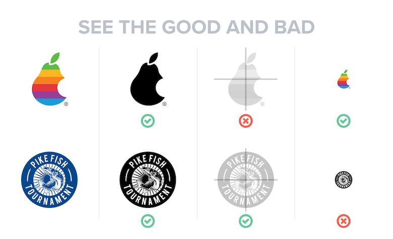
Simplicity is Key: Why Less is More
In the world of logo design, embracing a minimalist approach can significantly enhance your brand’s visibility and memorability. When crafting a logo, less truly is more. A clean, simple design often resonates more effectively with audiences than intricate, complicated graphics. This principle can guide you in creating a logo that stands the test of time.
To achieve a successful minimalist logo, consider focusing on these key elements:
- Color Palette: Select a limited color palette to keep your design cohesive. A couple of well-chosen colors can evoke emotions and establish brand recognition.
- Typography: Choose fonts that align with your brand’s personality. A clean, readable typeface often communicates professionalism and clarity.
- Iconography: If you opt to include an icon, ensure it’s straightforward and easily recognizable. Avoid overly complex shapes or designs.
- Negative Space: Utilize negative space effectively to create balance and make your logo visually interesting without cluttering it.
Moreover, simplicity aids in versatility. A logo that scales well across various mediums—business cards, websites, billboards—will help maintain brand consistency. When your logo can be easily adapted without losing its essence, it becomes a powerful tool for your brand identity.
Consider these examples of iconic logos that embody this principle:
| Logo | Brand | Why It Works |
|---|---|---|
| Apple | Simple apple silhouette represents innovation and quality. | |
| Nike | The swoosh signifies movement and speed with minimal design. | |
| Adobe | Bold lettering and simple geometric shape for instant recognition. |
When you strip down a concept to its essentials, you create a logo that is not only eye-catching but also effective in communicating your brand’s core message. This approach can simplify the design process, allowing even non-designers to create impactful logos with clarity and precision.
Ultimately, a focus on simplicity in logo design can lead to a more memorable brand. Investing time in refining your design to its most basic components will yield a logo that’s versatile, timeless, and resonates deeply with your audience.
Incorporating Versatility for Different Platforms
When designing a logo, one of the key considerations is how it will look across various platforms. A logo isn’t just a static image; it’s a versatile symbol that represents your brand in a multitude of contexts. Whether on social media, a website, or printed materials, your logo should maintain its integrity and impact.
Simplicity is Crucial: A complex design may look stunning on a large billboard but could lose its essence when shrunk down for a mobile app icon. Here are a few tips to keep your logo versatile:
- Avoid intricate patterns: Stick to clean lines and bold shapes.
- Limit colors: A color palette of 2-3 colors helps with recognition and reproduction.
- Think in black and white: Ensure the logo remains impactful even without color.
Test Across Platforms: Before finalizing your design, visualize how it appears on different platforms. Here’s a quick checklist to guide you:
| Platform | Size Recommendations | Design Considerations |
|---|---|---|
| Website | 250px - 300px | Should be scalable and clear |
| Social Media | 180px x 180px | High contrast for visibility |
| Print Materials | A4 / Letter Size | High-resolution files for quality |
Adaptability is Key: Your logo should adapt to various backgrounds—whether it’s a light or dark theme, or even a busy design. Consider creating variations of your logo:
- Full-color version for vibrant contexts.
- Single-color version for minimalistic approaches.
- Icon version that can be used in smaller spaces.
Get Feedback: Before launching your logo, gather feedback from your target audience. Use mockups to show how the logo functions in real-world applications. Understanding how potential customers perceive your logo across different platforms can provide invaluable insights.
a logo that thrives on every platform is a logo that truly embodies your brand’s essence. By ensuring versatility and adaptability in your design, you not only enhance brand recognition but also create lasting impressions that resonate with your audience.

Getting Feedback: The Value of Fresh Perspectives
When it comes to logo design, the opinions of others can be invaluable. Fresh perspectives can breathe life into your ideas, helping you to uncover aspects you might have overlooked. Whether you’re a seasoned designer or a novice, seeking feedback from various sources can sharpen your vision and enhance the effectiveness of your logo.
Here are some key reasons why gathering feedback is essential:
- Diverse Insights: Different people have different experiences and preferences. Their feedback can reveal insights that may not align with your own perspective.
- Clarifying Your Message: A logo needs to communicate your brand’s essence effectively. Others can help identify if your design conveys the intended message or if it requires tweaking.
- Spotting Potential Issues: Fresh eyes are often better at spotting design flaws or areas of confusion. They can tell you if the logo is too busy, lacks balance, or simply doesn’t resonate.
Consider creating a feedback loop by involving a variety of people in the process:
- Friends and Family: They can provide initial impressions and help you gauge emotional responses.
- Target Audience: Gather opinions from your potential customers to see if the logo appeals to them.
- Design Communities: Online platforms and forums can connect you with design enthusiasts who can offer constructive criticism.
To organize your feedback effectively, you might find it helpful to create a table to track opinions and suggestions. Here’s a simple template you can use:
| Source | Feedback | Action Required |
|---|---|---|
| Friend | Color palette is too bright | Consider softer tones |
| Target Audience | Logo feels outdated | Explore modern design trends |
| Online Forum | Font choice lacks readability | Test different font styles |
As you gather feedback, remember to approach it with an open mind. Not all suggestions need to be implemented, but understanding where others are coming from can lead to a more refined design. It’s about finding the right balance between your vision and the insights you receive.
consider iterating on your designs after receiving feedback. Making adjustments based on what you’ve learned can transform a good logo into a truly great one. Your logo serves as the face of your brand—ensure it accurately represents you and resonates with your audience by embracing the power of fresh perspectives.

Using Design Tools That Make It Easy
Creating a stunning logo doesn’t require a degree in graphic design. With the right tools at your disposal, anyone can craft a logo that resonates with their brand’s identity. The key is to leverage design tools that simplify the process while still offering flexibility for creativity. Here are some fantastic options that can help you get started:
- Canva: Intuitive and user-friendly, Canva provides a plethora of templates tailored specifically for logos. You can easily customize colors, fonts, and icons to match your brand’s personality.
- Adobe Spark: Perfect for those who want a bit more control, Adobe Spark allows you to create professional-quality logos with simple drag-and-drop functionality. You can start with a template or create your design from scratch.
- Looka: This AI-powered logo maker generates designs based on your preferences. Just input your brand’s details, and Looka will provide a range of logo options to choose from, making it easy to find the perfect fit.
- Figma: While more advanced, Figma offers collaborative features that make it ideal for teams. If you’re working with partners or friends, you can all contribute to the design in real time.
When using these tools, keep in mind the fundamental principles of logo design. A logo should be:
- Simplistic: Aim for a clean and uncomplicated design that can be recognized at a glance.
- Memorable: Utilize unique shapes or colors that draw attention and stick in the minds of your audience.
- Versatile: Ensure your logo looks great in various sizes and applications, from business cards to billboards.
- Timeless: Focus on classic elements that won’t look outdated in a few years.
As you explore these tools, don’t forget the importance of feedback. Platforms like Dribbble or Behance allow you to share your designs and get constructive criticism from fellow creatives. This community can offer invaluable insights that may refine your logo further.
Lastly, consider creating a visual style guide to accompany your logo. This guide can include:
| Element | Description |
|---|---|
| Color Palette | Define the primary and secondary colors used in your logo. |
| Typography | Specify the fonts that complement your logo design. |
| Usage Guidelines | Outline how to use the logo in different contexts, ensuring consistency. |
This not only helps maintain consistency across various platforms but also reinforces your brand identity. Ultimately, using these design tools and principles can dramatically enhance your logo creation experience, making it accessible and enjoyable—even for those without a design background.
Avoiding Common Logo Design Mistakes
When embarking on the journey of logo design, it’s easy to get caught up in the excitement and overlook some fundamental principles. Here’s how to steer clear of the pitfalls that can lead to a less-than-stellar logo.
Prioritize Simplicity: A great logo is not about complexity but clarity. The most memorable logos are often the simplest. Here are a few reasons why simplicity matters:
- Easier to Recognize: Simple logos are easier to remember and recognize.
- Versatile Usage: A straightforward design works across various platforms and sizes, from business cards to billboards.
- Timelessness: Trends may come and go, but a simple logo has a better chance of standing the test of time.
Avoid Overcomplicating with Fonts: Choosing the right font can make or break your logo. While it might be tempting to use elaborate typography, it’s essential to choose fonts that reflect your brand’s personality without overwhelming your design. Consider the following:
- Legibility: Always ensure your logo is legible at any size.
- Consistency: Align your font choice with your brand identity. A modern tech company might opt for sleek sans-serif fonts, while a luxury brand might prefer elegant serifs.
- Limit Styles: Stick to one or two font styles to maintain cohesion.
Color Choices Matter: Your color palette is crucial in conveying your brand’s message and evoking emotions. Here’s what to consider:
- Psychology of Color: Different colors evoke different feelings. For instance, blue conveys trust, while red often signifies excitement.
- Limit Your Palette: Choose 2-3 primary colors to keep your design focused and impactful.
- Consider Contrast: Ensure your logo is easily distinguishable against various backgrounds.
Testing and Feedback: Before finalizing your logo, gather feedback from a diverse group. Different perspectives can highlight issues you might overlook. Here’s how to effectively test your design:
- Informal Surveys: Share your logo with friends, family, or colleagues and ask for their impressions.
- Social Media Polls: Leverage your social media platforms to gauge public opinion.
- A/B Testing: If possible, test a couple of variations to see which resonates more with your audience.
Stay Clear of Trends: While it’s tempting to incorporate the latest design fads, your logo should be timeless. Consider the following:
- Think Long-Term: Trends fade; focus on elements that will remain relevant.
- Classic Elements: Incorporate classic design elements that have endured through time.
- Brand Values: Ensure your design reflects the core values and mission of your brand.
Testing Your Logo in Real-World Scenarios
Once you’ve designed your logo, the real test begins: seeing how it performs in real-world scenarios. This step is crucial because it allows you to gauge how your audience connects with your visual identity. Here are some effective methods to put your logo through its paces:
- Mock-ups: Use design software or online tools to create mock-ups of your logo on different products. This could include business cards, apparel, signage, or digital platforms. Seeing your logo in various contexts helps visualize its impact.
- User Feedback: Share your logo with a small focus group consisting of potential customers or colleagues. Their insights can pinpoint strengths and weaknesses that you may not have noticed.
- Social Media Tests: Post your logo on your social media accounts and track engagement metrics. This can provide immediate feedback on how well it resonates with your audience.
- Print Tests: Print your logo on different materials like paper, fabric, or even vinyl. Notice how colors and dimensions change in various formats and lighting conditions.
One of the most effective ways to evaluate your logo is by conducting A/B testing. This marketing strategy involves presenting two logo variations to different audience segments and measuring their reactions. You might consider the following parameters:
| Parameter | Variation A | Variation B |
|---|---|---|
| Engagement Rate | 5% | 7% |
| Brand Recall | 60% | 75% |
| Overall Preference | 40% | 60% |
This table illustrates how a simple logo tweak can lead to notable differences in audience perception and engagement. Use this data to inform your final design choices.
Another great tactic is to explore how your logo holds up against competitors. Conduct a competitive analysis by reviewing logos in your industry. Consider the following:
- Distinctiveness: Does your logo stand out from the competition?
- Relevance: Does it speak to your target audience and fit the industry standards?
- Versatility: How does it perform in various applications, from web to print?
remember that your logo is not just a static image but a dynamic element of your brand’s identity. Be prepared to iterate based on feedback and performance data. The more you test and refine, the closer you’ll get to a logo that truly encapsulates your brand’s essence and connects with your audience.
Finalizing and Protecting Your Logo Design
Once you’ve meticulously crafted your logo design, it’s time to finalize it and ensure it’s protected. After all, your logo isn’t just a pretty graphic; it’s a vital part of your brand identity. Here are some key steps to take:
- Get Feedback: Before you seal the deal, gather opinions from trusted friends, family, or colleagues. Their insights can help you identify any necessary tweaks that might enhance your design.
- Test It Out: Visualize your logo in real-world applications. Place it on business cards, social media profiles, and merchandise to see how well it translates. Does it still look good in black and white? Ensure versatility!
- Choose the Right Formats: Saving your logo in various file formats is crucial. Opt for scalable vector graphics (SVG) for versatility and PNG or JPEG for immediate use on web platforms. This ensures you always have the right version ready.
Once you’re satisfied with your design, the next step is protecting your hard work. You want to ensure that no one can use your logo without permission. Here are some essential protections to consider:
- Trademark Your Logo: This legal protection grants you exclusive rights to your logo and helps prevent others from using a similar design. It’s a worthwhile investment to secure your brand identity.
- Register Your Logo: Depending on your location, you may have options for registering your logo with local or national business registries, further solidifying your ownership.
- Document Everything: Keep records of your design process, including sketches and drafts. These documents can serve as proof of your ownership should any disputes arise.
consider creating a brand style guide. This document will outline how your logo should be used across various platforms, ensuring consistency in branding. A simple style guide might include:
| Element | Description |
|---|---|
| Color Palette | Specify the exact colors (with hex codes) to maintain brand consistency. |
| Font Choices | List the fonts used in conjunction with your logo. |
| Usage Guidelines | Outline how to properly display the logo, including spacing and sizing. |
By taking these steps, you’re not just finalizing your design; you’re ensuring that it represents your brand effectively and remains uniquely yours. Protecting your logo is not merely a legal formality but a strategic move that reinforces your brand’s integrity.

Staying Open to Evolution and Improvement
The world of logo design is constantly evolving, and staying open to new ideas can make a world of difference in creating a memorable brand identity. Embracing change doesn’t mean you have to abandon your original vision; rather, it’s about refining and enhancing what already exists. Here are a few strategies to help you navigate the landscape of design evolution:
- Follow Trends, But Don’t Get Lost in Them: Keeping an eye on current design trends is essential. However, it’s crucial to discern which trends resonate with your brand’s identity and which might dilute its message. Choose elements that enhance your logo without overshadowing its core essence.
- Seek Feedback: Don’t shy away from soliciting opinions from your audience, friends, or even design communities. Constructive criticism can provide valuable insights and help you identify areas for improvement that you may have overlooked.
- Test Different Versions: Create variations of your logo and test them in real-world scenarios. How does it look on different backgrounds? How does it hold up in black and white? These tests can reveal strengths and weaknesses you might not have anticipated.
As you explore these avenues, remember that flexibility is key. Your logo should be able to adapt to various mediums, from digital platforms to print materials. This adaptability ensures that your brand remains relevant as new technologies emerge.
Consider maintaining a document that outlines the evolution of your logo. This can include sketches, color palettes, and notes on design choices. Not only does this serve as a fantastic reference for future updates, but it also helps you understand how your brand has grown over time.
When making changes, focus on improvements that enhance clarity and visual appeal. For instance, if your logo is overly complex, simplifying it can improve recognition and memorability. Strive for balance; a well-proportioned logo often communicates professionalism and stability.
| Design Element | Consideration |
|---|---|
| Color Scheme | Ensure it aligns with brand values |
| Font Choice | Readability is key; avoid overly decorative fonts |
| Simplicity | Avoid clutter; simpler logos tend to be more timeless |
| Scalability | Logo should look good at any size |
remember that great logos don’t emerge overnight. They require time, patience, and an openness to evolve. The best logos often undergo multiple iterations before reaching their final form. So, don’t hesitate to take a step back, reflect on your design, and make adjustments as needed. Staying open to evolution means allowing your logo to grow alongside your brand, ensuring it remains fresh and relevant in an ever-changing marketplace.
Celebrating Your Unique Brand Identity
Your brand identity is more than just a logo—it’s the essence of who you are as a business. It tells your story, communicates your values, and resonates with your target audience. When designing your logo, keep in mind that it should reflect your unique personality and stand out in a crowded marketplace.
To achieve a memorable logo, consider these key elements:
- Colors: Choose a color palette that aligns with your brand’s message. For instance, blues can evoke trust, while reds can elicit excitement.
- Fonts: The choice of typography can convey different emotions. Serif fonts often suggest tradition, while sans-serif can imply modernity.
- Symbols: Incorporate elements that are relevant to your industry or reflect your brand values. A tech company might use sleek lines, while an organic food brand might opt for natural shapes.
Don’t shy away from simplicity. A cluttered logo can confuse your audience rather than communicate your message. Aim for a design that is clean and versatile, one that looks good on various backgrounds and sizes. Think about how your logo will be used—on business cards, social media, or even billboards—and ensure it retains its impact across all platforms.
One effective strategy to connect with your audience is storytelling. Your logo can be a visual representation of your brand’s journey. Consider crafting a narrative around your logo’s design elements. For example, if your brand focuses on sustainability, your logo might incorporate elements that symbolize nature or recycling.
| Design Element | Emotional Response |
|---|---|
| Curved Lines | Warmth and Approachability |
| Straight Lines | Stability and Strength |
| Bright Colors | Energy and Enthusiasm |
| Muted Colors | Calmness and Professionalism |
Lastly, feedback is essential. Share your designs with trusted friends or potential customers to gauge their reactions. Ask them what emotions your logo evokes and whether it aligns with your brand identity. This feedback can be invaluable as you refine your design.
Remember, your logo is a vital part of your brand identity and can significantly impact how your business is perceived. Embrace your uniqueness, and let it shine through in your logo design!
Frequently Asked Questions (FAQ)
Q&A: Logo Design Tips That Actually Work (Even If You’re Not a Designer)
Q: Why is having a good logo so important for a business?
A: Great question! A logo is often the first impression people have of your brand. It’s a visual representation of your business values and personality. A strong logo can help establish credibility, create brand recognition, and even foster customer loyalty. So, investing some time in creating a standout logo can really pay off!
Q: I’m not a designer—can I really create a decent logo on my own?
A: Absolutely! You don’t need a degree in graphic design to create a logo that resonates. With the right approach and tools, anyone can whip up a compelling logo. Think of it as telling your brand’s story visually. Plus, there are plenty of user-friendly design platforms out there that can guide you through the process.
Q: What are some essential elements to consider when designing a logo?
A: There are a few key components to keep in mind: simplicity, relevance, and memorability. A simple logo is easier to recognize and reproduce. Make sure it relates to your brand’s identity and mission. aim for a design that sticks in people’s minds—something that makes them go, “Oh, I know that brand!”
Q: How do I choose the right colors for my logo?
A: Color matters more than you might think! Different colors evoke different emotions. For example, blue often conveys trust, while green is associated with growth. Think about the message you want to send and choose colors that reflect that. And don’t go overboard—stick to a palette of two or three colors to keep it cohesive.
Q: What about fonts? Can I just use any typeface I like?
A: Fonts are like the personality of your logo! While you might love a quirky font, it’s essential to ensure it’s legible and aligns with your brand’s tone. For example, a modern sans-serif might work well for a tech company, while a classic serif could suit a law firm. Stick to one or two complementary fonts to maintain harmony.
Q: How important is it to get feedback on my logo design?
A: Incredibly important! Getting feedback can provide valuable insights you might not have considered. Share your designs with friends, family, or even potential customers. Ask them what feelings the logo evokes and what it communicates about your brand. Constructive criticism can help you refine your design and make it even better!
Q: Any final tips for someone creating their first logo?
A: Definitely! Don’t rush the process. Take your time to brainstorm ideas, sketch out concepts, and refine your design. Remember, your logo should be versatile—it needs to look great online, in print, and on various merchandise. And most importantly, trust your instincts! If something feels right, it probably is.
Q: Where can I find resources or tools to help me design my logo?
A: There are tons of resources available! Websites like Canva, Adobe Spark, and Looka offer user-friendly interfaces for creating logos. You can also find inspiration on platforms like Behance or Dribbble. And if you’re truly stuck, consider hiring a freelance designer for a professional touch—they can bring your vision to life with their expertise.
Q: How often should I consider updating my logo?
A: It depends on your brand’s evolution! If you’re undergoing significant changes in your business or market, it might be time for a refresh. However, it’s best to avoid frequent changes, as consistency builds recognition. A good rule of thumb is to revisit your logo every few years to ensure it still aligns with your brand identity.
With these tips in hand, you’re well on your way to creating a logo that not only looks great but also embodies your brand’s essence. So, roll up your sleeves and get designing! You’ve got this!
In Summary
And there you have it! Armed with these practical logo design tips, you don’t need to be a professional designer to create something that truly represents your brand. Remember, a great logo is more than just a pretty picture; it’s the face of your business and the first impression you make on potential customers. So, take your time, experiment, and don’t be afraid to seek feedback along the way. Whether you’re drafting your first logo or refreshing an existing one, keep these strategies in mind, and you’ll be well on your way to crafting a logo that resonates with your audience and stands the test of time.
Now, roll up your sleeves and get started—your brand deserves it! Whether you’re sketching on a napkin or using design software, the possibilities are endless. Trust in the process, and remember: great design can emerge from even the simplest ideas. Happy designing!