Are you ready to transform your website’s homepage into a powerful tool that captivates visitors and drives conversions? The homepage is often the first impression potential customers have of your brand, and we all know how important first impressions can be! In today’s digital landscape, a well-designed homepage isn’t just a nice-to-have; it’s a must-have. But with so many design options and trends swirling around, how do you know what truly works? That’s where we come in! In this article, we’ll explore five essential design principles that can elevate your homepage layout from ordinary to extraordinary. Plus, we’ll share nine inspiring examples to ignite your creativity and help you see these principles in action. So, whether you’re a seasoned designer or just starting out, let’s dive in and uncover the secrets to crafting a homepage that not only looks great but also effectively engages your audience!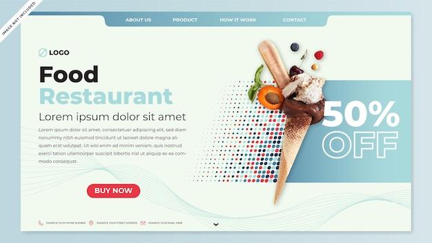
Understanding the Importance of a Well-Designed Homepage
A well-designed homepage serves as the face of your website, creating the first impression for visitors and establishing the overall tone of your brand. It’s essential to consider that your homepage is not just a landing page; it’s a strategic platform that guides users to engage with your content. When done right, it can significantly improve user experience and drive conversions.
One of the critical aspects of a homepage is clarity. Visitors should immediately understand what your website is about without having to search. This means using clear headlines, succinct subheadings, and well-structured content that encourages exploration. A cluttered homepage can overwhelm users and lead them to abandon your site in search of simpler alternatives.
Equally important is visual hierarchy. Your design should naturally guide the viewer’s eye to the most important elements, such as calls to action (CTAs), product highlights, or essential information. This can be achieved through effective use of size, color, contrast, and placement. For instance, larger buttons or brighter colors for CTAs can draw immediate attention, helping users know where to click next.
Another vital principle is responsive design. With a significant portion of web traffic coming from mobile devices, ensuring your homepage is optimized for various screen sizes is non-negotiable. A responsive design not only improves user experience but also positively impacts your search engine rankings, making it easier for potential visitors to find you.
Incorporating trust signals like testimonials, reviews, or recognizable brand logos can significantly boost your site’s credibility. When visitors see that others have had positive experiences with your brand, they are more likely to engage and convert. These elements can be strategically placed on your homepage to reinforce trust right off the bat.
Moreover, consider the impact of load speed. A homepage that takes too long to load can frustrate users and lead to high bounce rates. Optimizing images, minimizing scripts, and utilizing efficient coding can enhance performance, ensuring visitors stay engaged rather than leaving in frustration.
Lastly, regularly testing and updating your homepage is crucial. Trends change, and so do user preferences. Conducting A/B tests can provide valuable insights into what works best for your audience. Analyzing user behavior through tools like heat maps can help you determine which areas are most engaging and which need improvement.
| Design Principle | Importance |
|---|---|
| Clarity | Helps users understand your site immediately. |
| Visual Hierarchy | Guides users to essential information effortlessly. |
| Responsive Design | Ensures accessibility across devices. |
| Trust Signals | Builds credibility and encourages conversions. |
| Load Speed | Reduces bounce rates and enhances user experience. |
Key Elements That Make a Homepage Stand Out
Creating a homepage that captures attention and fosters engagement is no small feat. To truly stand out, a homepage needs to blend aesthetics with functionality, allowing visitors to navigate effortlessly while being visually inspired. Here are the key elements that can elevate your homepage to the next level.
Visual Hierarchy is paramount. Your homepage should guide users through a well-structured layout where the most important information grabs attention first. Utilize size, color, and placement to emphasize key elements, such as headlines, calls to action, and images. A striking hero image or video at the top can create an immediate connection with visitors.
Next, focus on clear and concise messaging. Visitors often skim content, so delivering your value proposition in a straightforward manner is essential. Use punchy headlines and short paragraphs to hold their attention. Bullet points can also break down complex information, making it digestible at a glance.
Intuitive Navigation is another critical aspect. A seamless user experience hinges on how easily users can find what they’re looking for. Ensure your navigation menu is straightforward, with categories that make sense. Consider a sticky navigation bar that stays visible as users scroll, maintaining accessibility to essential sections without frustration.
Incorporating visual elements like high-quality images and videos can significantly enhance engagement. These elements should align with your brand identity and resonate with your audience. Additionally, consider using graphics or icons to represent key services or features, making your content more engaging and easier to understand.
Don’t underestimate the power of social proof. Including testimonials, reviews, or client logos can help establish trust and credibility. A simple slider showcasing positive feedback can create a sense of community and assure visitors they are making a sound decision by exploring your site.
| Element | Purpose | Example |
|---|---|---|
| Hero Image | Captures attention | Large, stunning visuals |
| Clear CTA | Encourages action | “Get Started” or “Learn More” buttons |
| Responsive Design | Enhances usability | Adaptable layout for mobile devices |
a strong call-to-action (CTA) is essential to guide users toward the next steps. Whether it’s signing up for a newsletter, downloading a resource, or contacting you for more information, make sure your CTAs are prominent and persuasive. Experiment with colors and wording to see what resonates best with your audience.
By implementing these elements, you can ensure your homepage not only looks great but also functions effectively to convert visitors into customers. Prioritize clarity, engagement, and user experience, and watch your homepage become a powerful tool for your brand.
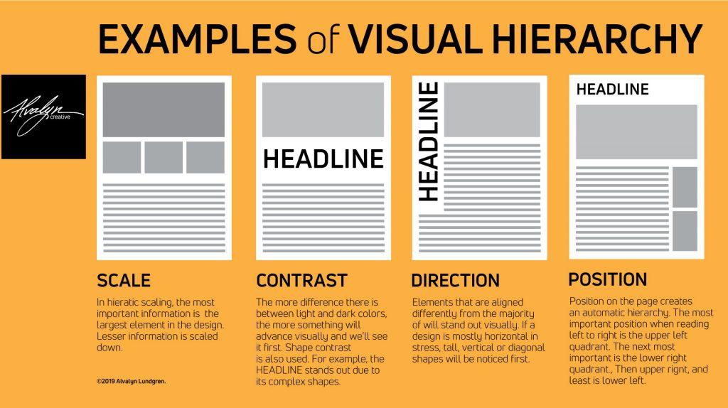
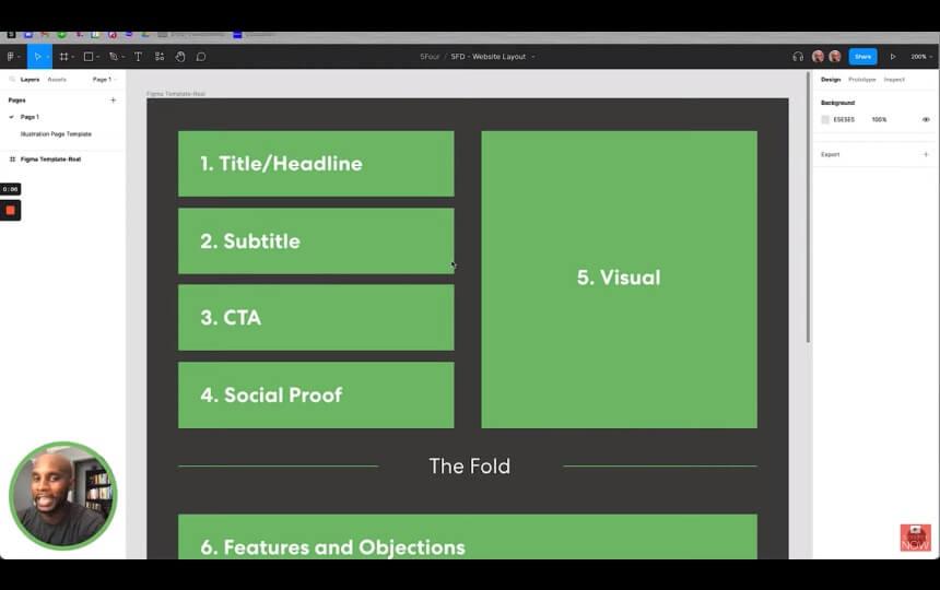
Crafting a Clear Visual Hierarchy for Better Engagement
Establishing a clear visual hierarchy on your homepage is crucial for driving engagement and enhancing user experience. By strategically organizing content, you guide visitors’ eyes to the most important elements first, effectively communicating your message without overwhelming them. Here are some key principles to consider.
Prioritize Key Elements: Start by identifying the primary goals of your homepage. Is it to generate leads, promote a product, or share your brand story? Once you have clarity on your objectives, arrange the most significant elements, such as headlines, call-to-action buttons, and images, in a way that they stand out. Utilizing size, color, and positioning can help emphasize these focal points.
Utilize Size and Scale Wisely: Larger elements naturally draw attention. Make your headlines bold and sizeable to signify their importance. In contrast, secondary information can be smaller and less prominent. This not only helps visitors to scan content quickly but also directs them toward the actions you want them to take. Consider using a mix of font sizes and weights to create contrast.
Incorporate Color and Contrast: Color plays a pivotal role in visual hierarchy. Use a limited color palette to establish harmony while ensuring that key elements pop against the background. Bright colors can highlight calls to action or important messages, while muted tones can help less critical information fade into the background. The goal is to create an aesthetically pleasing and functional design.
Whitespace is Your Friend: Don’t underestimate the power of whitespace. Adequate spacing around elements helps reduce clutter, allowing users to focus on the most critical areas. It creates a breathing room for design and can enhance the navigability of your homepage. Ensure that each section has sufficient margin and padding, giving users clear boundaries between different site elements.
| Principle | Description |
|---|---|
| Prioritization | Focus on the most critical elements to achieve your homepage goals. |
| Size & Scale | Use larger elements for headlines and CTAs, smaller for secondary info. |
| Color Contrast | Highlight key areas with bright colors while using muted tones for less important info. |
| Whitespace | Utilize spacing to reduce clutter and enhance navigability. |
Consistent Typography: Consistency in font choices not only strengthens your brand identity but also aids in establishing a visual hierarchy. Use a maximum of two or three typefaces that complement each other. Limit variations in styles such as bold and italic to necessary instances to prevent visual chaos. This will help your users to navigate your content more intuitively.
Visual Cues: Incorporate arrows, icons, or images that lead the eye toward the next action you want users to take. These visual cues can help guide visitors naturally through your homepage, encouraging them to engage further with your content. The use of directional visuals can effectively communicate flow and next steps.
crafting a clear visual hierarchy is about understanding the importance of each element on your homepage and arranging them thoughtfully. By prioritizing key elements, utilizing size and color, embracing whitespace, ensuring consistent typography, and adding visual cues, you can create a layout that not only looks appealing but also drives user engagement effectively.
Choosing the Right Color Palette to Evoke Emotion
When it comes to designing a homepage, the color palette you choose can significantly shape the emotional response of your visitors. Colors have the power to influence mood, convey messages, and even prompt action. So, let’s delve into how you can select the perfect colors to resonate with your audience.
First and foremost, understanding the psychology of color is crucial. Each color carries its own set of associations and emotions. For instance:
- Blue: Often associated with calmness and trust, making it ideal for corporate and financial websites.
- Red: Evokes passion and urgency, perfect for sales and promotions.
- Green: Represents tranquility and health, commonly used in eco-friendly or wellness sites.
- Yellow: Radiates optimism and energy, but should be used sparingly to avoid overwhelming the visitor.
Another vital aspect is to consider your target audience. Different demographics may respond differently to your color choices. For example, younger audiences may prefer vibrant, bold colors, while older audiences might appreciate more subdued, classic tones. To find the right balance, create user personas that reflect your audience’s preferences and expectations.
Moreover, consider the context in which colors will be used. The same color can have different meanings based on cultural or contextual factors. For example, while white signifies purity in Western cultures, it is often associated with mourning in some Eastern cultures. Researching these nuances can help avoid potential pitfalls and ensure that your message is clearly conveyed.
| Color | Emotion Evoked | Best Used For |
|---|---|---|
| Blue | Calmness, Trust | Corporate, Financial |
| Red | Passion, Urgency | Sales, Promotions |
| Green | Tranquility, Health | Eco-friendly, Wellness |
| Yellow | Optimism, Energy | Creative, Youthful Brands |
Utilizing different shades and tints of a color can also enhance the emotional impact. A lighter shade often feels more approachable and airy, while darker shades might convey sophistication and stability. Experimenting with various saturations can help create a visual hierarchy that guides users through your homepage intuitively.
Lastly, remember that contrast matters. High-contrast palettes can grab attention and drive users to critical calls-to-action, whereas low-contrast palettes can create a more subtle experience. Striking the right balance ensures that your primary message stands out without overwhelming the senses.

Utilizing White Space Effectively for an Uncluttered Look
In the realm of web design, white space—often referred to as negative space—is more than just empty areas on your homepage; it’s a powerful design element that can enhance user experience and guide visitors through your site. By effectively utilizing white space, you can create a sense of order and simplicity, allowing your content to shine without overwhelming the viewer.
Consider how white space can:
- Improve readability: Adequate spacing between lines of text and around paragraphs helps users absorb content more easily. Keep in mind that less clutter translates to better comprehension.
- Highlight important elements: Use white space strategically to draw attention to calls to action (CTAs), images, or special offers. A well-placed button surrounded by ample space can lead to higher conversion rates.
- Create a sense of elegance: A minimalist design characterized by generous white space can convey sophistication and professionalism, fostering trust with your audience.
- Facilitate navigation: White space can act as a visual cue, helping users distinguish different sections of your homepage and making it easier to navigate between them.
To illustrate the impact of white space, let’s take a closer look at some effective homepage layouts:
| Example | Description |
|---|---|
| Brand A | Utilizes ample white space around product images, making each item stand out, thereby enhancing the shopping experience. |
| Brand B | Features a clean, minimalist design with a centered logo and simple navigation bar, allowing visitors to focus on the main content. |
| Brand C | Incorporates generous margins and padding in its blog layout, improving readability and encouraging longer visits on the site. |
When it comes to implementation, here are some tips to maximize the effectiveness of white space:
- Balance is key: While white space is essential, too much can make your homepage feel empty. Aim for a harmonious balance between content and open space.
- Layer your elements: Use overlapping elements with strategic spacing to create depth. This can make your design more engaging without sacrificing clarity.
- Consistency matters: Maintain consistent spacing throughout your homepage. This unifies the layout and enhances overall aesthetics.
- Test and iterate: Don’t hesitate to experiment with different amounts of white space. Use A/B testing to see what resonates best with your audience.
Ultimately, the goal is to create a homepage that feels inviting and intuitive. By understanding and applying the principles of white space, you can craft a design that not only looks good but also functions effectively, leading to better user engagement and higher conversion rates. Remember, less is often more when it comes to design, and effective use of white space is a prime example of this principle in action.
Incorporating Compelling Call-to-Actions That Drive Action
To effectively guide your visitors toward taking the desired actions, your call-to-action (CTA) needs to be more than just a button; it should be a compelling invitation that resonates with your audience. Start by ensuring that your CTAs are visually distinct. Using contrasting colors, large fonts, and ample spacing can draw attention to these crucial elements. A well-placed CTA can significantly increase conversion rates, so don’t underestimate the power of its design.
Next, consider the copy you use. Your wording should be both concise and persuasive. Instead of generic phrases like “Submit” or “Click Here,” opt for action-oriented phrases that convey value. For instance, “Get Your Free Guide!” or “Start Your 30-Day Trial!” not only specify what users can expect but also trigger a sense of urgency. When crafting your CTAs, think about what kind of emotional response you want to evoke.
Placement is critical; your CTAs should be strategically positioned throughout your homepage. Here are some effective placements to consider:
- Above the fold, to catch immediate attention.
- At the end of key content sections, where users are likely to be ready for the next step.
- In pop-ups or slide-ins that appear based on user engagement.
Another essential aspect is creating a sense of urgency. Phrases like “Limited Time Offer” or “Only 5 Spots Left!” can encourage users to act swiftly. You can also incorporate countdown timers to visually reinforce the urgency. This not only grabs attention but also prompts users to make decisions faster.
To further enhance your CTAs, consider using social proof. This could be in the form of testimonials, reviews, or statistics. When potential customers see that others have benefited from your offerings, they’re more likely to follow suit. For instance, a brief quote from a satisfied customer next to your CTA can create trust and credibility, making users more willing to engage.
| Action-Oriented Phrases | Emotional Triggers |
|---|---|
| Download Now | Instant Gratification |
| Join the Community | Belonging |
| Claim Your Discount | Value |
| Try It Free | Risk-Free |
always be sure to test and optimize your CTAs. A/B testing different phrases, colors, and placements can provide valuable insights into what resonates best with your audience. Use analytics to track performance and refine your approach over time. Remember, the goal is not just to attract clicks, but to convert those clicks into meaningful actions that benefit your business.
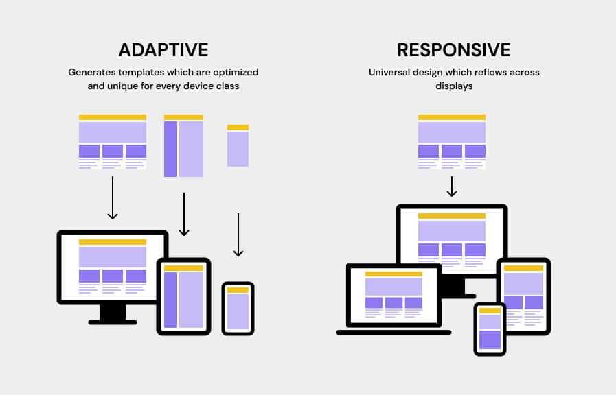
Responsive Design: Making Your Homepage Mobile-Friendly
In today’s digital landscape, ensuring your homepage is mobile-friendly is no longer optional; it’s a necessity. With a significant portion of web traffic coming from mobile devices, you want to make sure your visitors have an enjoyable and seamless experience. Here’s how you can achieve that through responsive design principles.
First and foremost, flexible layouts are key. This means using fluid grids that adjust based on the screen size. Instead of fixed-width designs, let your content adapt. CSS frameworks like Bootstrap are fantastic for this, as they provide grid systems that automatically resize components. For instance, a three-column layout on a desktop can stack into a single column on mobile, making your content easier to navigate.
Another critical aspect is responsive images. Large images can slow down load times on mobile, frustrating users. Use CSS to specify maximum widths and heights, ensuring images scale appropriately. Implement the srcset attribute to serve different image sizes based on the device’s screen resolution. This will not only improve loading times but also enhance the visual appeal of your site.
Typography also plays a vital role in mobile design. Small text can lead to squinting and frustration. Opt for larger, more legible font sizes and choose a line height that ensures readability. Utilize media queries to adjust text sizes for different devices, ensuring your content is easily digestible no matter the screen size.
Don’t overlook the importance of navigation. A cluttered menu can overwhelm mobile users. Consider implementing a hamburger menu that expands when tapped, keeping your homepage clean and organized. Focus on the most important links, and use icons alongside text for easy recognition. This approach simplifies navigation and improves user experience.
| Design Element | Desktop View | Mobile View |
|---|---|---|
| Layout | Multi-column | Single column |
| Image Size | Full resolution | Scaled to fit |
| Font Size | Standard | Larger for readability |
| Navigation | Visible menu | Hamburger menu |
Lastly, always remember to test your design. Use tools like Google’s Mobile-Friendly Test to check how your homepage performs on various devices. Additionally, engage with real users to gather feedback on their mobile experience. Continuous improvements based on user interaction will help you refine your design and keep your audience engaged.
Optimizing Load Speed for a Seamless User Experience
In today’s fast-paced digital landscape, users expect webpages to load almost instantly. A delay of just a few seconds can lead to significant increases in bounce rates, negatively impacting user engagement and, ultimately, conversion rates. Therefore, it’s crucial to prioritize load speed as a fundamental aspect of your homepage design.
To kick things off, consider the following key strategies:
- Optimize Images: Large images can significantly slow down your page. Utilize tools to compress your images without sacrificing quality. Formats like WebP are particularly effective.
- Minimize HTTP Requests: Each element on your page, from scripts to images, requires a request to the server. Reduce the number of elements on your page, or combine CSS and JavaScript files to streamline requests.
- Leverage Browser Caching: Caching allows frequently accessed files to be stored on the user’s device, speeding up load times for repeat visitors. Be sure to set appropriate caching rules through your server settings.
- Use a Content Delivery Network (CDN): CDNs distribute your content across various global servers, allowing users to download data from the server closest to them, thereby improving load times.
Additionally, implementing lazy loading for images and videos can dramatically enhance speed. This technique only loads media content as it comes into the user’s viewport, reducing initial load time and conserving bandwidth.
It’s also essential to keep your code clean and optimized. Minify CSS and JavaScript files by removing unnecessary characters, comments, and spaces. This reduces file size and improves load times, making a significant difference in performance.
Lastly, regularly monitor your site’s performance. Tools like Google PageSpeed Insights and GTmetrix provide valuable feedback on your load speed and suggest specific improvements. By staying proactive and making adjustments as needed, you can maintain a seamless user experience that keeps visitors coming back.
| Optimization Strategy | Benefit |
|---|---|
| Image Compression | Faster load times, better UX |
| Minimized Requests | Quicker page rendering |
| Browser Caching | Reduced server load, faster repeat visits |
| CDN Usage | Global reach, improved load speed |
| Code Minification | Lighter files, quicker downloads |
By implementing these strategies, not only do you enhance the performance of your homepage, but you also create a more inviting environment for your users. Remember, a faster site is a happier site, and a happy user is more likely to convert.

Showcasing Your Brand Identity Through Thoughtful Design
In the digital landscape, your homepage acts as the front door to your brand. It’s the first place visitors encounter your identity, and thoughtful design can make all the difference. A well-crafted layout not only attracts attention but also communicates your brand’s values and personality. Here are some essential principles to keep in mind:
- Consistency is Key: Ensure that your design elements, such as colors, fonts, and imagery, align with your brand identity. This creates a cohesive experience that reinforces recognition and trust.
- Visual Hierarchy: Guide your visitors through your homepage by using size, color, and spacing to highlight the most important elements. This helps users navigate effortlessly and absorb key messages.
- Utilize White Space: Don’t underestimate the power of a clean layout. White space allows your content to breathe, making it easier for visitors to focus on what truly matters.
- Responsive Design: With mobile browsing on the rise, ensure your homepage looks impeccable across all devices. A responsive design not only enhances user experience but also reinforces your brand’s professionalism.
To see these principles in action, let’s take a look at some exemplary homepage layouts:
| Brand | Design Element | Why It Works |
|---|---|---|
| Apple | Minimalist Aesthetics | Focuses attention on products with a clean, white background. |
| Trello | Bright Colors | Utilizes vibrant colors to highlight features and calls to action. |
| Airbnb | High-Quality Imagery | Captivating visuals create an emotional connection and reflect the brand experience. |
| Spotify | Dynamic Typography | Bold fonts convey energy and reflect the music-centric brand. |
Engaging your audience starts by communicating what your brand stands for. Each design choice should reflect the essence of your identity, whether it’s through the tone of your copy or the style of your graphics. Consider these additional strategies:
- Tell Your Story: Use visuals and text to narrate your brand’s journey, mission, and values. This builds a connection with your audience.
- Incorporate User-Generated Content: Showcase testimonials or social media posts that highlight real experiences with your brand, fostering community and trust.
- Call to Action (CTA): Make your CTAs stand out with distinct colors and positioning. They should beckon visitors to engage further with your offerings.
Ultimately, your homepage is a canvas where every element should reflect your brand identity. Thoughtful design not only enhances usability but also builds an emotional rapport with your visitors. By carefully considering these principles and examples, you can create a homepage that not only looks great but also embodies who you are as a brand.
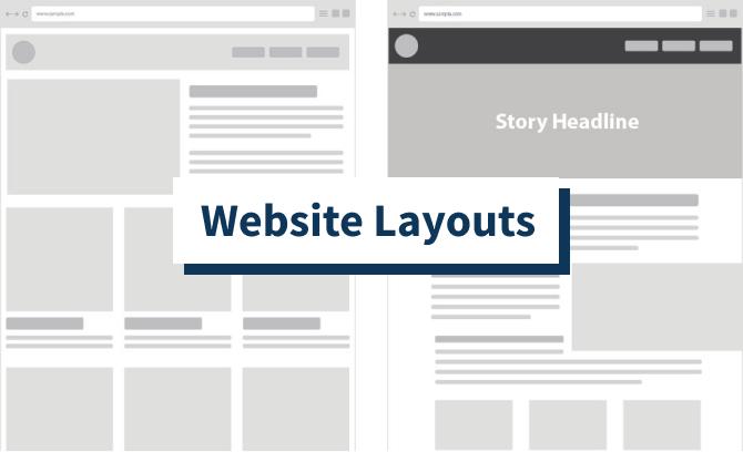
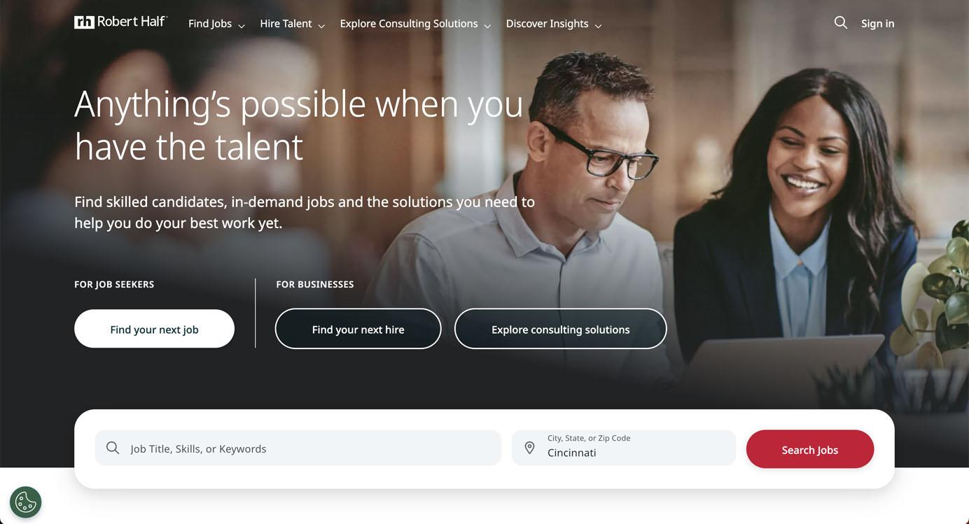
Examples of Effective Homepage Layouts That Inspire
When it comes to designing a homepage, the layout can make or break the user experience. An effective layout not only captures attention but also guides visitors through the content effortlessly. Here are some exemplary homepage layouts that stand out for their creativity and functionality:
1. Visual Storytelling
Websites like Airbnb utilize large, high-quality images that tell a story. The layout is simple, focusing on visuals that evoke emotion and curiosity. Each section flows seamlessly into the next, making it easy for users to navigate. Key features include:
- Full-width banners that create an immersive experience.
- Clear call-to-action buttons that stand out against the backdrop.
- Minimal text that complements the imagery.
2. Clean and Minimalist Design
Apple is renowned for its clean, minimalist homepage layout. It features a harmonious balance of white space and striking product images. This approach helps visitors focus on the essentials. Consider these elements:
- Simple navigation that prioritizes user experience.
- Limited color palette that enhances brand identity.
- Effective use of typography to direct attention to key messages.
3. Interactive Elements
Incorporating interactive elements can significantly boost user engagement. Websites like Spotify use dynamic content, such as playlists and featured songs, that invite users to interact. Here’s what makes this layout effective:
- Engaging animations that provide visual feedback.
- Personalized user experiences based on listening habits.
- Intuitive interface that encourages exploration.
4. Content-Rich Layouts
Medium exemplifies a content-rich homepage that effectively showcases articles and stories. This layout prioritizes readability and encourages discovery through a grid-based format. Features include:
- Clear categorization of topics for easy navigation.
- Visual hierarchy that highlights trending articles.
- Social proof through reader statistics and comments.
5. E-commerce Focus
For e-commerce sites, an effective layout is crucial for conversion. Amazon employs a layout that prioritizes product visibility and user reviews. Here’s what makes it successful:
- Prominent search bar for easy product discovery.
- Featured deals and recommendations based on user behavior.
- Clear calls to action that guide purchasing decisions.
Comparison Table of Homepage Layouts
| Website | Layout Style | Key Feature |
|---|---|---|
| Airbnb | Visual Storytelling | Full-width images |
| Apple | Minimalist | White space utilization |
| Spotify | Interactive | Dynamic playlists |
| Medium | Content-Rich | Grid-based articles |
| Amazon | E-commerce Focus | Prominent search bar |
These examples illustrate how thoughtful design principles can transform a homepage into an inspiring and functional space. Each layout not only reflects the brand’s identity but also enhances user engagement, making it easier for visitors to connect with the content.
Lessons Learned from Top Brands and Their Homepage Successes
When it comes to homepage design, successful brands have cracked the code by embracing a few fundamental principles that elevate their online presence. These brands don’t just focus on aesthetics; they create a seamless user experience that keeps visitors engaged. Here are some key takeaways:
- Clarity Over Clutter: Top brands understand that less is often more. Their homepages are designed to convey a clear message without overwhelming visitors. By using ample white space and focusing on essential elements, they guide users through their offerings with ease.
- Responsive Design: With a significant portion of web traffic coming from mobile devices, leading brands prioritize responsive design. They ensure their homepage looks and functions beautifully across all screen sizes, making it accessible to everyone.
- Compelling Calls to Action: Successful homepages feature bold, clear calls to action that stand out. These prompts encourage visitors to take specific actions, whether it’s signing up for a newsletter, exploring products, or making a purchase. The strategic placement of these CTAs can significantly influence conversion rates.
- Visual Storytelling: A visually engaging homepage can tell a story that resonates with the audience. Brands use high-quality images, videos, and graphics to create an emotional connection, helping visitors relate to their mission and values instantly.
Moreover, the integration of social proof, such as customer testimonials and trust badges, reinforces credibility. Visitors are more likely to engage with a brand that showcases positive feedback and endorsements from real customers.
| Brand | Homepage Feature | Impact |
|---|---|---|
| Apple | Minimalist Design | Enhances focus on products |
| AIRBNB | High-quality Imagery | Creates emotional engagement |
| Amazon | Dynamic Personalization | Boosts user retention |
| Dropbox | Clear Benefit Statements | Clarifies value proposition |
Ultimately, the power of a well-designed homepage lies in its ability to connect with visitors on multiple levels. By adopting these principles, brands can craft a homepage that not only attracts users but also converts them into loyal customers.
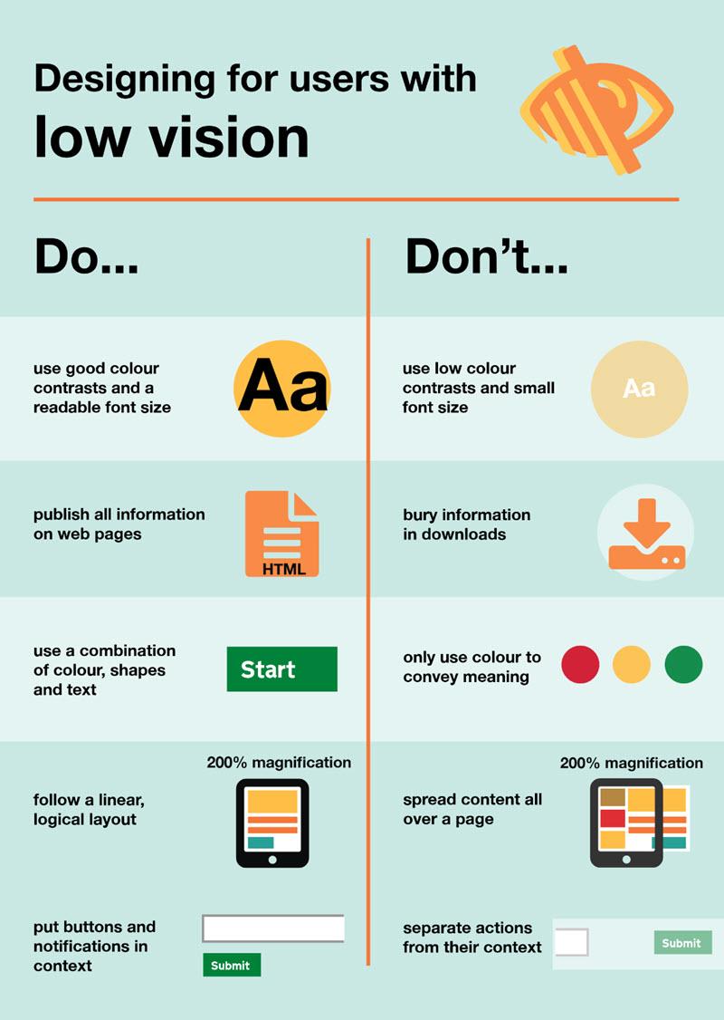
Designing for Accessibility: Ensuring Inclusivity on Your Homepage
Designing a homepage that is accessible and inclusive not only broadens your audience but also creates a welcoming environment for all users. When considering accessibility, it’s essential to incorporate features that can make your website easier to navigate for individuals with disabilities. Here are some fundamental principles to keep in mind:
- Color Contrast: Ensure that text contrasts sufficiently with background colors. This helps users with visual impairments read text without strain. Tools like the WebAIM Contrast Checker can help you assess your color choices.
- Keyboard Navigation: Design your homepage so that users can navigate through it using only a keyboard. This is crucial for individuals who cannot use a mouse. All links and buttons should be easily reachable using the Tab key.
- Alternative Text for Images: Provide descriptive alt text for all images. This allows screen readers to convey what each image represents, ensuring users with visual impairments understand the context of visual content.
- Consistent Layout: Maintain a consistent layout throughout your homepage. Consistency helps users predict where to find information, creating a more intuitive and user-friendly experience.
- Responsive Design: Ensure your homepage is mobile-friendly. Many users rely on mobile devices, so it’s vital that your layout adapts well to different screen sizes and orientations.
Incorporating these principles not only enhances accessibility but also improves overall user experience. To further illustrate the positive impact of accessible design, consider the following table that highlights common accessibility features alongside their benefits:
| Accessibility Feature | Benefit |
|---|---|
| Text Resizing | Allows users to adjust text size, making content easier to read. |
| Screen Reader Compatibility | Ensures that all content can be read aloud, aiding visually impaired users. |
| Skip Links | Enables users to skip repetitive content, improving navigation efficiency. |
| Accessible Forms | Improves the user experience for individuals who use assistive technologies. |
Moreover, testing your homepage for accessibility is critical. Use tools like WAVE or Axe to evaluate your website’s compliance with the Web Content Accessibility Guidelines (WCAG). Regular audits will help you identify and rectify any barriers that may hinder user experience.
Lastly, remember that accessibility is not a one-time task but an ongoing commitment. By actively seeking feedback from users with disabilities, you can continually improve your homepage and ensure that it evolves to meet the needs of all visitors.
Tips for Testing and Iterating Your Homepage Layout
Testing and iterating your homepage layout is crucial for ensuring that it meets the needs of your users while effectively conveying your brand message. First and foremost, establish clear goals for your homepage. Ask yourself: What actions do I want visitors to take? Whether it’s signing up for a newsletter, making a purchase, or exploring your services, defining these objectives will guide your design decisions.
Next, consider conducting A/B testing. This involves creating two versions of your homepage, each with slight variations. For example, you might change the placement of a call-to-action button or the color scheme. By analyzing user interactions with both versions, you can identify which elements drive engagement and conversions more effectively.
Another valuable approach is to gather feedback directly from users. Implementing tools such as heatmaps can provide insights into how visitors navigate your site. This data can reveal which sections are attracting attention and which may need improvement. Additionally, consider using short surveys or feedback forms to gather qualitative insights that can inform your design choices.
Don’t shy away from making bold changes based on your findings. If a particular layout or design element isn’t performing as expected, be prepared to iterate quickly. Remember that design is not a one-time event; it’s an ongoing process. Make small, manageable adjustments and monitor their impact over time.
Lastly, keep accessibility in mind throughout your testing process. Ensure that your layout is user-friendly for all visitors, including those with disabilities. Regularly check that your homepage meets accessibility guidelines, such as providing alt text for images and ensuring color contrast is sufficient. A well-designed, inclusive homepage not only expands your audience but also enhances the overall user experience.
To summarize, here are some quick tips to keep in mind:
- Set clear goals for your homepage layout.
- Conduct A/B testing to find out what works best.
- Use heatmaps and user feedback for insights.
- Be willing to iterate quickly based on data.
- Prioritize accessibility in your design choices.
By incorporating these strategies into your design process, you can create a homepage that not only looks great but also performs effectively in meeting your users’ needs.
Final Thoughts on Creating an Impactful Homepage Design
Creating an impactful homepage design is more than just aesthetics; it’s about crafting an experience that resonates with your visitors. A well-thought-out homepage serves as the digital front door of your brand, and it should invite users in while guiding them effortlessly through your content.
To achieve this, focus on clear messaging. Your homepage should immediately communicate who you are and what you offer. Use concise headlines and supporting text to minimize confusion. Remember, visitors typically skim content, so make sure your main message stands out visually. Utilize contrasting colors and bold fonts to draw attention to key information.
Another essential principle is user-centered design. Understand your target audience and tailor your homepage layout to meet their needs. Consider their journey—what information are they seeking? Design your homepage to answer their questions quickly and effectively. This means strategically placing calls to action and ensuring that navigation is intuitive.
Don’t underestimate the power of visual hierarchy. By prioritizing elements based on their importance, you can guide users through the page seamlessly. Use size, color, and placement to highlight crucial sections. For instance, larger images or buttons can indicate the most important actions you want visitors to take. A well-structured layout allows users to process information without feeling overwhelmed.
Incorporating engaging visuals is equally important. High-quality images and videos not only make your homepage aesthetically pleasing but also enhance storytelling. Whether it’s a striking hero image or a quick explainer video, visuals help convey your brand’s message in a way that text alone cannot. Consider the emotional impact of your visuals—aim for images that resonate with your audience’s aspirations and desires.
Equally relevant is the importance of mobile responsiveness. With a growing number of users accessing websites via mobile devices, ensure that your homepage is fully optimized for all screen sizes. This means your layout should adapt seamlessly, maintaining functionality without sacrificing design quality. A mobile-friendly design not only improves user experience but also boosts SEO, making it easier for users to find you online.
Lastly, don’t forget about performance optimization. A slow-loading homepage can frustrate users and increase bounce rates. Optimize images and streamline code to enhance loading speeds. Regularly test your homepage’s performance to ensure that visitors have a smooth experience from the moment they arrive.
| Design Principle | Key Focus |
|---|---|
| Clear Messaging | Immediate understanding of brand and offerings |
| User-Centered Design | Tailored experience for target audience |
| Visual Hierarchy | Guided navigation through prioritized elements |
| Engaging Visuals | Emotional connection through high-quality imagery |
| Mobile Responsiveness | Seamless experience on all devices |
| Performance Optimization | Fast loading times for better user retention |
By focusing on these principles, you can create a homepage that not only looks great but also functions effectively. The right design choices can transform your homepage into a powerful tool for engagement, conversions, and ultimately, success in the digital landscape.
Frequently Asked Questions (FAQ)
Q&A for “5 Homepage Layout Essential Design Principles (+ 9 Examples)”
Q1: What are the main principles for designing an effective homepage layout?
A1: The five essential design principles for a successful homepage layout include clarity, visual hierarchy, responsiveness, consistency, and user-centered design. Each principle plays a crucial role in ensuring that visitors can navigate your site easily, engage with your content, and ultimately convert into customers.
Q2: Why is clarity so important in homepage design?
A2: Clarity is key because it helps your visitors understand your message instantly. When your homepage is cluttered or confusing, users may leave without exploring further. A clean layout with clear headings and concise content makes it easier for users to grasp what your website is about at a glance.
Q3: How does visual hierarchy impact user experience?
A3: Visual hierarchy guides users through your homepage, highlighting the most important elements first. By strategically using size, color, and placement, you can lead visitors’ eyes to call-to-action buttons or key information, making it easier for them to engage with your site. It’s like giving them a roadmap for their journey!
Q4: What does responsive design entail, and why is it necessary?
A4: Responsive design means creating a homepage that looks and functions beautifully on any device, whether it’s a desktop, tablet, or smartphone. With increasing mobile usage, having a responsive design is essential to ensure all users have a seamless experience, no matter how they access your site.
Q5: Can you explain what consistency means in homepage design?
A5: Consistency refers to maintaining uniformity in elements such as colors, fonts, and layouts throughout your homepage and the entire website. This creates a cohesive look and feel, which builds trust with your audience. When users encounter familiar design elements, they feel more comfortable navigating your site.
Q6: What is user-centered design, and how can it benefit my homepage?
A6: User-centered design focuses on understanding the needs, preferences, and behaviors of your target audience. By prioritizing their experience, you can create a homepage that resonates with visitors, encouraging them to explore further and take action. Ultimately, this leads to higher satisfaction and conversion rates.
Q7: Can you share some examples of effective homepage layouts?
A7: Absolutely! In the article, we highlight nine inspiring examples of homepage designs that embody these principles. Each example showcases unique approaches while adhering to the essential design principles—such as appealing visuals, well-structured content, and intuitive navigation. You’ll be inspired to elevate your own homepage!
Q8: How can I start applying these design principles to my own homepage?
A8: Start by analyzing your current homepage with these principles in mind. Identify areas where clarity can be improved or where visual hierarchy could be enhanced. Consider using tools or templates that promote responsiveness and consistency. Remember, even small changes can have a significant impact on user experience!
Q9: What’s the key takeaway from the article?
A9: The key takeaway is that an effective homepage isn’t just about aesthetics—it’s about creating a user-friendly environment that guides visitors to their desired actions. By applying these five essential design principles, you can craft a homepage that not only looks great but also drives engagement and conversions. Ready to transform your homepage? Let’s get started!
Concluding Remarks
And there you have it! We’ve explored the five essential design principles that can transform your homepage into a user-friendly, visually appealing gateway to your brand. From creating a clear hierarchy to ensuring mobile responsiveness, these foundational elements are crucial for capturing your audience’s attention and guiding them through your website seamlessly.
But don’t just take our word for it—look at the nine examples we shared! Each one showcases how thoughtful design can elevate user experience and engagement. As you embark on your own design journey, remember that a well-structured homepage is not just about aesthetics; it’s about connecting with your visitors and making it easy for them to navigate your offerings.
So, go ahead and apply these principles to your own homepage! With a little creativity and these strategies in your toolkit, you’ll be well on your way to crafting an inviting online presence that resonates with your audience. Happy designing, and here’s to creating a homepage that truly reflects your brand’s essence!