In today’s data-driven world, the ability to transform numbers into compelling visuals is not just a luxury—it’s a necessity. Whether you’re a seasoned data analyst, a business owner looking to make informed decisions, or a marketer trying to convey insights, the right data visualization tool can make all the difference. But with so many options out there, how do you choose the one that fits your needs best?
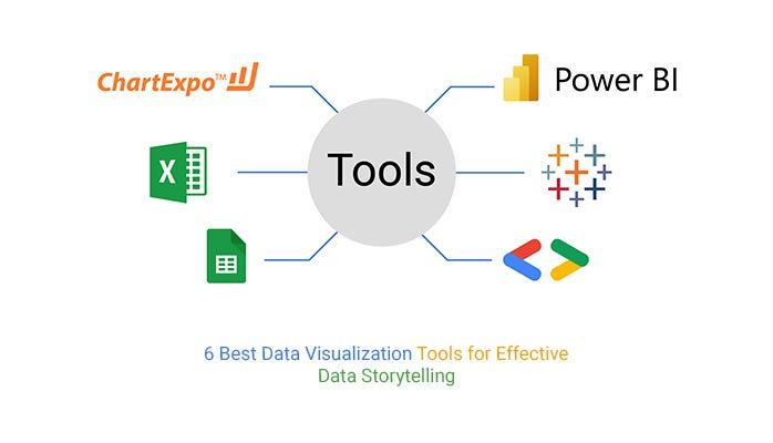
In this article, we’re diving into the 7 Best Data Visualization Tools available today. We’ll explore their unique features, strengths, and ideal use cases, so you can find the perfect match for your projects. Plus, we’ll share some practical tips on how to select the right tool for your specific needs. So, grab a cup of coffee, and let’s decode the art of data visualization together—your journey from raw data to stunning visual stories starts here!
Understanding the Importance of Data Visualization
Data visualization is more than just pretty charts and graphs; it’s a powerful tool that transforms complex data into understandable insights. When data is presented visually, it becomes easier for individuals and organizations to uncover patterns, trends, and outliers that might be missed in raw numerical form. This clarity is vital in today’s fast-paced world, where quick decision-making can be the difference between success and failure.
One of the primary reasons for using visualizations is to enhance comprehension. Humans are naturally inclined to process visual information more efficiently than text or numbers. Infographics, heat maps, and interactive dashboards can convey a wealth of information at a glance, making it simpler for stakeholders to grasp essential data points. This is especially crucial in fields like marketing, finance, and healthcare, where data-driven decisions are paramount.
Moreover, effective data visualization fosters better communication. In meetings or presentations, stakeholders often have varying levels of data literacy. Using visual elements can bridge this gap by providing a common ground for understanding. Instead of drowning the audience in spreadsheets or technical jargon, visuals create an engaging narrative that captures attention and drives discussion. This shared understanding can lead to more informed decisions, as everyone is on the same page.
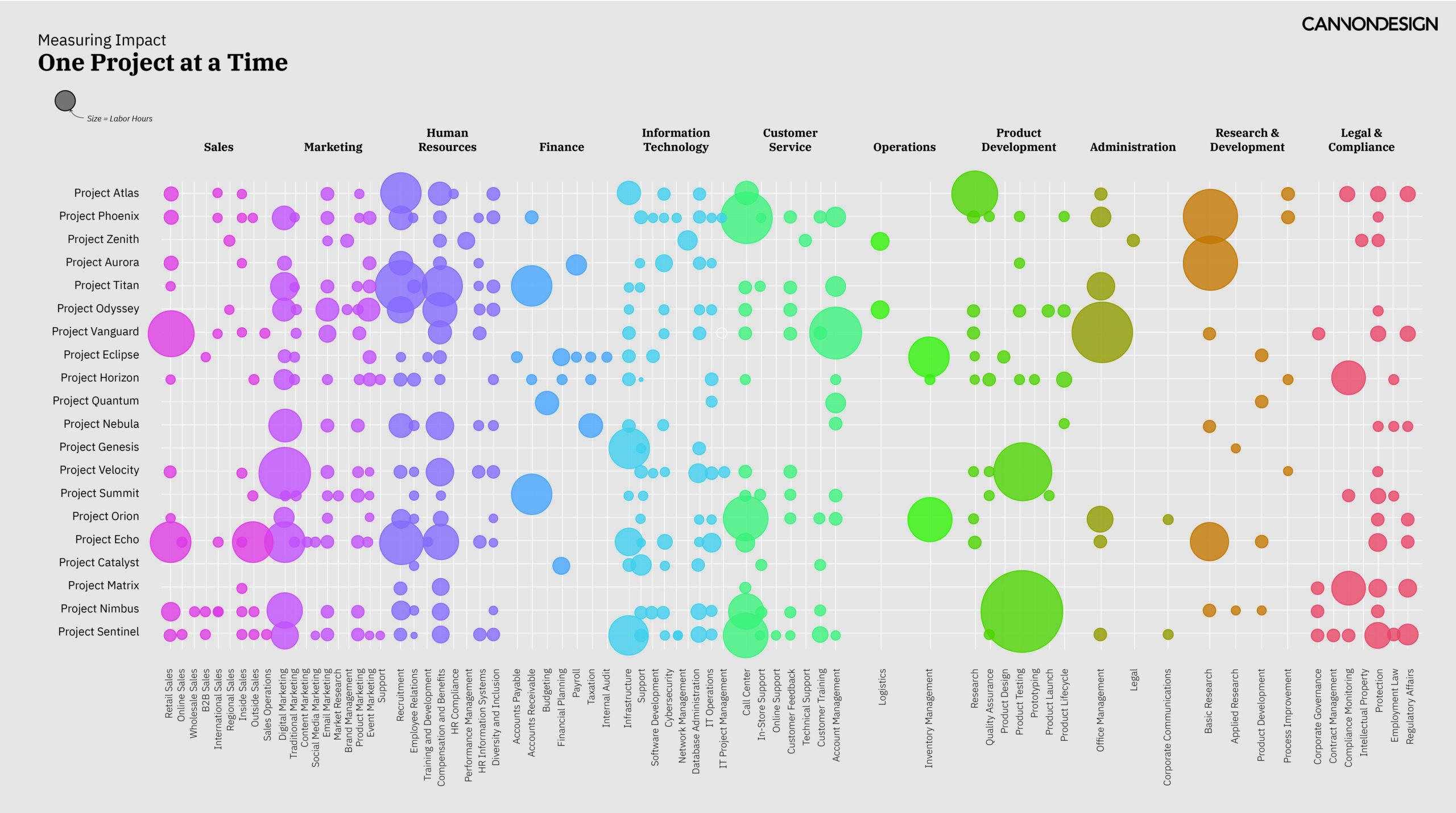
Another critical aspect to consider is the ability of visualizations to uncover insights that might not be immediately apparent. For instance, a well-designed scatter plot can reveal correlations between variables that may not be obvious in tabular data. The ability to manipulate and explore data visually allows users to ask new questions and identify relationships, leading to innovative solutions and strategies.
Furthermore, the advent of interactive data visualizations has revolutionized the way we interact with data. With tools that allow users to filter, zoom, and drill down into specifics, individuals can tailor their exploration to their unique needs. This interactivity empowers users to engage deeply with the data, fostering a culture of inquiry and discovery. Organizations that leverage these capabilities can stay ahead of the competition by making data exploration an integral part of their workflow.
When selecting a data visualization tool, it’s essential to consider the specific needs of your project. Not all tools are created equal, and the right one can significantly impact your ability to convey information effectively. Here are some factors to keep in mind:
User-Friendliness: Choose tools that are easy to learn and use, especially for team members who may not have a technical background.
Customization Options: Look for tools that allow you to tailor visualizations to fit your brand and message.
Integration Capabilities: Ensure the tool can easily integrate with your existing data sources and software.
Support and Resources: Opt for tools that provide ample documentation, tutorials, and customer support.
By understanding the significance of data visualization and carefully selecting the right tools, organizations can unlock the full potential of their data, leading to actionable insights and informed decision-making.
Key Features to Look for in Data Visualization Tools
When exploring data visualization tools, it’s crucial to identify features that will elevate your data storytelling and enhance usability. Here are some essential aspects to consider:
User-Friendly Interface: Look for tools that offer intuitive designs and drag-and-drop functionality. This ensures that users, regardless of their technical expertise, can create visualizations without a steep learning curve.
Data Integration: Your chosen tool should seamlessly connect with various data sources, including databases, spreadsheets, and cloud services. This flexibility allows for real-time data updates and simplified workflows.
Variety of Visualization Options: A robust tool will provide a wide range of visualization types, such as charts, graphs, and maps. The ability to switch between different formats helps present data in the most effective way for your audience.
Customization and Flexibility: The best tools allow for deep customization. Look for options to modify colors, fonts, and layouts to align with your branding and message. This personalization can increase engagement significantly.
Collaboration Features: If you’re working in a team, collaboration tools are essential. Features like shared dashboards, comments, and version control can streamline the data presentation process and foster teamwork.
Mobile Compatibility: In today’s world, accessing data on-the-go is crucial. Ensure that the tool you choose offers mobile-friendly visualizations so stakeholders can view insights anytime, anywhere.
Performance and Scalability: As your data needs grow, your visualization tool should scale accordingly. Consider performance metrics and whether the tool can handle large datasets without lag.
To illustrate how different tools stack up against these features, consider the following comparison table:
Feature
Tool A
Tool B
Tool C
User-Friendly Interface
✔️
✔️
❌
Data Integration
✔️
❌
✔️
Variety of Visualization Options
✔️
✔️
✔️
Customization
❌
✔️
✔️
Collaboration Tools
✔️
✔️
❌
Ultimately, the right data visualization tool will depend on your specific needs and goals. By evaluating these key features, you can make an informed choice that will empower your data storytelling and enhance the impact of your insights.
A Deep Dive into the Top Seven Data Visualization Tools
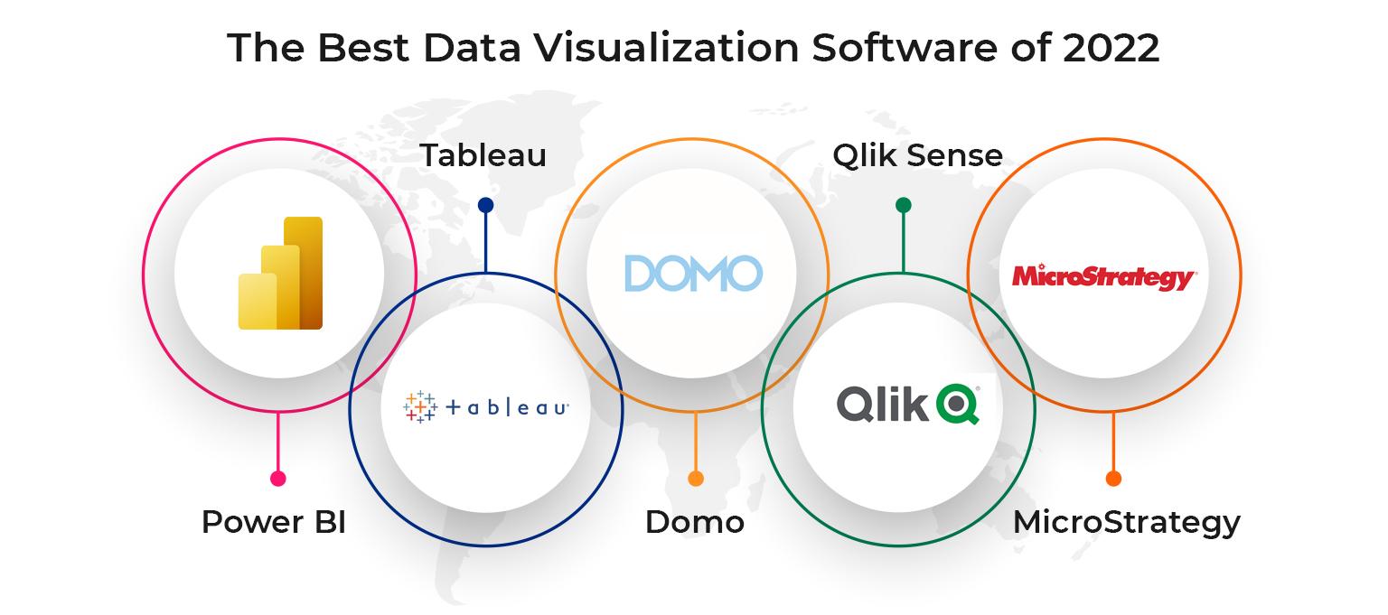
When it comes to choosing the right data visualization tool, the variety available can be overwhelming. Each tool offers unique features tailored to different needs, whether you’re a data scientist, a business analyst, or a casual user. Here’s a closer look at seven of the best tools in the market today, along with what makes each one stand out.
Tableau is renowned for its powerful analytics capabilities and interactive dashboards. Its drag-and-drop interface allows users to create complex visualizations without writing any code. With a robust community and extensive resources, Tableau is perfect for businesses looking to derive actionable insights from their data. The tool supports a wide range of data sources, making integration seamless and efficient.
Power BI, developed by Microsoft, has gained popularity for its integration with other Microsoft products. It offers a user-friendly interface and real-time data analysis, which makes it an excellent choice for organizations already utilizing Excel or Azure services. Its ability to create compelling reports and dashboards enhances collaboration among team members, enabling data-driven decision-making.
Google Data Studio stands out for its collaboration features, allowing multiple users to work on reports simultaneously. It’s free to use and integrates easily with Google Analytics, Google Sheets, and other Google services. This makes it an ideal choice for small businesses and marketers looking to visualize web traffic and performance data without breaking the bank.
D3.js is a powerful JavaScript library that allows for highly customizable and interactive visualizations. While it requires some coding knowledge, the flexibility it offers is unparalleled. Developers love D3.js for its capability to create unique, tailored visualizations that can be embedded in websites. This makes it a favorite among web developers and data enthusiasts who want total control over their visual representations.
QlikView is known for its associative data model, which lets users explore data in any direction they choose. Its in-memory data processing means that users can analyze large datasets quickly. QlikView’s visual analytics capabilities enable users to create interactive dashboards that tell a story with their data. This makes it a strong contender for enterprises that prioritize data discovery and exploration.
Looker offers a modern approach to data analytics, focusing on business intelligence solutions that are customizable. Its LookML language allows users to define metrics and dimensions, creating a flexible environment for report generation. The platform’s integration capabilities with cloud databases like BigQuery and Redshift are particularly appealing for organizations looking to leverage cloud storage effectively.
Infogram is particularly user-friendly, catering to those who may not have a technical background. Its drag-and-drop functionality and extensive template library make it easy to create infographics, reports, and charts quickly. This tool is excellent for marketers and educators who want to present information visually without delving into complex data analysis.
Ultimately, the best data visualization tool for you will depend on several factors, including your technical expertise, the types of data you work with, and the specific insights you wish to gain. Consider taking advantage of free trials or demos to see which tool feels right for your needs. Data visualization is not just about showcasing data but also about telling a compelling story that drives decisions and actions.
Comparing User-Friendly Options for Beginners
When venturing into the world of data visualization, beginners often face the daunting task of selecting a tool that suits their needs. The landscape is filled with various options, each catering to different skill levels and requirements. Fortunately, a handful of tools stand out for their user-friendly interfaces and robust features, making them ideal for novices.
Tableau Public is a popular choice among beginners due to its intuitive drag-and-drop interface. Users can easily create stunning visualizations without extensive coding knowledge. With a vibrant community and a wealth of online resources, newcomers can quickly find help and tutorials to enhance their skills.
Google Data Studio offers a seamless experience for those already familiar with Google’s ecosystem. This tool allows users to create interactive dashboards and reports that can be shared effortlessly. Its integration with Google Analytics and other data sources simplifies the process, making it a go-to option for beginners who want to visualize web data without complexity.
Microsoft Power BI is another excellent option that caters to beginners. Its user-friendly interface, combined with powerful features, makes it a versatile choice. Users can connect to various data sources and create visualizations that are both dynamic and informative. The availability of templates also provides a solid starting point for those unsure where to begin.
For those looking for something lightweight and straightforward, Infogram is worth considering. This tool is designed primarily for creating infographics and reports, making it perfect for beginners who may feel overwhelmed by more complex tools. With a simple interface, users can easily drag and drop elements to create visually appealing content.
Chart.js, though slightly more technical, offers a great introduction to coding for those interested in a more hands-on approach. This open-source library allows users to create responsive charts and graphs with HTML5. Beginners can learn the basics of JavaScript while crafting visually engaging representations of data.
When comparing these user-friendly options, consider the following factors:
Ease of Use: Look for tools with intuitive interfaces and plenty of tutorials.
Integration: Choose tools that easily connect with the data sources you already use.
Community Support: Opt for platforms with active user communities for tips and troubleshooting.
Cost: Some tools offer free versions or trials, which can be beneficial as you’re just starting out.
Ultimately, the right choice will depend on your specific needs and comfort level. Experimenting with different tools can help you find the one that resonates with your style and workflow. With the right tool in hand, transforming raw data into compelling visual stories can be both fun and fulfilling.
Exploring Advanced Features for Data Experts
Unleashing the Power of Data Visualization Tools
When it comes to data visualization, the right tools can make all the difference in turning complex datasets into compelling stories. If you’re a data expert, you’re likely already familiar with the basics. But let’s dive deeper into the advanced features that can elevate your data visualization game.
Many modern tools offer sophisticated capabilities that allow you to manipulate and present data in ways that resonate with your audience. Here are some advanced features to consider when choosing the best tool:
Customizable Dashboards: Look for tools that allow you to create personalized dashboards tailored to your needs, presenting only the most relevant information at a glance.
Real-Time Data Integration: Choose tools that can connect with your data sources in real time, ensuring that your visualizations are always up-to-date.
Interactive Elements: Enhance user engagement by incorporating interactive elements such as filters, hover details, and drill-down capabilities that let viewers explore the data themselves.
Machine Learning Integration: Some tools offer built-in machine learning algorithms that can help you uncover patterns and make predictions based on your data.
Advanced Charting Options: Beyond basic bar and line charts, explore tools that support advanced visualizations like heatmaps, treemaps, or network graphs for a more nuanced analysis.
Moreover, consider the collaboration features of the tools you’re evaluating. In today’s data-driven environment, sharing insights with your team is crucial. Look for platforms that facilitate easy sharing, comments, and collaborative editing, allowing teams to work together seamlessly on data projects.
Another important aspect is the support for various data formats. A versatile tool can handle a range of file types, from CSV to more complex database connections, providing you with the flexibility to work with the datasets you have on hand.
Lastly, don’t underestimate the value of community and support. A robust community or responsive customer support can be a game-changer when you’re navigating the complexities of advanced features. Tools that offer comprehensive resources, tutorials, and forums can significantly reduce your learning curve, making it easier to harness their full potential.
Feature
Description
Importance
Customizable Dashboards
Personalize your data views.
High
Real-Time Data Integration
Keep visualizations current.
Critical
Interactive Elements
Engage users in data exploration.
High
Machine Learning Integration
Leverage AI for deeper insights.
Medium
Advanced Charting Options
Visualize data in diverse ways.
High
By focusing on these advanced features, you can make a more informed choice when selecting a data visualization tool that not only meets your current needs but also scales with your growing expertise. Remember, the ultimate goal is to transform data into impactful visuals that drive decisions and foster understanding.
Evaluating Cost versus Value in Data Visualization Tools
When choosing a data visualization tool, it’s crucial to weigh the cost against the value it brings to your projects. The price tag of a tool can often be misleading. A more expensive option may offer extensive features, but if those features don’t align with your specific needs, you might find yourself overpaying for functionality you won’t use. Conversely, a budget-friendly tool that fits your requirements can provide excellent value without emptying your wallet.
Understanding the features that matter most to you is essential in this evaluation process. Start by identifying your primary objectives:
What types of data will you be visualizing?
Who is your target audience?
Do you need real-time data updates?
How important is collaboration among team members?
Once you have a clear understanding of your needs, it’s time to compare the features of different tools against their pricing structures. Many tools offer free trials or tiered pricing models that can help you gauge their value without a hefty upfront investment. You can use this opportunity to test functionalities such as:
Ease of use and learning curve
Customization options for visualizations
Integration with other software
Customer support and community resources
To simplify your comparison, consider creating a table that outlines each tool’s features and costs. Here’s an example of how you might structure this:
Tool
Cost
Key Features
Tool A
Free / $30/month
Real-time data import, collaboration tools
Tool B
$50/month
Customizable dashboards, advanced analytics
Tool C
Free / $15/month
User-friendly interface, template library
Additionally, don’t underestimate the importance of community and support. A tool with an active user community can provide invaluable resources in terms of tutorials, troubleshooting, and best practices. This can save you time and frustration, further enhancing the tool’s value. If you encounter a roadblock, having access to a vibrant community can turn a potential setback into a minor hiccup.
consider the long-term implications of your choice. A tool that seems costly at first may save you significant time and resources down the line. Assess how well it scales with your needs as your projects or team grow. Remember, the goal is to find a balance where the tool’s capabilities enhance your data storytelling without straining your budget.
How to Align Your Tool Choice with Your Specific Needs
Choosing the right data visualization tool is crucial for effectively communicating your insights. However, the best tool isn’t necessarily the most popular one; it depends on your unique requirements. Let’s explore how you can align your tool choice with your specific needs.
First and foremost, consider your audience. Are you presenting to technical users who crave detailed analytics, or to a general audience that benefits from straightforward, visually appealing graphics? Understanding their preferences can guide your choice. For example:
Technical Audiences: Look for tools that offer advanced features, such as Tableau or Power BI, which allow for deeper data exploration.
General Audiences: Opt for user-friendly platforms like Canva or Piktochart, which simplify the visualization process.
Next, assess the type of data you’ll be working with. Different tools cater to various data formats and complexities. If you’re dealing with large datasets, you’ll need a tool that can handle big data efficiently. Consider solutions like Looker or Qlik that excel in performance with extensive datasets. Conversely, for smaller datasets, lighter tools may suffice.
Another critical aspect is the level of interactivity you desire in your visualizations. If your goal is to create dashboards that allow users to interact with the data, tools such as Microsoft Power BI or D3.js can provide robust options. On the other hand, if static images are sufficient, simpler tools will do the job.
Lastly, always keep an eye on budget constraints. Many visualization tools come with a variety of pricing models—some are free, while others require a subscription. It’s essential to weigh the features offered against your budget. For instance:
Tool
Price
Best For
Tableau
Starts at $70/month
Advanced analytics
Canva
Free/Premium at $12.95/month
Basic visualizations
Power BI
Starts at $9.99/month
Interactive dashboards
Google Data Studio
Free
Collaborative reports
By considering your audience, data type, interactivity needs, and budget, you’ll be better equipped to choose a data visualization tool that truly aligns with your goals. Take the time to evaluate these factors, and you’ll find that your choice will significantly enhance the clarity and impact of your data presentations.
Tips for Effectively Integrating Data Visualization into Your Workflow
Integrating data visualization into your daily workflow can transform the way you interpret and present information. Here’s how to make that integration seamless and effective:
Start with Clear Objectives: Before diving into any tool, define what you want to achieve with your visualization. Are you trying to highlight trends, compare data sets, or tell a story? Clear objectives will guide your choice of tools and techniques.
Choose the Right Tool for the Job: With so many options available, select a data visualization tool that aligns with your project requirements. Consider factors like:
Ease of use
Customization options
Integration capabilities with existing data sources
Utilize Templates and Libraries: Many visualization tools offer templates and libraries. Leverage these to save time and ensure consistency across your visuals. Standardizing your visual style helps maintain a professional appearance.
Incorporate Feedback Loops: Share your visualizations with stakeholders early in the process. Their feedback can provide valuable insights that may lead to improvements in clarity and effectiveness.
Prioritize Interactivity: Interactive visualizations allow users to engage with the data directly. Consider tools that enable features like hover effects or clickable elements, enhancing user experience and understanding.
Integrate with Other Tools: Ensure your chosen data visualization tool can easily connect with other applications, such as spreadsheets or databases. This interoperability streamlines your workflow, allowing for real-time data updates.
Stay Informed: The world of data visualization is constantly evolving. Keep up with trends and new tools by following relevant blogs, webinars, and online courses. Continuous learning will help you utilize your tools to their fullest potential.
Using these strategies, you can effectively integrate data visualization into your workflow, enhancing your ability to communicate insights and drive decision-making.
Real-World Use Cases: Success Stories with Data Visualization
Organizations across various sectors have harnessed the power of data visualization to transform their operations, drive decision-making, and enhance their storytelling capabilities. Let’s explore some compelling success stories illustrating how data visualization tools have made significant impacts.
Healthcare: Improving Patient Care
A leading hospital network adopted data visualization tools to analyze patient outcomes and treatment efficacy. By integrating patient data into interactive dashboards, they could easily identify trends and anomalies. This approach allowed healthcare providers to:
Track recovery rates for specific treatments.
Identify high-risk patients quickly.
Optimize resource allocation based on real-time data.
Tailor marketing campaigns based on customer preferences.
This data-driven approach resulted in a 20% increase in sales during promotional periods, showcasing the power of understanding customer behavior through data visualization.
Finance: Streamlining Operations
A financial services company leveraged data visualization to monitor market trends and investment performance. The integration of real-time data visualizations allowed analysts to:
Spot market anomalies quickly.
Compare investment portfolios effortlessly.
Forecast financial risks more accurately.
This proactive approach led to a 25% reduction in operational costs and improved investment strategies, affirming that data visualization can drive efficiency in finance.
Education: Driving Student Success
An innovative school district embraced data visualization to track student performance and engagement. Using interactive dashboards, educators could:
Monitor attendance rates across classes.
Identify at-risk students early.
Evaluate the effectiveness of teaching methods.
By focusing on data-driven insights, the district boosted overall student performance by 30%, demonstrating the importance of data visualization in education.
Identify the most profitable channels for advertising.
This strategic use of data visualization led to a 40% improvement in campaign ROI, proving that visualization is crucial for data-driven marketing decisions.
Table: Key Success Metrics
Sector
Success Metric
Improvement (%)
Healthcare
Reduced readmission rates
15%
Retail
Increased sales during promotions
20%
Finance
Reduced operational costs
25%
Education
Boosted student performance
30%
Marketing
Improved campaign ROI
40%
These success stories highlight the diverse applications of data visualization tools and their potential to drive significant improvements across various industries. By translating complex data into insightful visuals, organizations can foster informed decision-making and achieve remarkable outcomes.
Troubleshooting Common Challenges in Data Visualization
Data visualization can sometimes feel like a double-edged sword. While it has the power to transform complex information into easily digestible visuals, it can also present challenges that may hinder your storytelling efforts. Recognizing these potential pitfalls is the first step toward creating effective visualizations that resonate with your audience.
One of the most common issues is the overuse of colors. While color can enhance the visual appeal of your charts, too many colors can confuse or overwhelm the viewer. Aim for a consistent color palette that aligns with your brand and uses subtle variations to differentiate data points. Tools like Tableau and Power BI offer built-in color schemes that can help you maintain visual clarity.
Another frequent challenge is data overload. Presenting too much information at once can detract from your main message. To combat this, prioritize key insights and use white space effectively. This allows your audience to focus on what’s most important without getting lost in details. Consider breaking up larger datasets into multiple visuals or interactive dashboards, which can guide the viewer through the information step-by-step.
Inconsistent data formatting can also lead to misinterpretation. Ensuring that all data points are formatted uniformly is crucial for clarity. For instance, if you’re displaying sales figures, be consistent with currency symbols and decimal places. A simple table can help you review your data formatting:
Data Type
Format
Sales Figures
$12,345.67
Percentage Growth
+15%
Time Period
Q1 2023
Moreover, choosing the wrong type of visualization can misrepresent your data. A bar chart might be perfect for showing comparisons, while a line chart could be better for trends over time. Take the time to understand the strengths of each visualization type, and don’t hesitate to prototype your ideas. Many tools provide templates that can guide you in selecting the best fit for your data.
consider the audience’s familiarity with the data. Technical jargon or complex visualizations may alienate stakeholders who are not experts in the field. Always tailor your visualizations to your audience’s level of understanding. Incorporate tooltips or interactive elements to provide additional context without cluttering the main visuals.
By being aware of these common challenges and implementing strategies to address them, you can elevate your data visualization efforts. The right tools, combined with thoughtful design choices, will empower you to create compelling visuals that not only inform but also engage your audience.
Making the Most of Your Data: Best Practices to Follow
Data visualization is a powerful tool that transforms raw data into meaningful insights. To truly harness its potential, following best practices can ensure your visualizations not only convey the right message but also engage your audience effectively. Here are some key strategies:
Know Your Audience: Understanding who will be viewing your visualizations is crucial. Tailor your visuals to meet their needs, preferences, and level of expertise. A finance team may require detailed charts, while marketing may prefer simpler, more colorful graphics.
Choose the Right Type of Visualization: Each dataset has its own story to tell, and selecting the appropriate type of visualization is essential. For example, use line graphs to show trends over time, while bar charts are better for comparing quantities across categories.
Keep It Simple: The best visualizations are often the simplest ones. Avoid clutter and focus on the key message you want to convey. Use white space strategically to draw attention to essential elements.
Use Color Wisely: Color can enhance your visualization but can also confuse it if used poorly. Stick to a limited color palette and ensure contrast for readability. Use colors purposefully to highlight important data points.
Provide Context: Always include context in your visualizations. This could mean adding labels, legends, or annotations that help the viewer understand what they’re looking at. A good visualization tells a story, so guide your audience through it.
Iterate and Test: Don’t settle for the first version of your visualization. Gather feedback from peers or test it with your target audience. Iteration can lead to insights that improve clarity and impact.
Embrace these best practices when utilizing data visualization tools. They not only enhance the clarity and effectiveness of your presentations but also empower decision-makers to act on the insights provided. Remember, the goal is to transform complex data into a narrative that resonates with your audience and drives informed actions.
Best Practice
Why It Matters
Know Your Audience
Ensures relevancy and engagement.
Choose the Right Type
Enhances clarity and comprehension.
Keep It Simple
Avoids confusion and distraction.
Use Color Wisely
Improves readability and focus.
Provide Context
Guides viewers through the data story.
Iterate and Test
Improves overall effectiveness and impact.
Future Trends in Data Visualization You Should Know About
As we look to the future, the world of data visualization is evolving rapidly. Emerging technologies and design philosophies are reshaping how we interact with data, making it more intuitive and impactful. Here are some key trends to watch as you consider which tools might be best for your needs.
1. Artificial Intelligence and Machine Learning
AI is making waves in data visualization by automating complex processes and providing insights that might not be immediately apparent. Advanced algorithms can analyze datasets and suggest the most relevant visualizations. This means that even users with minimal technical expertise can create impactful visual stories.
2. Augmented and Virtual Reality
As AR and VR technologies advance, they are beginning to find their way into data visualization. Imagine being able to walk through a 3D model of your data, interacting with it in real-time. This immersive experience can help stakeholders understand complex datasets in a way that traditional charts and graphs cannot.
3. Real-Time Data Visualization
Organizations are increasingly relying on real-time data to make informed decisions. Tools that allow for live data visualizations are becoming essential, especially in industries like finance and healthcare where timely information can significantly impact outcomes. The ability to visualize data as it changes opens up new possibilities for responsiveness and agility.
4. Storytelling with Data
Data storytelling is gaining traction as a critical skill for effective communication. The use of narratives to explain data points not only makes visuals more engaging but also aids in comprehension. Look for tools that allow you to integrate narratives seamlessly into your visualizations, facilitating a deeper connection with your audience.
5. Increased Customization and Personalization
Users are seeking more control over how they visualize data. The trend toward customization means that tools enabling users to tailor visual elements—such as colors, layouts, and interactivity—are highly valued. Personalization can elevate the user experience and ensure that visuals resonate with diverse audiences.
6. Cloud-Based Solutions
With the rise of remote work and distributed teams, cloud-based data visualization tools are on the rise. These platforms allow for easy sharing and collaboration, making it simpler to work within teams and across departments. Look for tools that offer robust collaboration features, ensuring everyone is on the same page.
Trend
Benefits
AI and ML Integration
Automates insights, user-friendly
AR/VR Experiences
Immersive data interaction
Real-Time Visualization
Timely decision-making
Data Storytelling
Enhanced engagement and comprehension
Customization
Personalized user experience
Cloud-Based Tools
Support for remote collaboration
Embracing these trends can help you stay ahead of the curve and make the most of your data visualization efforts. As you explore different tools, consider how each aligns with these emerging trends to ensure that you are not just keeping up but leading the way in data visualization.
Wrapping Up: Choosing the Right Tool for Your Data Journey
As you embark on your data visualization journey, it’s essential to choose a tool that not only meets your current needs but also scales with your ambitions. The best visualization tools offer a blend of functionality, usability, and flexibility, allowing you to present data in a compelling way. To ensure you make an informed decision, consider the following key factors:
User Experience: The interface should be intuitive, minimizing the learning curve. A tool that’s easy to navigate encourages more frequent use and experimentation.
Integration Capabilities: Your chosen tool should seamlessly integrate with your existing data sources. Whether you’re pulling from Excel, Google Sheets, or databases, compatibility is crucial.
Customization Options: Look for tools that allow you to tailor visualizations to align with your branding or specific data storytelling needs. This includes color schemes, fonts, and layout designs.
Collaboration Features: If you work in teams, choose a tool that facilitates collaboration. Features like shared dashboards and real-time editing can enhance teamwork and efficiency.
Cost: Your budget will play a significant role in your decision. Some tools offer excellent free versions, while others require subscriptions. Weigh the cost against the features provided to ensure value for money.
To help you visualize how these tools stack up against one another, consider the following comparison table. This concise overview highlights some of the most popular data visualization tools and their standout features.
Tool
Best For
Key Feature
Tableau
Advanced Analytics
Drag-and-drop interface
Power BI
Business Intelligence
Integration with Microsoft products
Google Data Studio
Real-Time Collaboration
Free with Google account
Looker
Data Exploration
In-depth data modeling
QlikView
Data Association
Associative data indexing
Ultimately, the right tool for your data visualization needs will depend on your specific goals, the complexity of your data, and your audience. Whether you’re a data analyst aiming for in-depth analysis or a marketer looking to create stunning visual reports, there is a perfect match out there for you.
Your journey doesn’t end with just picking a tool; it’s about continuously refining your skills and exploring new ways to present data. Stay curious, experiment with different features, and keep an eye on emerging tools that could take your visual storytelling to the next level. With the right tool, you can transform your data into actionable insights that resonate with your audience.
Final Thoughts on Enhancing Your Data Skills with the Right Tool
Choosing the right data visualization tool can significantly enhance your ability to interpret and communicate data effectively. In a world awash with information, the ability to transform complex datasets into clear, insightful visuals is not just an advantage—it’s a necessity. Whether you’re a data analyst, a marketer, or a business manager, the right tool can empower you to uncover trends, illustrate insights, and drive decisions with clarity.
The best data visualization tools cater to a variety of needs, from simple charts to complex interactive dashboards. When making your choice, consider the following factors:
User-Friendliness: Can you quickly learn how to use the tool without extensive training?
Integration: Does it seamlessly integrate with your existing data sources?
Customization: Are you able to customize visuals to match your brand or specific requirements?
Collaboration Features: Does it allow you to share insights easily with your team or stakeholders?
Cost: Is the pricing model compatible with your budget and the scale of your projects?
To illustrate how different tools stack up against these criteria, consider the following table that compares some popular options:
Tool
User-Friendly
Integration
Customization
Collaboration
Cost
Tableau
Yes
High
Extensive
Yes
High
Power BI
Yes
Very High
Moderate
Yes
Moderate
Google Data Studio
Yes
High
Moderate
Yes
Free
D3.js
No
Moderate
Highly Customizable
Yes
Free
As you explore these tools, remember that the ultimate goal is to enhance your data skills and make data-driven decision-making a fundamental part of your workflow. Familiarize yourself with the features and capabilities of each option, and don’t hesitate to experiment with free trials. Finding the right tool is not just about functionality; it’s about how well it fits into your specific context and how it enhances your work.
investing time in selecting the right data visualization tool can yield substantial benefits. Not only will it improve your data presentation, but it will also elevate your analytical insights, making them more accessible and actionable. With the right approach, you can turn data into a powerful storytelling medium, influencing decisions and driving results in your organization.
Frequently Asked Questions (FAQ)
Q: What are data visualization tools, and why are they important?
A: Great question! Data visualization tools help you turn complex data into visually appealing charts, graphs, and dashboards. They are essential because they make it easier to interpret data, identify trends, and share insights with others. Instead of sifting through endless spreadsheets, you can see the story your data tells in a glance. This can lead to smarter, faster decision-making!
Q: What are the top 7 data visualization tools you recommend?
A: Absolutely! Here are my top picks:
Tableau – Known for its powerful capabilities and ease of use. It’s great for both beginners and experts.
Power BI – A Microsoft product that integrates seamlessly with other Microsoft tools. It’s perfect for businesses already in the Microsoft ecosystem.
Google Data Studio – Free and user-friendly, it allows for real-time collaboration and is ideal for Google users.
Qlik Sense – Offers robust data analytics features and is great for larger enterprises looking to dive deep into their data.
D3.js – A JavaScript library for those who love customization and want to create unique visualizations from the ground up.
Looker – A Google Cloud tool that focuses on data exploration and is excellent for businesses wanting insights on the go.
Infogram – Perfect for marketers, it allows users to create infographics and reports that are visually stunning and easy to share.
Q: How do I choose the right data visualization tool for my needs?
A: Choosing the right tool can feel overwhelming, but it doesn’t have to be! Here are some key factors to consider:
Ease of Use – If you’re a beginner, you might want to start with something intuitive like Google Data Studio or Infogram.
Integration – Look at what other tools your organization uses. If you heavily rely on Microsoft products, Power BI could be a natural fit.
Customization – If you need highly customized visuals, D3.js would be your best bet, though it does require some coding knowledge.
Collaboration – If your team needs to work together in real-time, go for tools like Tableau or Google Data Studio that support multiple users.
Cost – Consider your budget. Some tools like Google Data Studio are free, while others like Tableau may require a subscription.
Scalability – Think about your future needs. If you anticipate growth, choose a tool that can scale with your organization.
Support and Community – Look for tools with strong support and an active user community. This can be invaluable when you’re learning the ropes.
Q: Can I use multiple tools for different purposes?
A: Absolutely! In fact, many businesses find that using a combination of tools is the best approach. For instance, you might use Tableau for in-depth analysis and D3.js for creating custom visualizations for reports. It’s all about finding the right balance that meets your specific needs!
Q: What’s the biggest takeaway from this article?
A: The main takeaway is that data visualization tools can significantly enhance your ability to understand and communicate data. By choosing the right tool for your specific needs, you can unlock the true potential of your data, making it not just informative but also engaging and actionable. So, take the time to explore your options, and don’t hesitate to experiment—your insights await!
In Conclusion
And there you have it—the 7 best data visualization tools that can transform your data into compelling visuals! Whether you’re a seasoned data analyst or just starting your journey in the world of data, the right tool can make all the difference in how you present your findings and insights.
Remember, choosing the right data visualization tool isn’t just about features; it’s about finding the one that fits your specific needs, your workflow, and your audience. So take your time, explore the options, and don’t hesitate to try a few out before making your final decision.
With the right tool in your arsenal, you’ll not only enhance your data storytelling but also empower your audience to grasp complex information quickly and effectively. So go ahead, dive into the world of data visualization, and let your insights shine! Happy visualizing!