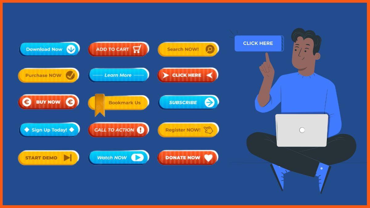
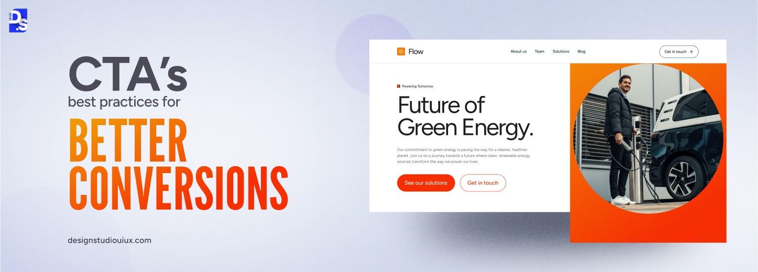
Are you ready to transform your website’s performance and boost those conversion rates? If so, let’s talk about one of the most powerful tools in your digital arsenal: the CTA button. You know, that little button that says “Buy Now,” “Sign Up,” or “Learn More”? It may seem small, but its impact is anything but! Unfortunately, many businesses make common mistakes when designing these buttons, which can lead to missed opportunities and frustrated users. In this article, we’ll dive into the seven critical mistakes you should steer clear of when designing your CTA buttons—along with best practices that will elevate your design game. By the end, you’ll be ready to create eye-catching, irresistible CTAs that not only grab attention but also drive action. Let’s get started!
Understanding the Importance of Effective CTA Buttons
Effective CTA (Call to Action) buttons are crucial for driving user engagement and conversions on your website. They serve as signposts that guide visitors towards the next steps you want them to take. When designed well, these buttons can significantly increase click-through rates and ultimately boost your bottom line.
One of the key elements that make a CTA button effective is its visibility. A button that blends into the background can easily be overlooked. Utilize contrasting colors to ensure your CTA stands out. Think of your button as a beacon, drawing users in with its vibrant hue. Consider using color psychology to evoke emotions that align with your brand’s message and the action you want users to take.
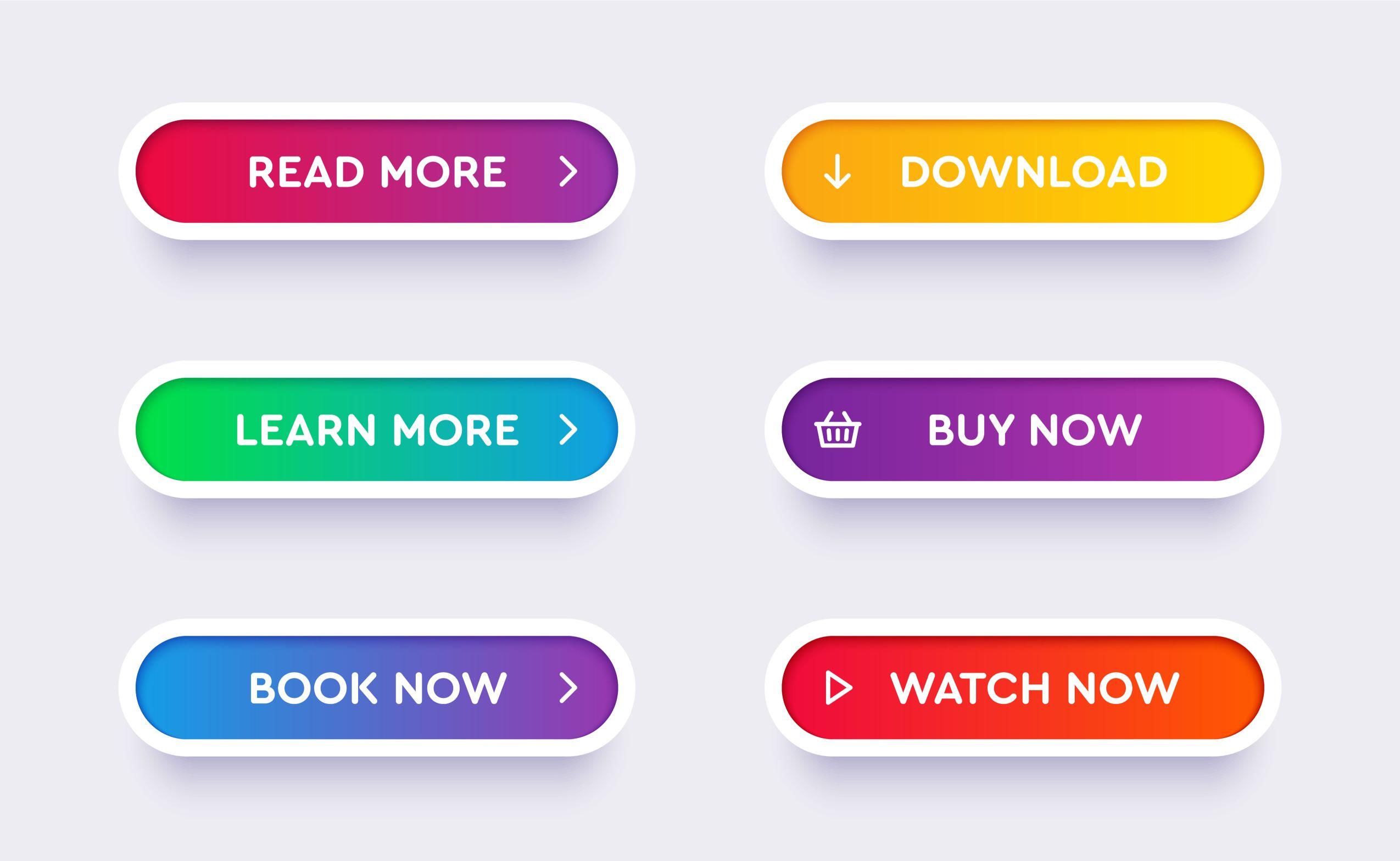
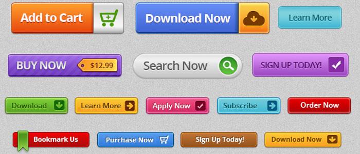
Next up is the text on the button. Avoid generic phrases like “Click Here” and opt for more action-oriented language that clearly communicates what the user will gain from clicking. Phrases like “Get Your Free Trial,” “Join the Community,” or “Start Shopping Now” are more compelling and provide a sense of urgency and value. Make it about them, not you.
Moreover, the size and shape of your CTA buttons can influence their effectiveness. A button that is too small may be hard to click, especially on mobile devices. Aim for a size that is easily tappable and noticeable. Rounded corners often make buttons appear more inviting, so consider this when designing your CTAs.
CTA Button Design Elements
Best Practices
Color
Use contrasting colors for visibility.
Text
Use action-oriented, benefit-focused words.
Size
Ensure it is large enough for easy clicking.
Shape
Consider rounded corners for a friendly appearance.
Another often-overlooked aspect is the placement of your CTA buttons. Positioning them strategically within your content can greatly affect user interaction. Typically, placing CTAs above the fold ensures that they are seen immediately. Additionally, consider including secondary CTAs at the end of the content to catch users who engage fully with your message.
Lastly, testing your CTA buttons is essential. A/B testing different colors, texts, and placements can yield valuable insights into what resonates best with your audience. Use analytics to track performance and continually refine your approach. A well-optimized CTA can lead to remarkable increases in conversions and user engagement.
Common CTA Button Mistakes That Can Hurt Your Conversions
When it comes to boosting conversions, the design and placement of your CTA buttons can make a significant difference. Unfortunately, many marketers make common mistakes that ultimately hinder their success. Here’s a look at some pitfalls to avoid:
Poor Color Choices: A CTA button should stand out from the rest of the page. Using colors that blend in can cause it to go unnoticed. Aim for contrasting colors that catch the eye but also fit within your overall branding.
Vague Text: If your button says something generic like “Click Here,” you’re not giving users a clear action to take. Use persuasive language that specifies what users will get, like “Get Your Free E-Book” or “Start Your Free Trial.”
Small Size: A button that’s too small can be easily overlooked, especially on mobile devices. Ensure your CTA is large enough to be seen and clicked with ease. A recommended minimum is 44×44 pixels for touchscreens.
Inconsistent Placement: If you keep moving your CTA button around on different pages, users might get confused about where to find it. Stick to a consistent placement, like at the top, middle, or bottom of your page, so that users know where to look.
Lack of Urgency: Creating a sense of urgency can motivate users to take action immediately. If your button does not convey urgency, consider adding phrases like “Limited Time Offer” or “Don’t Miss Out!”
Now, let’s also take a look at how these mistakes compare with best practices:
Mistake
Best Practice
Poor Color Choices
Use contrasting, eye-catching colors
Vague Text
Incorporate clear, action-oriented phrases
Small Size
Ensure the button is large enough for easy clicking
Inconsistent Placement
Maintain a consistent position across pages
Lack of Urgency
Add urgency with time-sensitive language
avoiding these common mistakes can put you on the path to higher conversions. By focusing on effective color choices, clear messaging, appropriate sizing, consistent placement, and a sense of urgency, you can create CTA buttons that not only attract attention but also drive action.
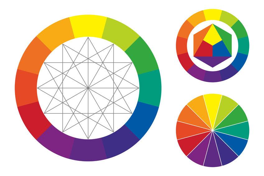
Choosing the Right Color: How It Impacts Click-Through Rates
When it comes to CTA button design, the color you choose can have a profound impact on your click-through rates. Colors evoke emotions and can influence user behavior in ways that you might not even realize. Selecting the right hue for your call-to-action button is not just a matter of aesthetic preference; it’s a strategic decision that can lead to measurable results.
Consider how different colors are perceived psychologically:
Red: Creates a sense of urgency. Often used for clearance sales.
Green: Associated with safety and positivity. Great for financial or eco-friendly products.
Blue: Evokes trust and dependability. Ideal for brands aiming for a reliable image.
Orange: Encourages action and enthusiasm. A popular choice for ‘Buy Now’ buttons.
Yellow: Grabs attention, but should be used sparingly as it can be overwhelming.
When testing different colors, it’s essential to consider your overall brand palette. A button that clashes with your website design may confuse users or make them feel uneasy. Aim for a shade that stands out but still complements your site’s aesthetic. High contrast is key; your CTA button should be easily distinguishable from the background.
Another important factor to consider is the emotional connection between color and your target audience. Different demographics often respond to colors differently. For instance, younger audiences may prefer vibrant, bold colors, while older audiences might gravitate toward more muted shades. A/B testing can help you fine-tune your choices based on real user interactions.
Here’s a quick reference table summarizing color meanings and their potential impact on click-through rates:
Color
Emotion/Meaning
Best Use
Red
Urgency, Passion
Sales, Limited Offers
Green
Growth, Safety
Finance, Health
Blue
Trust, Calm
Services, Technology
Orange
Energy, Action
CTA, Promotions
Yellow
Attention, Cheerfulness
Awareness, Fun
never underestimate the power of testing. The best way to determine the right color for your CTA buttons is to experiment. Use A/B testing to compare the performance of different colors and see which one resonates more with your audience. Track your click-through rates and adjust your strategy accordingly. After all, data-driven decisions are key to optimizing your CTA effectiveness and enhancing user engagement.
The Power of Text: Crafting Compelling CTA Copy
When it comes to crafting effective CTA (Call to Action) buttons, the actual text you use can make all the difference. The words chosen need to resonate with your audience, compelling them to take the desired action. This means that every syllable counts, and the right phrasing can turn a passive reader into an engaged customer.
Clarity is King: Your CTA should clearly convey what the user can expect. Phrases like “Download Now” or “Get Your Free Trial” leave no room for confusion. Users should know exactly what will happen when they click the button. Avoid jargon or complex phrases that can dilute the message.
Urgency Drives Action: Incorporating a sense of urgency can propel users to act quickly. Words like “Limited Time Offer” or “Act Fast!” create a psychological prompt that encourages immediate response. However, be sure that your urgency claims are genuine to maintain trust.
Value Proposition Matters: Make sure to highlight the benefits of clicking your CTA. Instead of a plain “Submit”, consider using “Get My Free Guide” to clearly communicate the value users will receive. This simple tweak can significantly enhance engagement rates.
Personalization Enhances Connection: Tailoring your CTA text to your audience can foster a stronger connection. For instance, instead of a generic “Join Us”, use “Join Our Community of Innovators”. This personal touch can make users feel more included and valued.
Test Your Copy: Don’t settle for the first version of your CTA. A/B testing different phrases can reveal what resonates most with your audience. Experiment with variations in tone, length, and wording to see which yields the highest conversion rates.
Additionally, consider using the following table to visualize the impact of different CTA phrases:
CTA Phrase
Engagement Level
Conversion Rate (%)
Download Now
High
25%
Join Our Community
Medium
18%
Get Your Free Trial
Very High
30%
Learn More
Low
10%
Ultimately, your CTA copy should be a reflection of your brand’s voice while simultaneously addressing your audience’s needs and motivations. By focusing on clear, compelling text, you can transform a simple button into a powerful tool for engagement and conversion.
Size Matters: Finding the Perfect Dimensions for Your CTAs
When it comes to crafting compelling call-to-action (CTA) buttons, size truly plays a crucial role. A button that’s too small risks being overlooked, while one that’s too large can overwhelm and deter users. Striking the right balance is essential to ensure your messages resonate effectively with your audience.
Here are some key considerations to keep in mind when determining the dimensions of your CTA buttons:
Visibility: Ensure your buttons are easily noticeable against the background. A good rule of thumb is to make them at least 44 pixels in height and width to guarantee touch-friendliness.
Proximity: Position your CTA buttons strategically. Buttons should be large enough to stand out but not so large that they dominate the entire interface. Aim for a size that draws attention without being intrusive.
Text Size: The font size within the button should complement its dimensions. A minimum of 16 pixels for text ensures readability while keeping the button visually appealing.
White Space: Incorporate ample padding around the text within your buttons. This not only improves aesthetics but also enhances clickability.
To illustrate this, consider the following table that outlines recommended sizes based on device type:
Device Type
Recommended Button Size
Minimum Touch Target Size
Desktop
100-200px width x 40-60px height
44px x 44px
Tablet
80-180px width x 35-55px height
44px x 44px
Mobile
70-150px width x 30-50px height
44px x 44px
Testing different dimensions and layouts can yield valuable insights. A/B testing your CTA buttons will reveal what sizes convert best for your specific audience. Remember, user experience should always be your guiding principle; ensure your buttons are large enough to click easily but not so large that they detract from your content.
Ultimately, the right size for your CTAs can significantly influence conversion rates. By prioritizing visibility, touch-friendliness, and aesthetic appeal, you’re not just designing buttons—you’re crafting opportunities for engagement. Use these guidelines to refine your button dimensions and watch your clicks soar!
Placement Strategies: Where to Position Your CTA for Maximum Impact
When it comes to maximizing the effectiveness of your CTA (Call to Action) button, placement is just as crucial as design. The strategic positioning of your CTA can significantly influence user behavior and conversion rates. Here are some tips on where to place your CTA for optimal impact:
Above the Fold: Placing your CTA above the fold ensures that it’s one of the first things visitors see, increasing the likelihood of interaction. This prime real estate not only grabs attention but also communicates the main action you want users to take.
In-line with Content: Integrating your CTA within the content, especially after a compelling argument or story, aligns the action with the narrative. This method leverages the context of your content to encourage users to convert.
End of the Page: After providing valuable information, placing your CTA at the end of blog posts or landing pages can capitalize on the user’s engagement. If they’ve thoroughly read your content, they’re already interested in what you have to offer.
Floating or Sticky CTAs: Consider using floating CTAs that stay visible as users scroll down the page. This unobtrusive method keeps the CTA accessible without being distracting, reminding users of the desired action throughout their browsing experience.
Another effective strategy is to utilize multi-CTA placements. Depending on the length of your content, it might be beneficial to include multiple CTAs at different points to catch users at various stages of their journey. However, this must be done strategically to avoid overwhelming visitors.
Placement
Pros
Cons
Above the Fold
High visibility, immediate action
Can disrupt flow if overused
In-line with Content
Contextual relevance, seamless integration
Risk of being overlooked
End of Page
Captures engaged users
May miss users who don’t scroll
Floating/Sticky
Always accessible
Can become annoying if intrusive
Lastly, don’t forget about the importance of testing. Experiment with different placements to see which one resonates best with your audience. Conduct A/B testing on various pages, analyzing performance metrics like click-through rates and conversion rates to determine the most effective strategies.
By thoughtfully considering where you position your CTA, you can create a seamless user experience that encourages action. Remember, the goal is to make it as easy as possible for your audience to take the step you want them to, so be strategic with your placements and watch your conversion rates soar!
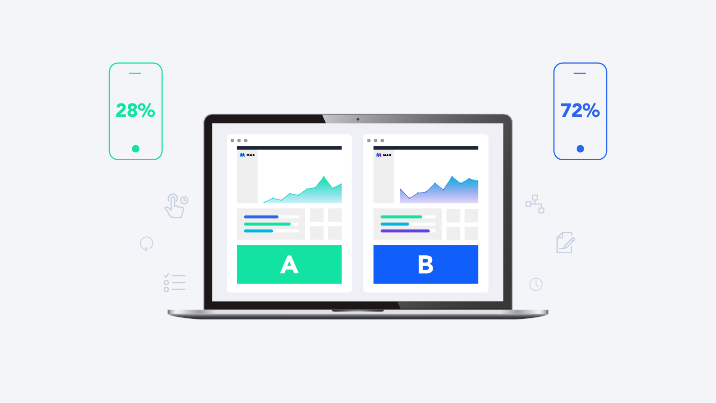
Testing and Iterating: The Importance of A/B Testing Your CTA Buttons
One of the most effective ways to enhance user engagement and improve conversion rates is through A/B testing your call-to-action (CTA) buttons. By creating variations of your CTA buttons, you can determine which design elements resonate best with your audience. The goal of A/B testing is not only to identify the most effective button but also to understand the motivations and behaviors of your visitors.
When embarking on your A/B testing journey, consider the following elements to modify:
Color: Different colors evoke different emotions. Experiment with hues that align with your brand yet stand out on the page.
Text: The wording of your CTA is crucial. Test phrases like “Sign Up Now” vs. “Get Started Free” to see what drives more clicks.
Size: A larger button may attract more attention, but can also overwhelm. Finding the right size is key.
Placement: Where your button appears on the page can significantly impact its visibility and click-through rate. Try positioning it at the top, in the middle, or at the end of the content.
To help visualize the effectiveness of your changes, create a simple table to track your results:
Variation
Clicks
Conversion Rate
Original Button
150
2.5%
Red Button
200
4.0%
Green Button
180
3.5%
Large Button
220
5.0%
Analyzing the data will reveal actionable insights. For instance, if a red button significantly outperforms a blue one, you may want to consider how color psychology plays into your audience’s decisions. Similarly, if a larger button yields a higher conversion rate, it could indicate that your users appreciate a more prominent and assertive approach.
Don’t forget to factor in the context of your testing. The effectiveness of a CTA button can vary based on the time of year, the device used, or even the type of content on the page. Regularly revisiting your A/B tests ensures your buttons remain optimized for current trends and user behavior.
Lastly, it’s important to run your tests for a sufficient amount of time to gather meaningful data. A week-long test might not capture the behavior of all your users, especially if your traffic fluctuates. Aim for at least two to four weeks for a more reliable outcome. This commitment to testing and iterating can lead to significant improvements in engagement and conversions over time.
Mobile Optimization: Designing CTAs for On-the-Go Users
When it comes to mobile optimization, designing effective calls-to-action (CTAs) is essential for engaging users who are always on the go. With the majority of web traffic coming from mobile devices, it’s crucial to tailor your CTA buttons to cater to this audience’s unique needs and behaviors.
Firstly, size matters. Your CTA buttons should be large enough to be easily tapped on a smaller screen without the risk of accidentally clicking adjacent elements. A good rule of thumb is to make buttons at least 44×44 pixels, which is the recommended size for touch targets. This ensures that users can interact with your buttons comfortably, reducing frustration and improving engagement.
Color and contrast are also vital in mobile design. Ensure that your CTA buttons stand out against the background and are easily distinguishable from other elements on the screen. A/B testing different color schemes can help you pinpoint what resonates best with your audience. Aim for high contrast to draw attention, but also consider your brand’s color palette for consistency.
Another important factor is the placement of your CTAs. On mobile devices, users typically scroll vertically, so positioning your buttons above the fold can significantly increase visibility. Additionally, consider placing them in areas where users can easily reach with their thumbs, often the lower half of the screen. This strategic placement can lead to higher click-through rates.
Moreover, the messaging of your CTAs should be concise and action-oriented. Use clear, compelling verbs that make it obvious what the user will gain by clicking the button. Phrases like “Get Started,” “Download Now,” or “Claim Your Offer” are direct and encourage immediate action. Avoid vague language that may confuse or disengage users.
Don’t overlook feedback and animation on your buttons. Subtle animations, such as a slight grow or color change on tap, can provide visual feedback to users, reinforcing that their click has registered. This small touch can enhance user experience and make your CTAs feel more interactive and engaging.
Best Practices
Mistakes to Avoid
Use large, tappable buttons
Buttons too small to tap easily
High contrast colors
Low visibility against background
Strategic placement
Buttons placed in hard-to-reach areas
Concise action-oriented text
Ambiguous or lengthy phrasing
Lastly, always consider the load times and performance of your mobile site. A button that takes too long to respond or is sluggish to load can deter users from completing actions. Optimizing images, scripts, and overall site speed can make a significant difference in user experience and conversion rates.
Creating Urgency: How to Encourage Immediate Action with Your CTAs
Creating a sense of urgency is a powerful psychological trigger that can nudge users to take immediate action. When designing your call-to-action (CTA) buttons, implementing urgency can significantly boost conversion rates. Here are some effective strategies to consider:
Time-sensitive offers: Highlight limited-time promotions or discounts. Phrases like ”Only 2 hours left!” or “Sale ends at midnight!” can prompt users to act quickly before missing out.
Scarcity tactics: Make it clear that the product or service is in limited supply. Statements such as “Only 5 left in stock!” or “Join 10 others who are viewing this right now!” can create a fear of missing out (FOMO) that encourages swift decisions.
Countdown timers: Incorporating a countdown timer can visually convey urgency. It adds a dynamic element to your CTA, making it clear that the clock is ticking on their opportunity.
Another effective approach is to use action-oriented language in your CTAs. Instead of a simple “Buy Now,” consider more urgent phrases like:
Standard CTA
Urgent CTA
Sign Up
Sign Up Now – Spots Are Filling Fast!
Learn More
Learn More Before It’s Too Late!
Add to Cart
Add to Cart – Limited Stock Available!
It’s also essential to align the urgency of your CTAs with the overall user experience. If users feel rushed or pressured, they may disengage. Balance urgency with a clear, informative path to conversion. For example, if you’re promoting a flash sale, ensure that the navigation to complete a purchase is smooth and hassle-free.
Lastly, consider the placement of your CTAs. Position them strategically throughout your content where users are most likely to be engaged. A well-placed button that communicates urgency can act as a gentle prodding nudge just when the user is considering their next move.
Incorporating these urgency-driven strategies into your CTA button design can transform your approach to conversions. By compelling users to act fast, you not only increase the likelihood of immediate engagement but also foster a sense of excitement and importance surrounding your offerings.
Using Contrast Effectively to Make Your CTAs Stand Out
When it comes to CTA button design, using contrast effectively is crucial for grabbing attention and driving conversions. Contrast is about making elements visually distinct from one another, and when applied to your CTA buttons, it can significantly influence user behavior. Here’s how to leverage contrast to ensure your calls to action stand out.
First and foremost, consider the color scheme of your website. The color of your CTA button should be different from the background and surrounding elements. For instance, if your site primarily features cool tones like blue and green, a warm color such as orange or red can create an inviting pop that draws the eye directly to the button. Here’s a quick reference table to illustrate effective contrast choices:
Background Color
CTA Button Color
Light Blue
Bright Orange
Dark Gray
Vibrant Yellow
White
Royal Purple
Soft Green
Coral Red
Another effective method is to utilize size and shape to create contrast. A larger button will naturally attract more attention, especially if it stands out from smaller surrounding elements. Furthermore, rounded edges can create a sense of friendliness, while sharp angles project a more professional appearance. Experiment with various sizes and shapes to see which resonates best with your audience.
Don’t forget about text contrast as well. The font color of your CTA text should be highly readable against the button background. Use bold or slightly larger font sizes for the text to enhance visibility. A good rule of thumb is to ensure a minimum contrast ratio of 4.5:1 between the button text and the button color to maintain readability.
Additionally, consider the use of white space around your CTA buttons. Ample spacing can help isolate your buttons from other elements, making them more noticeable. A crowded design can make it difficult for users to identify where to click. By giving your buttons breathing room, you create a more inviting environment that encourages interaction.
remember that the context in which your CTA appears can also affect its visibility. Ensure that your CTA button is placed prominently within the user’s line of sight—above the fold or strategically positioned within the content. The goal is to grab attention at the right moment, guiding users seamlessly toward taking action.
By thoughtfully applying these contrast strategies, you can create CTA buttons that not only stand out but also drive user engagement. Test different combinations and solicit feedback to refine your approach, making user experience a top priority in your design process.
Accessibility Considerations: Making Your CTA Buttons Usable for Everyone
Creating Call-to-Action (CTA) buttons that everyone can use is more than just a design choice; it’s a commitment to inclusivity. Understanding accessibility principles can make a significant difference in how effectively your CTAs engage users with diverse needs. Here’s what you need to consider:
Color Contrast: Ensure that your button colors have sufficient contrast against the background. This helps users with visual impairments easily identify and interact with your buttons. Use tools like the WebAIM Color Contrast Checker to verify accessibility.
Size Matters: Your buttons should be large enough to tap easily on mobile devices. A minimum size of 44 x 44 pixels is recommended to accommodate users who may have difficulty with precision.
Descriptive Text: Instead of generic labels like “Click Here,” use clear and descriptive phrases that explain what will happen when the button is clicked. This is especially helpful for screen reader users.
Moreover, consider the order of elements on your page. Logical and predictable navigation helps all users, particularly those who rely on keyboard navigation. Ensure that your buttons are easily reachable without excessive tabbing or scrolling.
Additionally, it’s beneficial to think about the functionality of these buttons. Including focus states—like a visible outline or color change when the button is selected—provides visual feedback to keyboard users, enhancing their navigation experience.
Button Feature
Accessibility Benefit
Color Contrast
Improves visibility for users with low vision
Size
Makes it easier for users to interact, especially on mobile
Descriptive Text
Helps screen reader users understand the action
Focus States
Provides feedback for keyboard navigation
Lastly, don’t forget about testing your buttons with real users, including those with disabilities. User testing can reveal insights that standard audits might miss, enabling you to refine your designs effectively. By prioritizing accessibility, you’re not just adhering to guidelines—you’re creating a user-friendly experience that builds trust and engagement across your audience.
Analyzing CTA Performance: Key Metrics to Watch and Improve
Once your CTA buttons are designed to perfection, the next step is to analyze their performance. Tracking key metrics is essential for understanding how effectively your CTAs are driving user engagement and conversions. Here are some crucial metrics to keep an eye on:
Click-Through Rate (CTR): This metric measures the percentage of users who click on your CTA compared to the total number of visitors. A low CTR may indicate that your CTA needs to be more compelling or better positioned.
Conversion Rate: This shows the percentage of users who completed the desired action after clicking the CTA. A high conversion rate signals that your CTA is effective at persuading users to take action.
Time on Page: Tracking how long users stay on the page before clicking the CTA can provide insights into user engagement. If users are leaving too quickly, it might be time to reassess your content or the CTA’s placement.
Abandonment Rate: This metric reveals the percentage of users who clicked on the CTA but didn’t complete the desired action. A high abandonment rate could suggest friction in the conversion process that needs to be addressed.
Heatmaps: Utilizing heatmaps allows you to visualize where users are clicking on your page. This information can help you optimize CTA placement and design based on user behavior.
To improve CTA performance, consider running A/B tests. Experiment with different button colors, sizes, and texts to see what resonates best with your audience. For instance, you might find that a bright red button outperforms a muted blue one, or that “Get Started Now” converts better than “Submit.”
Additionally, using a clear and compelling message can significantly impact your conversion rates. Ensure that your CTAs communicate the value of taking action. Instead of generic phrases like “Click Here,” try more specific and persuasive language that highlights the benefits, such as “Claim Your Free Trial” or “Get Exclusive Access Today.”
CTA Variations
CTR
Conversion Rate
Get Started Now
5.2%
12%
Claim Your Free Trial
7.8%
15%
Download Free eBook
4.5%
9%
don’t forget mobile optimization. With an increasing number of users browsing on mobile devices, ensure your CTA buttons are easily clickable and visible. A responsive design that adapitates to various screen sizes can enhance user experience and, consequently, increase your CTA performance.
Incorporating User Feedback: Building Better CTAs Through Audience Insights
Understanding your audience is key to creating effective call-to-action (CTA) buttons. By incorporating user feedback, you can optimize your CTAs to resonate more deeply with your target demographic. Here are some strategies to harness audience insights effectively:
Conduct Surveys: Regularly ask your audience what they think about your CTAs. This could be as simple as a quick poll asking if the language is clear or if the buttons are visually appealing.
Utilize A/B Testing: Experiment with different designs, colors, and text. Use analytics to track which versions perform better, allowing you to refine your approach based on real-time data.
Engage on Social Media: Use your platforms to solicit feedback directly. Ask your followers which CTAs they find most compelling and use their responses to inform your designs.
Heat Maps: Implement tools that provide visual representations of where users click most. This data can reveal which aspects of your CTAs are drawing attention and which are not.
It’s also essential to consider the language you use in your CTAs. User feedback can guide you in choosing phrases that resonate with your audience. For example, while “Buy Now” might work well for some, others might respond better to ”Get Your Free Trial.” A few tips for crafting compelling CTA language include:
Be Clear and Concise: Users should immediately understand what action they need to take.
Convey Urgency: Phrasing like “Limited Time Offer” can encourage quicker decisions.
Focus on Benefits: Instead of just stating the action, highlight what users will gain from it.
Moreover, pay attention to the placement of your CTAs. User feedback can reveal whether your buttons are easy to find and interact with. Here are a few best practices for CTA placement:
Above the Fold: Ensure that your CTA is visible without users having to scroll.
End of Content: Placing CTAs at the end of blog posts can capture users after they’ve engaged with your content.
In the Sidebar: A persistent CTA in the sidebar can provide ongoing visibility throughout the browsing experience.
Lastly, gather qualitative feedback through user sessions or usability studies. Watching real users interact with your site can provide insights that numbers alone can’t. You may discover pain points in the user journey or elements that distract from your CTAs. Document these observations and iterate on your designs.
By integrating user feedback effectively, you not only refine your CTAs but also build a stronger connection with your audience. Understanding their preferences and behaviors is crucial in creating CTAs that drive action and conversion.
Frequently Asked Questions (FAQ)
Q&A: CTA Button Design – 7 Mistakes to Avoid & Best Practices
Q1: What exactly is a CTA button, and why is it so important?
A1: Great question! A CTA, or Call to Action, button is a crucial element of web design that encourages users to take a specific action, like signing up for a newsletter or making a purchase. It’s important because it guides visitors through their journey on your site, turning passive browsers into active participants. A well-designed CTA can significantly boost your conversion rates!
Q2: What are some common mistakes people make when designing CTA buttons?
A2: There are a few major pitfalls to avoid. For instance, using generic phrases like “Click Here” can lead to confusion. Similarly, blending your CTA button into the background can make it hard for users to spot. Another mistake is neglecting mobile optimization. Remember, a significant chunk of users browses on their phones!
Q3: Can you elaborate on why color choice matters for CTA buttons?
A3: Absolutely! Color is a powerful tool in design. A strong contrast between your CTA button and the rest of the content can make it pop. But it’s not just about visibility; different colors evoke different emotions. For example, red can create urgency, while green is often associated with success. Choose colors that align with your brand and the action you want users to take!
Q4: Text matters too, right? What should I keep in mind when writing the text for my CTA button?
A4: You bet! The text on your CTA button should be concise yet compelling. Instead of saying “Submit,” try using action-oriented phrases like “Get Your Free Trial” or “Join the Adventure!” This not only gives users a clear idea of what to expect but also creates excitement around taking action.
Q5: How do I ensure my CTA buttons are mobile-friendly?
A5: Mobile-friendliness is crucial! Make sure your buttons are large enough to tap easily without zooming in. Also, place them where users can easily see them without excessive scrolling. Lastly, consider using thumb-friendly placements—typically towards the bottom of the screen—for easy access.
Q6: Is there a best practice for the placement of CTA buttons on a webpage?
A6: Definitely! The placement of your CTA can greatly impact its effectiveness. Ideally, you want it above the fold so users see it without having to scroll. You can also use multiple CTAs throughout the page, especially after compelling sections, to keep the momentum going. Always test different placements to see what works best for your audience!
Q7: Should I test my CTA buttons? If so, how?
A7: Yes, testing is essential! Conduct A/B tests to compare different versions of your CTA button—vary colors, text, size, and placements. Analyze the results to see which version performs better, and don’t be afraid to make adjustments based on user behavior. Continuous testing helps you find the most effective design for your audience.
Q8: Any final thoughts on CTA button design?
A8: Remember, your CTA button is a vital part of the user experience on your site. Avoid common mistakes, follow best practices, and always be ready to adapt based on feedback and performance. A well-designed CTA can be a game-changer in your conversion strategy, so give it the attention it deserves!
Closing Remarks
As we wrap up our journey through the world of CTA button design, remember that every pixel counts when it comes to guiding your visitors toward action. Avoiding the common pitfalls we’ve discussed can make a significant difference in your conversion rates.
Think of your CTA button as your brand’s friendly nudge—encouraging users to take the next step. By following best practices and steering clear of those pesky mistakes, you’ll create eye-catching, effective buttons that resonate with your audience.
So, whether you’re redesigning your existing buttons or crafting new ones from scratch, take a moment to consider how these elements can elevate your user experience. Your efforts will not only enhance engagement but also foster a stronger connection with your users.
Now, go ahead—put these tips into action and watch your conversions soar! Your future self (and your bottom line) will thank you. Happy designing!