Hey there! So, you’ve decided it’s time to dive into the exciting world of web development, huh? Maybe you’ve got a fantastic idea for a blog, a small business, or even a personal project that deserves to shine online. But let’s be real—just having a website isn’t enough anymore. In today’s digital landscape, an interactive website can truly set you apart, engaging visitors and encouraging them to stick around. Don’t worry if you’re feeling a bit overwhelmed; we’re here to guide you through every step of the process!
In this beginner’s guide, we’ll break down the essentials of creating an interactive website that not only looks great but also keeps your visitors coming back for more. From understanding the basics of web design to incorporating fun elements like quizzes, polls, or chat features, we’ll cover it all in a friendly, straightforward way. By the end of this journey, you’ll be equipped with the knowledge and confidence to bring your vision to life. So grab a cup of coffee, roll up your sleeves, and let’s get started on turning your ideas into an engaging online experience!
Understanding the Importance of an Interactive Website
In today’s digital landscape, having an interactive website is not just a luxury; it’s a necessity. An interactive website engages visitors in ways that static sites simply cannot. This engagement can significantly enhance user experience, leading to longer visit durations and increased likelihood of conversions. When users feel involved, they’re more likely to return and recommend your site to others.
One of the primary benefits of an interactive website is the enhanced user engagement it offers. By incorporating elements such as quizzes, polls, and dynamic content, you invite users to actively participate rather than passively consume information. This interaction keeps them on your site longer and fosters a sense of connection to your brand. Here are some engaging features you might consider:
Interactive forms and surveys
Live chat support
Image sliders and carousels
Gamified experiences
Moreover, an interactive website can dramatically improve your SEO performance. Search engines favor sites that keep visitors engaged, as it signals that the content is valuable. When users spend more time on your site, your bounce rate decreases, sending positive signals to search engines. This can lead to higher rankings and increased organic traffic.
Another critical aspect is data collection. Interactive elements can serve as valuable tools for gathering user insights. For instance, tracking how users interact with quizzes can provide you with information about their preferences and pain points. This data can inform your marketing strategies and help you tailor your offerings more effectively. Here’s a simple table showing data collection methods:
Method
Purpose
Surveys
Understand customer preferences
Quizzes
Engage users while collecting insights
Live Chat
Instant feedback and support
Additionally, an interactive website strengthens your brand identity. When users engage with your content, it creates a memorable experience that reinforces your brand’s personality. Whether it’s through fun animations or informative infographics, these elements help communicate your message effectively and make your site stand out from competitors.
an interactive website is key to fostering a community around your brand. By encouraging user-generated content, comments, and discussions, you create a platform where visitors feel valued and heard. This sense of belonging can turn casual visitors into loyal customers who advocate for your brand.
the importance of an interactive website cannot be overstated. By prioritizing engagement, improving SEO, collecting valuable data, reinforcing brand identity, and fostering community, you set the stage for a successful online presence that keeps users coming back for more.
Identifying Your Target Audience and Their Needs
Understanding who your audience is and what they need is crucial when creating an interactive website. This foundational step will guide your design choices, content creation, and functional elements. Without a clear picture of your target audience, you risk building a site that fails to engage or serve the very users you aim to attract.
Start by conducting some research. Utilize tools such as surveys, interviews, and analytics to gather insights about your potential visitors. Here are some key aspects to consider:
Demographics: Age, gender, location, and income level will influence the design and content of your site.
Interests: Understanding what captivates your audience can help you create content that resonates.
Online Behavior: Analyze how your audience interacts with similar websites to identify features they appreciate.
Once you have gathered this information, create detailed user personas. These are fictional characters that represent your target audience segments. Each persona should include:
Name: A catchy name that embodies the persona.
Background: Information about their education, career, and lifestyle.
Goals: What do they hope to achieve by visiting your site?
Challenges: What problems might they face that your website can help solve?
Utilize these personas to map out the user journey. This is a visual representation of the steps your audience takes while interacting with your website. Consider incorporating a table to illustrate different user paths:
User Persona
Goals
Challenges
Key Features Needed
Budget-Conscious Buyer
Find affordable products
Limited budget
Price comparison tool
Tech-Savvy User
Access advanced features
Information overload
Intuitive navigation
New Visitor
Learn about your offerings
Overwhelming options
Clear onboarding process
Next, prioritize the needs of your audience based on your findings. Not all needs are equally important, so consider which features or content will provide the most value. This will help you allocate resources effectively, ensuring that your website meets the most pressing demands of your users.
Incorporate feedback loops as part of your interactive design. This means offering your audience avenues to share their thoughts and experiences on your site. Use forms, comment sections, or even live chat options to encourage engagement. Not only does this provide real-time insights into their needs, but it also fosters a sense of community.
Ultimately, the goal is to create an interactive website that not only attracts visitors but also meets their specific needs in an engaging and user-friendly manner. By understanding your target audience and continuously refining your approach based on their feedback, you can build a site that resonates and converts.
Choosing the Right Platform for Your Interactive Site
When it comes to building an interactive website, selecting the right platform is crucial. With a plethora of options available, it’s essential to consider factors like usability, scalability, and the specific features you need to bring your vision to life. Here’s a closer look at some of the most popular platforms and what they offer.
WordPress is undoubtedly one of the most widely used platforms for website creation. It’s user-friendly, flexible, and equipped with a plethora of plugins that can enhance interactivity. With options like Elementor and WPBakery, you can build visually appealing layouts and add engaging features without needing to code. Plus, the active community means you’ll always find support and resources.
If you’re aiming to create a more complex interactive experience, consider Webflow. This platform combines design and development, allowing you to customize your site extensively while offering responsive design capabilities. Unlike traditional builders, Webflow gives you more control over your site’s behavior and animations, making it perfect for those who have a grasp of design principles.
Squarespace is another strong contender, especially for creatives and small businesses. It offers stunning templates and an intuitive drag-and-drop interface. While it may not have as many plugins as WordPress, its built-in features, such as forms and galleries, can provide an interactive experience right out of the box. It’s ideal for users who prefer a straightforward setup without compromising on aesthetics.
For those looking to integrate e-commerce functionality, Shopify is the go-to option. It’s designed for online stores and offers interactive elements like product customizers and chatbots to enhance customer engagement. Shopify’s extensive app marketplace allows you to add various interactive features that can boost sales and improve user experience.
Platform
Best For
Main Advantage
WordPress
General use
Flexibility and plugins
Webflow
Design-heavy sites
Customizability and animations
Squarespace
Creatives and small businesses
Beautiful templates
Shopify
E-commerce
Integrated sales features
Ultimately, the right platform for your interactive site depends on your specific needs and goals. Consider your technical skills, the level of customization you want, and the type of content you plan to offer. By carefully weighing these factors, you can choose a platform that not only meets your current requirements but also grows with you as your site evolves.
Don’t forget to explore user reviews and case studies for each platform. These can provide valuable insights into how other users have leveraged the platforms to create successful interactive sites. Making an informed decision will set a solid foundation for your project, ensuring that your interactive website is both engaging and effective.
Designing User-Friendly Navigation for Maximum Engagement
Creating an interactive website hinges significantly on the effectiveness of its navigation. When users arrive at your site, they should feel guided and not overwhelmed. A well-structured navigation system ensures that visitors can easily find what they’re looking for and encourages them to explore further.
To achieve this, consider implementing a clear hierarchy in your navigation menu. This means organizing your content in a way that makes sense to your audience. Use descriptive labels for each section of your menu. Instead of generic terms like “Products” or “Services,” opt for more specific labels that convey exactly what users will find. For instance, instead of “Products,” you could use “Eco-Friendly Home Goods.”
Another key aspect is to maintain consistency across your site. Your navigation should appear in the same location on every page. Typically, a horizontal menu at the top of the page works best, but it can also be effective on the left side for websites with more complex structures. Additionally, consider using sticky navigation that remains visible as users scroll down, allowing them to access the menu without needing to scroll back up.
Utilize dropdown menus to categorize sub-items without overcrowding your main navigation bar. This keeps the interface clean and organized, allowing users to find related topics quickly. For example:
Main Menu
Dropdown Items
Home
Welcome, Latest News
About Us
Our Story, Team, Careers
Blog
Categories, Recent Posts
Contact
Support, Feedback, Locations
Moreover, ensure that your navigation is mobile-responsive. More users are accessing websites through their smartphones and tablets than ever before. A mobile-friendly design means that your menus should stack vertically or be easily accessible through a hamburger icon. Testing your site on various devices will help you identify any usability issues that may arise.
Don’t overlook the importance of search functionality. Including a search bar allows users to find specific information quickly. Make sure it’s prominently placed, ideally at the top of the page. This can be a crucial tool for enhancing user experience, particularly on content-heavy sites.
Lastly, consider incorporating visual cues like arrows or icons that indicate which sections are expandable or clickable. A small icon can help clarify functionality and guide users seamlessly through your content. Remember, the goal is to create a navigation system that feels intuitive, enabling users to engage meaningfully with your site.
Incorporating Eye-Catching Visuals and Multimedia Elements
One of the most effective ways to enhance user engagement on your website is by . These elements not only grab attention but also communicate your message more effectively than text alone. Consider integrating the following components to create a visually appealing experience:
High-Quality Images: Use clear, relevant images that resonate with your audience. Websites that use professional photography often see higher engagement rates.
Infographics: Transform complex information into visually appealing infographics. They are great for summarizing data and making it easily digestible.
Videos: Integrate short videos that explain your products or services. A well-produced video can communicate your brand’s personality and keep visitors on your site longer.
Animations: Subtle animations can guide users’ attention and create a dynamic experience. Be careful not to overdo it; too much movement can be distracting.
When selecting visuals, ensure they align with your brand identity. Consistency in style—whether through color palettes, typography, or imagery—will help reinforce your message and create a cohesive aesthetic. Here’s a simple table that illustrates how different types of visuals can enhance various website sections:
Website Section
Visual Type
Purpose
Homepage
Hero Image or Video
Captures attention immediately
Blog Post
Infographics
Simplifies complex topics
Product Pages
High-Quality Images
Showcases product details
Testimonials
Video Clips
Builds trust through authenticity
Don’t forget about the power of interactive elements! Adding features such as sliders, quizzes, or polls can significantly boost user interaction and provide a personalized experience. These elements encourage visitors to engage actively with your content, making them more likely to return.
Furthermore, ensure your visuals are optimized for different devices. With the increasing use of mobile devices, resizing images and using responsive design for videos is essential. A website that looks great on both desktop and mobile will provide a seamless experience for all users.
Lastly, always keep accessibility in mind. Use alt text for images, captions for videos, and ensure color contrasts are friendly to users with visual impairments. By being inclusive, you not only widen your audience but also enhance the overall experience for everyone who visits your site.
Creating Compelling Content That Encourages Interaction
Creating content that captivates your audience and sparks interaction is crucial for an interactive website. Here are some strategies to help you foster engagement through your content.
Use Storytelling to Connect: People love stories. They resonate with emotions and experiences. When you share a narrative, whether it’s about your brand, customer experiences, or even a fictional tale, it creates a connection with your audience. Consider using:
Real-life customer testimonials
Behind-the-scenes glimpses of your business
Relatable scenarios that echo your audience’s experiences
This will not only entertain but also encourage users to share their own stories in the comments.
Incorporate Interactive Elements: Adding interactive features can significantly enhance user engagement. Here are a few elements you can include:
Polls and surveys to gather opinions
Quizzes that relate to your content
Comment sections that invite discussion
These elements not only engage users but also provide valuable feedback to you.
Visual Content Speaks Volumes: Humans are visual creatures. Incorporate vibrant images, infographics, and videos into your content. For instance, an eye-catching infographic can simplify complex information and make it more digestible. Consider this table for visual content suggestions:
Type of Visual Content
Use Case
Infographics
To explain processes or data
Videos
Tutorials or product demos
Images
Showcase products or events
Encourage User-Generated Content: Invite your audience to create content related to your brand. This could be through contests, challenges, or simply asking for feedback. Examples include:
Photo contests with a specific theme
Requesting user reviews and features on your site
Creating a hashtag for social media sharing
User-generated content not only boosts engagement but also builds community.
Ask Open-Ended Questions: Sparking conversation is as simple as asking the right questions. Instead of yes or no queries, pose questions that require thought and elaboration. For example:
“What’s your favorite way to use our product?”
“How has your experience with us been?”
“What topics would you like us to cover next?”
This invites your audience to share their thoughts and experiences, fostering richer interactions.
Make Your Content Shareable: Ensure your content is easily shareable on social media platforms. Integrate share buttons and create compelling snippets that users want to share. Consider using:
Engaging headlines that spark curiosity
Visuals that stand out in feeds
Quotes or highlights that summarize key points
This not only broadens your reach but also encourages community discussions.
Implementing Interactive Features Like Quizzes and Polls
Interactive features like quizzes and polls can transform your website from a static page into a dynamic platform that engages users. By incorporating these elements, you not only make your website more fun but also increase user participation and feedback. Here’s how you can effectively implement these features.
First, consider using quiz plugins that are easy to integrate into your site. Many platforms like WordPress offer a variety of quiz plugins that come with customizable templates and built-in analytics. This means you can design quizzes that match your brand’s look and feel while collecting valuable data about your audience. Here are some popular options:
Quiz and Survey Master: Offers customizable quizzes and detailed results.
WP Quiz: Perfect for creating viral quizzes designed for social sharing.
Interact: A user-friendly tool that lets you create quizzes without coding.
Next, think about the type of quizzes you want to create. They can range from fun personality quizzes that entertain users to knowledge tests that provide educational value. Depending on your audience, you might want to design quizzes that align with your niche. For example, if your site is about health, consider quizzes on nutritional knowledge or fitness levels.
When it comes to polls, they are not only easy to set up but also provide immediate feedback. Using simple poll plugins, you can create single-question polls that are visually appealing and encourage users to participate. A well-placed poll can spark discussions and keep visitors returning to your site. Here’s a quick comparison of popular poll plugins:
Plugin
Features
Price
WP Polls
Simple setup, customizable styles
Free
YOP Poll
Multiple polls, scheduling options
Free & Premium
Opinion Stage
Interactive polls and surveys
Free & Premium
To maximize participation, ensure that your quizzes and polls are easily accessible. Embed them in blog posts, share them on social media, or feature them prominently on your homepage. Additionally, consider using engaging visuals and straightforward language to capture your audience’s attention and make the experience enjoyable.
always pay attention to analytics. Whether you are using Google Analytics or the built-in tools from your quiz and poll plugins, tracking user engagement will provide insight into what content resonates with your audience. This data can guide your content strategy moving forward, allowing you to refine your quizzes and polls for better interaction.
Utilizing Responsive Design for a Seamless Experience
Responsive Design Fundamentals
Creating a website that adapts to various screen sizes is crucial in today’s digital landscape. With the increasing use of smartphones and tablets, a responsive design ensures that your site looks and functions beautifully, regardless of the device being used. This approach not only enhances user experience but also boosts your website’s SEO ranking.
Key Principles of Responsive Design
To implement responsive design effectively, consider the following principles:
Fluid Grids: Instead of fixed widths, use percentages to allow your layout to adjust fluidly when the screen size changes.
Flexible Images: Ensure images resize within their containing elements by using relative units like percentages, ensuring no distortion occurs.
Media Queries: These CSS techniques allow you to apply styles based on the device characteristics, such as width, height, and orientation.
Building a Mobile-First Approach
Starting with a mobile-first design can be a game changer. This technique involves designing your website for smaller screens before adapting it to larger displays. Here’s why this approach stands out:
It prioritizes essential content, providing users with a streamlined experience.
Loading times are improved, as mobile users typically have less bandwidth.
It encourages the incorporation of user-friendly navigation features that are easily accessible on smaller screens.
Testing and Optimization
Once you’ve built your responsive design, testing across multiple devices is essential. Utilize tools like Google’s Mobile-Friendly Test to assess how your site performs. Here are some tips for optimization:
Check for any layout issues on various screen sizes.
Ensure that touch elements are adequately sized for easy interaction.
Pay attention to loading speeds, as quick load times are crucial for retaining visitors.
Responsive Design in Action
Let’s look at some practical examples of responsive design, highlighting notable features:
Website
Responsive Features
Example.com
Fluid grid layout, optimized images, and mobile navigation menu.
SampleSite.org
Media queries for different viewports and fast loading times.
DemoWeb.net
Touch-friendly elements and adaptive text sizes for readability.
Conclusion
By embracing responsive design, you’re not just enhancing user experience; you’re also setting your website up for long-term success in an ever-evolving digital world. Remember, a seamless experience translates into higher visitor retention and engagement, ultimately driving conversions.
Integrating Social Media for Enhanced User Connectivity
In today’s digital landscape, integrating social media into your website is more than just a trend; it’s a necessity. Connecting your site with social platforms not only enhances user connectivity but also amplifies engagement and boosts your online presence. Here’s how you can seamlessly blend social media into your interactive website.
First and foremost, choose the right platforms. Not every social media outlet will align with your brand’s identity or target audience. Focus on the platforms where your potential users are most active. Consider the following:
Facebook: Ideal for community building and sharing content.
Instagram: Perfect for visually-driven brands and storytelling.
Twitter: Great for real-time updates and customer interaction.
LinkedIn: Best for B2B connections and professional networking.
Once you’ve identified the platforms, it’s time to add social sharing buttons to your website. These buttons allow users to easily share your content on their social media profiles, driving more traffic to your site. Ensure these buttons are visible and accessible on all pages, particularly on blog posts and product pages.
Another effective strategy is to embed social feeds directly into your site. This not only keeps your content fresh but also showcases real-time interactions with your audience. For example, you can embed a Twitter feed to display live tweets about your brand, or an Instagram gallery to showcase user-generated content.
Furthermore, consider incorporating social login options. Allowing users to sign up or log in with their social media accounts simplifies the process and encourages more registrations. This feature reduces friction, making it easier for users to connect with your website.
Feature
Benefit
Social Sharing Buttons
Increases content reach and traffic.
Embedded Social Feeds
Enhances engagement with dynamic content.
Social Login
Streamlines user registration and login.
Lastly, don’t forget to analyze your social media performance. Use analytics tools to track how users interact with your social features. This data can provide invaluable insights into what works and what needs improvement, allowing you to refine your strategy continually.
By thoughtfully integrating social media into your website, you create an interactive space where users feel connected and engaged. Remember, the goal is to foster community, encourage sharing, and enhance the overall user experience. With these tactics in place, your website will not just be a destination but a vibrant social hub.
Testing Your Website for Functionality and User Experience
Creating an interactive website goes beyond just design; you need to ensure that all components work seamlessly. Testing functionality is a crucial step in the development process. It involves checking every element of your website to confirm it performs as intended. Here’s how to do it effectively:
Check Links: Ensure all internal and external links work correctly. Use tools like Broken Link Checker to automate this process.
Form Functionality: Test every form on your website to confirm submissions are received correctly. This includes contact forms, sign-up forms, and payment gateways.
Interactive Elements: Verify that buttons, sliders, and other interactive elements respond as expected. Engage real users for this assessment, as they may find issues you didn’t notice.
Once functionality is confirmed, it’s time to pivot to user experience (UX). A user-friendly website keeps visitors engaged and encourages them to return. Here are some strategies for testing UX:
User Testing: Invite a diverse group of users to navigate your site. Observe their interactions and solicit feedback on their experience.
Heatmaps: Utilize tools like Hotjar or Crazy Egg to track where users click most frequently. This data can highlight areas that are confusing or not utilized.
Accessibility Checks: Ensure your website is usable for everyone, including those with disabilities. Use tools like WAVE or Axe to check for compliance with accessibility standards.
Another essential aspect is responsiveness. Your site should perform well across devices, from desktops to smartphones. Consider the following:
Device Type
Key Considerations
Desktop
Screen size, layout, and hover interactions
Tablet
Touch interactions and spacing
Mobile
Touchscreen usability, font size, and load times
after you’ve worked through functionality and UX, don’t forget to conduct performance testing. A slow website can deter visitors, so analyze loading times and overall speed. Tools like Google PageSpeed Insights can provide valuable insights and suggestions for improvement.
Gathering Feedback to Continually Improve Interaction
Creating an interactive website is not just about flashy designs and clever layouts; it’s also about understanding your users and continuously refining their experience. To genuinely engage your audience, gathering feedback plays a crucial role. By actively seeking input from your users, you can identify what works, what doesn’t, and what could be improved.
One effective way to gather feedback is through surveys. These can be integrated directly into your website, allowing users to share their thoughts conveniently. Consider including questions that ask about:
Overall satisfaction with the website
Ease of navigation
Content relevance and clarity
Features they would like to see
Another powerful tool is the feedback form. Make it easily accessible, perhaps in the footer or as a popup after users spend some time on your site. Ensure the form is short and user-friendly, so visitors feel encouraged to provide their insights. You might ask open-ended questions like:
What do you like most about our website?
What challenges did you face while navigating?
Moreover, implementing analytics tools can provide you with quantitative data on user behavior. This data helps you understand how users interact with your site, which pages are most popular, and where they tend to drop off. With this information, you can make informed decisions on where to focus your improvement efforts.
Consider establishing a feedback loop where you not only collect feedback but also communicate the changes made based on that input. For instance, if users expressed a desire for more content in a specific area, after enhancing that section, you could send out a newsletter highlighting those updates. This not only shows that you value their opinions but also encourages ongoing engagement.
Lastly, don’t underestimate the power of social media as a feedback tool. Create posts asking your audience for their thoughts on specific elements of your website. This not only broadens your reach but also taps into a community that may be more inclined to share spontaneous feedback. Here’s a simple table to summarize various feedback methods:
Feedback Method
Pros
Cons
Surveys
Structured insights
May deter users if too long
Feedback Forms
Direct user input
Limited responses if questions are vague
Analytics Tools
Data-driven insights
Requires interpretation
Social Media
Engages community
May receive biased feedback
Incorporating a robust feedback strategy is essential for any interactive website. The more you listen to your audience, the better you can tailor their experience, ultimately leading to increased satisfaction and engagement. So, remember to keep those lines of communication wide open, and use the insights gained to continuously evolve your site.
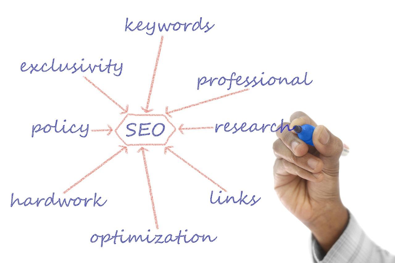
Optimizing for Search Engines to Drive Traffic
When it comes to driving traffic to your interactive website, optimizing for search engines is crucial. By implementing effective SEO strategies, you can ensure that your site ranks higher in search results, making it easier for potential visitors to find you. Here are some key techniques to consider:
Keyword Research: Start by identifying the keywords that your target audience is using to search for content related to your niche. Tools like Google Keyword Planner or Ubersuggest can help you find keywords with high search volume and low competition.
On-Page SEO: Optimize your website’s content by including the targeted keywords in strategic places such as the page title, headers, and throughout the body text. Ensure that your content remains engaging and relevant to the readers.
Meta Tags: Craft compelling meta descriptions and title tags that not only include your keywords but also encourage users to click through to your site. A well-written meta tag can significantly boost your click-through rate (CTR).
Image Optimization: Don’t forget about images! Use descriptive file names and alt text for images to help search engines understand their context. This practice can also improve your visibility in image search results.
Internal Linking: Create a network of internal links within your website to guide visitors to related content. This not only enhances user experience but also helps search engines crawl your site more effectively.
Mobile Optimization: With an increasing number of users accessing websites via mobile devices, ensure that your site is responsive and mobile-friendly. Google prioritizes mobile-optimized sites in search rankings.
Another important aspect is to focus on building high-quality backlinks. Backlinks from reputable websites can significantly enhance your site’s authority and boost its SEO performance. Consider the following strategies:
Guest Blogging: Write guest posts for established blogs in your niche. This not only increases your visibility but also allows you to include backlinks to your website.
Social Media Engagement: Leverage social media platforms to share your content and engage with your audience. This can lead to increased shares and, consequently, more backlinks.
Collaborations: Partner with influencers or other websites for co-marketing opportunities. This collaboration can help you reach a broader audience while earning valuable backlinks.
Lastly, monitor your SEO performance regularly. Use tools such as Google Analytics and Google Search Console to track your traffic, understand user behavior, and identify areas for improvement. Regular audits of your SEO strategy will keep your website competitive and relevant in search engine results.
SEO Technique
Description
Keyword Research
Identify keywords relevant to your niche for targeting.
On-Page SEO
Optimize content by placing keywords in key areas.
Backlinks
Earn links from reputable sites to increase authority.
Mobile Optimization
Ensure a responsive design for mobile users.
By implementing these strategies, you’ll not only enhance your site’s visibility but also attract a larger audience, ultimately leading to greater engagement and success for your interactive website.
Launching Your Interactive Website with a Bang
Once you’ve crafted an interactive website filled with intriguing features and engaging content, it’s time to unveil it to the world. Launching your site effectively can make all the difference in attracting visitors and retaining their interest. Here are some essential strategies to ensure your launch goes off without a hitch:
Create Buzz Before the Launch: Build anticipation by sharing teasers on your social media channels. Use captivating images and short videos to create excitement.
Leverage Email Marketing: Send out a launch announcement to your subscribers. Include exclusive offers for early visitors to encourage them to check out your new site.
Host a Launch Event: Consider hosting a virtual launch event. This could be a live stream where you walk through the key features of your website and answer questions from your audience.
As you prepare for your launch, make sure you have a solid plan in place for tracking visitor engagement. Utilize tools like Google Analytics to gather data on how users are interacting with your site. This information can be invaluable in understanding what works and what needs improvement.
Essential Features to Highlight
When structuring your launch, it’s crucial to highlight the features that make your interactive website stand out:
Feature
Benefit
Live Chat Support
Instant assistance for users, enhancing their experience.
User-Generated Content
Encourages community engagement and keeps content fresh.
Interactive Quizzes
Fun way for users to learn more about your offerings.
Make sure to demonstrate these features during your launch event. Show how they work in real-time, allowing your audience to see the value they bring.
Post-Launch Tactics
After the initial launch excitement, keep the momentum going with these tactics:
Content Marketing: Regularly update your blog with helpful articles and engaging content that drives traffic back to your site.
Engage on Social Media: Keep your followers updated and encourage them to share their experiences using your site’s features.
Run Contests or Giveaways: Incentivize user participation by offering giveaways that require engagement with your website.
Remember, launching your interactive website is just the beginning. By continuously promoting and improving your site, you’ll cultivate a vibrant online community that keeps coming back for more.
Promoting Your Website to Attract Visitors and Retain Engagement
Building an interactive website is just the first step; the real challenge lies in attracting visitors and keeping them engaged. In today’s digital landscape, where attention spans are shorter than ever, it’s crucial to implement effective strategies that not only draw traffic but also retain it. Here are some tried-and-true methods to promote your site successfully.
Leverage Social Media Platforms: Social media is a powerful tool for driving traffic to your website. Create engaging posts that highlight the features of your interactive site. Use platforms like Facebook, Twitter, Instagram, and LinkedIn to:
Share snippets of your content.
Encourage user-generated content.
Run contests or polls to foster community engagement.
Utilize SEO Best Practices: Search Engine Optimization (SEO) is vital for increasing your website’s visibility. Make sure your content is optimized for keywords related to your niche. Consider:
Using descriptive titles and meta descriptions.
Incorporating alt text for images.
Creating a blog to provide regular, valuable content.
Engage with Email Marketing: Building an email list is a fantastic way to keep your audience informed about new interactive features or content updates. Send newsletters that include:
Exclusive content only available to subscribers.
Invitations to live webinars or online events.
Personalized recommendations based on user behavior.
Collaborate with Influencers: Partnering with influencers in your industry can significantly expand your reach. When selecting influencers to collaborate with:
Ensure they align with your brand values.
Look for those who have an engaged following.
Consider co-creating content that showcases your website’s interactivity.
Strategy
Benefits
Social Media Promotion
Increases visibility and engagement.
SEO Practices
Improves organic search rankings.
Email Marketing
Encourages repeat visits and loyalty.
Influencer Collaborations
Broader audience reach and credibility.
regularly analyze your website’s performance using tools like Google Analytics. Understanding where your traffic comes from and how users interact with your content is essential. Adjust your strategies based on this data to ensure you are constantly improving your outreach efforts and enhancing user engagement.
Frequently Asked Questions (FAQ)
Q&A: How to Create an Interactive Website (Beginner’s Guide)
Q: What do you mean by an “interactive website”? A: Great question! An interactive website is one that encourages user engagement and participation. Think of features like quizzes, forms, comment sections, and even interactive maps. The goal is to create a two-way communication channel between you and your visitors. This not only makes the experience more enjoyable but can also lead to better retention of your audience.
Q: Why should I create an interactive website? A: If you want your website to stand out in a sea of static pages, interactivity is key! It enhances user experience, keeps visitors on your site longer, and can improve conversion rates. Plus, interactive features can make your content more memorable. Imagine a user taking a quiz on your site and sharing their results—now that’s free publicity!
Q: I’m a complete beginner. Where should I start? A: Don’t worry! Everyone starts somewhere. First, decide on the purpose of your website. Are you a blogger, a small business, or perhaps creating a portfolio? Once you have a clear vision, you can choose the right platform to build on. Popular options include WordPress, Wix, and Squarespace, which offer user-friendly templates and drag-and-drop features.
Q: What tools do I need to create an interactive website? A: You’ll need a few key tools to get started. Most website builders have built-in features for interactivity, like forms and comment sections. If you’re feeling more adventurous, check out platforms like Typeform for surveys or Google Maps API for interactive maps. And don’t forget about social media integration—it’s a great way to engage your audience!
Q: How can I make my website visually appealing? A: Visuals are crucial for an engaging website! Use high-quality images, videos, and infographics to draw in users. Choose a color scheme that reflects your brand, and make sure your layout is clean and intuitive. Tools like Canva can help you create stunning visuals, even if you’re not a design pro!
Q: What type of content works best for interactivity? A: Content that invites participation usually works best. Think about quizzes, polls, or games related to your niche. Tutorials with step-by-step processes, interactive infographics, or even a simple FAQ section can make your site more engaging. The more users can get involved, the better!
Q: How do I ensure my website works well on mobile devices? A: In today’s world, mobile optimization is non-negotiable! Most website builders automatically optimize for mobile, but you should always test it yourself. Make sure interactive elements work seamlessly on smaller screens. Tools like Google’s Mobile-Friendly Test can help you check your site’s performance on mobile.
Q: What if I encounter technical difficulties? A: It’s perfectly normal to face challenges when building your website! Most website builders have extensive help centers, video tutorials, and community forums. Don’t hesitate to reach out for help. You can also find plenty of online courses that can guide you through any technical hiccups.
Q: How do I drive traffic to my interactive website? A: Once your site is live, promoting it is crucial! Utilize social media platforms to share your content, engage with your audience, and invite them back to your site. Email marketing is another great way to keep your visitors informed and encourage repeat visits. Consider SEO practices to improve your site’s visibility in search engines too!
Q: Is it worth the investment to create an interactive website? A: Absolutely! The time and effort you invest in creating an interactive website can pay off tremendously. It’s not just about having a digital presence; it’s about creating a space where users feel connected and valued. In the long run, this can translate to increased loyalty and sales!
Final Thoughts: Creating an interactive website may seem daunting at first, but with the right tools and mindset, it’s entirely achievable. So why wait? Dive in and start crafting a website that doesn’t just inform, but truly engages. Your audience is waiting!
In Conclusion
As we wrap up this beginner’s guide on creating an interactive website, let’s take a moment to reflect on the exciting journey ahead of you. Building an interactive website isn’t just about coding or design; it’s about crafting an experience that resonates with your audience and keeps them coming back for more.
Remember, the tools and techniques we discussed are just the starting point. Don’t hesitate to experiment and let your creativity shine! Whether you’re aiming to engage visitors through captivating animations, responsive designs, or user-driven content, the possibilities are endless.
So, what are you waiting for? Dive into the world of interactive web design and bring your ideas to life! Your unique vision is just a few clicks away from transforming into a vibrant online presence. And if you ever feel stuck, just remember: every expert was once a beginner. Keep learning, keep creating, and most importantly, have fun along the way!
Happy building! Your interactive website is just around the corner!