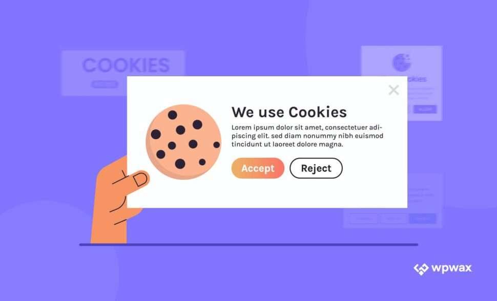
What to Put On A Cookie Banner So Visitors Aren’t Annoyed
When it comes to browsing the internet, there’s one thing that almost everyone can agree on: cookie banners can be downright annoying. You visit a website, ready to dive into content, and suddenly—bam!—a pop-up demands your attention, asking for your consent to use cookies. It’s enough to make anyone roll their eyes. But what if we told you there’s a way to make these cookie notices less of a nuisance and more of a friendly reminder? In this article, we’ll explore the ins and outs of crafting a cookie banner that doesn’t just comply with regulations, but actually respects your visitors and enhances their experience. Let’s turn that obligatory pop-up into a helpful and engaging part of your website!
Understanding the Purpose of a Cookie Banner
When visitors land on your website, the last thing you want is for them to be overwhelmed by an intrusive cookie banner. However, the purpose of this seemingly annoying feature is crucial: it serves as a bridge between your site and its users, ensuring transparency about data collection practices. By understanding what a cookie banner should achieve, you can create a user-friendly experience that respects privacy while still engaging visitors.
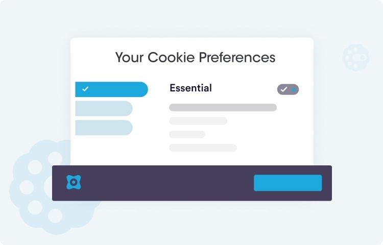
A cookie banner’s primary objective is to inform users about the types of cookies being used and to provide them with choices regarding their consent. This is increasingly important as data privacy regulations, like the GDPR and CCPA, impose strict guidelines on how businesses can collect and use personal information. To keep your visitors informed without irritating them, consider including the following elements:
Clear Information: Briefly explain what cookies are, why they’re used, and how they benefit the user experience.
Consent Options: Give visitors straightforward options to accept all cookies, reject non-essential cookies, or customize their preferences.
Link to a Privacy Policy: Always provide a link to your full privacy policy so users can delve deeper into how their data will be used.
One effective strategy is to adopt a friendly tone in your cookie banner. Instead of a strict “accept or deny” approach, consider phrasing it as an invitation. For example: “We use cookies to improve your experience. Click ‘Accept’ to enjoy a tailored browsing experience or ‘Manage Preferences’ to choose what works for you!” This kind of language can help soften the impact of the banner while still fulfilling legal requirements.
Another important aspect is to keep the design of the cookie banner simple and unobtrusive. It should not cover the entire screen or disrupt the user’s flow. A well-placed banner at the bottom or top of the page allows visitors to continue reading without feeling interrupted. Here’s a quick comparison of two designs:
Design Feature
Banner at Top
Banner at Bottom
Visibility
Easily noticeable but can interrupt initial engagement
Less intrusive, keeps the main content visible
User Interaction
Requires immediate action to continue browsing
Allows users to read before deciding
Design Flexibility
Can blend with site header
May clash with footer design
Additionally, consider employing a gradual approach to consent. Instead of bombarding users with a cookie banner upon their first visit, you can introduce a less invasive notification bar that gradually leads into the cookie consent request. This gentle nudge can create a sense of trust, making users more willing to engage with your site and its offerings.
Lastly, remember to regularly review and update your cookie banner as needed. As privacy laws evolve and your website changes, so too should your approach to cookies. Staying current not only helps you comply with regulations but also builds credibility with your audience.
Why Transparency Matters in Cookie Notices
When it comes to cookie notices, transparency is not just a legal requirement; it is a fundamental aspect of building trust with your website visitors. A clear and honest approach can make all the difference in how your audience perceives your brand. Instead of hiding behind complex jargon or dense text, a straightforward cookie notice invites users to engage with your content without feeling overwhelmed or deceived.
Here are a few key reasons why transparency in cookie notices is essential:
Builds Trust: When users understand what cookies are being used and why, they are more likely to feel comfortable interacting with your site. Trust leads to loyalty, which is invaluable for any business.
Enhances User Experience: A transparent cookie notice contributes to a seamless user experience. Users appreciate clarity and are less likely to navigate away from a site that respects their preferences.
Avoids Legal Issues: With regulations like GDPR and CCPA in place, being transparent about cookie usage helps you stay compliant. This not only protects your business but also reassures users that you take their privacy seriously.
But what does transparency look like in practice? It starts with using simple language that demystifies cookie usage. Avoid industry jargon and instead, explain:
What cookies are being used (e.g., functional, analytical, advertising)
Why these cookies are necessary for the site’s functionality or user experience
How users can manage their cookie preferences, including how to opt out
Consider implementing a cookie consent banner that clearly outlines this information without overwhelming visitors. For example, an effective banner might look something like this:
Cookie Type
Purpose
Functional Cookies
Essential for website functionality
Analytical Cookies
Help us understand site usage
Advertising Cookies
Personalize marketing efforts
This table format provides quick insights and can make your cookie notice more digestible. Furthermore, allow users to easily access a detailed policy that elaborates on cookie usage, boosting transparency without cluttering the initial banner.
Incorporating a clear and approachable tone in your cookie notice is also vital. Instead of a dry, legalistic statement, try a friendly message that says something like:
“We use cookies to enhance your experience. By continuing to browse, you agree to our use of cookies. Want to know more? Check our cookie policy!”
By prioritizing transparency in your cookie notices, you not only comply with legal standards but also foster a positive relationship with your visitors. A friendly, clear approach to cookie usage can turn a mundane notification into an opportunity for engagement, ensuring that users feel valued and respected as they navigate your site.
The Importance of Clear Language in Your Message
When crafting your cookie banner, the language you use is crucial. Clear and straightforward language ensures that visitors understand your message without feeling overwhelmed or annoyed. Using jargon or overly complex phrases can lead to confusion and may even drive users away from your site. Instead, opt for simple, direct statements that convey the necessary information without unnecessary fluff.
For instance, instead of saying, “This website utilizes cookies to enhance user experience and analyze site traffic,” consider a more approachable version: “We use cookies to make your visit better. Do you accept?” This not only simplifies the message but also invites users to engage positively with your site.
Here are some essential elements to include in your cookie banner:
Clarity: Use plain language that everyone can understand.
Relevance: State why cookies are being used in a straightforward manner.
Choice: Allow users to opt-in or out easily, making it a clear decision.
Transparency: Provide a link to your privacy policy for those who want more information.
It’s also beneficial to keep your cookie banner design clean and unobtrusive. Visitors appreciate when important information is presented without clutter. A compact, visually appealing banner can convey respect for their time and attention, creating a more positive user experience. Use contrasting colors for the text and background so the message stands out but doesn’t clash with your website’s design.
Consider this simple HTML table layout for easy readability:
Element
Description
Message
Use friendly, clear language.
Options
Provide easy opt-in/opt-out choices.
Link
Connect to your privacy policy.
Design
Keep it simple and non-intrusive.
Lastly, remember that a well-crafted cookie banner not only complies with regulations but also builds trust with your audience. When visitors feel they are being treated with respect and transparency, they are more likely to engage with your content and return to your site. So, invest the time to refine your cookie banner language—your visitors will appreciate it, and it’ll lead to better overall engagement.
How to Use Friendly and Inviting Tone
When crafting a cookie banner, the first step is to embrace a friendly and inviting tone that resonates with your visitors. Instead of using stiff legal jargon, think of how you would talk to a friend. This approach not only makes the message more approachable but also enhances the overall user experience.
Start by addressing your visitors directly. Use pronouns like “you” and “your” to make the communication feel personal. For instance, instead of saying, “Cookies are used on this site,” try something like, “We use cookies to improve your experience and make our site even better for you!” This small tweak can make a significant difference in how your message is perceived.
Another effective strategy is to inject a bit of personality into your cookie banner. Use playful language or emojis that align with your brand’s voice. For example:
“🍪 We love cookies, and we know you do too! Check out how we use them to enhance your journey.”
“Hey there! We use cookies to make your browsing sweeter. Let’s make it a great experience together!”
Keep your message brief and to the point. Visitors often skim content, so aim for clarity. Use short sentences and highlight key points. A format that combines text with visual elements, like buttons or icons, can help guide the visitor’s eye and make your message stand out.
Consider offering visitors a choice. Instead of just stating that cookies are used, give them options. A statement like “Would you like to know more about our cookie policy?” can empower users and reduce any feelings of annoyance. Use a simple and clean layout for this, perhaps with a table to outline what cookies you use and why:
Cookie Type
Purpose
Essential Cookies
To ensure the site functions correctly.
Analytical Cookies
To help us understand how visitors use our site.
Advertising Cookies
To provide personalized ads based on your interests.
closing your cookie banner with a friendly invitation to continue browsing can leave a positive impression. Phrases like “Thanks for stopping by! Enjoy your stay!” or “Let’s get started on your adventure!” can transform a transactional message into a warm welcome.
Highlighting Benefits Over Obligations
When crafting a cookie banner, it’s essential to focus on what users stand to gain rather than what they might feel obligated to accept. By shifting the narrative, you can create a more engaging experience that resonates with your visitors. Here’s how you can highlight the benefits effectively:
Enhanced Experience: Inform users how cookies help tailor their browsing experience. For instance, “Cookies help us remember your preferences, so you can enjoy a personalized experience every time you visit!”
Exclusive Offers: Let visitors know that accepting cookies can unlock special content or promotions. Something like, “By accepting cookies, you’ll be the first to know about our exclusive deals and updates!” adds value.
Improved Performance: Explain that cookies can enhance website performance. You might say, “Cookies enable us to optimize our site, so it loads faster and works better for you!”
Streamlined Navigation: Highlight how cookies can simplify the website navigation process. For example, “With cookies, we can remember your last viewed items, making it easier for you to pick up where you left off!”
Consider using a friendly and straightforward tone in your messaging. Instead of saying, “We use cookies to track your data,” try rephrasing it to, “We use cookies to enhance your journey on our site. Here’s how!” This not only informs users but also fosters trust and understanding.
Benefit
Description
Personalized Content
Cookies remember your interests, delivering content tailored just for you.
Faster Loading Times
We use cookies to optimize our site speed for a smoother experience.
Exclusive Access
Accepting cookies grants you access to special offers and promotions.
don’t forget to add a dash of humor to lighten the mood. A simple line like, “Cookies help us keep the good times rolling—don’t worry, no baking involved!” can make the acceptance feel less like a chore and more like a choice.
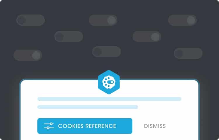
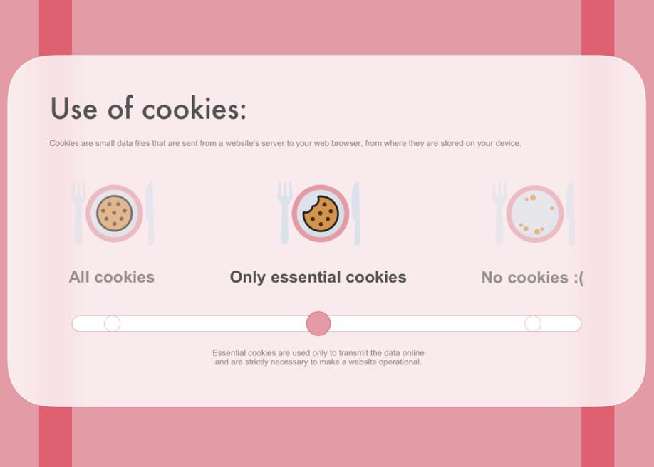
Making Your Cookie Options Easy to Understand
When it comes to cookie consent banners, clarity is key. Visitors should not feel overwhelmed or confused by your cookie options. An effective banner should communicate information in a straightforward manner. Here are a few strategies to simplify your cookie options:
Use Simple Language: Avoid jargon and legalese. Instead, use everyday language that everyone can understand. Phrases like “We use cookies to improve your experience” can be more welcoming.
Categorize Your Cookies: Break down the types of cookies you use into clear categories. This helps visitors to quickly grasp their purpose. A basic classification might include:
Cookie Type
Description
Essential Cookies
Necessary for website functionality.
Performance Cookies
Help us understand how visitors interact with the site.
Functional Cookies
Enhance user experience by remembering preferences.
Next, consider using visual elements to your advantage. Icons can effectively convey the function of different types of cookies without requiring a lot of text. For example, a small lock icon could represent security (essential cookies), while a chart icon could signify performance tracking. This visual language can enhance understanding and make the banner more engaging.
Provide Clear Choices: Make it easy for users to select their preferences. Instead of overwhelming them with an extensive list of options, offer a few clear choices, such as “Accept All,” “Reject All,” or “Customize Settings.” This simplifies the decision-making process.
Include a “Learn More” Link: For those who want to dive deeper, include a straightforward link to a dedicated privacy policy or cookie policy page. This allows users to explore in detail without cluttering the banner itself.
Lastly, consider the layout and design of your cookie banner. A clean, visually appealing design that aligns with your site’s aesthetic can make a significant difference. Use contrasting colors for buttons to draw attention without being aggressive. Ensure that the banner is not intrusive; it should fit seamlessly into the user experience.
The Power of Customization in User Experience
In today’s digital landscape, customization is more than just a trend; it’s a necessity for creating a user-friendly experience. When it comes to cookie banners, a thoughtfully crafted approach can significantly enhance visitor satisfaction. Instead of displaying a generic message that disrupts the browsing experience, consider using a more tailored approach to resonate with your audience.
Transparency is Key: Start with a clear and succinct explanation of what cookies are and why they’re used. A simple, friendly tone can go a long way. Instead of legal jargon, opt for language that your audience can easily understand. For example:
“We use cookies to enhance your experience on our website.”
“Cookies help us understand how you interact with our content.”
“Your privacy is important to us; we only use cookies that improve your visit.”
Offer Choices: Empower your visitors by giving them options. Instead of a one-size-fits-all solution, allow them to customize their cookie preferences. A simple toggle or checkboxes can effectively communicate the level of tracking they’re comfortable with. Example categories can include:
Essential Cookies
Performance Cookies
Functional Cookies
Targeting Cookies
Visual Appeal Matters: The design of your cookie banner should also be inviting. Use colors that align with your brand while ensuring readability. An aesthetically pleasing banner will make users more inclined to interact positively. Consider including icons next to each type of cookie to visually represent their function, making it easier for users to make informed choices.
Interactive Elements: Consider integrating a brief FAQ section directly into your cookie banner. This allows users to access more information without feeling overwhelmed. Here’s an example of how to structure that:
Question
Answer
What are cookies?
Cookies are small files stored on your device.
Can I change my cookie settings?
Yes, you can update your preferences any time.
Do I have to accept cookies?
No, you can continue to browse without accepting them.
Highlight Benefits: Clearly outline the advantages of allowing cookies. Emphasizing the value they provide can help alleviate user apprehension. Use phrases like:
“By allowing cookies, you’ll receive a more personalized experience.”
Ultimately, the goal is to create a cookie banner that not only informs but also engages. By leveraging customization, you can turn a potentially annoying popup into a valuable part of the user experience. Remember, a thoughtful approach to cookie consent can leave a lasting impression, making your visitors feel valued and respected.
Offering a Simple Opt-Out Option
When it comes to user experience, simplicity is key. Offering a straightforward opt-out option on your cookie banner not only respects your visitors’ preferences but also builds trust. Users appreciate transparency, and having the choice to decline cookies without hurdles can significantly enhance their experience on your site.
Here are some essential elements to consider when designing your opt-out option:
Clear Language: Use simple and direct wording for your opt-out option. Phrases like “No, thanks” or “Opt-out” are effective and easily understood.
Visibility: Ensure that the opt-out button is prominently displayed. It should be as visible as the accept button, making it easy for visitors to make informed choices.
Minimal Clicks: Reduce the number of clicks required to opt out. Ideally, visitors should be able to opt out with a single click, avoiding complicated processes or redirects.
In addition to clear language and visibility, providing additional context can improve user trust. A brief explanation of why visitors might want to opt-out can be beneficial. For instance, you might include a line that reads:
“We use cookies to enhance your experience. You can choose to opt out of non-essential cookies at any time.”
Another effective strategy is to incorporate a user-friendly table outlining the types of cookies your site uses. This helps users understand what they’re opting out of and why. Here’s a simple example:
By providing this level of detail, you empower your visitors to make informed decisions while fostering a sense of control over their online experience.
an effective opt-out option should be straightforward, clear, and accessible. By prioritizing user choice and transparency, you not only comply with regulations but also enhance the overall user experience on your website. Remember, a little effort goes a long way in turning casual visitors into loyal users.
Using Visual Appeal to Enhance User Engagement
When it comes to cookie banners, visual appeal can make a world of difference in user engagement. A well-designed cookie banner can turn what many consider a nuisance into an opportunity for positive interaction. Here are some strategies to ensure your cookie banner not only informs but also delights your visitors.
Color Scheme: Choosing the right colors can significantly impact how users perceive your cookie banner. Opt for colors that align with your brand while ensuring they stand out enough to grab attention. Consider using contrasting colors for the text and background to enhance readability. A soft pastel might soften the message, making it feel less intrusive, while bright colors can create urgency.
Typography Matters: The font you choose should be both legible and reflective of your brand’s personality. A modern sans-serif font can convey a sense of innovation, while a serif font might evoke tradition and trustworthiness. Keep font sizes appropriate; headings should be prominent, while body text should be easily readable without overwhelming the design.
Use Icons and Images: Incorporating relevant icons or images can add a friendly touch to your cookie banner. Instead of plain text, consider using an icon that symbolizes cookies or privacy. This approach not only makes the banner more visually appealing but also helps in communicating its purpose at a glance. A light-hearted illustration can make users smile, reducing their annoyance.
Clear Call-to-Action: The action you want users to take should be crystal clear. Utilize buttons that stand out, using words like “Accept Cookies” or “Customize Settings” to inform users of their choices. To further engage users, consider adding a tooltip or hover effect that provides more information about what accepting cookies entails.
Engagement through Animation: Subtle animations can draw users’ attention without being overly distracting. A banner that gently slides in or fades in on page load can create a more dynamic experience. However, keep animations minimal to avoid overwhelming the user; the goal is to catch their eye without diminishing the overall user experience.
Element
Purpose
Color Scheme
Enhances visibility and brand alignment
Typography
Communicates personality and readability
Icons/Images
Adds friendliness and visual interest
Call-to-Action
Directs user engagement and informs choices
Animation
Captures attention and creates dynamism
don’t forget about mobile responsiveness. With an increasing number of users accessing websites on their smartphones, your cookie banner must look great and be functional on smaller screens. Ensure that the design adapts seamlessly, maintaining all visual elements without compromising usability.
By focusing on these elements, you can transform your cookie banner from a source of annoyance into an engaging part of the user experience. Remember, a visually appealing banner not only fulfills legal obligations but also reflects your brand’s commitment to user satisfaction.
Crafting a Call to Action That Doesn’t Annoy
When it comes to cookie banners, striking the right balance between compliance and user experience is essential. The goal is to inform your visitors without overwhelming them. Here are some tips to create a call to action that feels friendly rather than intrusive:
Be Transparent: Clearly explain why you use cookies. For example, “We use cookies to enhance your browsing experience and analyze our traffic.” This builds trust and informs users of the benefits they receive.
Keep It Simple: Avoid jargon and complicated language. A straightforward statement like “We use cookies. By continuing to browse, you accept our use of cookies” is easy to understand.
Highlight Control: Emphasize that users can manage their preferences. A phrase such as “You can choose your cookie preferences at any time” encourages autonomy.
Offer Options: Instead of a single button that says ”Accept,” consider presenting multiple choices. For instance, “Accept All,” “Choose Preferences,” and ”Decline” gives users more control over their decisions.
Engage with Humor: A light-hearted approach can ease the annoyance factor. Something like, “We bake our cookies with care. Accept to enjoy them!” adds a touch of personality.
It’s also beneficial to use visuals that complement your message. A friendly icon or a background image that relates to your brand can make the banner more inviting. Additionally, consider the placement of your cookie banner; a less obtrusive location, like the bottom of the screen, can reduce frustration.
To ensure clarity, a simple table can effectively summarize your cookie policy. Here’s an example:
remember to test different variations of your call to action. A/B testing can provide valuable insights into what resonates best with your audience. Track engagement and adjust accordingly to find the sweet spot that keeps your visitors informed and happy.
Balancing Compliance with User Comfort
Creating a cookie banner that complies with regulations while maintaining user comfort can feel like walking a tightrope. Striking the right balance is essential not just for legal adherence but also for enhancing the user experience. Here are some key strategies to achieve this:
Be Transparent: Clearly explain why cookies are being used. A simple, straightforward explanation can build trust with your users. Consider using phrases like, “We use cookies to enhance your experience and analyze our traffic.” This way, users feel informed rather than overwhelmed.
Offer Choices: Allow visitors to customize their cookie preferences. Options like “Accept All,” “Reject Non-Essential,” or “Manage Preferences” can empower users, making them feel they have control over their information.
Keep It Simple: Avoid technical jargon. Use plain language that everyone can understand. For example, instead of saying “performance cookies,” opt for ”cookies that help us understand how you use our site.” This keeps your message clear and accessible.
Another effective approach is to minimize the size of the banner itself. A cluttered interface can lead to frustration. Aim for a compact design that captures attention without taking over the screen. The following table outlines some design elements to consider for your cookie banner:
Design Element
Recommendation
Color Scheme
Match your site’s theme for seamless integration
Font Size
Use legible fonts; ensure readability on mobile devices
Button Style
Use contrasting colors for action buttons to stand out
Moreover, consider timing your banner’s appearance. Instead of displaying it immediately upon entry, you might wait a few moments or until the user interacts with the site. This approach can reduce the initial annoyance and allow users to acclimate to your site first.
Lastly, always remember to respect user decisions. If a visitor opts out of cookie tracking, ensure that they still have full access to your site. Limiting access can lead to frustration and a negative perception of your brand.
Best Practices for Mobile and Desktop Experiences
When designing a cookie banner, it’s essential to consider both mobile and desktop experiences to ensure that visitors are not only informed but also engaged. A well-crafted cookie banner can enhance user experience rather than detract from it. Here are some best practices to keep in mind:
Clarity is Key: Use simple language to communicate what cookies are being used and why. Avoid jargon that could confuse visitors.
Be Transparent: Clearly outline what types of cookies are being used. Whether it’s for analytics, advertising, or functional purposes, provide concise explanations to build trust.
Visible Options: Provide straightforward choices. Users should be able to easily opt in or out of cookie usage, ideally with a single click.
Design Matters: Ensure your cookie banner is visually appealing and fits seamlessly into your site’s design. A banner that feels out of place can be off-putting.
Timing is Everything: Display the banner at the right moment. Avoid showing it immediately upon page load; instead, allow the user a moment to engage with your content first.
On mobile devices, screen real estate is limited, making it crucial to optimize the banner’s size and positioning. A few tips include:
Use a Compact Design: Ensure the cookie banner doesn’t take up too much space. A slim banner at the bottom or top of the screen can be effective.
Prioritize Touch-Friendly Elements: Buttons and links should be easily tappable to accommodate users with larger fingers.
For desktop experiences, consider the following:
Placement: Position the banner in a way that it doesn’t obscure important content, but is still noticeable. A static banner at the top of the page can work well.
Incorporate Visuals: Use icons or graphics to illustrate cookie types. This can make the information more digestible and engaging.
Cookie Type
Description
Essential Cookies
Necessary for website functionality.
Performance Cookies
Help us understand user behavior.
Advertising Cookies
Used for targeted advertising.
Social Media Cookies
Facilitate sharing content on social platforms.
remember to regularly review and update your cookie policy. As regulations and user preferences evolve, keeping your cookie banner relevant and compliant will help maintain trust with your visitors. Engaging with your audience about their preferences not only enhances their experience but also shows that you value their privacy and choice.
Testing and Iterating on Your Cookie Banner Design
Designing a cookie banner isn’t just about compliance; it’s also an opportunity to communicate transparently with your visitors. To ensure that your cookie banner is not perceived as an annoyance, it’s crucial to test and iterate based on user feedback and behavior. Here are some effective strategies to refine your cookie banner design:
A/B Testing: Create two different versions of your cookie banner and test them against each other. Pay attention to metrics like click-through rates and user engagement to determine which design resonates more with your audience.
Feedback Collection: Utilize tools like surveys or feedback forms to gather insights from your visitors. Ask specific questions about the cookie banner’s visibility, clarity, and overall impact on their browsing experience.
Analytics Tracking: Implement analytics to track how users interact with your banner. Are they dismissing it immediately, or are they clicking through to learn more? Understanding user behavior can provide valuable insights.
Another essential aspect is the placement of your cookie banner. While top or bottom of the page are common spots, testing various placements can reveal what works best for your audience. Consider using heatmaps or user recordings to see where your visitors’ attention is focused.
Design elements play a significant role in user perception. Experiment with color contrasts and typography to ensure your cookie banner is visually appealing yet unobtrusive. A well-designed banner can enhance user experience rather than disrupt it.
Design Element
Impact on User Experience
Color
Can draw attention or blend in with the site
Text Clarity
Informs users quickly without overwhelming them
Size
Should be noticeable but not intrusive
Incorporate clear and concise language that explains what cookies are and why they’re used. Avoid jargon and make it easy for users to understand their choices. A friendly tone can also encourage users to engage with the banner rather than ignore it.
continuously iterate. Just because a design seems effective initially doesn’t mean it will remain so. Regularly review your metrics and user feedback to ensure your cookie banner adapts to changing user expectations and preferences.
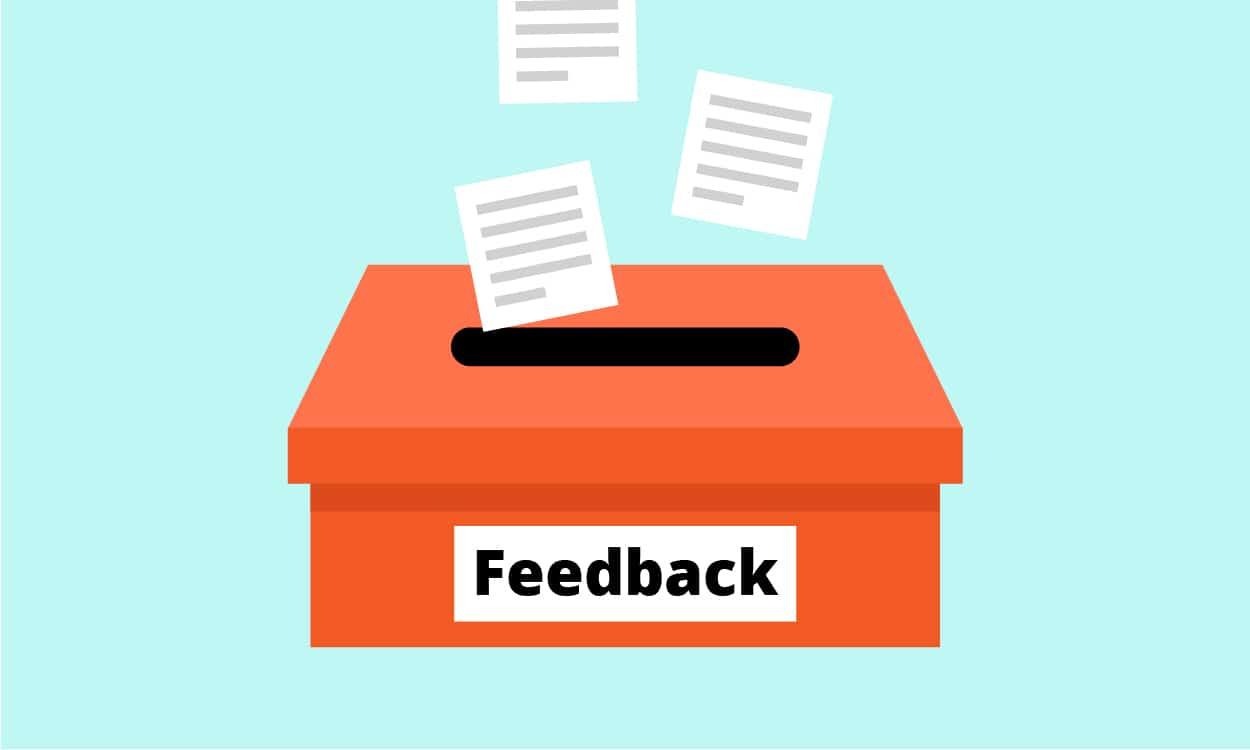
Gathering Feedback to Improve User Experience
Gathering feedback from users is a crucial step in enhancing their experience on your website. It allows you to understand their perceptions, frustrations, and preferences, particularly when it comes to cookie banners. A well-designed cookie banner can either enhance or detract from user experience, so let’s delve into effective methods to gather constructive feedback.
Start by implementing a short survey that pops up after users interact with your cookie banner. This survey could include questions such as:
How clear was the information provided in the cookie banner?
Did you feel it was too intrusive?
What additional information would you like to see?
Keep the survey brief—users are more likely to engage with it if it takes less than a minute to complete. Offering a small incentive, like a discount code or entry into a giveaway, can significantly increase participation rates.
Another effective method is to use heatmaps and session recordings to observe how users interact with your cookie banner. These tools can provide insights into:
Where users click on the banner
How quickly they dismiss it
Any patterns in user behavior when they are presented with different banner designs
These analytics can help you identify problem areas. For instance, if you notice a significant number of dismissals, it may indicate that the banner is too aggressive or unclear about its purpose.
Moreover, consider utilizing social listening tools to track mentions of your website on social media platforms. Users often share their frustrations or praise through these channels. By monitoring conversations, you can gain valuable insights into how your cookie banner is perceived in a broader context.
Feedback Method
Benefits
Short Surveys
Direct user insights, quick to implement
Heatmaps
Visual representation of user behavior
Social Listening
Understanding user sentiment in real-time
don’t forget to actively encourage users to provide feedback through your website’s contact channels. A simple prompt inviting users to share their thoughts on the cookie banner can yield qualitative insights that numbers alone cannot provide. You might ask:
What did you think about our cookie consent message?
Did it affect your experience on our site?
By prioritizing user feedback, you can create a more engaging and less intrusive cookie banner that respects your users’ preferences, ultimately leading to a more positive overall experience on your site.
Frequently Asked Questions (FAQ)
Q&A: What to Put On a Cookie Banner So Visitors Aren’t Annoyed
Q: Why do I need a cookie banner on my website? A: Great question! A cookie banner is essential because it informs visitors about how your site uses cookies—small data files that track user behavior. It ensures transparency and helps you comply with privacy laws like GDPR and CCPA. Plus, it builds trust with your audience!
Q: What should I include in my cookie banner to avoid annoying visitors? A: The key is to be clear, concise, and friendly! Start with a straightforward message. For example, “We use cookies to enhance your experience.” Then, provide a brief explanation of what cookies do. give users the option to accept cookies or manage their preferences. A simple button that says “Learn more” can redirect them to your privacy policy!
Q: How much information is too much for a cookie banner? A: Less is often more! You want to provide enough information to inform without overwhelming. Keep the language simple and avoid technical jargon. If visitors want more details, they can click through to your privacy policy. Your banner should be an invitation to understand, not an essay!
Q: Should I use humor in my cookie banner? A: Humor can be a double-edged sword! If it aligns with your brand voice and feels natural, it can lighten the mood. Just ensure that it doesn’t detract from the message. A touch of wit can make the banner memorable, but clarity should always come first!
Q: What about the design of the cookie banner? A: A clean, unobtrusive design works best. Use colors that complement your website but ensure the text stands out. You want it to be noticeable without being disruptive. A well-placed banner at the bottom or top of the page can be effective. Also, ensure the buttons are clearly labeled—“Accept”, “Reject”, or “Manage Preferences” work well!
Q: How can I make the cookie banner feel less intrusive? A: Timing and placement are key! Show the banner after a slight delay, allowing visitors to engage with your content first. Additionally, consider a ‘soft’ banner that doesn’t take up the entire screen. And remember, offering visitors clear choices makes them feel in control!
Q: Is it really worth the effort to create a thoughtful cookie banner? A: Absolutely! A well-crafted cookie banner can enhance user experience, foster trust, and increase compliance. When visitors feel respected and informed, they’re more likely to engage with your site. A little effort can go a long way in building relationships with your audience!
Q: Where can I find examples of effective cookie banners? A: Plenty of websites serve as great examples! Look at popular e-commerce or news websites—they often have clear and respectful cookie banners. You can also check out cookie consent tools that offer templates to get you started. Just remember to tailor it to fit your brand’s voice!
Q: What are the consequences of not having a cookie banner? A: Skipping the cookie banner can lead to legal repercussions, including fines for non-compliance with privacy laws. Beyond that, it can damage your reputation with users who may feel their privacy is being ignored. In today’s digital world, it’s better to be safe than sorry!
By considering these questions and answers, you can craft a cookie banner that not only informs but also engages your visitors without causing annoyance. Happy website building!
Future Outlook
As we wrap up our exploration of cookie banners, remember that clarity and respect for your visitors’ experience are key. A well-crafted cookie banner doesn’t just comply with regulations—it builds trust and encourages engagement. By being transparent about what data you collect and why, you can turn a potentially annoying pop-up into a friendly reminder that you’re committed to their privacy.
So, as you design your cookie banner, keep it simple, informative, and user-friendly. Don’t shy away from a little personality; a sprinkle of charm can go a long way in making your visitors feel valued. After all, a happy visitor is a returning one!
With the right approach, your cookie banner can become an integral part of your website, enhancing user experience rather than detracting from it. Now, go ahead and implement these tips—your visitors will thank you, and your website will shine! Happy cookie-ing! 🍪