Unlocking the Secrets of Effective Pricing Pages: 19 Designs That Drive Conversions
Hey there, savvy marketers and business owners! If you’ve ever wondered why some pricing pages seem to work like magic while others leave potential customers scratching their heads, you’re in the right place. A well-designed pricing page can be the difference between a visitor clicking “Buy Now” and bouncing away in confusion. In this article, we’re diving deep into 19 pricing page designs that don’t just look good—they convert.
But what exactly makes these designs so effective? From clear value propositions and strategic layout choices to enticing calls to action, we’ll break down the elements that turn casual browsers into loyal buyers. Whether you’re revamping your existing pricing page or starting from scratch, the insights you’ll gain here will empower you to create a page that not only informs but also inspires action. So, let’s get started on transforming your pricing strategy into a conversion powerhouse!
Understanding the Importance of a Well-Designed Pricing Page
A well-crafted pricing page serves as the gateway between a potential customer’s interest and their decision to purchase. It’s not just about listing prices; it’s about presenting value in a way that resonates with your audience. When done correctly, a pricing page can turn casual visitors into loyal customers.
First and foremost, clarity is key. A pricing page should eliminate any confusion regarding what each plan or tier offers. Bullet points are an effective way to highlight features, making it easy for users to scan and compare options. For example:
Basic Plan: Ideal for individuals.
Standard Plan: Best for small teams.
Premium Plan: Perfect for growing businesses.
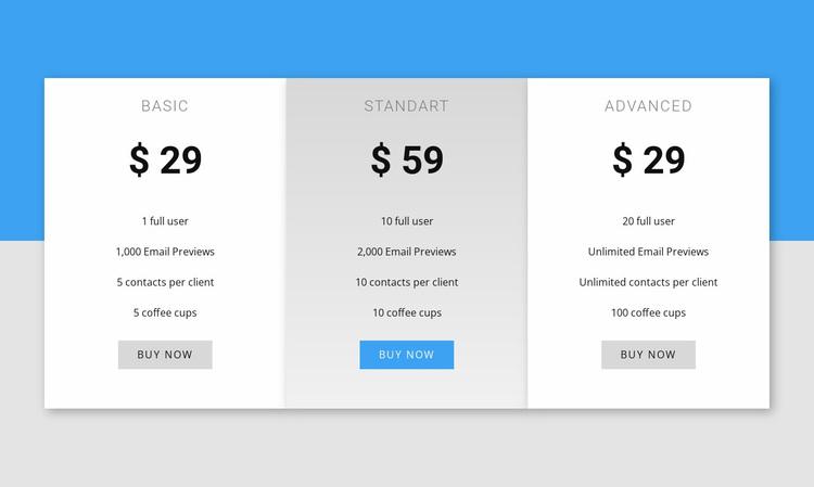
This kind of straightforward presentation helps customers quickly identify the plan that best suits their needs. Furthermore, incorporating a comparison table can provide visual clarity and allow customers to weigh their options side by side. Here’s an example:
Features
Basic
Standard
Premium
Monthly Price
$10
$20
$30
User Accounts
1
Up to 5
Unlimited
Support
Email
Email & Chat
24/7 Support
Another essential aspect is the psychological trigger of pricing. Anchoring is a powerful strategy; by showcasing a high-priced plan next to lower-tier options, you can make the latter appear more appealing. This technique plays into human nature, drawing focus to perceived savings and value. Additionally, incorporating limited-time offers or discounts can instill a sense of urgency, prompting immediate action.
Don’t forget about design elements! A visually appealing pricing page with intuitive navigation can significantly enhance user experience. Use consistent branding and colors that align with your overall website design to create a cohesive look. A good design will not only attract attention but will also guide visitors smoothly through the decision-making process.
Lastly, integrate customer testimonials or success stories on your pricing page. Hearing from satisfied customers can alleviate potential buyers’ concerns and build trust. Their experiences can serve as powerful endorsements, showcasing the effectiveness and value of your service. Placing these testimonials strategically near pricing options can help solidify the decision to purchase.
Key Elements That Make Pricing Pages Effective
When it comes to designing a pricing page that truly converts, several key elements come into play. These elements not only enhance the user experience but also build trust and encourage potential customers to make a purchase. Here’s a breakdown of what makes an effective pricing page.
Clear and Concise Pricing: Avoid overwhelming your audience with complicated pricing structures. Use straightforward language and ensure that each pricing option is easy to understand. Customers should immediately grasp what they are paying for without having to decipher hidden fees or confusing terminologies.
Compelling Value Proposition: Each pricing tier should clearly communicate the benefits of that plan. Highlight the unique features and advantages that customers will receive, ensuring they understand the value they are getting for their money.
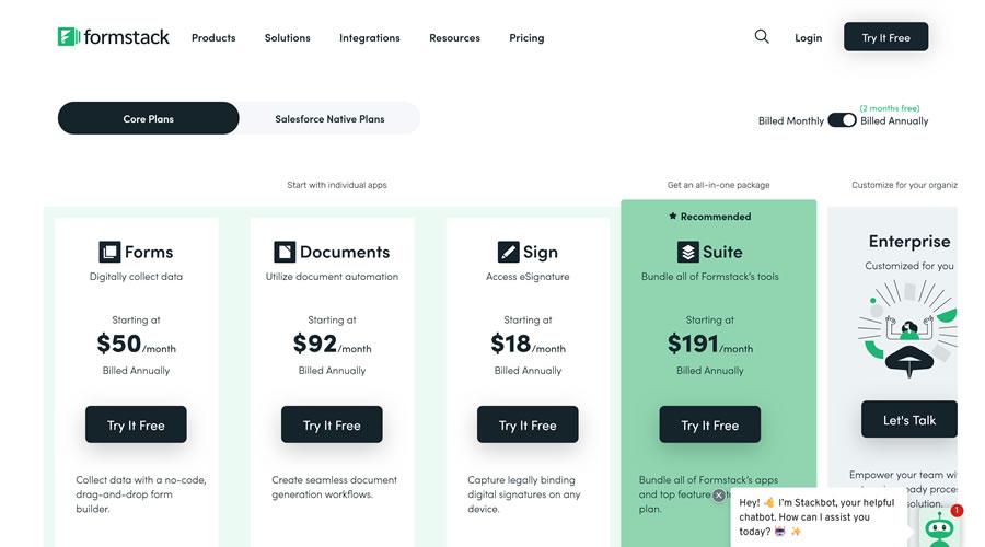
Visual Hierarchy: Utilize visual design elements to guide users’ attention. Make your most popular or recommended plan stand out using size, color, or borders. This strategy can effectively lead customers toward the option you want them to choose.
Social Proof and Testimonials: Incorporate reviews, ratings, and testimonials directly on your pricing page. This can significantly increase trust and reduce any lingering doubts about the decision to purchase. Seeing that others have had positive experiences can tip the scales in your favor.
Another essential component is the inclusion of a money-back guarantee. This can alleviate fears associated with making online purchases, especially if potential customers are unsure about whether the product or service will meet their expectations. A well-placed badge or statement regarding your refund policy can enhance credibility.
Additionally, incorporating a call to action (CTA) is crucial. Your CTA should be prominent and persuasive, encouraging users to take the next step. Use action-oriented phrases like “Get Started,” ”Join Now,” or “Try for Free” to prompt immediate action.
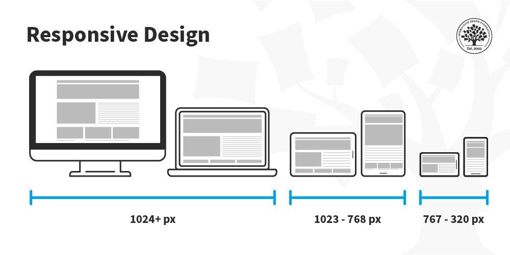
Lastly, don’t forget about mobile optimization. With an increasing number of users accessing websites through their phones, it’s vital that your pricing page is responsive and easy to navigate on smaller screens. A seamless experience across devices can lead to higher conversion rates.
By integrating these elements thoughtfully, you can create a pricing page that not only informs but also converts. Keep your audience’s needs at the forefront of your design process, and watch as your conversion rates soar.
How Clear Value Propositions Drive Conversions
In the world of online business, a clear value proposition is like a beacon guiding potential customers to your door. When users land on your pricing page, they are often looking for a reason to choose your product over others. A compelling value proposition answers the fundamental question: “What’s in it for me?” It addresses customer pain points and highlights the unique benefits your product offers.
To effectively drive conversions, your value proposition should be:
Concise: Keep it short and sweet. Users should grasp your message within seconds.
Specific: General claims can feel vague. Use clear, quantifiable benefits.
Relevant: Tailor your proposition to resonate with your target audience’s needs and desires.
One of the most effective strategies is to showcase how your product solves a problem or improves the user’s life. For instance, instead of stating, “Our software is user-friendly,” you could say, “Cut your project management time in half with our intuitive interface.” This not only presents a clear benefit but also elicits emotion, prompting users to envision their lives post-purchase.
Another essential aspect is the placement of your value proposition. It should be prominently displayed at the top of your pricing page. Utilizing contrasting colors or fonts can help draw attention to this crucial message. Consider implementing a two-column layout where one side highlights the benefits while the other presents pricing options. This not only improves readability but also reinforces the value proposition as users evaluate their choices.
Moreover, integrating social proof can significantly enhance your value proposition. Showcasing testimonials, case studies, or user reviews adds credibility. For example, a dedicated section on your pricing page that features real customer experiences can further validate your claims. Here’s a simple table showcasing how feedback can be presented:
Customer Name
Feedback
Jane D.
“This tool saved me hours of work each week!”
Mark S.
“The best investment I made for my business!”
Susan T.
“I love how easy it is to use. Highly recommend!”
remember that a strong value proposition is not a one-size-fits-all approach. A/B testing can provide insights into what resonates best with your audience. By experimenting with different versions of your value proposition, whether through wording, layout, or visuals, you can gather data to refine your messaging for maximum impact.
Incorporating a strong value proposition into your pricing page design not only clarifies the benefits of your offering but also fosters trust and builds an emotional connection with potential customers. By making it easy for users to see the value in your product, you pave the way for increased conversions and long-term business success.
The Power of Visual Hierarchy in Pricing Design
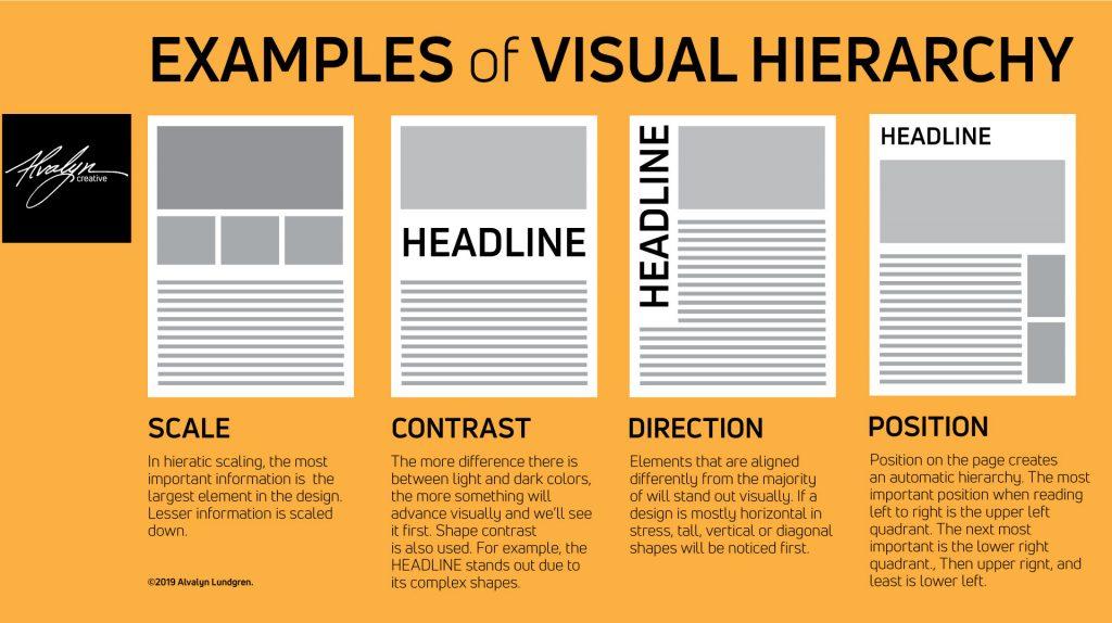
When designing a pricing page, visual hierarchy plays a pivotal role in guiding users toward making a purchase decision. By effectively arranging elements, you can lead the customer’s eye to the most important parts of your pricing structure, making it easier for them to understand and choose the best option for their needs.
Contrast is a crucial factor in establishing visual hierarchy. Use contrasting colors to highlight key information such as the most popular plan or special discounts. For instance, a bold background color for the selected pricing tier can create a significant impact, making it stand out from the rest. This technique helps potential buyers quickly identify the plan that may be the best fit for them. Consider these elements in your design:
Incorporate bold text to emphasize critical features or benefits.
Utilize whitespace effectively to separate different sections, reducing clutter and enhancing readability.
Another effective strategy is to group related information together. Organizing features, benefits, and price points in a logical order can make the decision-making process smoother. For example, you could create a table that clearly delineates the differences between pricing tiers, helping users quickly compare options without feeling overwhelmed.
Plan
Price
Features
Basic
$10/month
Up to 5 users, Basic support
Standard
$20/month
Up to 15 users, Email support
Premium
$30/month
Unlimited users, 24/7 support
Call-to-action (CTA) buttons should also follow the principles of visual hierarchy. Make them prominent and distinct from other text by using bold typography and contrasting colors. The placement of CTAs is just as important; positioning them strategically after each pricing option can encourage users to take action as soon as they feel ready. Ensure your CTAs are action-oriented, using phrases like “Start Free Trial” or “Choose This Plan” to inspire clicks.
Don’t overlook the power of icons and imagery. Visual elements can simplify complex information and make it more digestible. For instance, using icons to represent features can quickly communicate value without overwhelming the user with text. When accompanied by concise descriptions, these visual cues enhance understanding and retention.
remember that testing is essential. What works for one audience might not work for another, so it’s crucial to analyze user behavior and feedback. A/B testing different layouts, color schemes, and CTAs can provide insights into what resonates most with your audience, allowing you to refine your pricing page for optimal conversion rates.
Using Color Psychology to Influence Buyer Decisions
When it comes to designing a pricing page, the colors you choose can significantly affect how potential buyers perceive your offerings and, ultimately, their purchasing decisions. Color psychology plays a crucial role in guiding these emotions and actions, making it an essential aspect of your pricing strategy.
Understanding Emotions Associated with Colors
Different colors evoke different emotions and responses. Here’s a quick rundown of some key colors and their psychological impacts:
Red: Often associated with urgency and excitement, red can prompt quick decision-making. It’s perfect for limited-time offers.
Blue: This color conveys trust and reliability, making it ideal for financial services or tech products.
Green: Associated with growth and harmony, green is a great choice for eco-friendly products or wellness services.
Yellow: Bright and cheerful, yellow can grab attention and is often used for call-to-action buttons.
Purple: This color symbolizes luxury and creativity, appealing to high-end products or services.
By strategically incorporating these colors into your pricing page, you can influence the emotional journey of your visitors. For example, using a bold red for a limited-time offer can create a sense of urgency, while a calming blue for your main pricing options can instill trust and encourage exploration.
Color Combinations and Hierarchies
It’s not just about the individual colors but also how they work together. A well-thought-out color scheme can create a visual hierarchy that guides the eyes of your visitors toward key information. For instance:
Color Combination
Application
Blue & Orange
Trustworthy offers with a playful accent to drive engagement
Green & Grey
Professional and eco-friendly image for sustainability-focused brands
Purple & Gold
Luxury products to attract high-end customers
Using contrasting colors for your call-to-action buttons ensures they stand out from the rest of your content. This method can guide the user’s focus where you want it the most, increasing the likelihood of conversion.
A/B Testing Your Color Choices
While understanding color psychology is essential, it’s equally important to test your choices. Conducting A/B tests can provide insight into which colors resonate best with your audience. You could try:
Testing different shades of the same color to see which performs better.
Changing the color of your call-to-action buttons to identify the most effective option.
Experimenting with color placement on the page itself—sometimes subtle changes can make a big difference.
By gathering data from these tests, you can refine your pricing page design to maximize conversions and align with your brand identity.
Final Thoughts on Color Choices
The colors you utilize on your pricing page can create an emotional connection with your potential buyers, influencing their decision-making process. By understanding the psychology behind colors, employing effective combinations, and continuously testing your approach, you can create a compelling pricing page that not only attracts attention but also drives conversions.
Crafting Compelling Copy That Resonates with Customers
When it comes to designing a pricing page that not only attracts but also converts potential customers, the copy you use plays a pivotal role. Your words should create a connection with your audience, speak directly to their needs, and guide them toward making a purchase.
Here are some key elements to consider when crafting your pricing page copy:
Know Your Audience: Understanding who your customers are is essential. Tailor your messaging to address their pain points and desires. Use language that resonates with them.
Highlight Benefits Over Features: Customers want to know how your product or service will improve their lives. Focus on the benefits rather than just listing features. For example, instead of saying “Includes 24/7 customer support,” say “Get peace of mind with our round-the-clock customer support.”
Use Clear and Concise Language: Avoid jargon and overly complex terms. Your pricing page should be easy to read. Short sentences and simple words can help maintain clarity.
Incorporate Social Proof: Adding testimonials or reviews can significantly increase trust. Seeing that others have benefited from your offering can encourage new customers to take the plunge.
Create a Sense of Urgency: Phrases like “Limited time offer” or “Join now and save” can motivate customers to act quickly and avoid missing out on a good deal.
To put these principles into action, let’s explore a few effective pricing page designs:
Design Element
Description
Clear Pricing Structure
Use distinct tiers that are easy to compare, helping customers quickly identify the best option for them.
Call to Action (CTA)
Make your CTA buttons stand out with contrasting colors and persuasive text like “Get Started” or “Claim Your Discount.”
Visual Hierarchy
Utilize size, color, and placement to direct attention to the most important parts of your pricing page.
Ultimately, your goal is to create a pricing page that doesn’t just display numbers, but tells a story. By weaving together compelling copy with effective design elements, you can create an experience that captivates visitors and drives conversions.
Remember, your pricing page is not just a list of prices; it’s a powerful tool to communicate value and encourage buying decisions. Every word counts, so make sure that your copy is as persuasive as possible!
Incorporating Testimonials and Social Proof to Build Trust
When it comes to converting visitors into customers, incorporating testimonials and social proof on your pricing page can significantly enhance credibility. Potential buyers are often influenced by the experiences of others, and showcasing positive feedback can help alleviate any doubts they may have about your product or service. Here’s how to effectively leverage these elements:
Highlight Customer Success Stories: Use real-life examples of how your product has made a difference for your customers. Short case studies can add depth and relatability.
Use Visuals: Incorporate headshots or logos of companies that have endorsed your product. Visual elements can create a stronger connection and lend more authenticity to the testimonials.
Incorporate Quotes: Select powerful quotes from satisfied customers. Display them prominently, perhaps in a styled block quote format, to capture attention immediately.
Consider creating a dedicated section on your pricing page where testimonials can shine. By placing them near the pricing options, you reinforce that your offering is trusted by others. This can mitigate price anxiety, and customers are more likely to feel confident investing in a product that others have found valuable.
Another effective strategy is to include user-generated content. Encourage customers to share their experiences on social media and tag your brand. You can then showcase these posts directly on your pricing page. This not only fosters a sense of community but also demonstrates real-world satisfaction. Here’s how user-generated content boosts credibility:
Authenticity: Genuine feedback from real users often resonates more than traditional marketing messages.
Engagement: Engaging with your audience increases loyalty and encourages others to share their experiences.
For a more structured approach, consider creating a table that displays ratings or reviews from different customers. This can help potential buyers quickly assess the value of your product based on multiple opinions. Here’s a simple example:
Customer
Rating
Testimonial
Jane Doe
⭐⭐⭐⭐⭐
“This product transformed my workflow!”
John Smith
⭐⭐⭐⭐
“Excellent support and results to match!”
Sarah Lee
⭐⭐⭐⭐⭐
“I can’t imagine my business without it!”
Lastly, don’t forget to include a call-to-action (CTA) that encourages visitors to join the ranks of your satisfied customers. Phrasing like “Join thousands of happy users” or “See why our customers love us” can effectively create a sense of urgency and community.
integrating testimonials and social proof into your pricing page not only boosts credibility but also creates a persuasive environment that encourages conversions. Customers are more likely to trust a product endorsed by their peers, so make sure to highlight these elements effectively!
The Impact of Responsive Design on User Experience
Responsive design has revolutionized the way users interact with web pages, particularly pricing pages that are crucial for conversions. By ensuring that a website adapts seamlessly to various devices, responsive design significantly enhances user experience. When a pricing page is optimized for different screen sizes, it not only makes information accessible but also engages users effectively, allowing for informed decision-making.
Consider the following benefits of responsive design:
Improved Readability: Text and pricing structures that adapt to screen sizes enable users to easily read and comprehend the information presented, whether they are on a desktop, tablet, or smartphone.
Enhanced Navigation: Responsive layouts simplify navigation, allowing users to find what they need quickly without unnecessary zooming or scrolling.
Consistent Branding: A responsive design ensures that your brand aesthetics remain intact across all devices, fostering trust and recognition.
Moreover, responsive design can directly impact conversion rates. Users are more likely to engage with a pricing page that is easy to navigate and visually appealing. When potential customers can clearly see pricing tiers, features, and benefits without frustration, they are more inclined to proceed with a purchase. A well-structured responsive pricing page can lead to lower bounce rates and higher retention.
Device Type
Conversion Rate
Desktop
3.5%
Tablet
2.8%
Mobile
4.2%
It’s essential to remember that mobile users now comprise a significant portion of web traffic. Thus, a pricing page that performs exceptionally well on mobile can lead to remarkable improvements in overall sales. The key lies in creating a streamlined experience that allows users to access all necessary information without hindrance, regardless of their device.
Furthermore, responsive design encourages users to share pricing pages easily on social media or via other platforms. When users have a positive experience, they’re more likely to recommend the product or service to their network, thereby increasing visibility and potential leads. This viral effect can significantly drive up traffic and conversions over time.
the integration of responsive design into your pricing page is not just an option; it’s a necessity in today’s digital landscape. By prioritizing user experience through adaptable design, you can create a pricing strategy that not only attracts but also retains customers effectively.
Offering Flexible Pricing Options to Cater to Different Needs
Tailored Pricing Solutions for Every Customer
Understanding that every customer has unique requirements is crucial in today’s diverse marketplace. By offering a range of flexible pricing options, businesses can cater to various budgets and preferences. This approach not only enhances customer satisfaction but also increases the likelihood of conversions.
One effective strategy is to implement a tiered pricing model. This allows potential customers to choose a package that aligns with their needs and financial capacity. Consider these tiers:
Plan
Price
Features
Basic
$19/month
Access to basic features
Email support
Pro
$49/month
All Basic features
Advanced analytics
Priority support
Enterprise
$99/month
All Pro features
Custom solutions
Dedicated account manager
Another approach is to offer a pay-as-you-go option. This pricing structure appeals to customers who are hesitant to commit to a subscription. Instead of paying upfront, they can pay only for the services they use, making it a less risky investment. Highlighting this flexibility can significantly boost user engagement.
Additionally, consider implementing discounts or promotional pricing for first-time users or annual subscriptions. Not only does this encourage trial, but it also promotes loyalty. Customers are more likely to stick around if they feel they are getting a good deal.
Moreover, showcasing customer testimonials alongside pricing options can enhance credibility. When potential buyers see how others have benefited from different pricing tiers, they are more inclined to make a purchasing decision. A well-placed testimonial can help demystify the value proposition and illustrate the tangible benefits of each plan.
ensuring that your pricing page is visually appealing and easy to navigate is paramount. Use clear headings, concise descriptions, and engaging visuals. A well-structured pricing page can be the tipping point that converts a casual visitor into a loyal customer.
Utilizing A/B Testing to Optimize Your Pricing Page
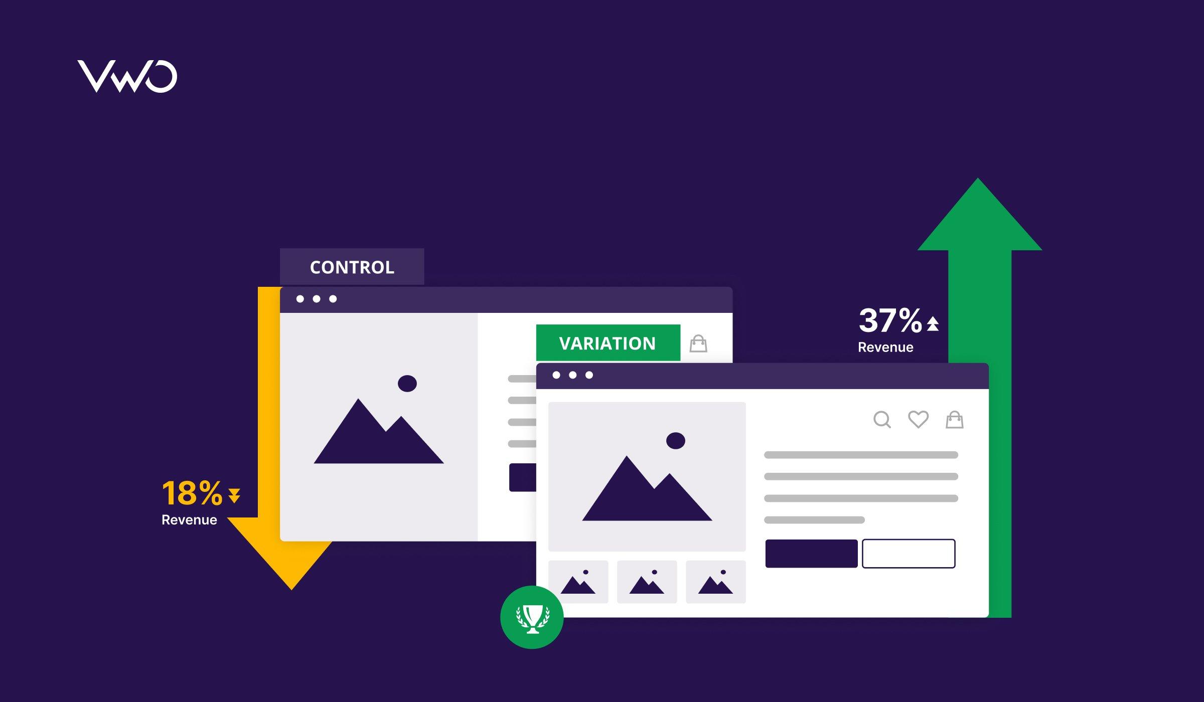
When it comes to maximizing conversions on your pricing page, A/B testing is your secret weapon. This method allows you to compare two versions of a page to see which one resonates more with your audience. By systematically altering elements of your pricing page, you can gather valuable insights that lead to enhanced performance. Here’s how to effectively utilize A/B testing for optimal results.
Start by identifying key elements on your pricing page that could impact conversion rates. Consider the following factors:
Pricing Structure: Test different pricing models, such as monthly vs. annual subscriptions, or flat rates vs. tiered pricing.
Call-to-Action (CTA): Experiment with various phrasing, colors, and button placements to see which garners the most clicks.
Visual Elements: Assess the impact of images, icons, and layout designs on user engagement.
Trust Signals: Incorporate elements like customer testimonials, security badges, and reviews to build credibility.
Next, create two versions of your pricing page: the control (A) and the variant (B). Ensure that changes are isolated to just one or two elements at a time to accurately gauge the impact of each modification. For instance, if you change the CTA button color from blue to green, keep everything else the same. This allows you to identify what truly drives conversions.
Once your test is live, it’s crucial to monitor performance metrics. Focus on:
Conversion Rate: The percentage of visitors who completed the desired action.
Bounce Rate: The percentage of visitors who leave without engaging with your page.
Average Time on Page: Longer times can indicate better engagement.
After collecting sufficient data, analyze the results to determine the winning version. You may find that small tweaks yield significant improvements. For example, a simple change in the copy of your pricing plan can lead to a substantial increase in sign-ups. Remember, what works for one audience may not work for another, so continuously test and adapt based on insights.
To keep your testing process organized, consider maintaining a table to track your A/B test results. Here’s a simple example:
Test Element
Version A (Control)
Version B (Variant)
Conversion Rate
CTA Button Color
Blue
Green
5% vs. 8%
Pricing Structure
Monthly
Annual
4% vs. 6%
Trust Signals
No Testimonials
With Testimonials
3% vs. 10%
Keep in mind that A/B testing is an ongoing process. The digital landscape is always evolving, and so are customer preferences. Regular testing ensures that your pricing page remains relevant and effective in converting visitors into paying customers. Each test is an opportunity to refine your approach, making your pricing page not just a static element, but a dynamic tool for growth.
Creating Urgency with Timers and Limited-Time Offers
In the world of online marketing, creating a sense of urgency can propel your pricing page from being merely informative to a powerful conversion driver. By incorporating timers and limited-time offers, businesses can effectively nudge potential customers towards making quicker decisions. The psychology behind urgency is simple: people are more likely to act when they feel that an opportunity is fleeting.
Consider adding a countdown timer directly to your pricing page. A visually appealing timer not only captures attention but also creates a visual cue that encourages immediate action. Here are a few effective design tips for your countdown timer:
Use contrasting colors to make the timer stand out.
Position the timer prominently above the pricing options.
Keep the countdown simple and easy to read.
Limited-time offers can also enhance the urgency factor. By presenting discounts or special packages that are only available for a short period, you create a compelling reason for visitors to make a purchase right away. Consider structuring your limited-time offers with clear expiration dates and benefits such as:
Exclusive discounts for the first 100 customers.
Free add-ons for purchases made within the promotional period.
A bonus gift for signing up before the deadline.
Another effective strategy is to highlight social proof alongside your urgency tactics. You might want to showcase how many people have already taken advantage of the limited-time offer. This can be done through a simple alert like “Only 5 items left!” or “Join over 1,000 satisfied customers today!” This not only instills urgency but also builds trust and credibility.
To illustrate the impact of urgency, consider the following comparison between two pricing page designs:
Design Element
With Urgency
Without Urgency
Timer
Countdown clock visible
No timer present
Limited-Time Offer
20% off for the next 24 hours
No special offer
Social Proof
“Only 3 spots left!”
No mention of sales
By integrating urgency into your pricing page, you’re not just putting a clock on your offers—you’re also creating a compelling narrative that encourages users to act now rather than later. Remember, in online shopping, every second counts, and the right design elements can lead to an increase in conversions that you might not have anticipated.
always keep in mind that urgency tactics should be genuine and transparent. Misleading customers with false expiration dates or exaggerated claims can lead to distrust and ultimately harm your brand. Strive for authenticity while using these persuasive tools, and you’ll not only drive conversions but also foster loyal customers who appreciate your integrity.
The Role of FAQs in Addressing Customer Concerns
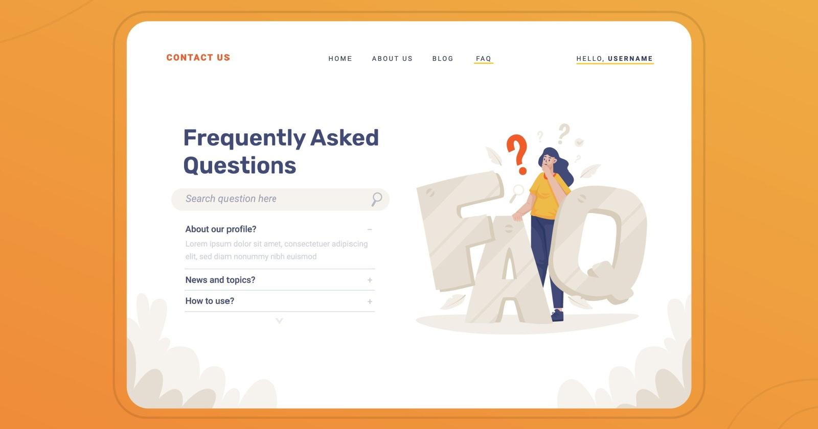
In the world of online shopping, customers are often filled with questions and concerns that can hinder their purchasing decisions. A well-crafted FAQ section serves as a bridge between potential buyers and the information they seek. By preemptively addressing common queries, you can significantly reduce friction in the buying process. Here’s how an effective FAQ section can play a pivotal role in alleviating customer anxieties.
First and foremost, an FAQ section offers instant access to critical information. Customers often have questions about:
Pricing Structures – Are there any hidden fees?
Shipping and Delivery - How long will it take to receive my order?
Return Policies - What if I’m not satisfied with my purchase?
Payment Options - Which payment methods are accepted?
By providing clear, concise answers to these questions, a well-organized FAQ section can empower customers to make informed decisions quickly, which can lead to higher conversion rates. When your pricing page includes an FAQ, it can guide users through their concerns and push them closer to the checkout point.
Moreover, a well-implemented FAQ section can also enhance your brand’s credibility. Customers are more likely to trust a business that demonstrates transparency. When you take the time to address potential concerns, you show that you value customer feedback and are willing to provide clarity. This fosters a sense of connection and trust, making them more likely to choose your product over a competitor’s.
Additionally, integrating visual elements into your FAQ section can boost engagement. Consider using collapsible sections or toggle buttons to keep the layout clean and user-friendly. This way, customers can easily navigate through their questions without feeling overwhelmed. Here’s a quick comparison of two FAQ styles:
FAQ Style
Pros
Cons
Collapsible
Cleaner look, easy navigation
May hide important info
Static List
All info visible at a glance
Can be overwhelming
In addition to functionality, your tone and language matter. Keep the FAQ responses friendly and approachable; use language that reflects your brand’s personality. This connection can make customers feel like they’re engaging with a real person rather than a faceless corporation, which is particularly important when it comes to sensitive topics like pricing.
don’t forget to keep your FAQs up to date. Regularly review and revise your FAQ section based on customer inquiries and feedback. This not only provides the latest information but also shows customers that you are actively listening and responsive to their needs. A dynamic FAQ section can evolve as your products, services, and market trends change, ensuring that customer concerns are always addressed effectively.
Integrating Call-to-Action Buttons for Maximum Engagement
In the realm of pricing page designs, effective call-to-action (CTA) buttons play a pivotal role in driving conversions. When thoughtfully integrated, these buttons can significantly enhance user engagement and guide potential customers toward making a purchase. Here are some strategies to maximize the effectiveness of your CTAs:
Use Contrasting Colors: Ensure your CTAs stand out from the rest of the page. A vibrant color that contrasts with the background can draw attention and make users more likely to click.
Action-Oriented Language: Instead of generic phrases like “Submit” or “Click Here,” opt for more compelling phrases such as “Get My Offer,” “Start My Free Trial,” or “Unlock Savings.” This creates a sense of urgency and excitement.
Strategic Placement: Position your buttons where users naturally look. Placing CTAs above the fold ensures immediate visibility, while including them throughout the content can capture interest before users scroll down.
Size Matters: Make sure your buttons are large enough to be easily clickable, especially on mobile devices. However, avoid making them so large that they overwhelm the page.
Another effective strategy is to utilize urgency and exclusivity in your CTA messaging. Phrases like “Limited Time Offer” or “Only X Left in Stock” can create a fear of missing out (FOMO), prompting users to act quickly. Additionally, using countdown timers next to your CTAs can further enhance this sense of urgency.
CTA Element
Impact
Contrasting Colors
Increases visibility and click-through rates
Action-Oriented Language
Encourages immediate action
Strategic Placement
Enhances visibility at crucial decision points
Urgency Messaging
Creates FOMO, prompting quicker decisions
Don’t forget about the mobile experience. With more users accessing websites via mobile devices, ensuring that your CTAs are optimized for smaller screens is imperative. This includes ensuring that buttons are not only sized appropriately but also spaced to prevent accidental clicks.
Lastly, take advantage of A/B testing to refine your CTA effectiveness. Experiment with different phrases, colors, and placements to see which combinations yield the highest conversion rates. The insights gained from these tests can provide valuable data to inform your ongoing design decisions.
Incorporating these elements into your pricing page design will not only enhance user engagement but also lead to increased conversions, ultimately benefiting your bottom line. Remember, an effective CTA is not just a button; it’s a powerful tool that can bridge the gap between interest and purchase.
Analyzing Competitor Pricing Pages for Inspiration and Insight
When it comes to converting visitors into paying customers, the pricing page is often the unsung hero of your website. It’s crucial to not only present your pricing clearly but also to understand what your competitors are doing effectively. Analyzing competitor pricing pages can provide invaluable insights and inspiration that you can apply to enhance your own page.
Identify Key Features
Begin by examining the features highlighted on competitor pricing pages. Look for common elements that seem to resonate with users, such as:
Clear value proposition: How do they articulate the benefits of each plan?
Feature comparisons: Are there tables or charts that make it easy to compare plans?
Customer testimonials: Do they leverage social proof to bolster credibility?
Creating a table comparing these elements can help visualize what works:
Competitor
Value Proposition
Comparison Tool
Testimonials
Competitor A
Best for teams
Feature comparison table
Yes
Competitor B
Affordable for startups
Interactive pricing calculator
No
Competitor C
Scalable solutions
Comparison chart
Yes
Pricing Strategies
Next, analyze their pricing strategies. Are they using tiered pricing, or do they have a single flat rate? Do they offer limited-time discounts or trials? Understanding these strategies can inspire you to adopt similar tactics or innovate new ones that can drive conversions.
Tiered Pricing: Allows users to select a plan based on their needs, which can lead to a higher average order value.
Free Trials: Lowering the barrier to entry can help attract hesitant buyers.
Don’t overlook the visual design elements of competitor pricing pages. Color schemes, typography, and layout all play a significant role in user experience. Look for:
Contrast: Does the pricing stand out?
Whitespace: Is there enough space to avoid overwhelming users?
Icons and imagery: Do these elements help convey value quickly?
always consider the user journey from the pricing page to conversion. Is there a clear call to action (CTA) that stands out? Comparing the CTAs of competitors can shed light on what wording and placement are most effective. Testing variations on your own pricing page can lead to insights that boost your conversion rate.
Frequently Asked Questions (FAQ)
Q&A: 19 Pricing Page Designs That Convert (& Why They Work)
Q: Why is a pricing page so important for my website? A: Your pricing page is often one of the most visited areas of your site. It’s where potential customers decide whether to commit to your product or service. A well-designed pricing page can make the difference between a visitor bouncing away and converting into a paying customer. It’s not just about the numbers; it’s about how you present them!
Q: What are the key elements of a high-converting pricing page? A: Great question! A high-converting pricing page should include clear pricing tiers, easy-to-understand descriptions of what each tier offers, a strong call-to-action (CTA), and social proof such as testimonials or user reviews. Visual elements, like comparison tables or highlight boxes for the most popular plan, also play a crucial role in guiding users toward a purchase.
Q: How do I choose the right pricing model for my business? A: The right pricing model depends on your business type and target audience. Consider whether a subscription model, one-time payment, or a freemium option aligns best with your product and customer needs. Look at competitors, but don’t be afraid to innovate! Testing different models can provide valuable insight into what resonates with your audience.
Q: Can you give me an example of a successful pricing page? A: Absolutely! Take a look at Dropbox’s pricing page. They effectively use simple visuals, clear tier descriptions, and a highlighted “Most Popular” option. This draws attention right where they want it—encouraging users to choose the plan that maximizes their perceived value.
Q: How can visuals enhance my pricing page? A: Visuals can significantly impact user understanding and engagement. Use icons to represent features, comparison tables to make differences clear, or even user-friendly charts to illustrate value. The goal is to make the information easily digestible and visually appealing, which can help reduce friction and guide users to a decision.
Q: What role does social proof play in conversion? A: Social proof can be a game changer! When potential customers see testimonials, case studies, or user reviews, it builds trust and credibility. They’re more likely to feel confident in their decision when they see that others have had positive experiences with your product. Adding a few compelling stories or statistics can really elevate your pricing page.
Q: Should I include a free trial or money-back guarantee on my pricing page? A: Yes, definitely! Offering a free trial or a money-back guarantee can reduce the perceived risk for customers. It shows that you’re confident in your product and gives users the chance to experience its value without commitment. This can significantly boost conversion rates, as it alleviates hesitation.
Q: What common mistakes should I avoid when designing a pricing page? A: A few pitfalls to watch out for include cluttered layouts, vague descriptions, and lack of clear CTAs. Avoid overwhelming users with too much information or options, as this can lead to decision fatigue. Make sure your pricing tiers are distinct and compelling, and always guide users toward the next step in the purchasing process.
Q: Can I use A/B testing to improve my pricing page? A: Absolutely! A/B testing is a fantastic way to optimize your pricing page. By testing different headlines, layouts, or CTAs, you can see what resonates best with your audience. Even small changes can lead to significant improvements in your conversion rate, so don’t hesitate to experiment!
Q: How often should I update my pricing page? A: Regular updates are key! As your offerings, market conditions, or customer feedback evolve, ensure your pricing page reflects those changes. This not only keeps it relevant but can also boost conversions by aligning with current consumer preferences and trends.
Q: Where can I find inspiration for my pricing page design? A: Check out design galleries, competitor websites, and even UI/UX blogs. You can also glean insights from successful companies in your industry. Remember, while it’s great to draw inspiration, always tailor your design to fit your unique branding and audience needs.
With these insights in mind, you’re all set to create a pricing page that not only attracts attention but also converts visitors into loyal customers! Happy designing!
To Wrap It Up
And there you have it! We’ve explored 19 standout pricing page designs that not only grab attention but also drive conversions. Each example we discussed offers unique insights into what makes a pricing page truly effective. Remember, it’s not just about throwing numbers on a page; it’s about creating a seamless experience that resonates with your audience.
As you consider your own pricing strategy, keep these principles in mind: clarity, value, and persuasion. Test different elements, listen to your audience’s feedback, and don’t be afraid to iterate. Your pricing page is often the first stop on a customer’s journey, so make it count!
So why wait? Dive in, experiment, and watch your conversions soar! If you have any thoughts or experiences with pricing pages, we’d love to hear from you in the comments below. Happy designing!